ROLE: UX RESEARCHER, UX STrategist IA, CONTENT STRATEGIST, QA
Client Profile:
Rehab Spot proudly works with counselors, therapists, advocates, bloggers, and contributors who have studied addiction, are in recovery themselves, or who have had their lives impacted by substance abuse in some way. They try to include the broadest possible set of perspectives on addiction, provide the most accurate and up-to-date information, and to reach the widest possible audience.
Objective:
To create a website that served the users as an informative hub of content in order to encourage individuals with drug/alcohol addictions or loved ones of known addicts to feel empowered and educated to get their addict loved one the proper attention and resources needed to overcome their disease. The client hopes to achieve an increase in business leads, expansion of brand awareness (via SEO) as well as educate their audience on the dangers of drug and alcohol abuse.
Restrictions:
The timeline was tight and the client had a strict timeline against other partnerships to meet quarterly and annual KPIs and business goals. My role in the project had to work fast in order to give the assigned Design resource direction on how to translate these needs into tangible UX/UI components and eventually transactions. Also, the client was very SEO-focused, all strategies needed to comply with their SEO performance allow them to continue scaling their SEO rank success. Lastly, building content is their source of attracting traffic to their webpage, therefore, all strategies needed to be scalable.
How Success Will Be Measured:
Amount of contact requested (leads) to the dedicated treatment expert, outranking competition via SEO performance, longer user sessions within the website content.
Project Scope:
Desktop and Mobile Site
Tools:
Excel, Sketch, Algolia, Airtable
UNDERSTANDING THE PROBLEM
What is Known
More than 23.5 million Americans struggle with substance abuse disorders every day
Each year, there are nearly 3 million violent crimes where the offender has been drinking.
Of all violent crime at universities, 95% involves the presence of alcohol.
The number of annual deaths related to Benzodiazepine addiction is increasing. In 2015, 4,000 female deaths and 5,000 male deaths were attributed to Benzodiazepine addiction. In 2003, 23% of people who died by an Opioid overdose also tested positive for Benzodiazepines.
744,000 violent incidents between acquaintances that result in police presence involve alcohol.
What I Need to Find Out
What is keeping addicts and loved ones of addicts from seeking professional help in order to achieve a better quality of life.
How I Found Out
I conducted research on the current and targeted audience and assessed their needs and experiences via second-hand research from trusted sources as well as government sources. I relied on the competitive analysis to compare what other companies in the same industry (and market) were successfully doing in order to leverage it on Rehabspot's digital presence.
RESEARCH
Drug Addiction Epidemic Affects All Americans:
Urban, suburban and rural counties all have experienced significant growth in deadly drug overdoses, according to the CDC. There were 19,172 fatal overdoses in urban counties in 2016, up 25% from the year before. Suburban counties experienced 36,424 such deaths, up 22%, while rural counties saw 8,036 deaths, up 9%. (This analysis uses the National Center for Health Statistics county classification scheme to assign each county to a community type.
Source: http://www.pewresearch.org/fact-tank/2018/05/30/as-fatal-overdoses-rise-many-americans-see-drug-addiction-as-a-major-problem-in-their-community/
PROFILE | The Addict State and Mindset
They often feel ashamed of their addiction and fear of being reported to the police. Authority may be one of the biggest obstacles to addicts seeking help. Seeing others seek help resulting in an improvement in their mood and quality of life can be inspiring, therefore, they see that change is possible. Addicts feel that love isn’t enough to overcome their disease. Research proves that chemical imbalances create dependencies and take over rationality. They do not purposely choose drugs over loved ones but generally want to seek help.
They often feel ashamed of their addiction and fear of being reported to the police. Authority may be one of the biggest obstacles to addicts seeking help. Seeing others seek help resulting in an improvement in their mood and quality of life can be inspiring, therefore, they see that change is possible. Addicts feel that love isn’t enough to overcome their disease. Research proves that chemical imbalances create dependencies and take over rationality. They do not purposely choose drugs over loved ones but generally want to seek help.
The Greatest Lies that Addicts Believe:
1. The need to become dishonest to sustain an addiction - leads to denial and delusion
2. Terminal uniqueness | It is the belief that what the person is facing in life is unlike anything faced by other people, they keep on telling themselves that they are different and they will not end up suffering the same consequences
3. Substance abuse leads to increased creativity
4. Addiction Recovery is boring
5. Addiction is the Best That the individual can hope for in life
6. Beer drinkers cannot be addicts
7. Sober People are Miserable
8. Successful people cannot be addicts
9. Life in recovery is a constant battle against cravings
10. Everyone is going to die anyway so it is best to party hard
11. Chronic relapsers will never get sober
12. Relapse is a normal part of recovery
13. Substance abuse is normal behavior
Source: http://alcoholrehab.com/drug-addiction/the-greatest-lies-that-addicts-believe/
PROFILE | Concerned Loved One Mindset
They want to offer help by finding and sharing information on where to get help. If the person with the addiction declines, the focus tends to shift to seeking coping mechanisms and help for themselves.
They feel the need to know how to acknowledge the addiction and cautiously make an effort not to misdirect emotions. Loved ones must be willing to support the recovery process.

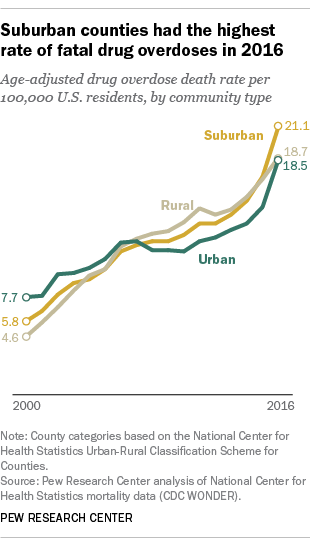
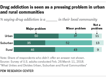
The charts above showcase how drug abuse has become a rising issues across several communities despite race and socio-economic standing
Source: PEW Research Center
RESEARCH INSIGHTS
Learnings:
1) There is an alarming epidemic that does not discriminate - it is affecting Americans of all races and socio-economic levels
2) Not many people are well-versed with the length and complicated names of each medication even identify what their loved could be addicted to
3) There are too many loose definitions of 'addiction; therefore the behavior can often go unnoticed and untreated
4) Addiction is disease that requires professional attention
5) The easiest solve is to restrict the accessibility to these drugs
Paint Points:
1) Resources for help are scarce especially in rural areas of the United States
2) Lack of education for individuals to address addiction before it takes a toll on the addict
3) Many victims and families of the addicts feel powerless
4) Many families feel that they cannot afford treatment or any type of recovery
5) There is a sense of isolation and despair when undergoing addiction
COMPETITIVE ANALYSIS
Navigation
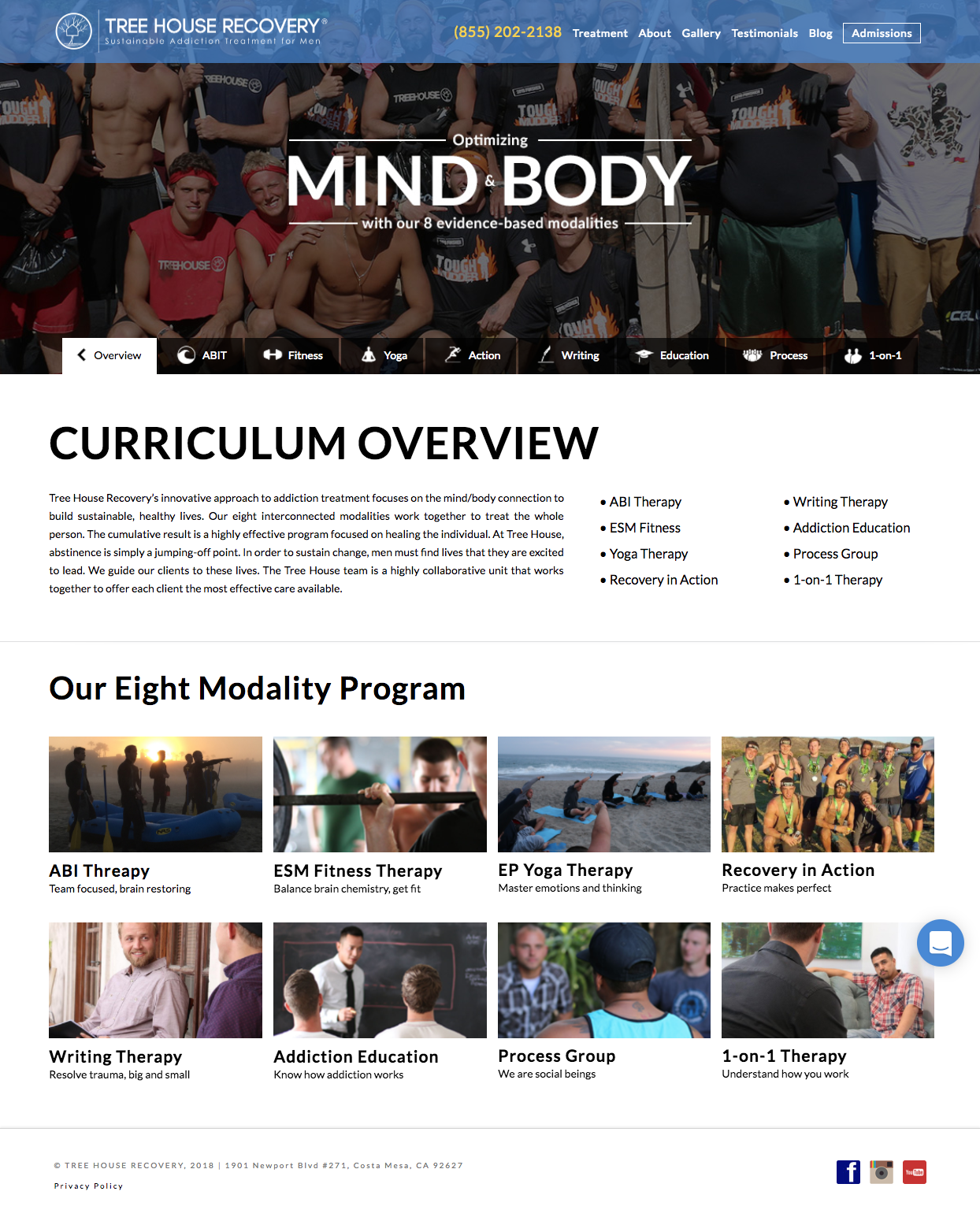
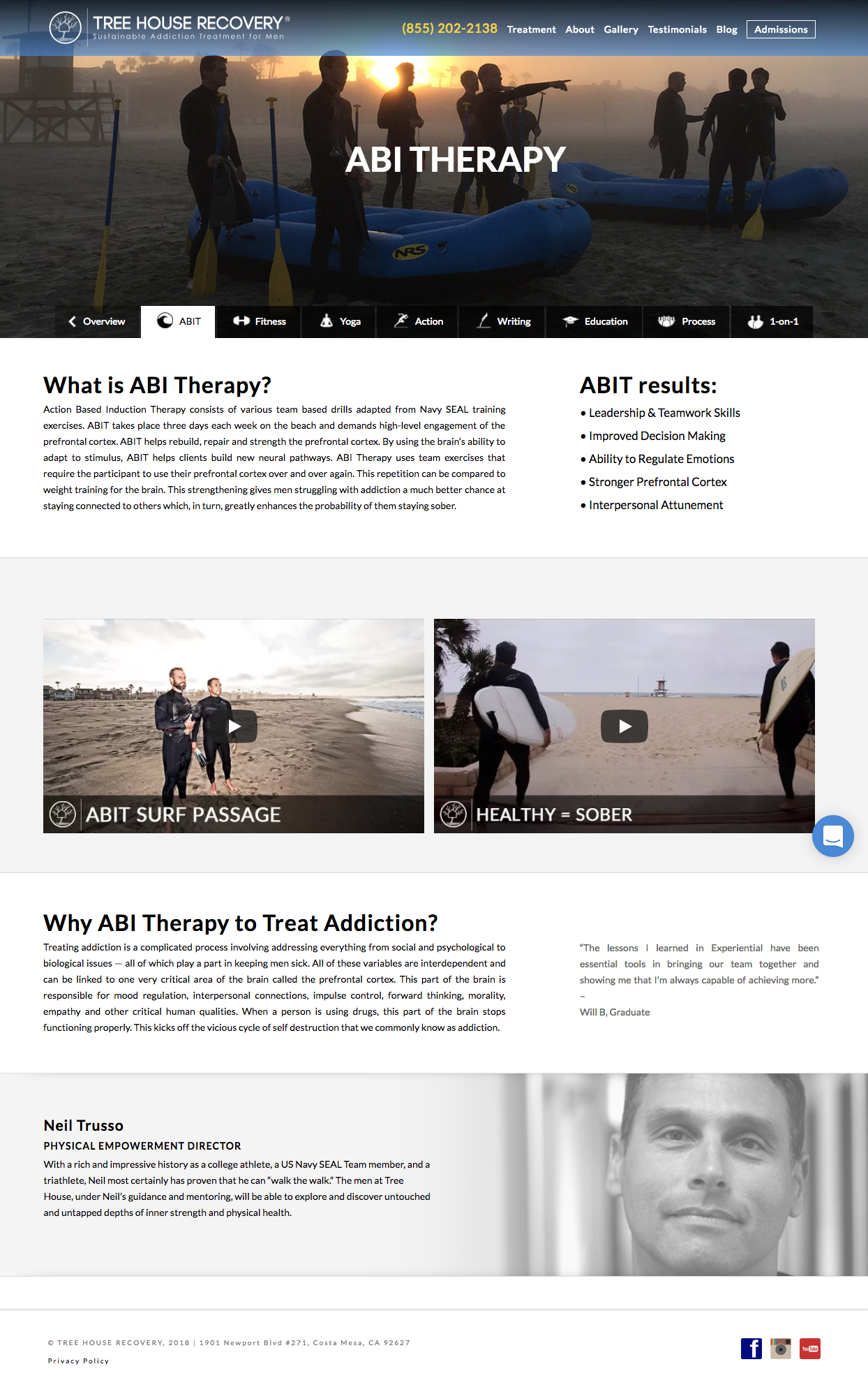
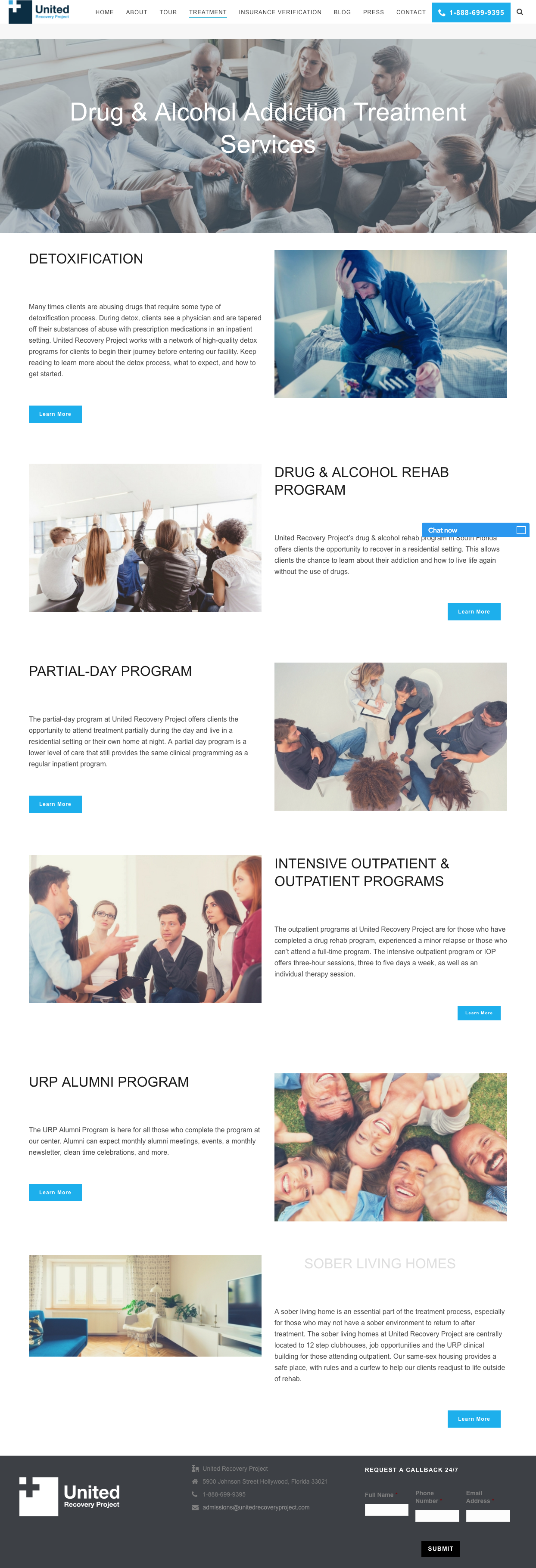
Seeing as the timeline was crunched, the architecture of the site was quickly put together based on the topics centered around addiction. A quick audit of competitors' navigation pointed out that there was interest in health, centers for treatment and programs and financial expectations. In terms of SEO, there was a lot of opportunity to promote the drug and alcohol substances themselves as a means to drive traffic based on substance based interest.
Lacking Variety in Content Models
Many competitors had webpages with large word-counts which are not condusive with information retention. Many users are in a very emotional state when they come to the website and long attention spans are not guaranteed and long text has a tendency to overwhelm and lose readers....as a result, you get high bounce rates. I felt that by applying hyperlinks, creative assets, text blocks for quotes/statistics and images it would retain user-engagement, make the client seem more approachable and humanistic while and promoting more content discovery.
Limited Target Audience
Also, it was revealed that there was marginal attention towards families of addicts, and this is typically the audience that actively seeks help whether it may be through interventions, or paying for treatments or hiring medical professionals.
Minimal Use of CTAs
Not many competitors leveraged the use of CTAs, this limits opportunities to track user engagement via tolls such as Google Analytics while not guiding the user to find relevant content.



UX PROPOSED SOLUTIONS
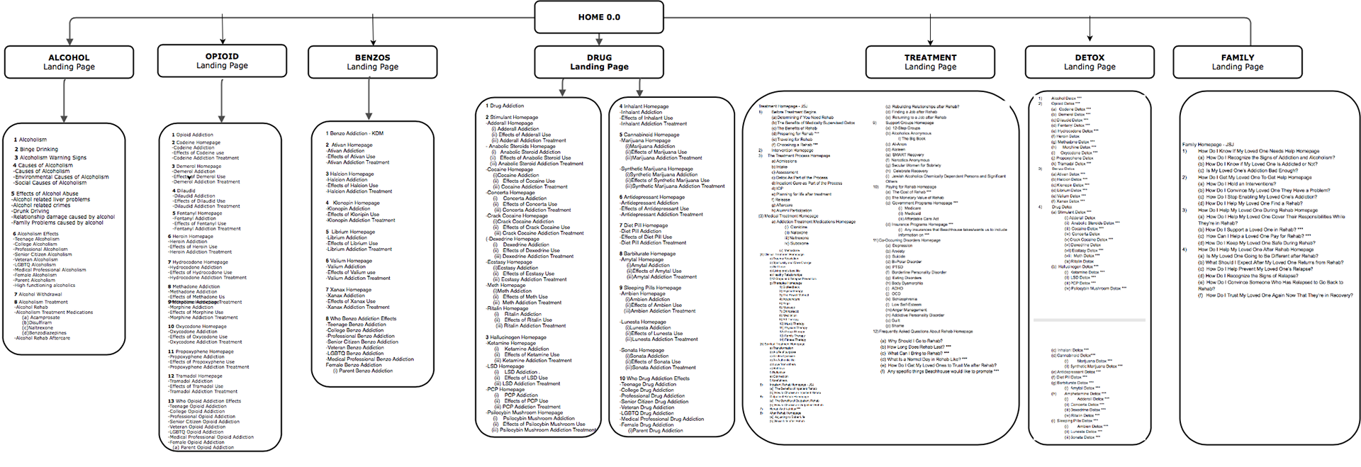
1) A navigation siloed by substance, in which each category would contain it's relevant information, statistics and address frequently asked questions/common misunderstandings
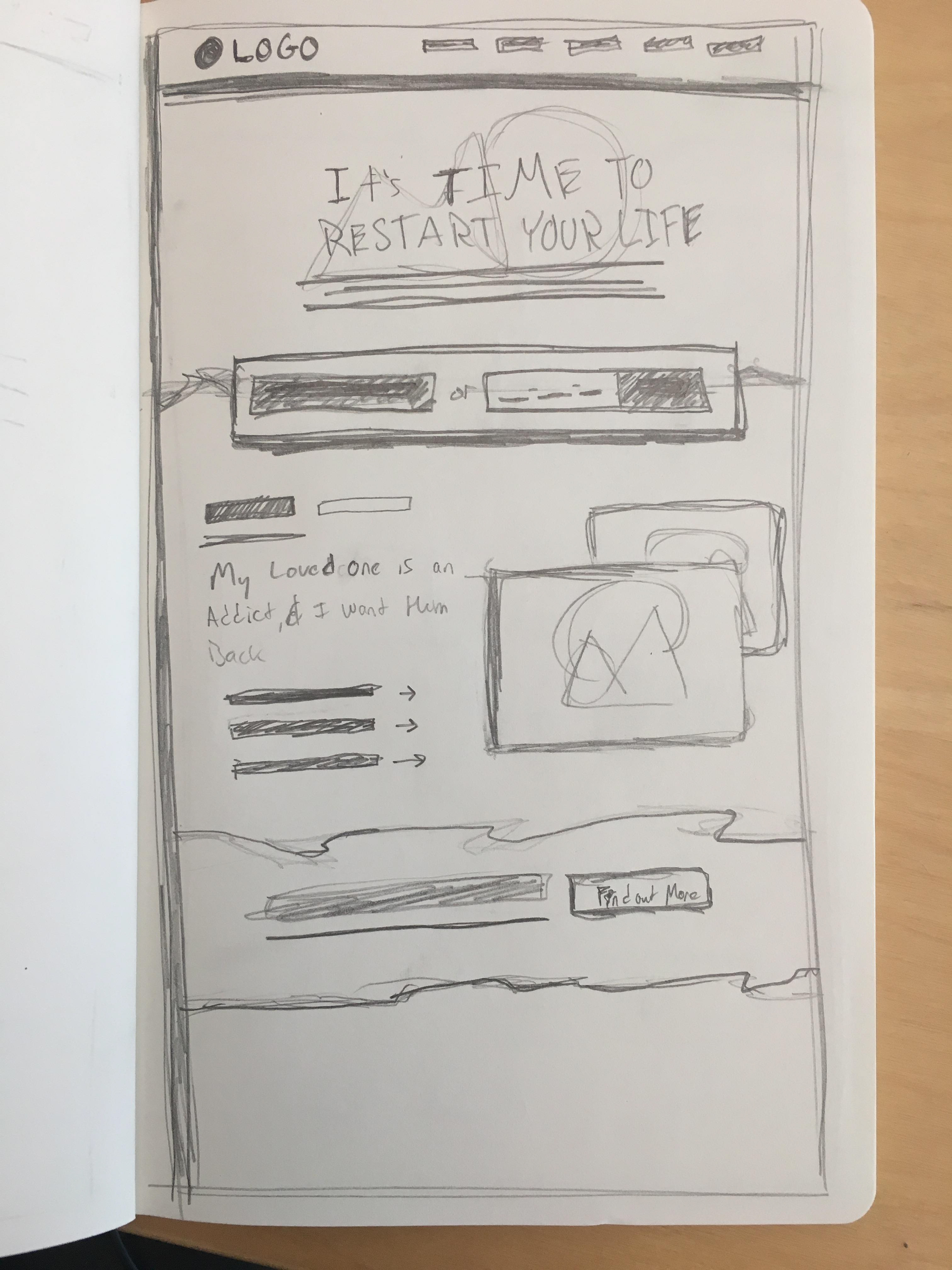
2) A homepage that would provide users with the opportunity to self-identify: Addicts and Loved Ones
3) Parent pages that would harbor and capitalize on powerful keywords to draw traffic and efficiently guide users to other pages that meet their search intents and needs
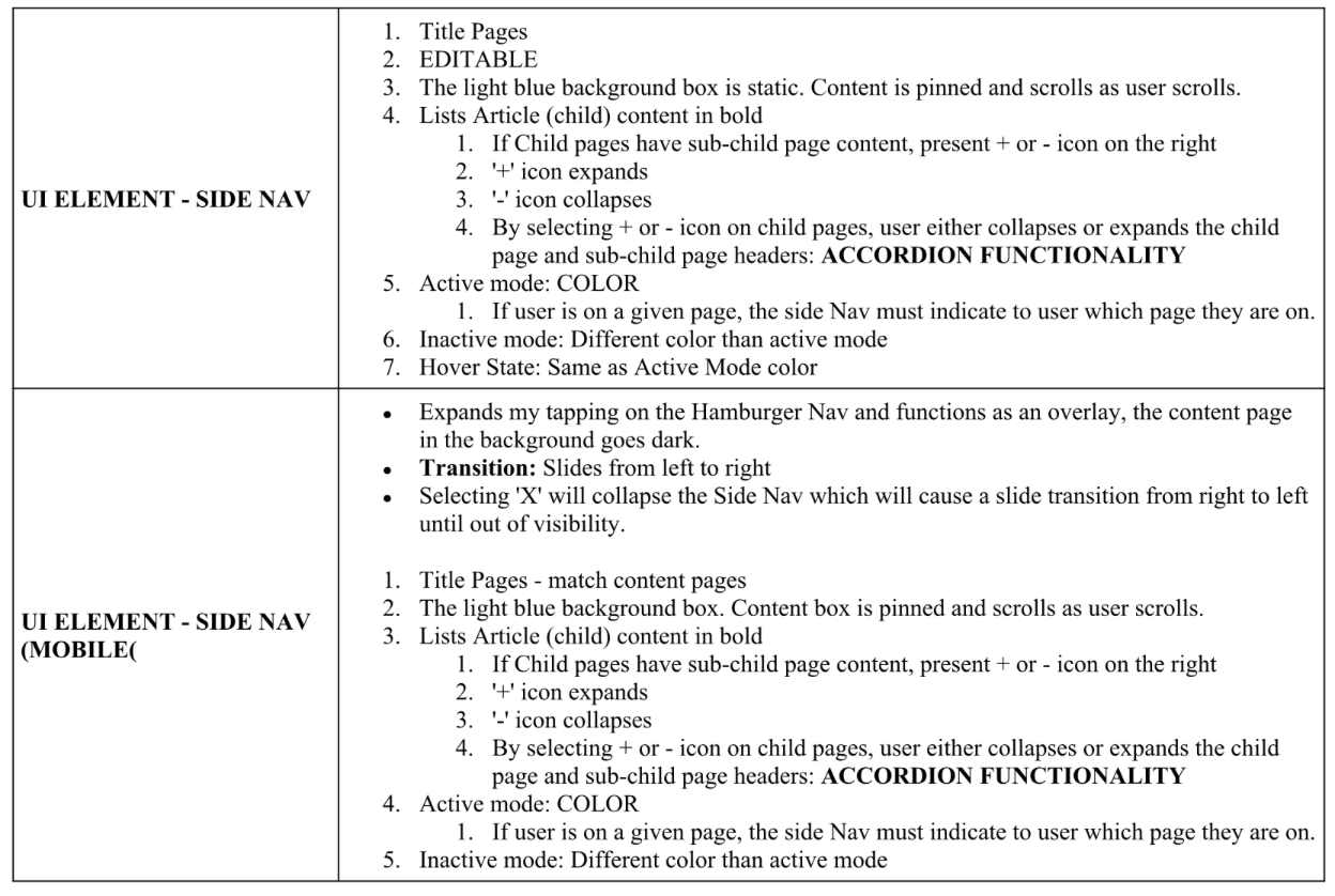
4) Repurpose the side menu navigation on children pages to serve as a breadcrumb feature where users can feel they have control over where they are on the site and easily find other information. The collapsible and expandable functionality reduces the chances of visual distractions. I based this logic off of F-pattern rationality and convinced the client to go agree to it.
Source: Nielson Norman Group; www.nngroup.com/articles/f-shaped-pattern-reading-web-content/
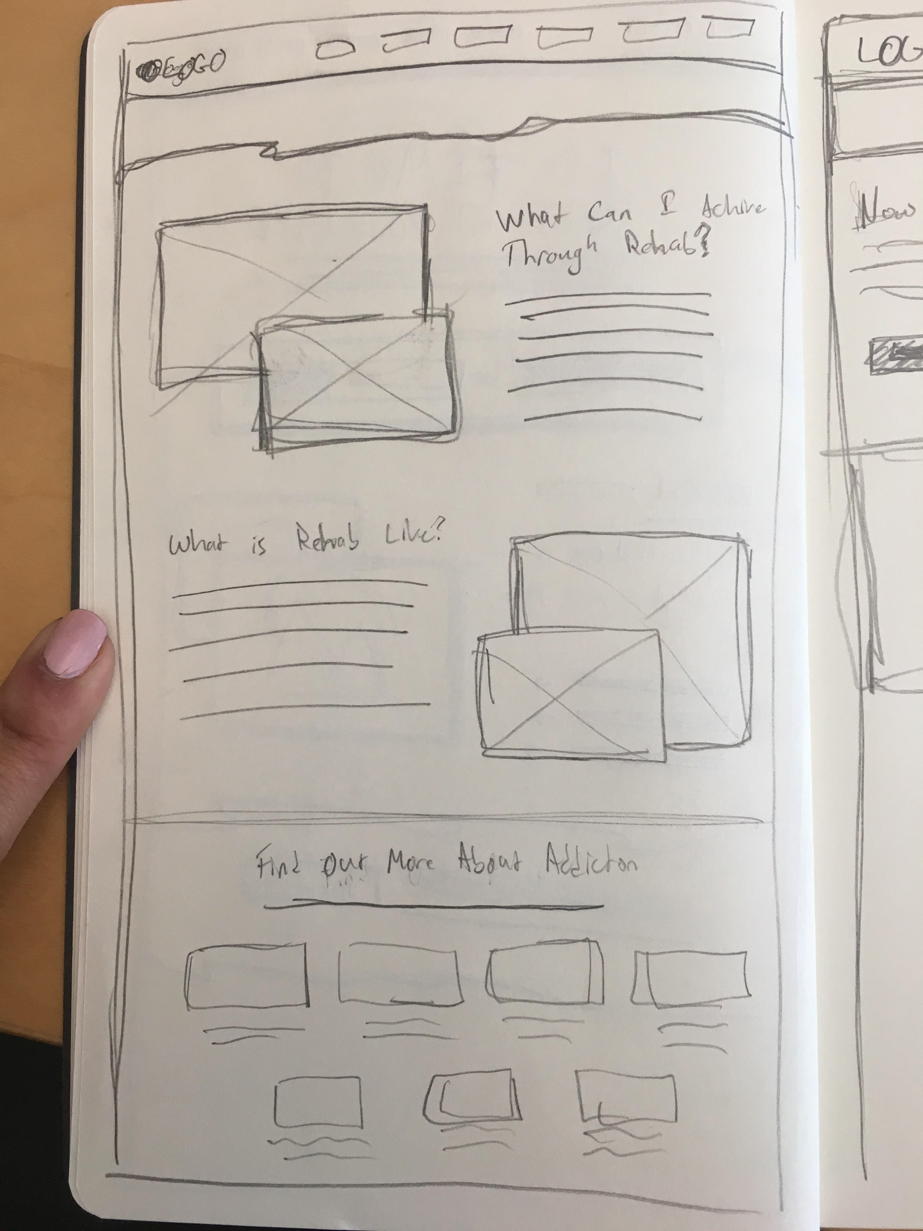
5) A variety of content blocks and more white space to emphasize on important details: statistics, quotes, infographics, iconography and testimonials
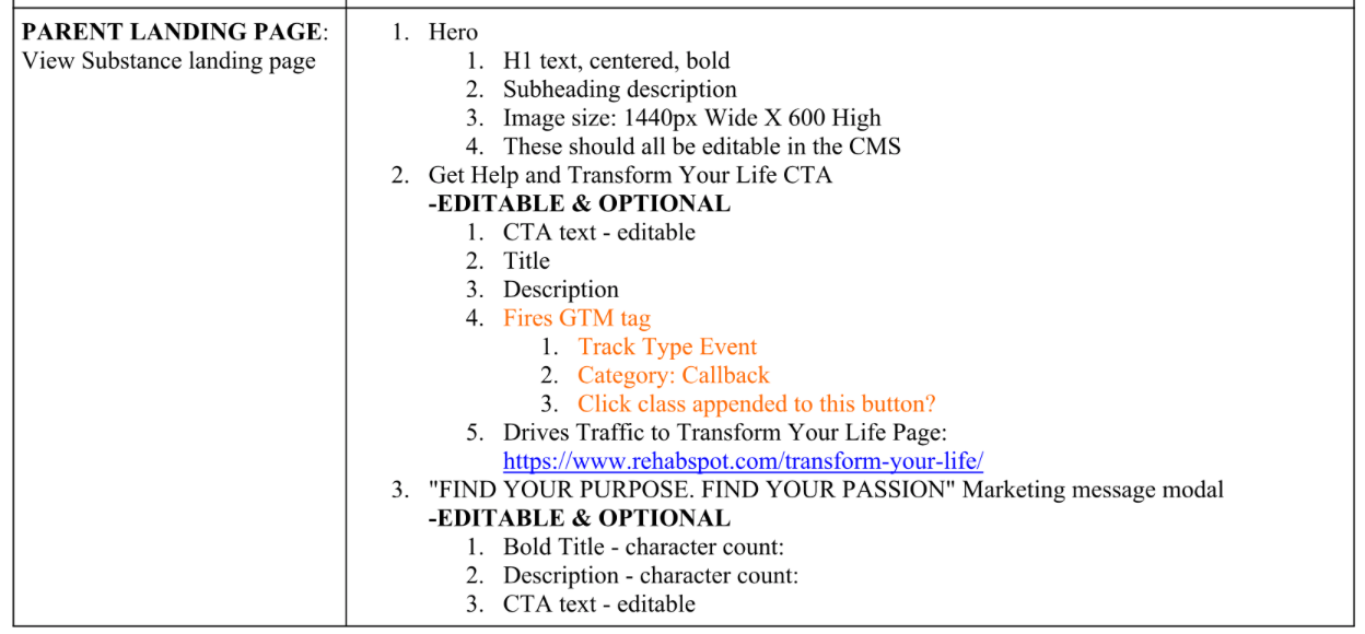
6) Relocate the marketing messaging from the side nav to in-content messaging modules in a variety of sizes that will apply to business-oriented KPIs by priority (ie the most important driver will be placed at the top of the page and the less important marketing drivers were designed as small modals). This created breakpoints within the content as well as multiple opportunities for users to convert
7) The most valuable digital marketing solution I proposed to this client was adding a GTM (Google Tag Manager) page-depth trigger. By placing triggers along the page, it would prove how far down the page users are reaching before continuing to other content. I felt this was a powerful solution because I had reservations about the copywriter's freedom to write without word-count limitations
8) Standardizing the CTAs and strategically placing them along the navigation and footer areas of the page where it would avoid the notion of 'spam' and overwhelming with the pressure to convert
9) Building robust search field that would source an internal xml file of common searches that will auto populate via an extension search API for users as they type. As a result, this would help with any difficulty in spelling (often seen with difficult substance names). The Dev resourced suggested Algolia was a great tool to applying this case.
GUERILLA CARD SORTING
On this project, I worked alongside the client's copywriter and content strategist who had presented a complete sitemap with hierarchy of intended topics they plan to cover. Unfortunately, it was obvious that their rough draft was geared towards capitalizing on keywords and target markets as opposed to targeting voice for a actual target market. Therefore, I politely stopped 5 individuals in my building who expressed having previously interacted with alcohol, cigarettes and prescription medicine.
RESULTS AND FINDINGS
a) The names of certain medicines were very difficult to spell and pronounce
b) 100% of users interacted with the global navigation
c) 100% of users expressed not feeling overwhelmed on the parent or children pages. They felt they could get through the full page with ease.
d) Many of the page titles resembled each other in nature with an added differentiating factor and 80% of tested users expressed confusion about how the content differed (ie LGBT alcoholism vs Female Alcoholism). After negotiations, I permitted that similar content be placed as tertiary items, only to be found if a user actually had a niche question/concern in mind.
e) 100% of users expressed that the variety in content was very helpful to them in considering new options and alternatives in treatments and approaches.
SITEMAP
rapid WIREFRAMING
In the wireframing and prototyping process, I played a supporting role to the assigned designer on the layout suggestions, color palette choices, CTA placement, output/input reactions of all interactions.
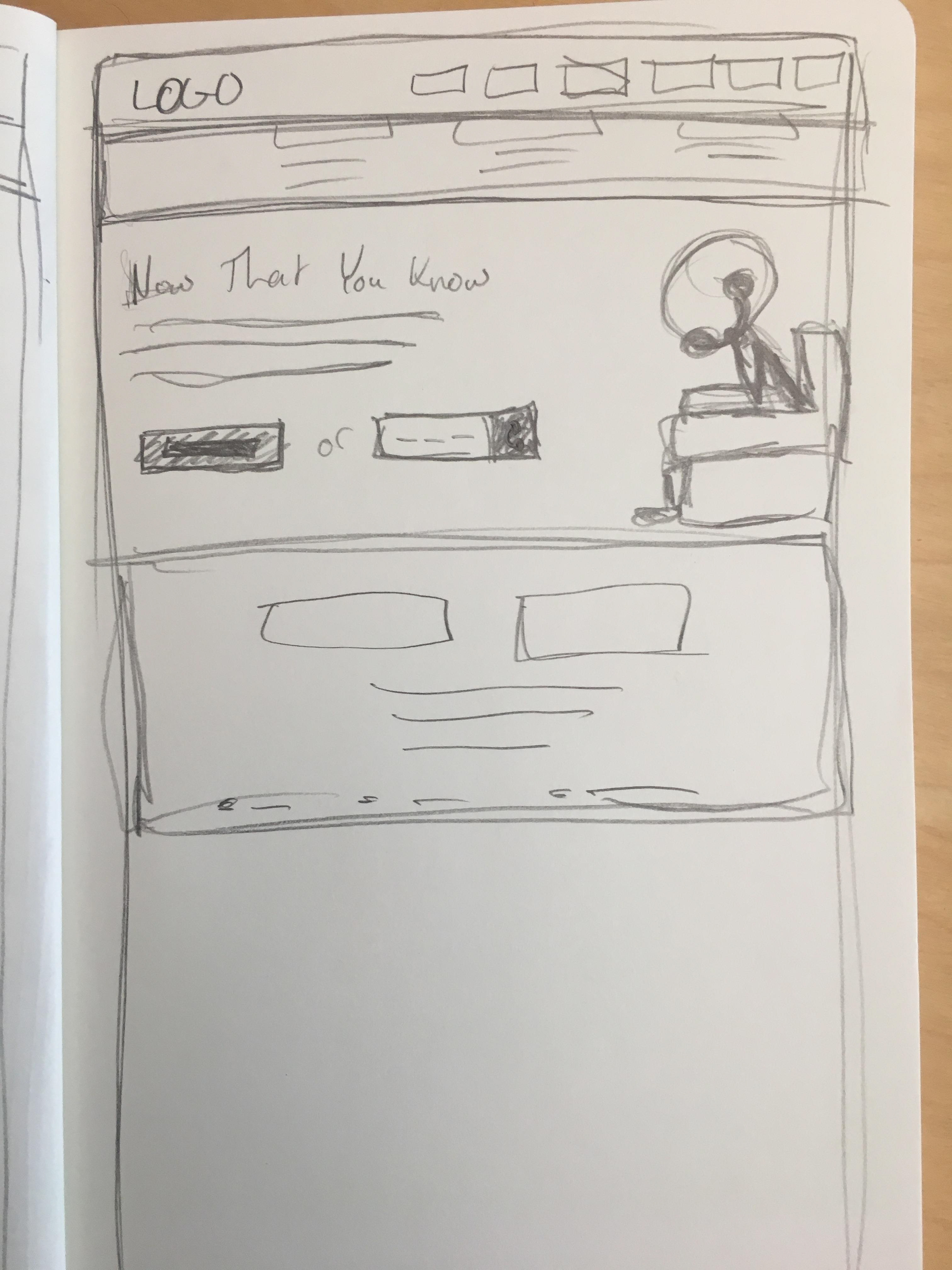
How the UI Designer brought my ideas to life
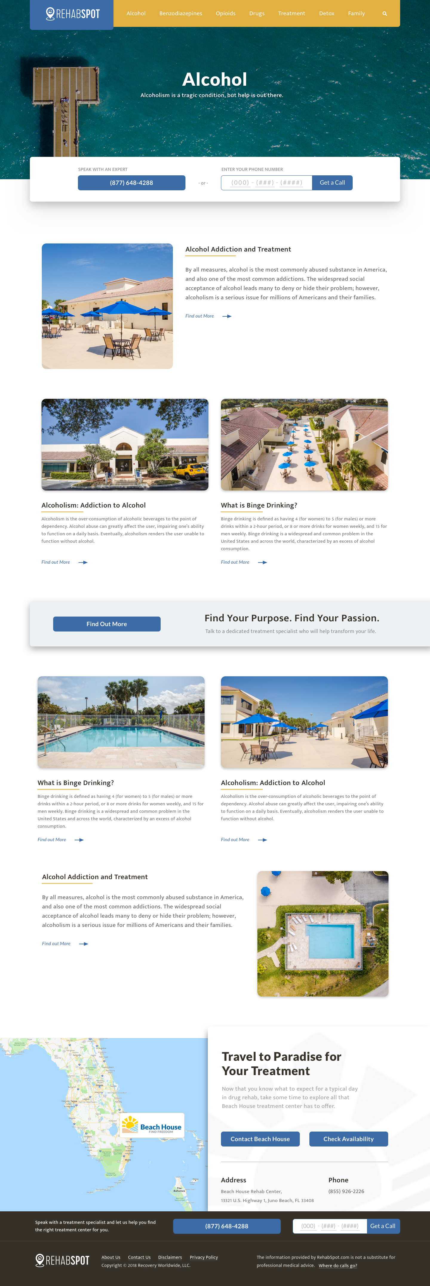
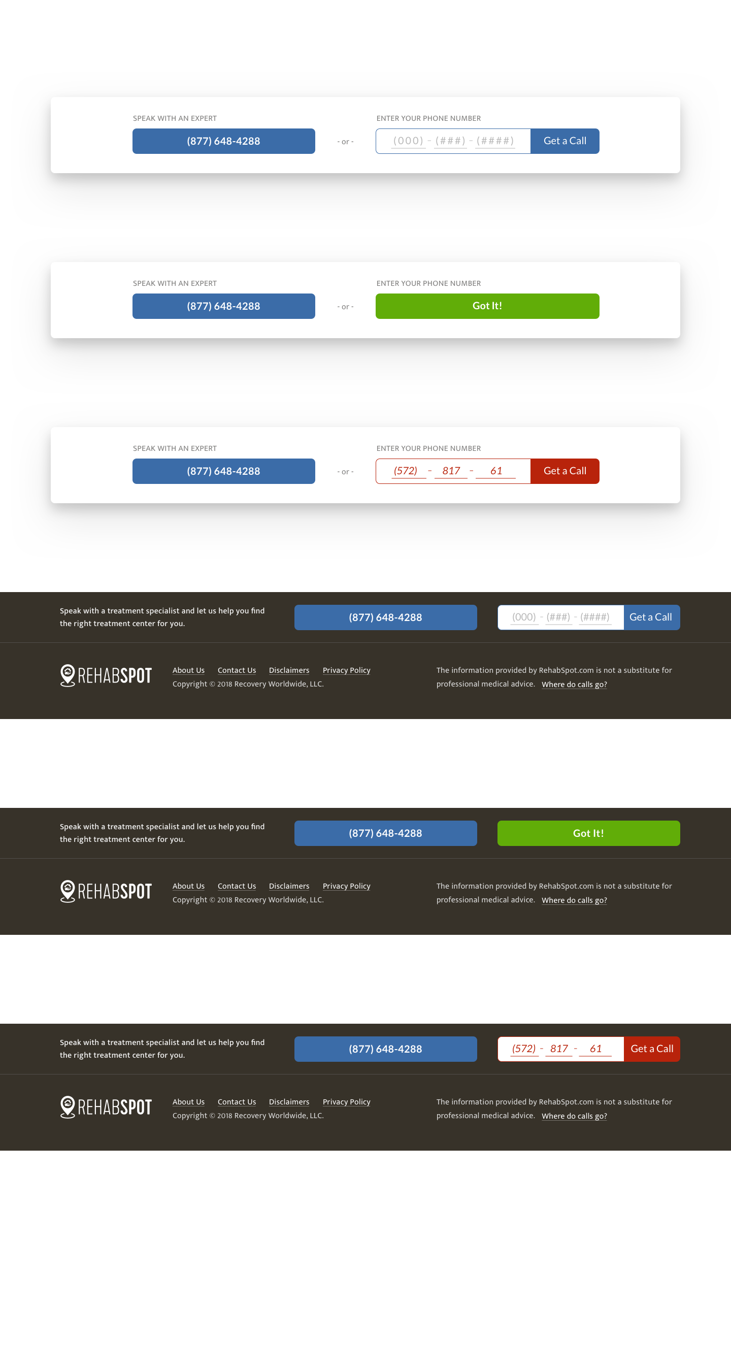

UI Designs above were created by team Product Designer
Stepping in as a Product Owner
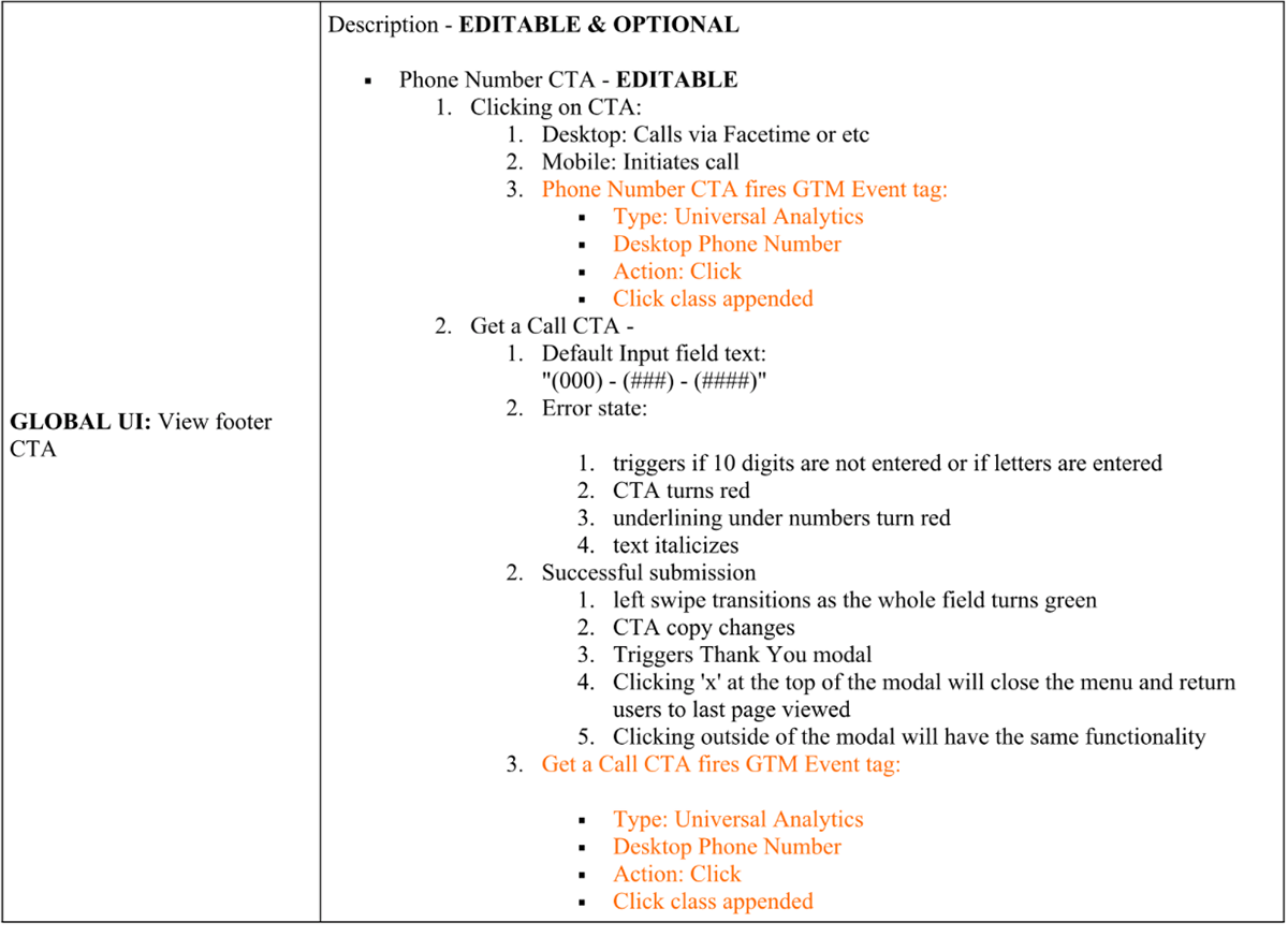
Functional requirements and QA
On this project, I was required to work alongside, the developer to ensure that the requirements I documented were executed accurately. I frequently generated spreadsheets to provide the developer with insight on outstanding items based on priority. The interesting challenge was working with an outsourced resourced (someone I had never met) but still meet the client expectation and clear the list.
The company is not agile, therefore, I stepped in as a Product Owner and generated a backlog list of issues seen in lower environments and rated the priority level for the outsourced Developer


CONCLUSION
Although the project is still in progress, the client has expressed the following results:
High user engagements across 75% of the page, which a success in itself due to the vast amount of content available
User sessions were previously 2min and are now exceeding an average of 10min
Newly added content pages were quickly indexed in a month's time and seeing organic traffic - this includes some tertiary navigation pages
Available CTAs are driving the right leads to convert by leveraging the available phone number.
Bounce rates decreased by 15% in the first 30 days.

