ROLE: UX/UI DESIGNER, UX STRATEGIST
Project Brief:
There was no renewal/extension warranty experiences was not an experience at all. Users relied on web searches and waited for messaging to appear at the moment of expiration to know their status and what their options were. A central hub (ie Jump page) was overlooked, underfunded and a support UX+UI in secondary and tertiary contextually relevant areas of the site to connect users to more information and Tech assistance was gravely lacking. The utility of the features and functionality of the full Warranties Support Experience was decentralized and bare minimum.
There was no renewal/extension warranty experiences was not an experience at all. Users relied on web searches and waited for messaging to appear at the moment of expiration to know their status and what their options were. A central hub (ie Jump page) was overlooked, underfunded and a support UX+UI in secondary and tertiary contextually relevant areas of the site to connect users to more information and Tech assistance was gravely lacking. The utility of the features and functionality of the full Warranties Support Experience was decentralized and bare minimum.
Discovery
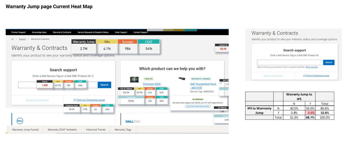
What warranty Jump Page does today:
• Navigate the user to a product/service tag
• Help identify recently visited products, current PC
• Navigate users to Dell vs EMC based warranty information (retail registration, ownership transfer, parts return/replace docs, extensions).
• Navigate the user to a product/service tag
• Help identify recently visited products, current PC
• Navigate users to Dell vs EMC based warranty information (retail registration, ownership transfer, parts return/replace docs, extensions).
What warranty Jump Page should do:
• Redirect users to the exact warranty information for an asset (current/tag based)
• Aid warranty-based claims, coverages
• Provide warranty handy information/FAQs like retail registration, ownership transfer, parts return/replace docs, extensions, plans, prices, etc.
• Provide generic support for common issues
Reasons driving a low CSAT on Warranty Jump Page - (54%)
• Search support is very generic
• Users end up entering model, name for their product, and hence find no contextual info
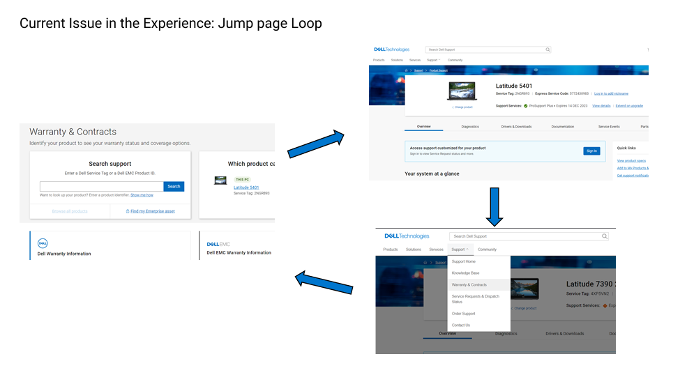
• There is a broken loop in the experience on the Jump page. 10% users visiting the Jump Page fall into the loop of Warranty Jump, Page IPS Page, Warranty Jump page
• 8-10% users are entering wrong service tags
• Users are fall into a loop from broken links and redirections:
(Jump page-> IPS page-> Jump page trying to find the right content)
• Users look for options to claim warranty
• Users with expired warranty are looking for FAQs/Support/Self help options
• The warranty and ownership transfer link today is hard to find and 3-4 clicks away from home page and the IPS page.
research
User collected Feedback and Pain points
Top searches included: Warranty types, consultation, offers (general):
• “warranty consultation”
• “it is not entirely clear what is the difference between a "premium support" and a "premium support plus" subscription!”
• “details of offers, warranty, product ”
• “please provide a contact number for the service, proper registration process for the service. ”
• “warranty consultation”
• “it is not entirely clear what is the difference between a "premium support" and a "premium support plus" subscription!”
• “details of offers, warranty, product ”
• “please provide a contact number for the service, proper registration process for the service. ”
On a warranty hub page, users expect to find information regarding:
• Warranty status
• Eligibility status
• Extending warranty
• Upgrading warranty
• Finding warranty prices, price comparisons and available plans
• Warranty status
• Eligibility status
• Extending warranty
• Upgrading warranty
• Finding warranty prices, price comparisons and available plans
Warranty contextual info:
“i suggest improving the costumer interface to find the information for warranty easier.”
“i want to update hardware contract “
“contact information for warranty questions ”
“i wonder why my system is not eligible for any extended warranty or upgrade. no answers found.
they do not give me a solution on changing equipment, because after 4 attempts to repair in technical support the equipment is not able to be 100% operational ”
Warranty claim:
“I am looking for a replacement with key on laptop which is under warranty. your website does not list the part or give details of where to get replacement keys. it also did not display the laptop as one of my products after customer number, postcode and order number had been entered."
“I am looking for a replacement with key on laptop which is under warranty. your website does not list the part or give details of where to get replacement keys. it also did not display the laptop as one of my products after customer number, postcode and order number had been entered."
Research Insights
TOP 3 UNDERLYING THEME OF DESIGN SOLUTION NEEDS UNDERSTOOD FROM USER RESEARCH
Accounting for ~80% of all reported comments
Accounting for ~80% of all reported comments
1. Find information on warranty, easy renewal process (approx ~50%)
2. Better Options for Out of Warranty Support and audience (approx ~15%)
3. Easily contact Tech Support about Warranty and Renewal pricing (approx ~15%)
2. Better Options for Out of Warranty Support and audience (approx ~15%)
3. Easily contact Tech Support about Warranty and Renewal pricing (approx ~15%)
Metrics presented at design sprint kickoff
• Search used by 67% rather than entering Product ID and having system filter custom results
• This PC offered to 21%, and 28% of them click on it
• RVPS (email newsletters) offered to 41%, and 6% of them click on it
• Support Assist (Dell's installable Software for system scans) offered to 40%, and 6% of them click on it
CSAT and traffic on the category page tiles:
• 1.7% use the Dell warranty information Tile, CSAT 39%
• 0.5 % use the Dell EMC warranty info tile, CSAT 44%
Targeted Personas
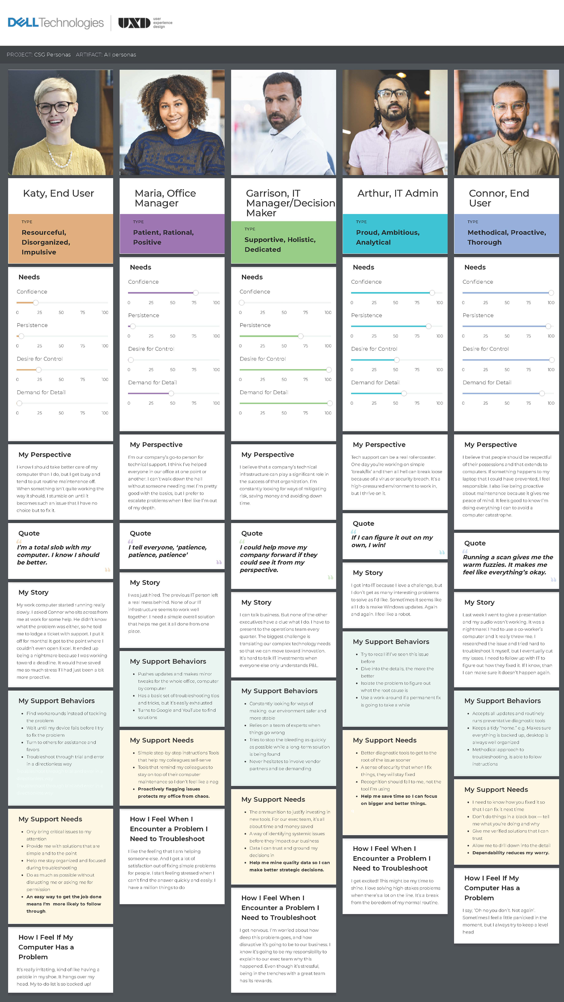
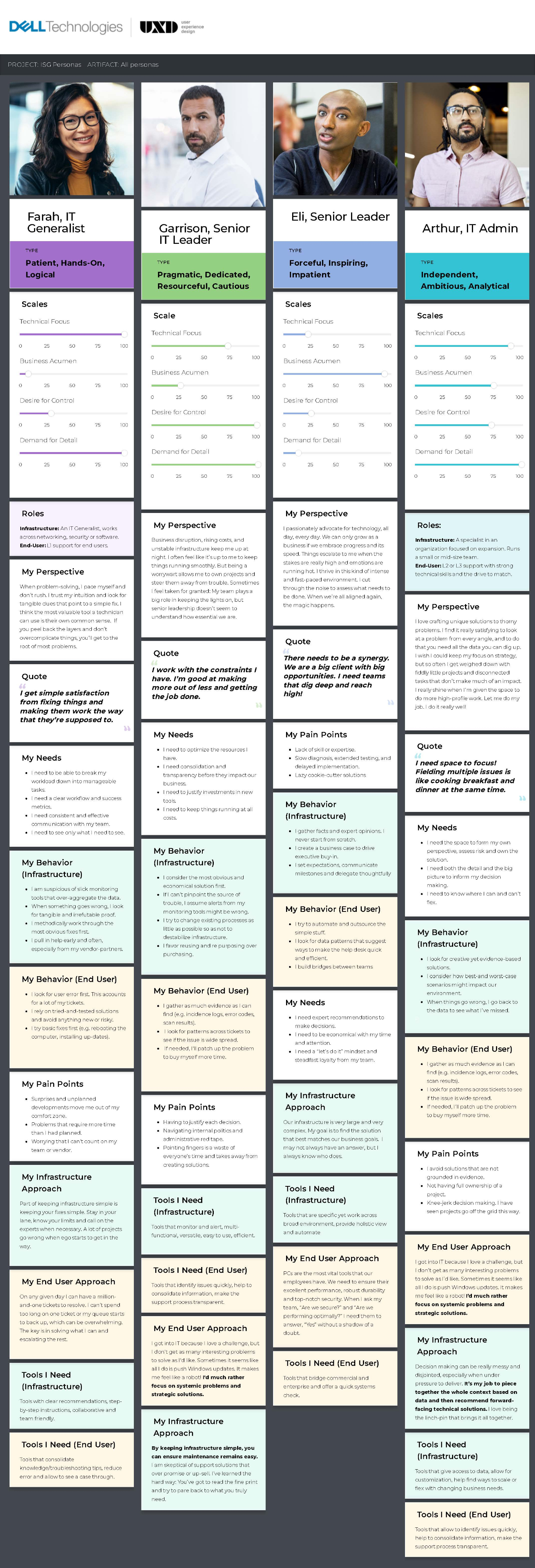
Dell has many Personas corresponding to different line of businesses, however, Warranties applies to everyone with access and ownership to a device. When scopes are this board, internally we simplify the Personas into two categories: Consumer and Enterprise.
This includes the average Joe, the IT Admin at a small company or an IT division overseeing Products for a full Enterprise size company. Either way, all need legible, concise, visibility and awareness into the state of Warranty plans for every device. UI/UX had to account for users with little time to dig and investigate. Transparency and messaging was key here because Warranties is a VERBOSE topic and we want to lay out all options and next steps available to the user.
HEURISTIC Analysis


competitive analysis


Design and ideation
Design and Content Strategy Needs
This project was SO massive that it took a whole year, multiple reiterations and was broken up into action items (P=Priority Item) to meet release dates throughout out the calendar year. I was the sole designer and I partnered with one content strategist
Proposed Solution Advantages:
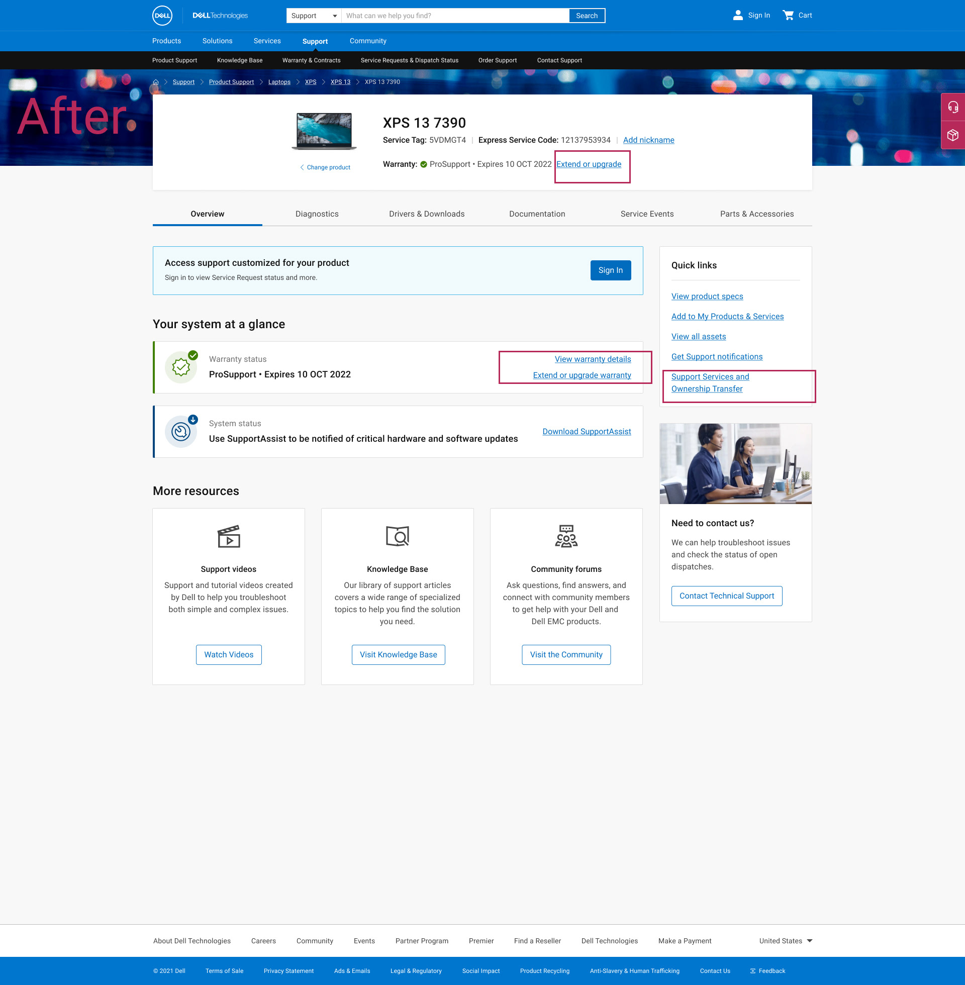
• Advantages: (Ease of Findability)
• Warranty related info in one place
• Reduce the number of clicks for the customer journey
• Easy access to warranty-based claims, registration, transfer links, etc.
• Add Quick links section on IPS (for both tagged and un-tagged experience)
• Advantages: (Ease of Findability)
• Warranty related info in one place
• Reduce the number of clicks for the customer journey
• Easy access to warranty-based claims, registration, transfer links, etc.
• Add Quick links section on IPS (for both tagged and un-tagged experience)
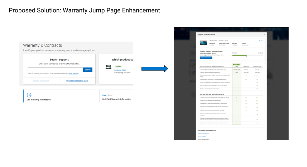
P1 and P8: Support services details popup featuring attached set of contracts
Problem:
Customers seeking to find their current warranty coverage before contacting agents (claiming for support). Customers also look for available upgrade options and the benefits in comparison to the current plan, when nearing expiration of warranty.
User Feedback Comments:
• “Clarity on warranty coverage”
• “more information about warranty of purchased product”
• “I’d like the warranty prices and benefits to be clearly displayed on the website, so I could decide more easily what to do without having to wait – and then go back to the task another day.”
Design Solution:
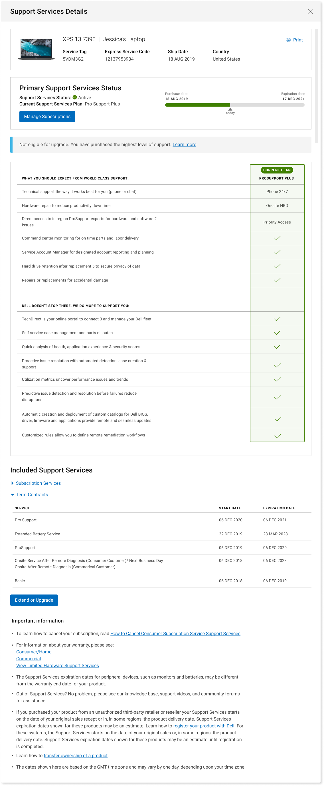
Highlight the current warranty plan and coverage offered alongside the available upgrade options if any in the warranty details popup. Shifting focus from historical data to current coverage offered as is the main rationale behind most of the customers visiting the support page.
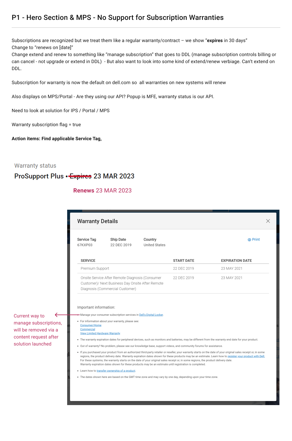
Summary notes from design sprint kickoff
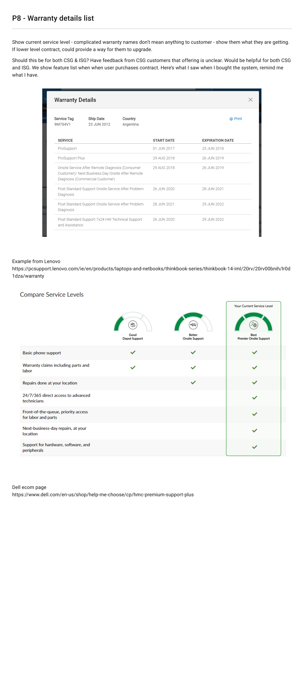
Design Drafts and Iterations
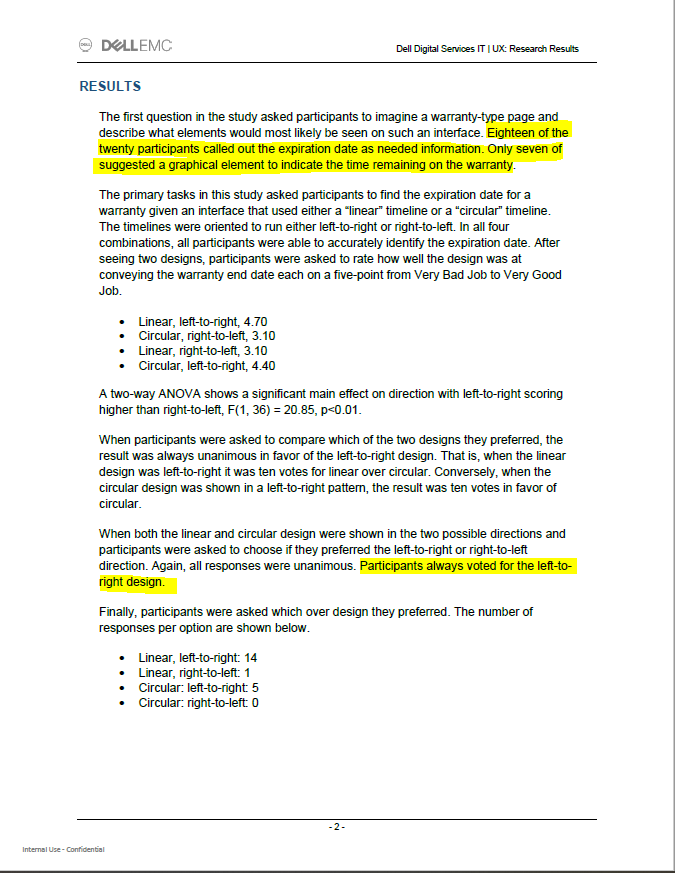
Through peer review and user testing, I adjusted to a horizontal timeline rather than circular timeline (thinking I'd style it like a dial) but users didn't vote for it. Users voted to re-enter the product image (from Product homepage) as a way to remember which device they are referring service and attention to. Also, I got rid of the grey background as a way to break up the white space and distinguish each content section and opted for thin line containers, and the chart needed reformatting to fit in the tiers and categories within the list of services.
delivered design solutions
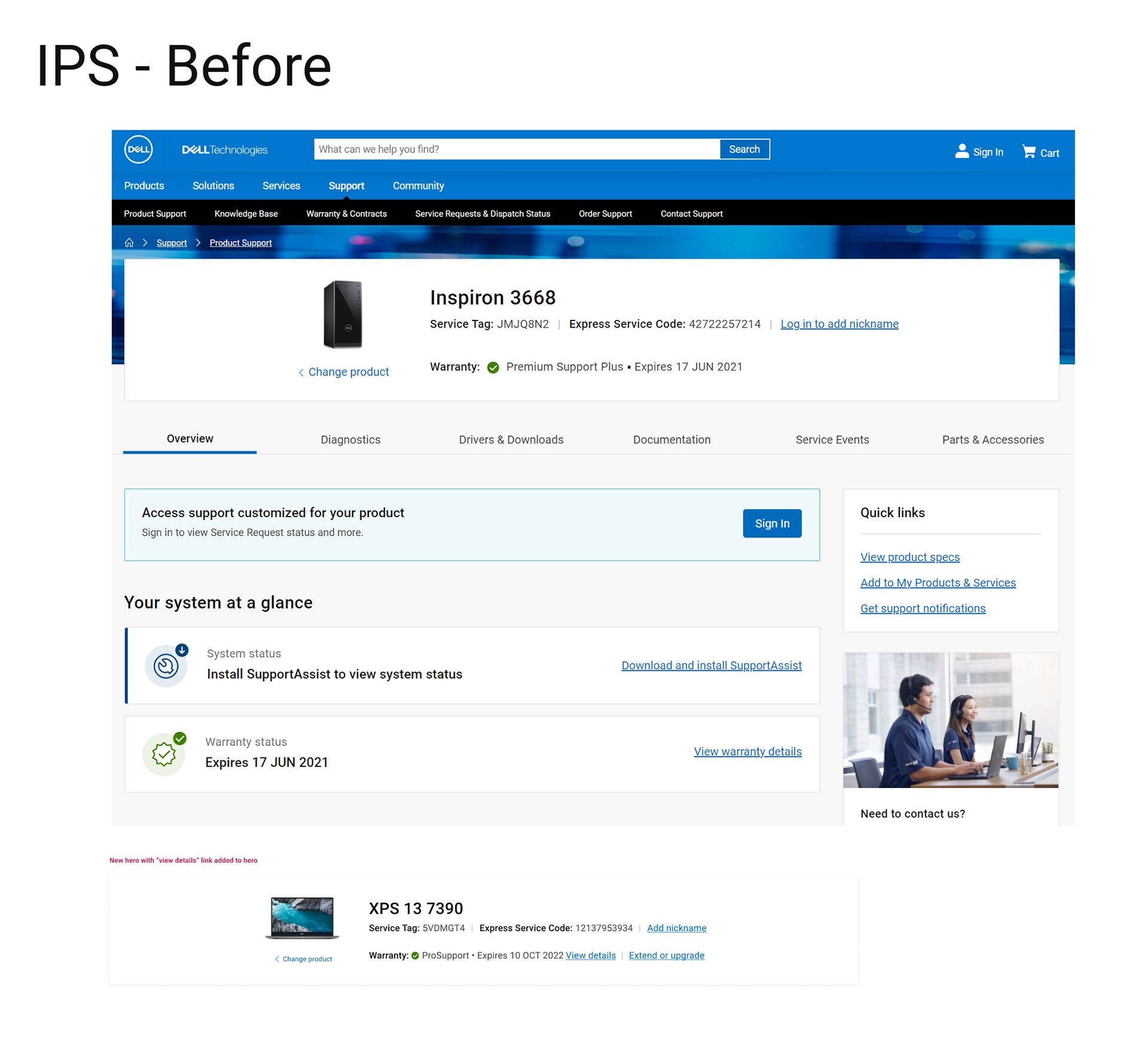
Following views demonstrate print preview feature, modal with all conditions and use cases, status states of warranty service, responsive view variations, and warranty summaries based on the user's main warranty plan's classification.
Benefits of New Design
• Focus on the Primary warranty
• Visual representation of warranty term with color conventions, highlighting the current state of warranty
• Vivid description of the coverage offered by the current plan
• Comparison of available upgrade options for warranty
• Historical data is still available for reference; however, the primary focus is moved to the coverage offered
• Ease of access for Ownership Transfer link
P4: Designing the Warranty Extend/Upgrade behavior
Requirements and needs presented to me:
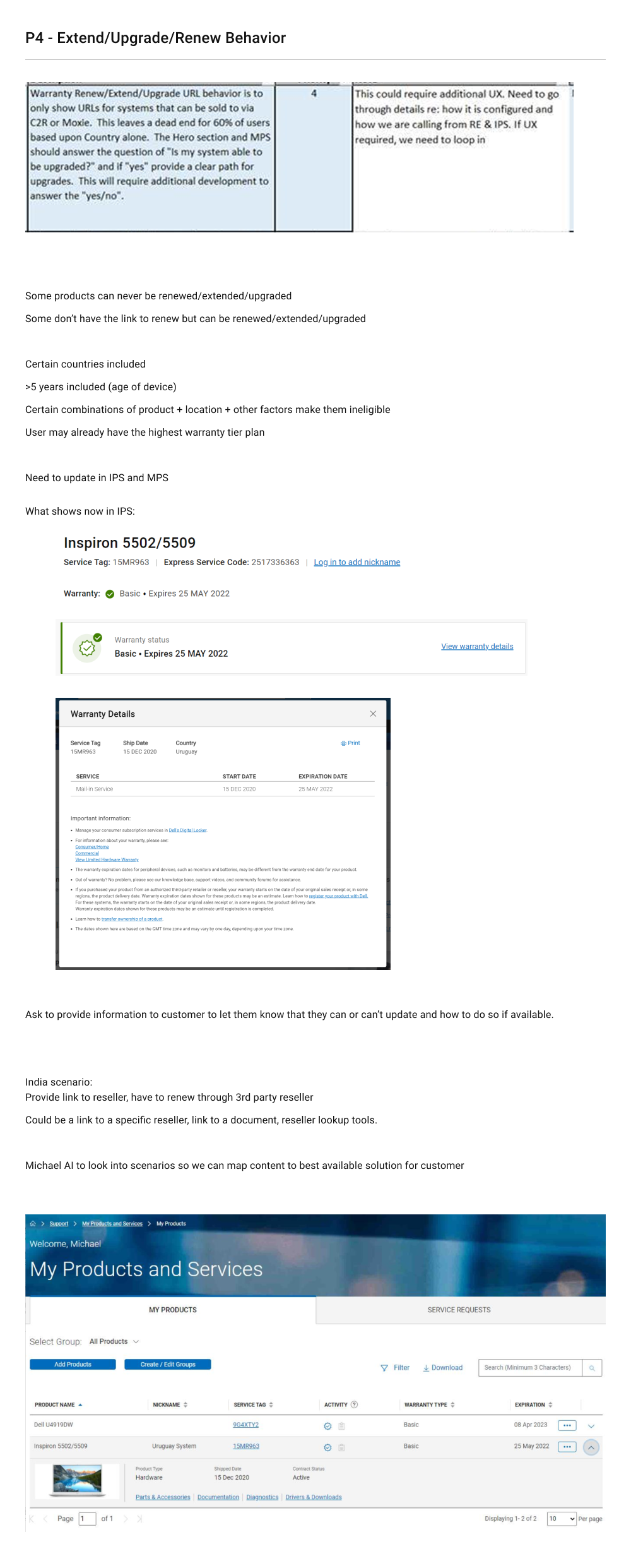
• Can we make the messaging for P4 item more customer friendly by also stating the reason why it cannot be extended / upgraded or renewed? Can we also give some path ahead instead of a dead end?
• 95% of reasons of this issue is due to users reaching End of Service Life (EOSL) unknowingly
• Re-evaluating other reasons (apart from EOSL) why renewal is not exposed and determining if we can identify them in site logic.
• Path ahead: Attaching a "learn more" article stating reasons why they are not eligible for upgrade (ETA yet to be determined)
• Customers can still go to the Contact form (warranty extension form) via SEO and try upgrading from there. How might we solve the same problem that exists there?
• Apply conditional logic and design variations in the Contact form to determine the eligibility of the Product tag
Conditions to consider:
• A user may have a Term contract (finite amount of time) and users may be subscriptions (that auto-renew but with a limit of renewals).
• Depending on the age of the device, users may reach a point where a Warranty plan can no longer support their device
• Depending on a number of reasons, users MAY or MAY not be eligible for extensions and that requires contacting Dell Tech Support, however, users BEFORE weren't alerted on whether they were or were not or even knew where to call.
Content Strategy's Role and Efforts
Warranty Extend/Upgrade behavior (P4): Plan of Action
• Can we make the messaging for P4 item more customer friendly by also stating the reason why it cannot be extended / upgraded or renewed? Can we also give some path ahead instead of a dead end?
• 95% of the reasons is End of Service Life (EOSL).
• Re-evaluating other reasons (apart from EOSL) why renewal is not exposed and determining if we can identify them in site logic.
• Path ahead: Attaching a "learn more" article stating reasons why they are not eligible for upgrade (ETA yet to be determined)
• Customers can still go to the Contact form (warranty extension form) via SEO and try upgrading from there. How might we solve the same problem that exists there?
• Place Renew/Ext rules in the Contact form to determine the eligibility of the tag


Delivered Designs
UI requirements to notice below:
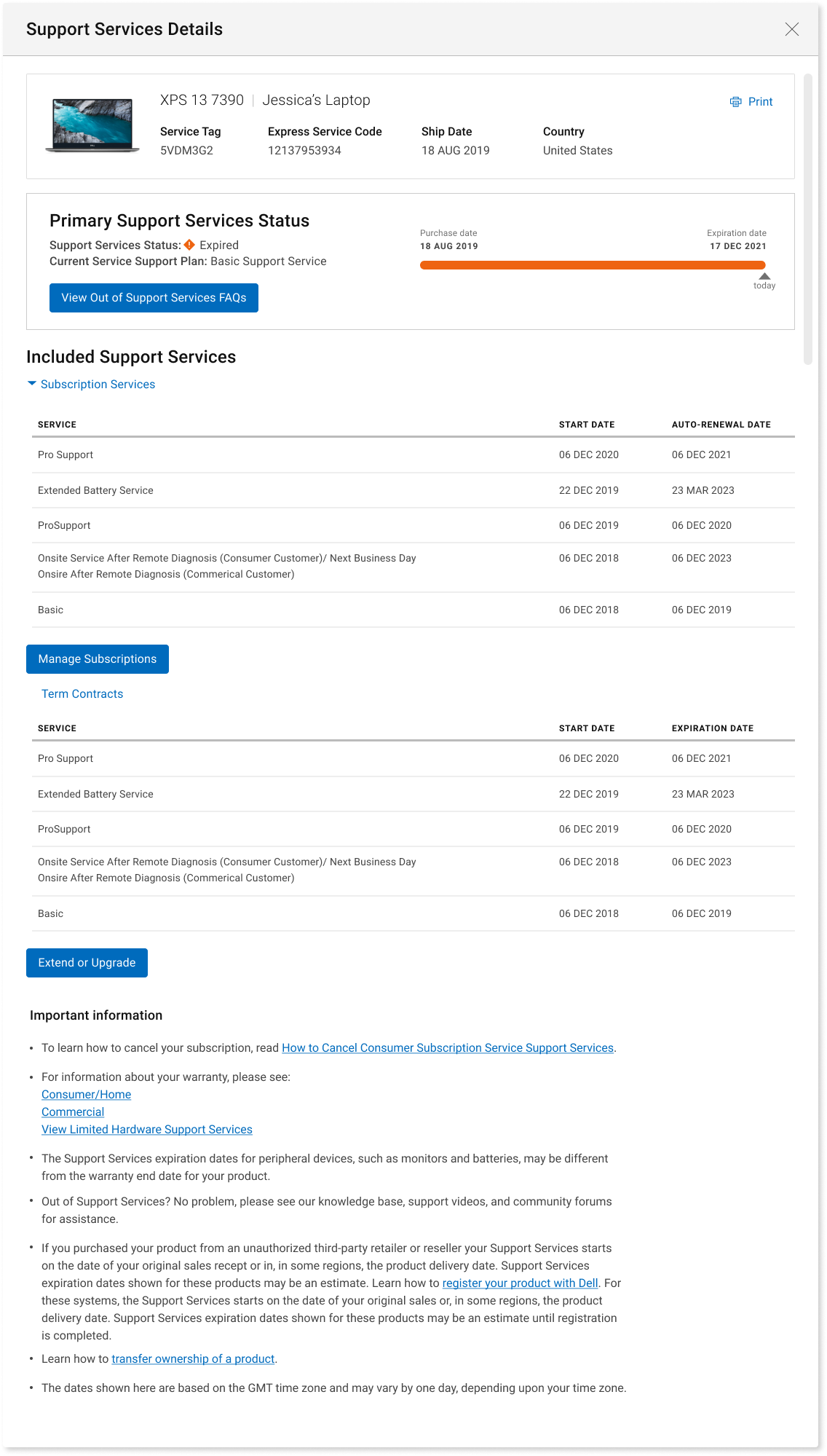
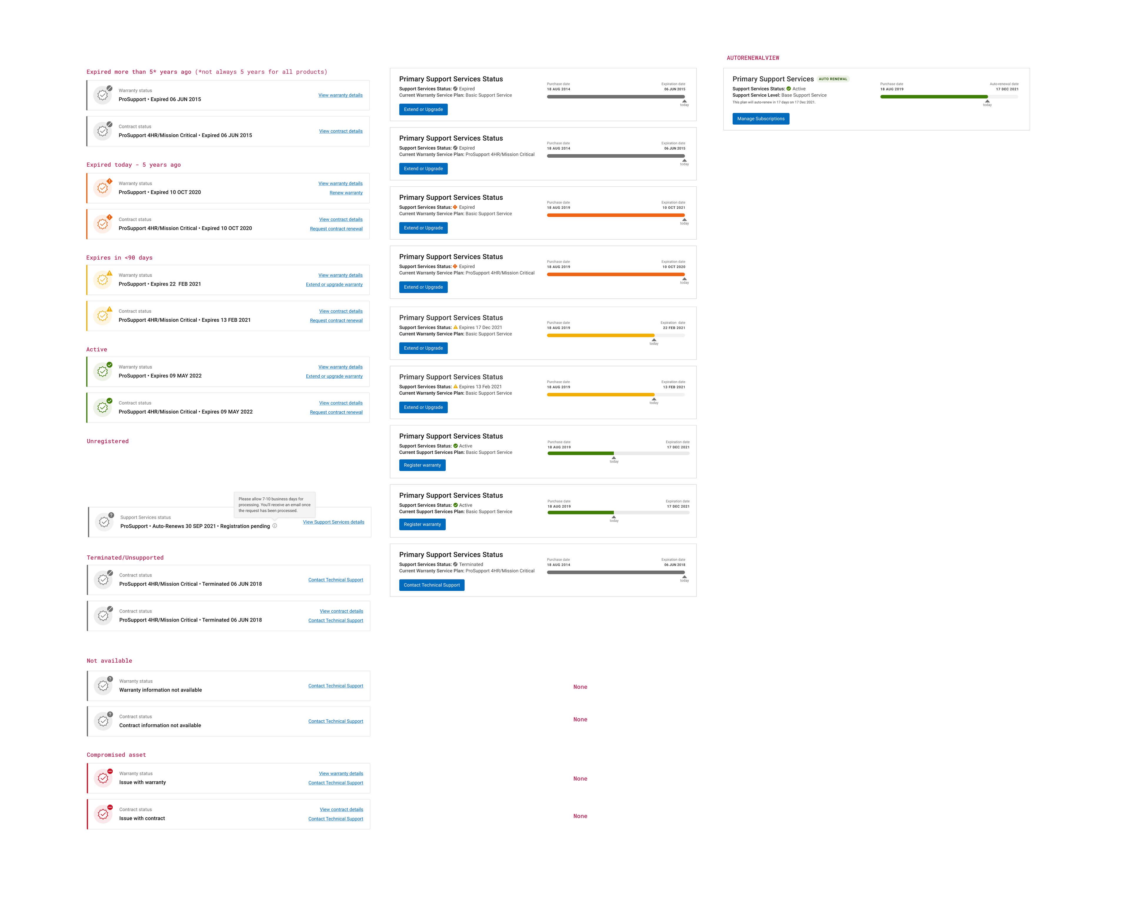
• Depending on your warranty plan status, the colors change
• Visual has been added to quickly understand where users are in warranty plan timeline
• If a users a subscription warranty plan, the word 'auto renewal' was added
• Support messaging detailing
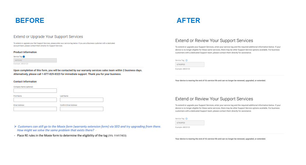
• Tailored CTAs (buttons) that clearly note to users that they're out of warranty (Extend=expired a term contract, Renew= pay for new subscription contract, Manage Subscriptions = see all you active active plans) but will also lead users to next steps, info and resources to get them back up and running
• Also, the table of plans view changes depending on which plan user has. Business did not want to promote demotions, so we only show plans higher than the ones user has).
Benefits of New Design
• Focus on the status of Primary "umbrella" warranty
• Comparison of available upgrade options for warranty
• Creating respective alert messaging tailored to users with extensions available or renewals available
• Adding new details such as letting the user know about their ELIGIBILITY for the first time ever (ie might and might not be available to you depending on product model and age of device.
See Modal Messaging below (L). This guides users to Contact Tech Support form (R)



P9,P10, P11
creating unregistered, disabled and unavailable
status states
status states
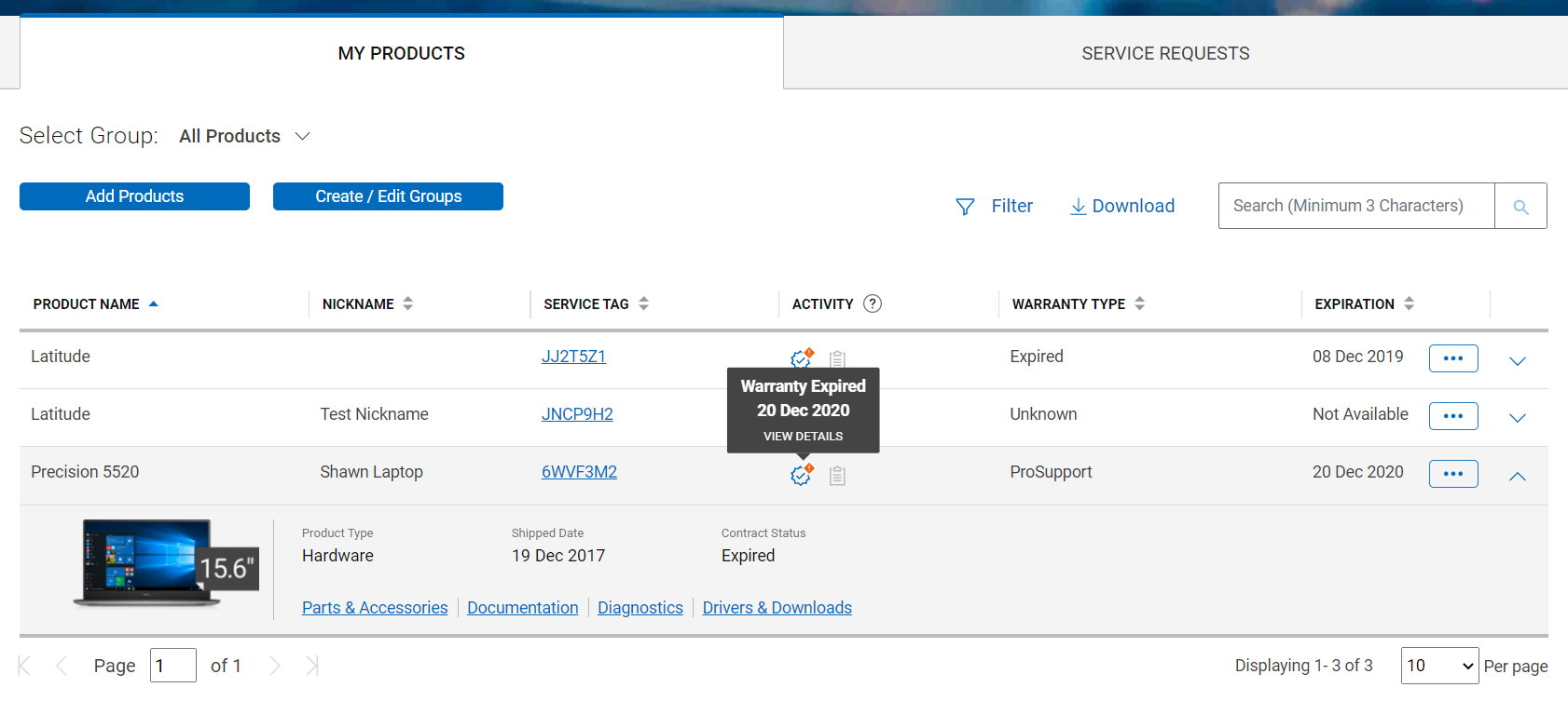
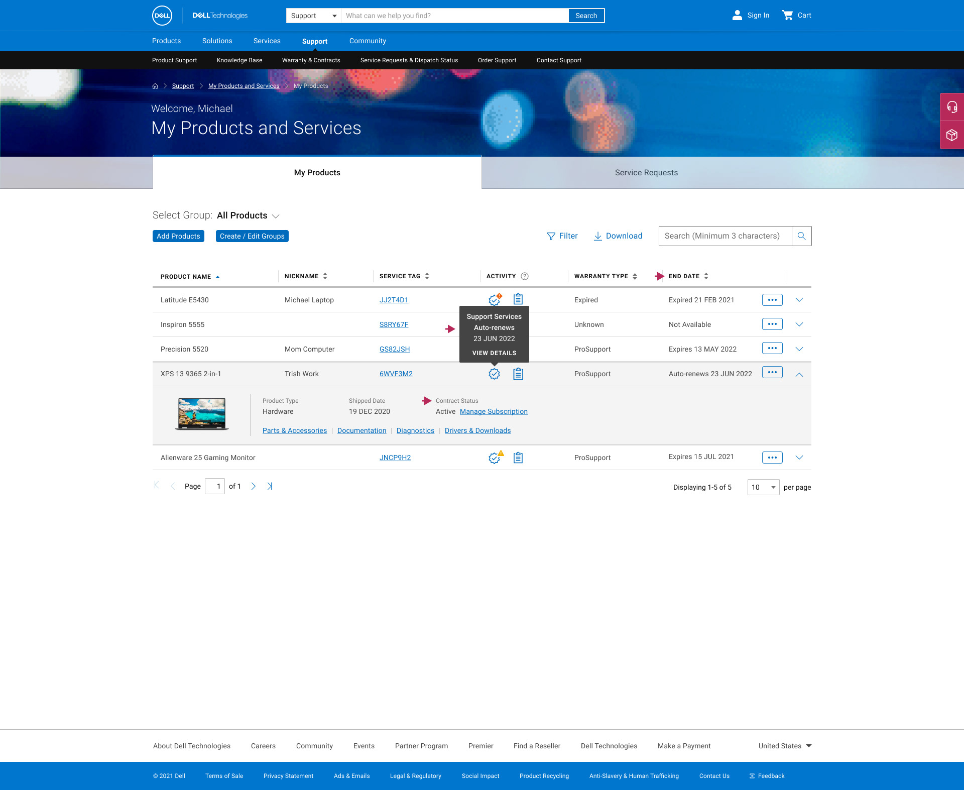
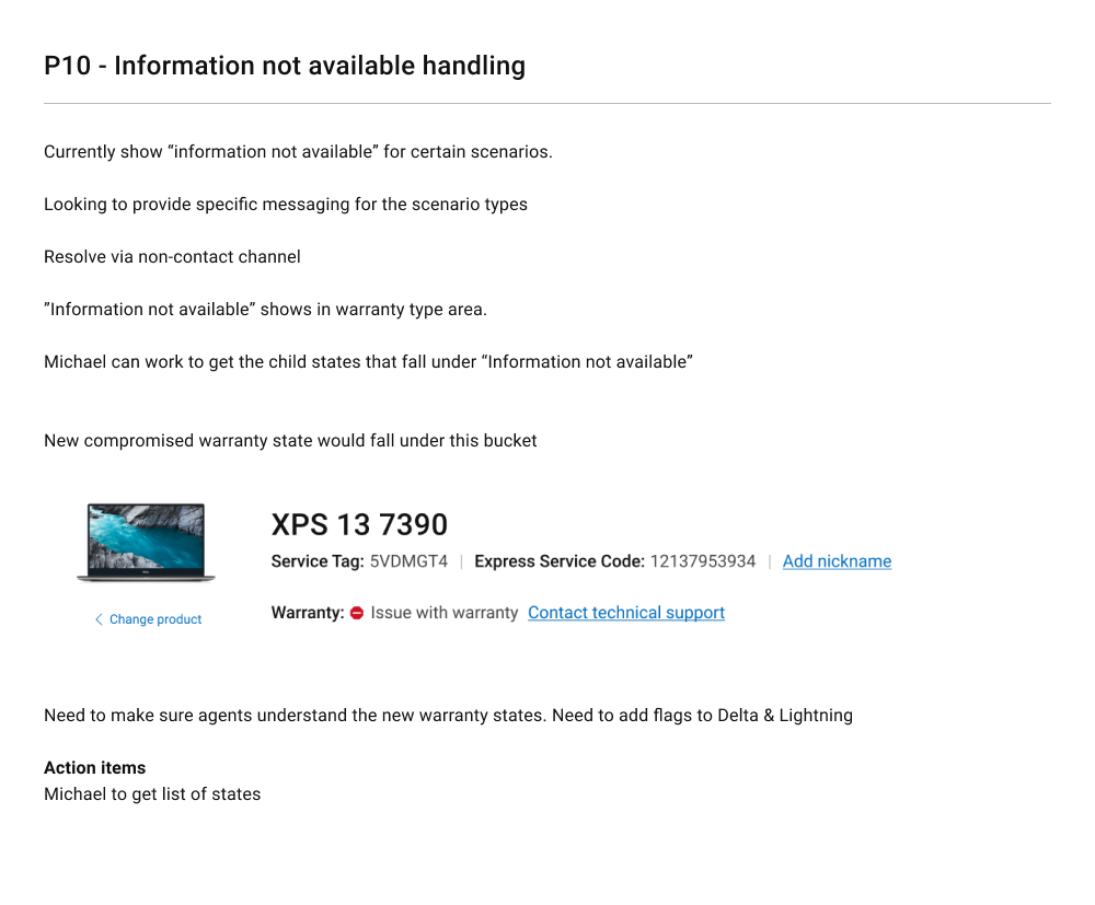
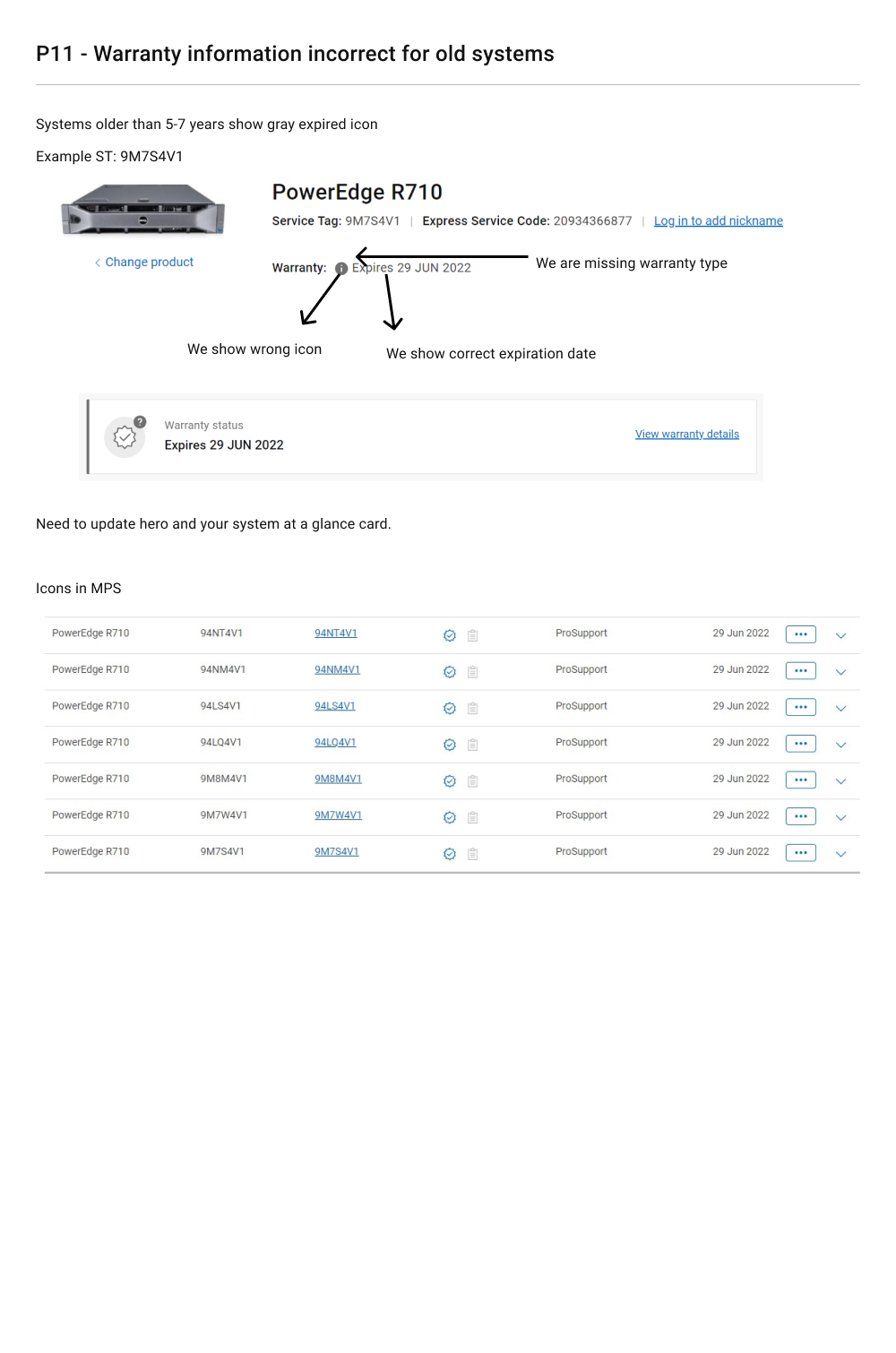
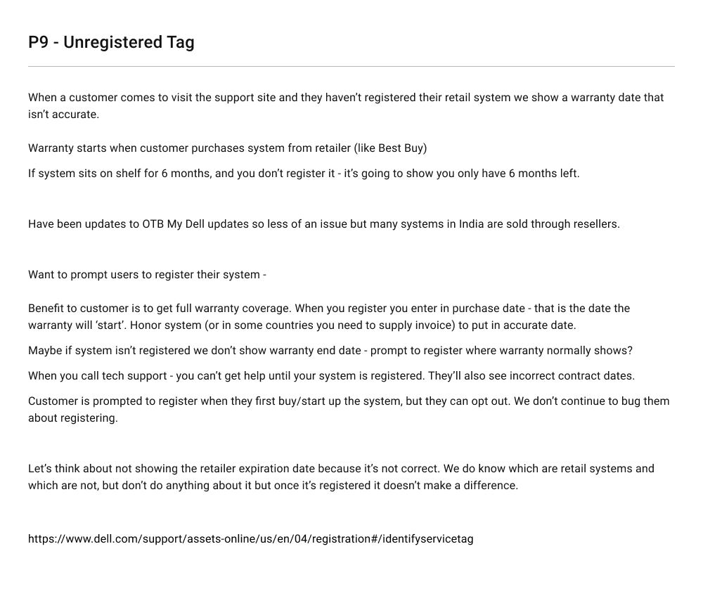
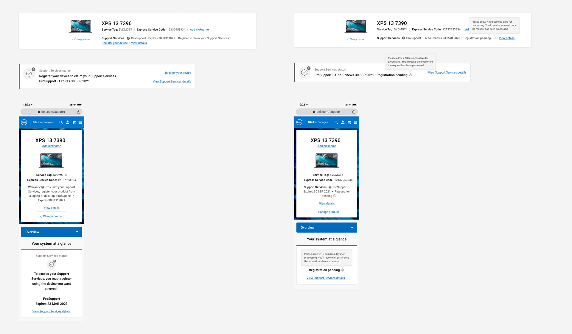
The following use cases previously had no status or representation in the UX or UI. The problem created here was that users had no idea what to do or what the error barriers were about when attempting to seek warranty coverage:
1. Users purchase resale devices
2. Have a registered stolen device
3. Brand new items that have been registered through any warranty and is being done for the very first time
4. Products with software simply too old to support any longer with
2. Have a registered stolen device
3. Brand new items that have been registered through any warranty and is being done for the very first time
4. Products with software simply too old to support any longer with
DESIGN SOLUTION:
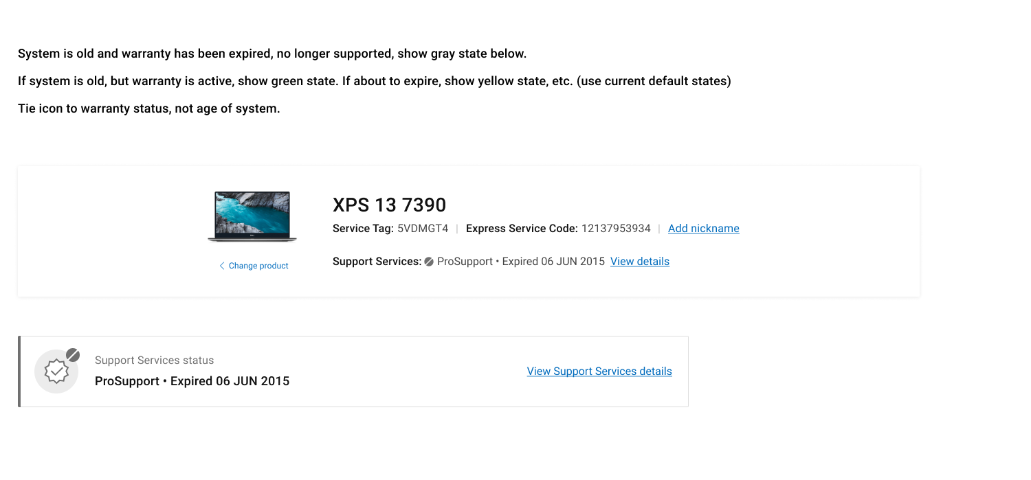
I created icons, matrix of status and worked with a Content Strategist for the support messaging (helper text, tooltip, status verbiage)
Summary of Notes from Design Kick off featuring notes from current behavior in Production:
Delivered Designs
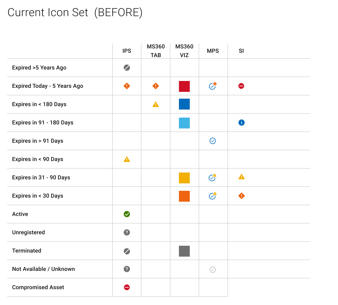
P12 Updating the Icon Status Legend and Library to account for all new statuses
This coordination involved me conducting a major audit across the site (through personal PC UX and enterprise users UX) to take all states and their respective colors into account, create a new one, and then PITCH to all designers involved in other portfolios to adapt and override to the new system. The system includes all create states in this program.
See below:

User Testing
A year's worth of user testing plans is a lot to compile. I'm only displaying a few testing plans below from this portfolio. For UX Research, I teamed up with our UX Research POC (a 2 people effort), an individual with a Stats background (you'll see what I mean in the summary results document. Between UX Research and Design, we've tested everything from layouts, content/messaging/verbiage, icon placement, visibility and legibility level etc.
My responsibilities:
• Assisting with creating the visuals and comps needed for testing
• Proofreading the questions in order to target the objective of the test
• Viewing all user test videos, documenting results, thoughts and opinions of user test candidates
My responsibilities:
• Assisting with creating the visuals and comps needed for testing
• Proofreading the questions in order to target the objective of the test
• Viewing all user test videos, documenting results, thoughts and opinions of user test candidates
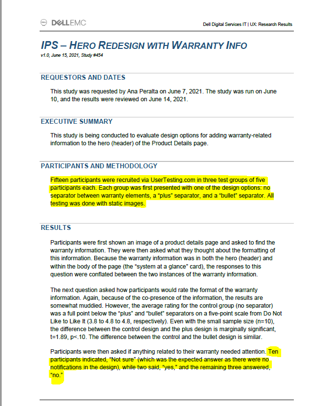
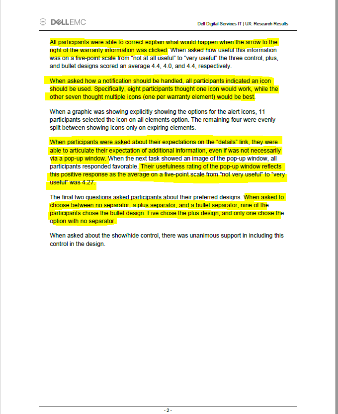

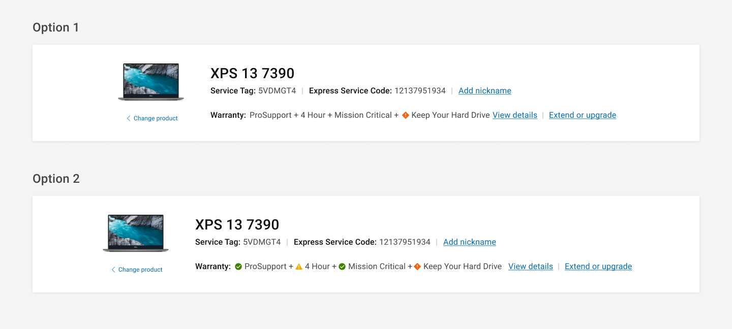
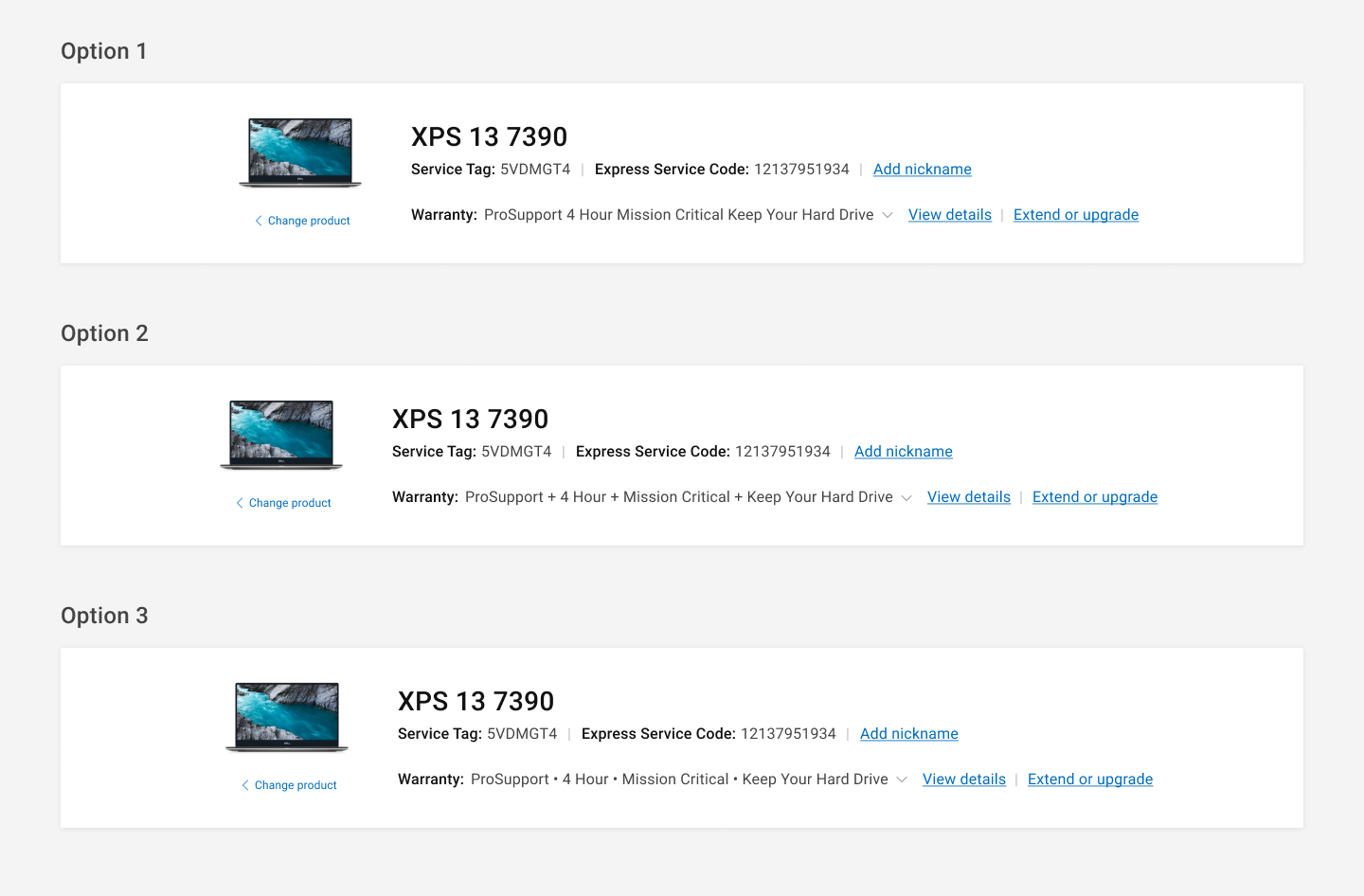


In the user test above, I wanted to know the best layout in hero section to format use cases when there is extensive warranty plans under one user's device (ie one primary warranty plan plus multiple add on plans). I wondered if in the hero section, they'd want to see the status icons of each, what would be the best way to break up the plan names, could a collapse/expand functionality work well here while also being mindful of accessibility standards.
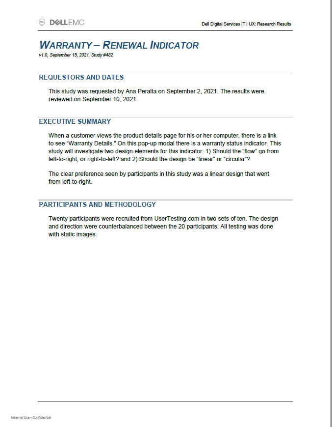


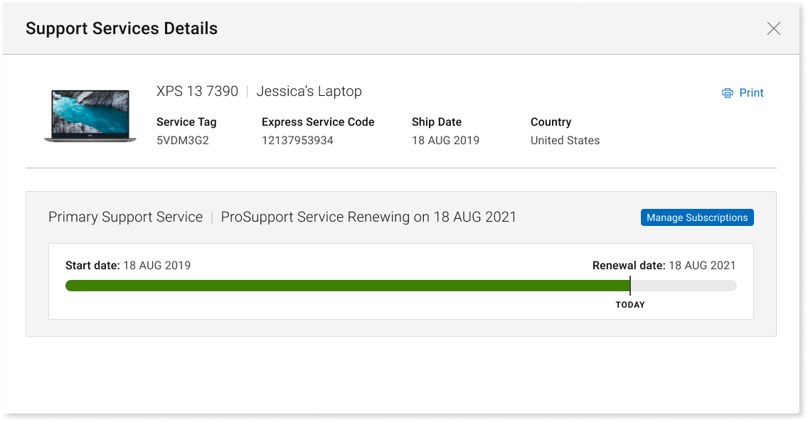
In the user test plan above, I needed to adjust the design on the a visual time (located in the View Warranty Details Modal) in order to apply to a Subscription warranty plan. The timeline, and it's respective interactions was originally designed to move from Point A to Point B representing a finite amount of time, however, how could this work for a subscription that would auto-renew? Would the user just see the time line reset? How do I include a Point B date when it technically wasn't an end date. A consideration of verbiage adds, status badge labels and timeline marker adds were considered. See above.
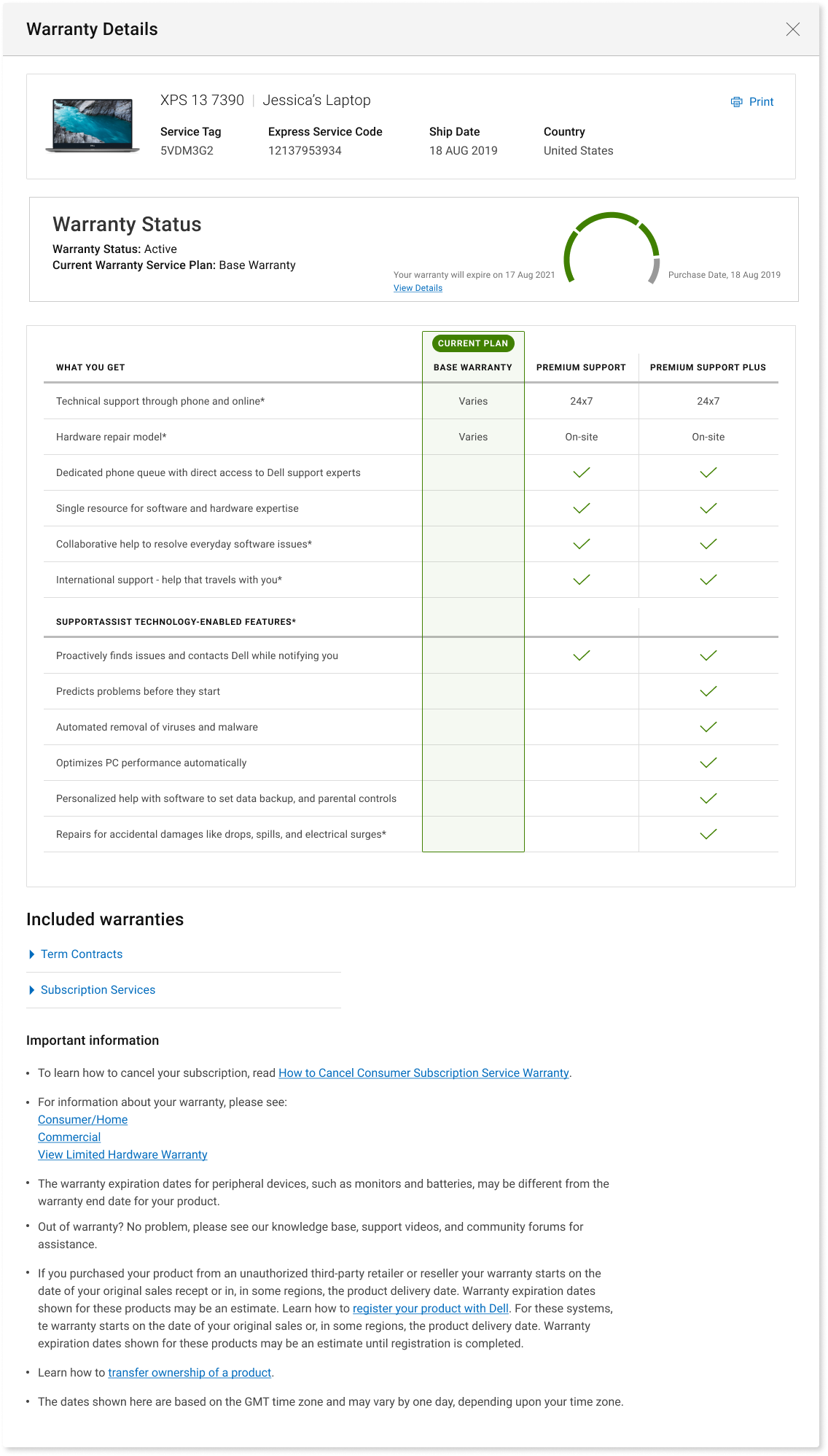

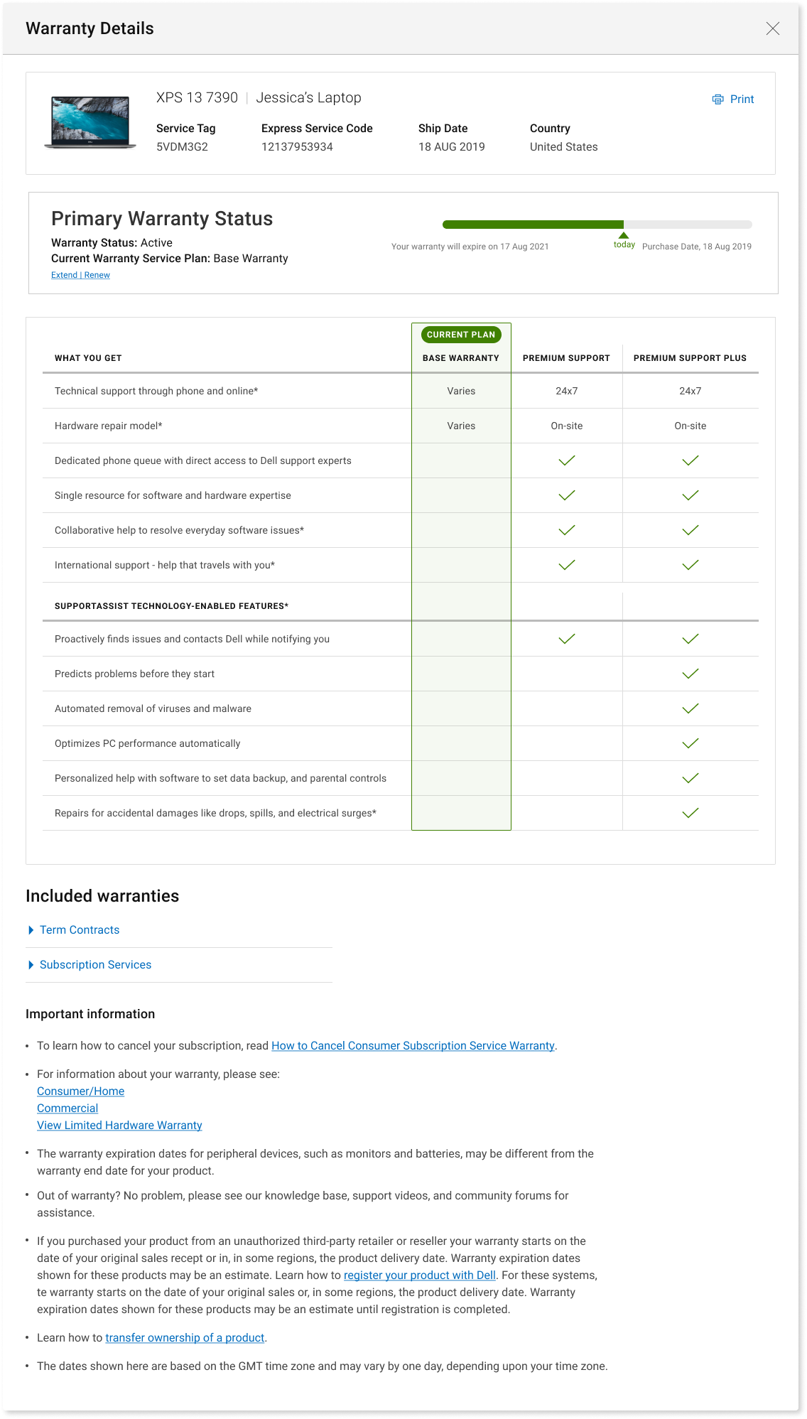
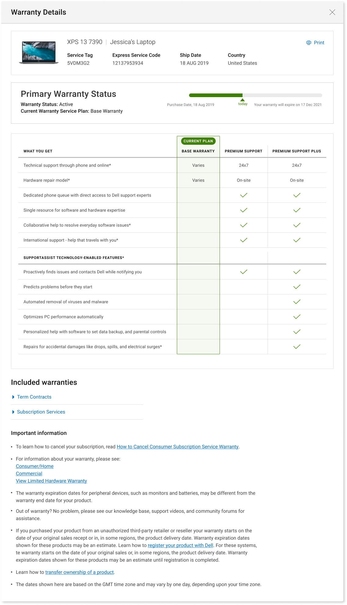
In the user test plan above, I needed to create visual representation of the timeline of the warranty lifespan as an easy-to-comprehend visual to the user of how much time and coverage they had left. I dabbled with a linear and non-linear diagram (a known 'dial' formatting vs a standard line) and tested whether the user preferred to count UP or count DOWN to their end of coverage date. The winner was linear and place the start date on the left and the expiration or renewal date on the right).
conclusions
Benefits of New Design
• Focus on the Primary warranty
• Pictorial representation of warranty term with color conventions, highlighting the current state of warranty
• Vivid description of the coverage offered by the current plan
• Comparison of available upgrade options for warranty
• Historical data is still available for reference; however, the primary focus is moved to the coverage offered
• Ease of access for Ownership Transfer link
results and achievements
• 27% increase in Extend upgrade and renew usage
• Warranty EOSL Messaging for Out of warranty users when NEARING ESOL messaging achieved an 80% CSAT score (with additional support experience)
• Warranty EOSL Messaging for Out of warranty users when REACHED ESOL messaging achieved a 71% (without additional support experience)
• Warranty EOSL Messaging on Renewals page messaging achieved a 63% (an 11% increase) because of crafted messaging and next steps for this requirement never previously addressed.
• Out of all the visits in a month where warranty UX was captured (5.5M)
• Highest CSAT improvement quarter over quarter basis within a fiscal year across any product lines
• Out of all the visits in a month where warranty UX was captured (5.5M)
• Highest CSAT improvement quarter over quarter basis within a fiscal year across any product lines
Still awaiting for results, analytics and metrics to come in for this MASSIVE effort.
