ROLE: Information architect, UX Research, UX Strategist, Usability Testing
Client Profile:
Although, MesotheliomaHub.com was new player to the landscape, it wanted to prove its expertise and thought leadership in the mesothelioma treatment and settlements space, more clearly to communicate the core of what Mesothelioma is to its consumers, and to serve as a one-stop hub for patients and caregivers alike to assist with solutions in order to overcome the challenges they face.
Although, MesotheliomaHub.com was new player to the landscape, it wanted to prove its expertise and thought leadership in the mesothelioma treatment and settlements space, more clearly to communicate the core of what Mesothelioma is to its consumers, and to serve as a one-stop hub for patients and caregivers alike to assist with solutions in order to overcome the challenges they face.
Context:
The client had the vision of creating a resource for mesothelioma victims that would equip them with educational insights and consultative next steps for their treatment process and potential legal rights
Approach:
We combined takeaways from our discovery workshop with research from the mesothelioma industry, motivation-driven personas, and card sorting exercises to organize site content into a relevant information
architecture.
We combined takeaways from our discovery workshop with research from the mesothelioma industry, motivation-driven personas, and card sorting exercises to organize site content into a relevant information
architecture.
Limitations and Caveats:
-Mesothelioma has typically affected individuals from an older generation, therefore, the usability needed to be very user-friendly
-The client had contracted a 3rd party content team to manage all content operations, SEO and copywriting.
-The legal marketplace that handled these types of cases and settlements was highly competitive
-The nature of the work faced harsh realities regarding life and death and information was often hidden behind HIPPA disclosures.
How will success be measured:
By user engagement levels, the amount of informational packets that would be ordered and by the amount of leads for legal support and advice.
Tools:
Confluence, UsabilityHub, Sketch, SEMRush, Google Tag Manager, Google Trends
UnDERSTANDING THE PROBLEM
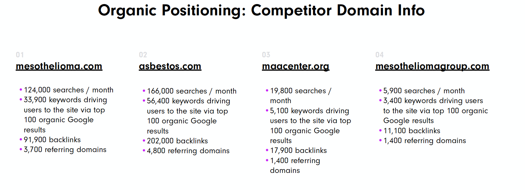
My Strategist colleague and I conducted a thorough audit of the resources available to mesothelioma victims on the web, aiming to understand how we could leverage keyword trends and study competitor site architecture to better present this critical information to this audience.
Research Phase Deliverables Included:
- Motivation-Based Personas
- Keyword Research
- Competitive Analysis
- Sitemap
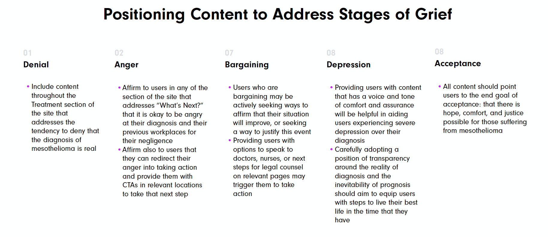
We began our approach to motivation-based personas by considering how grief plays a role in the journey of someone who has been recently diagnosed with mesothelioma.
I resorted to the Kübler Ross grief cycle which states that the stages of grief are cyclical, can occur in any order, and are unbound to a set timeframe. We can respect the cycles of grief that users are likely experiencing by crafting content that both addresses a given phase and also empowers users to know that these phases are not permanent.
In this way, we can position acceptance as a goal for our overall content strategy. The new site should empower users with information about their condition, guide next steps in both medical and legal spheres, and affirmation that they can reach acceptance about this difficult and unexpected turn in their life journey.
We aimed to explore answers to questions and concerns such as:
- “This can’t be happening to me?”
- “I give up, what can I do about this?”
- “What will happen to my family?”

Motivation Based Personas
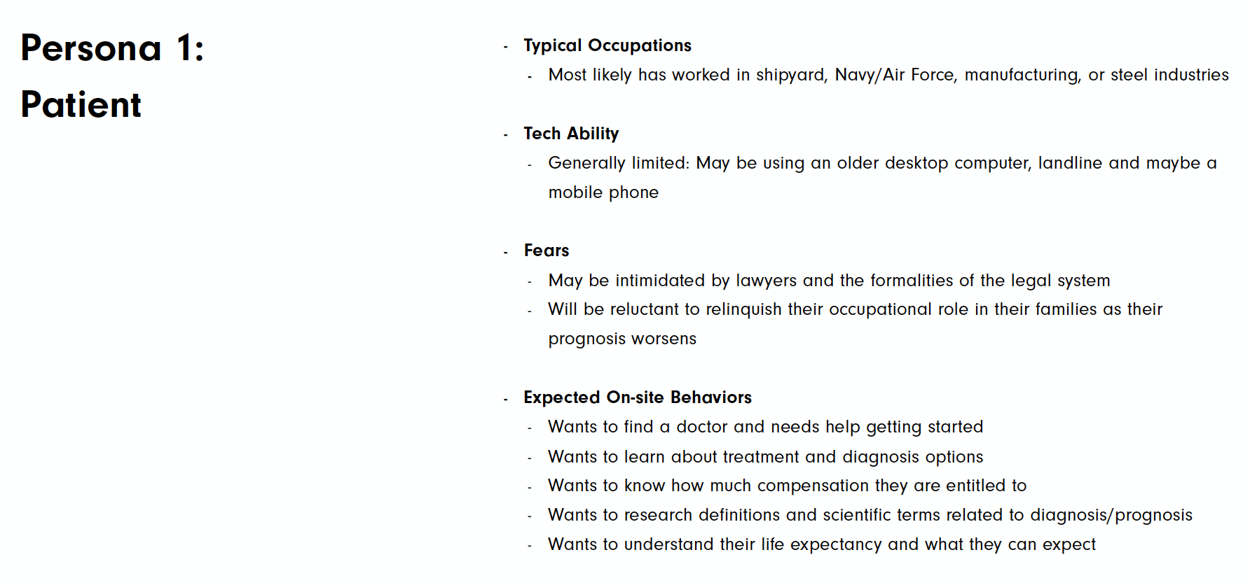
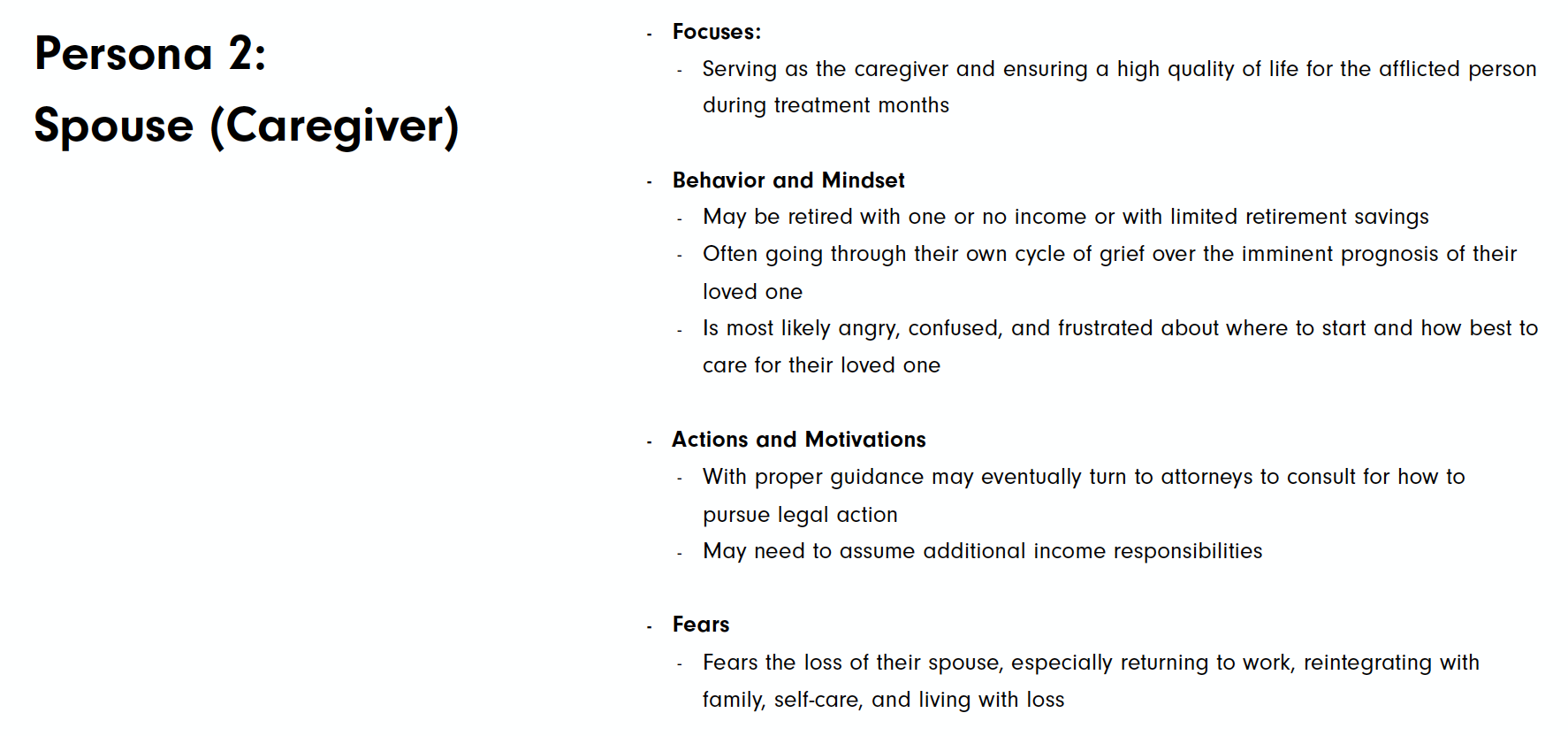
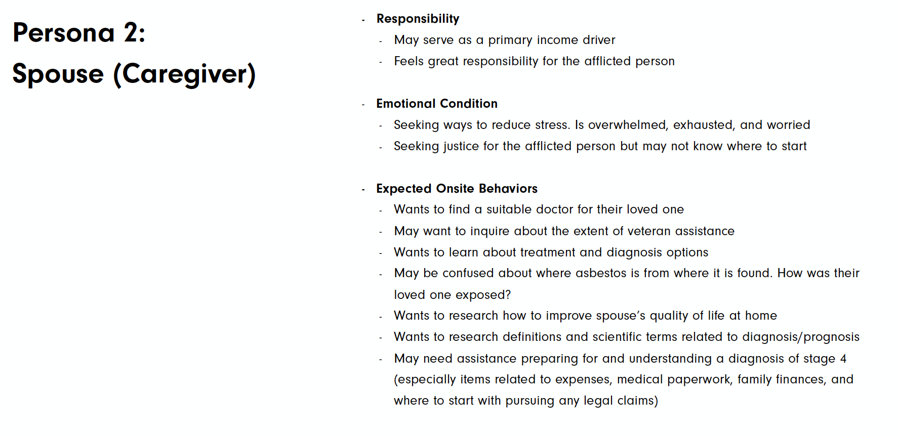
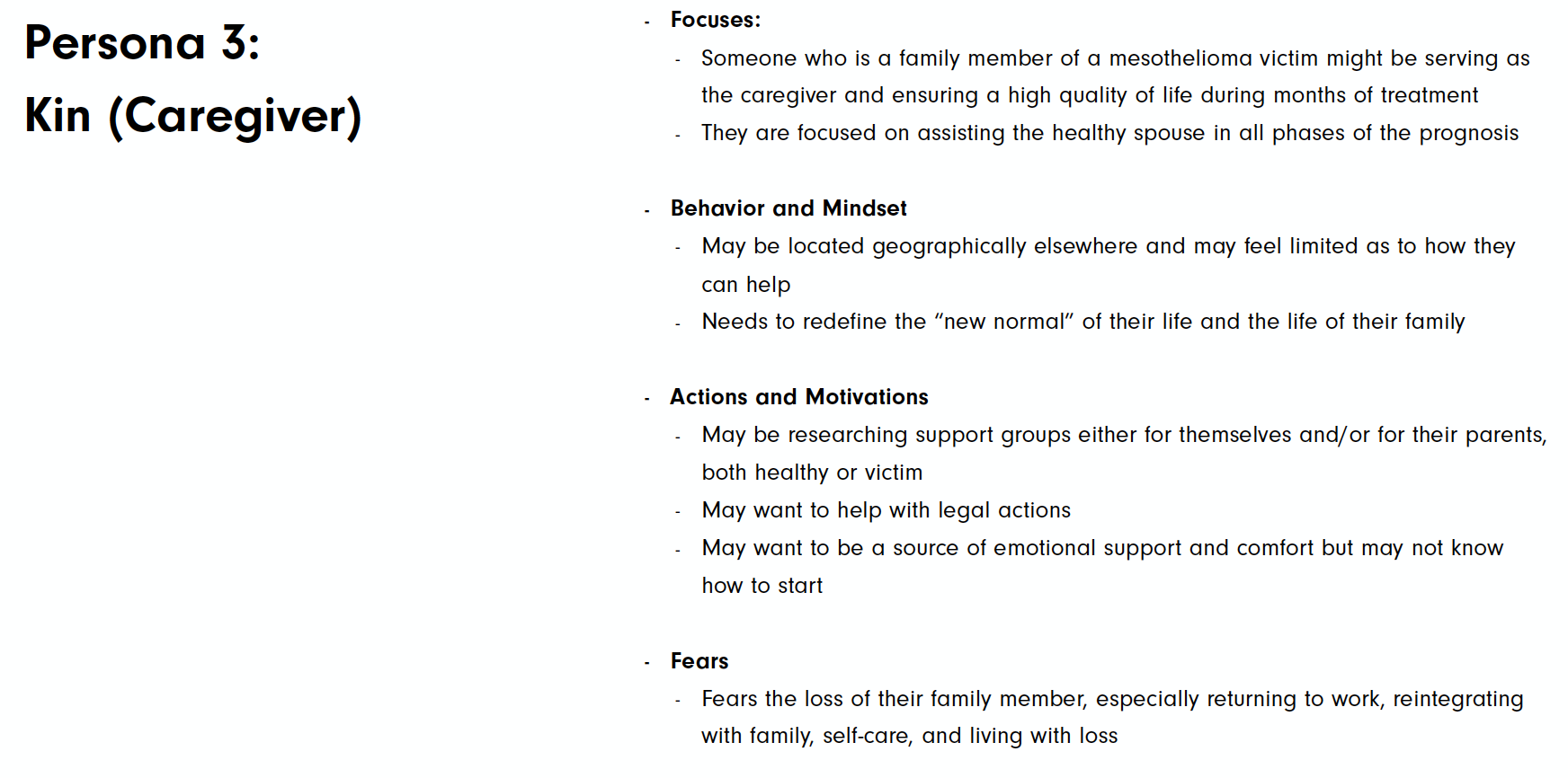
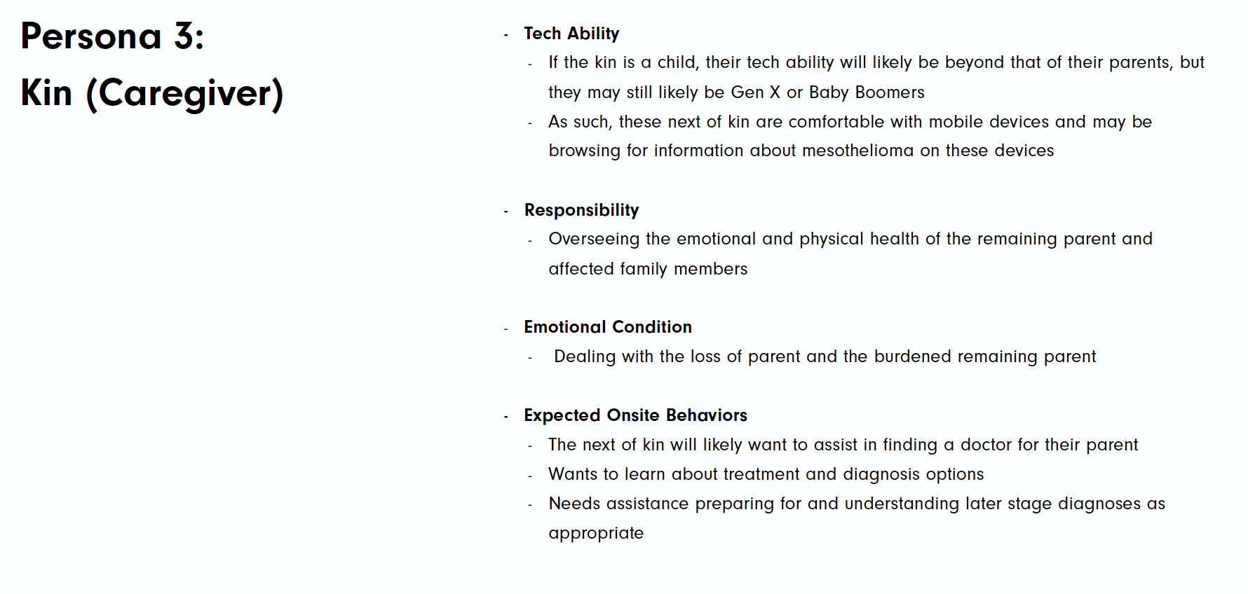
Research indicated that the user audience divided into 3 groups: The patient (individual diagnosed), the spouse, and the kin (son/daughter of the patient). Although all are related, the research proved that their concerns, their role in their families, generational differences and how they are impacted were unique enough to note.
Something Interesting I Learned:
Most American families impacted by Mesothelioma felt apprehensive about taking any legal action against an employer due to employee loyalty and the financial and emotional toll it would involve and never actively pursue that avenue. Little do they know that almost all mesothelioma related lawsuits do not actually go to trial but end in settlements, meaning to court, no judge and no jury.

Keyword Research and competitive analysis
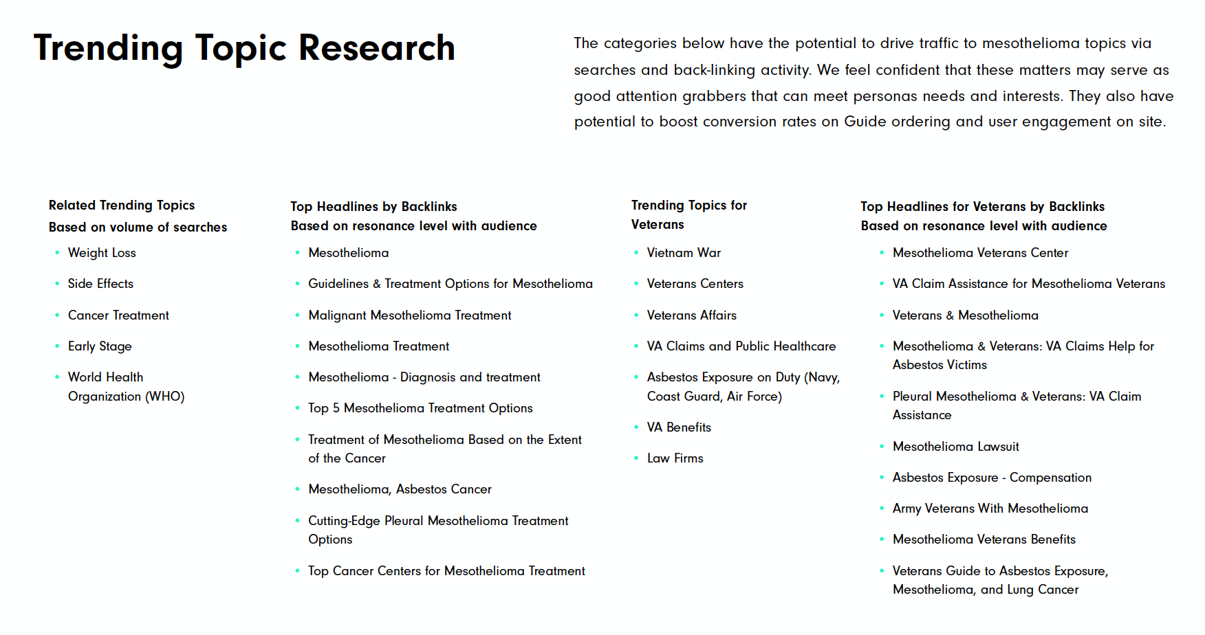
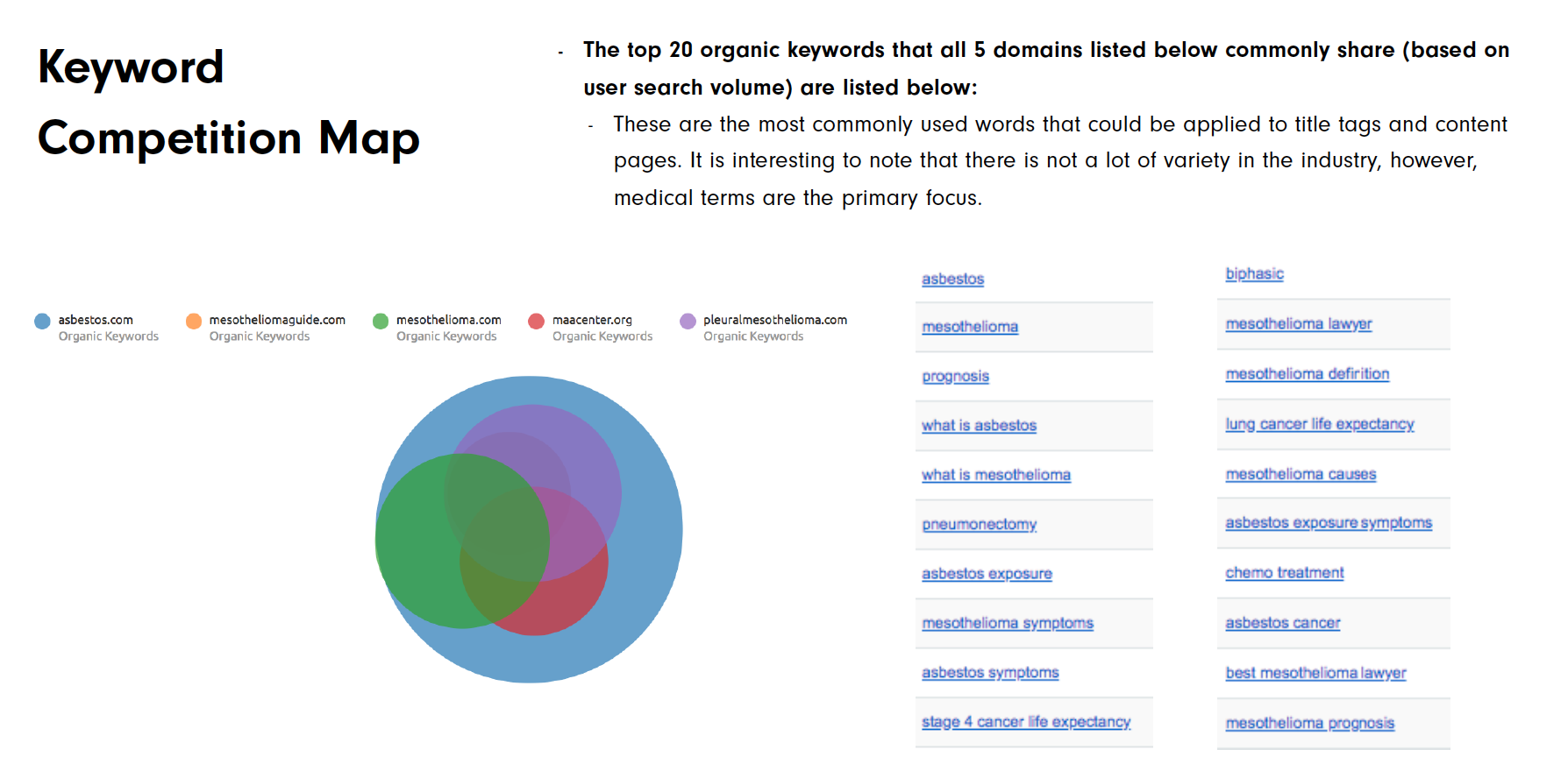
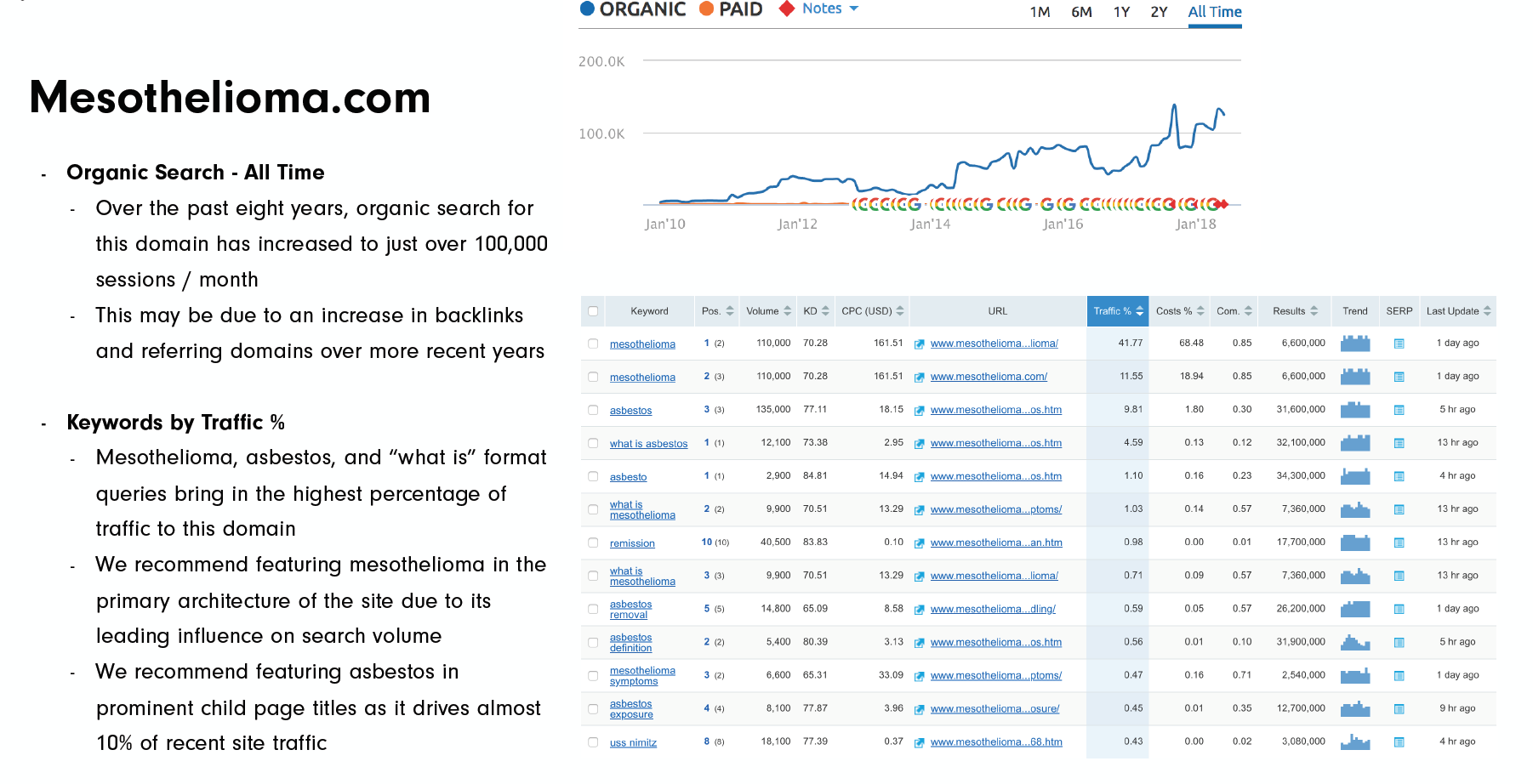
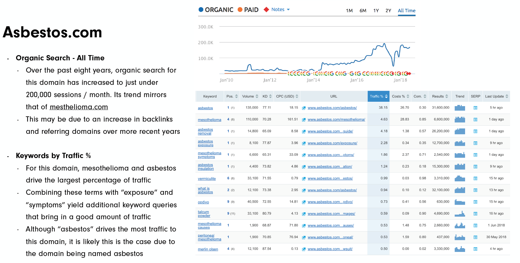
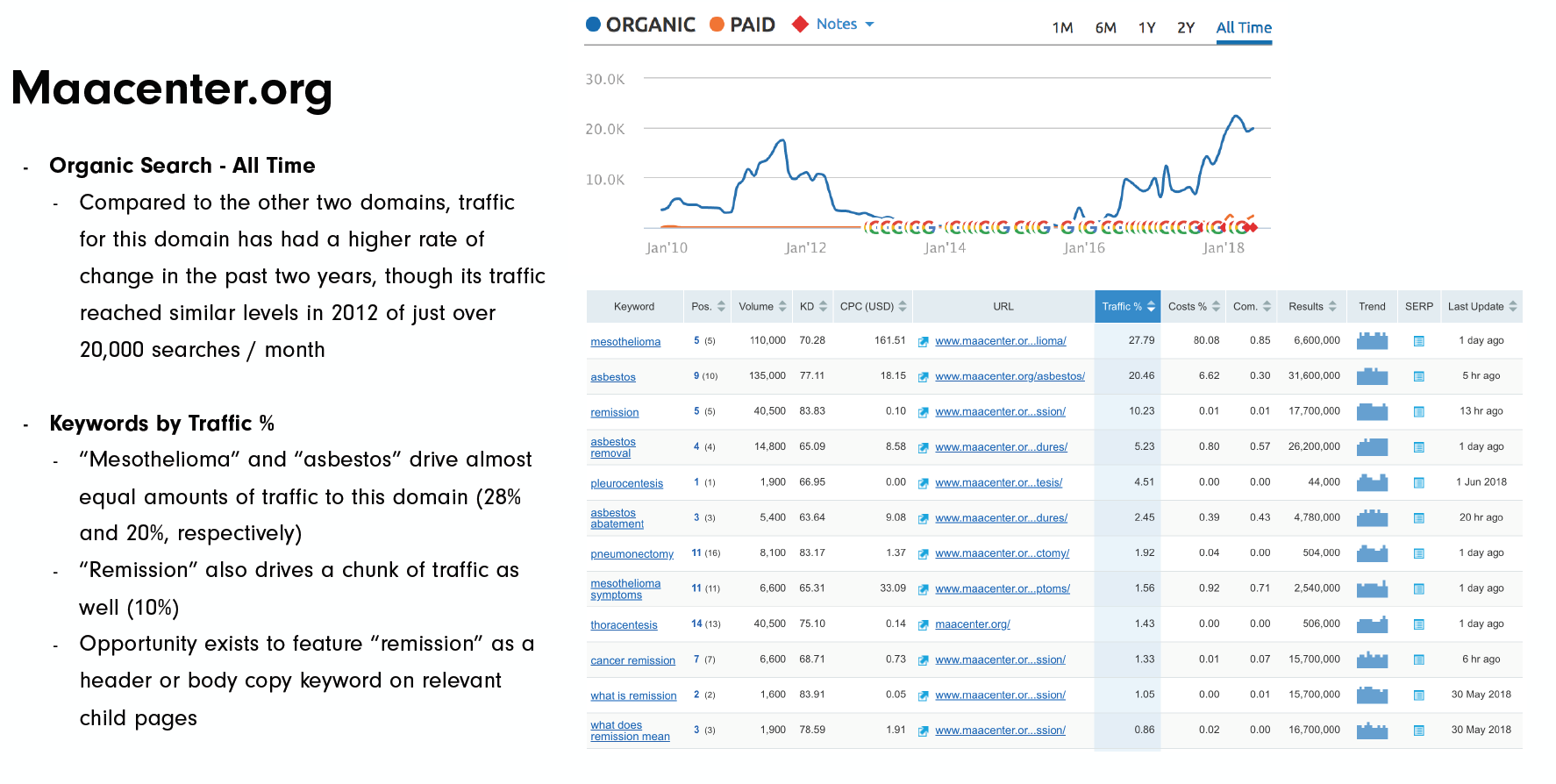
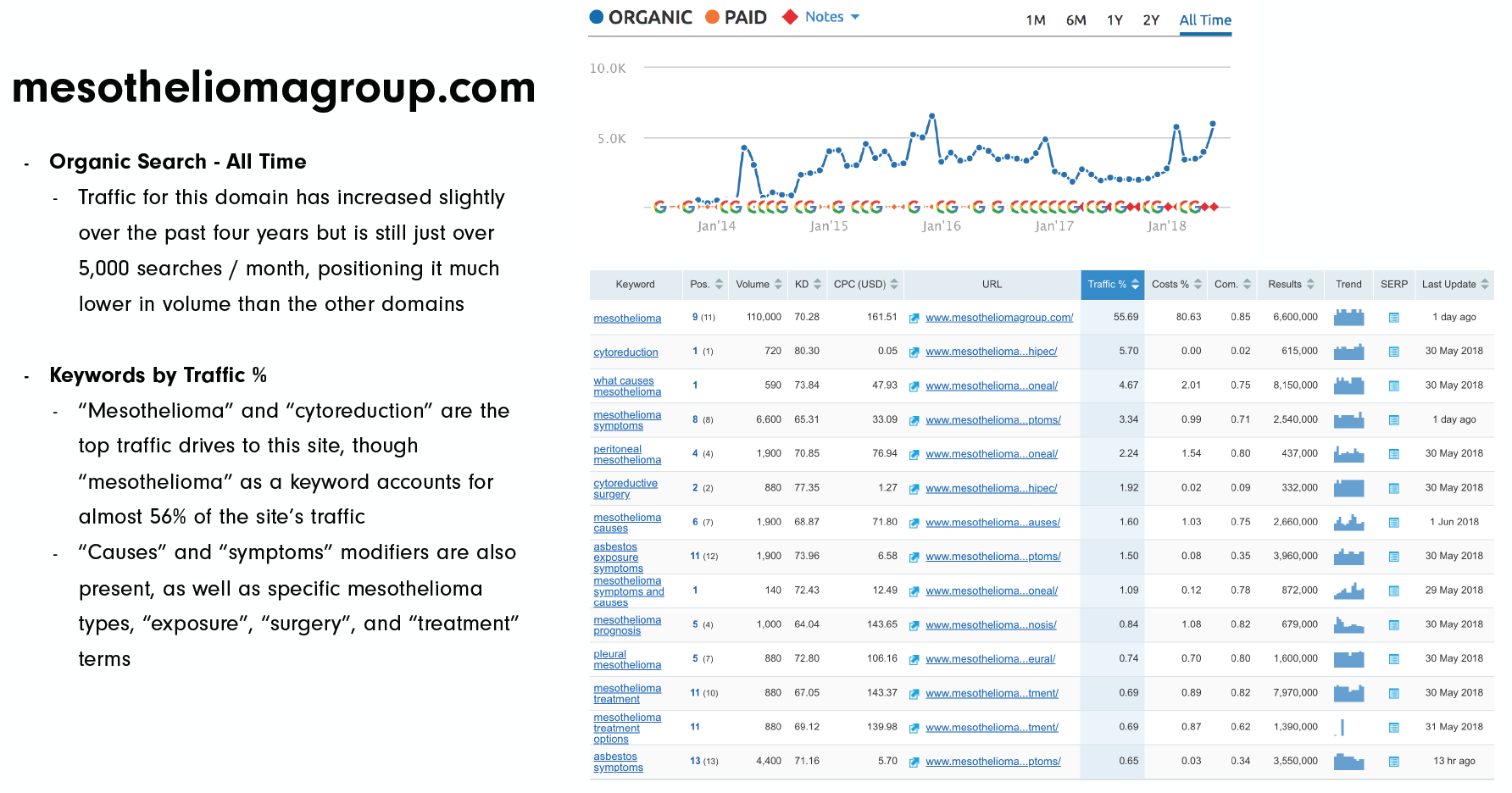
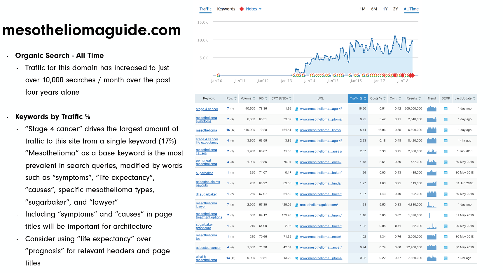
The following keyword research was provided to the 3rd party Content team we partnered with. It not only served as a proper guide to classify what content should be placed in the top tier (Nav) and so on but it also, provided the Content team with suggestions to rank certain pages as highly via SEO. The most traffic worthy of topics were called the 'catch all' pages, in the sense that, they were expected to perform highly and draw organic traffic to the website and serve as additional entry/starting points to the user experience.


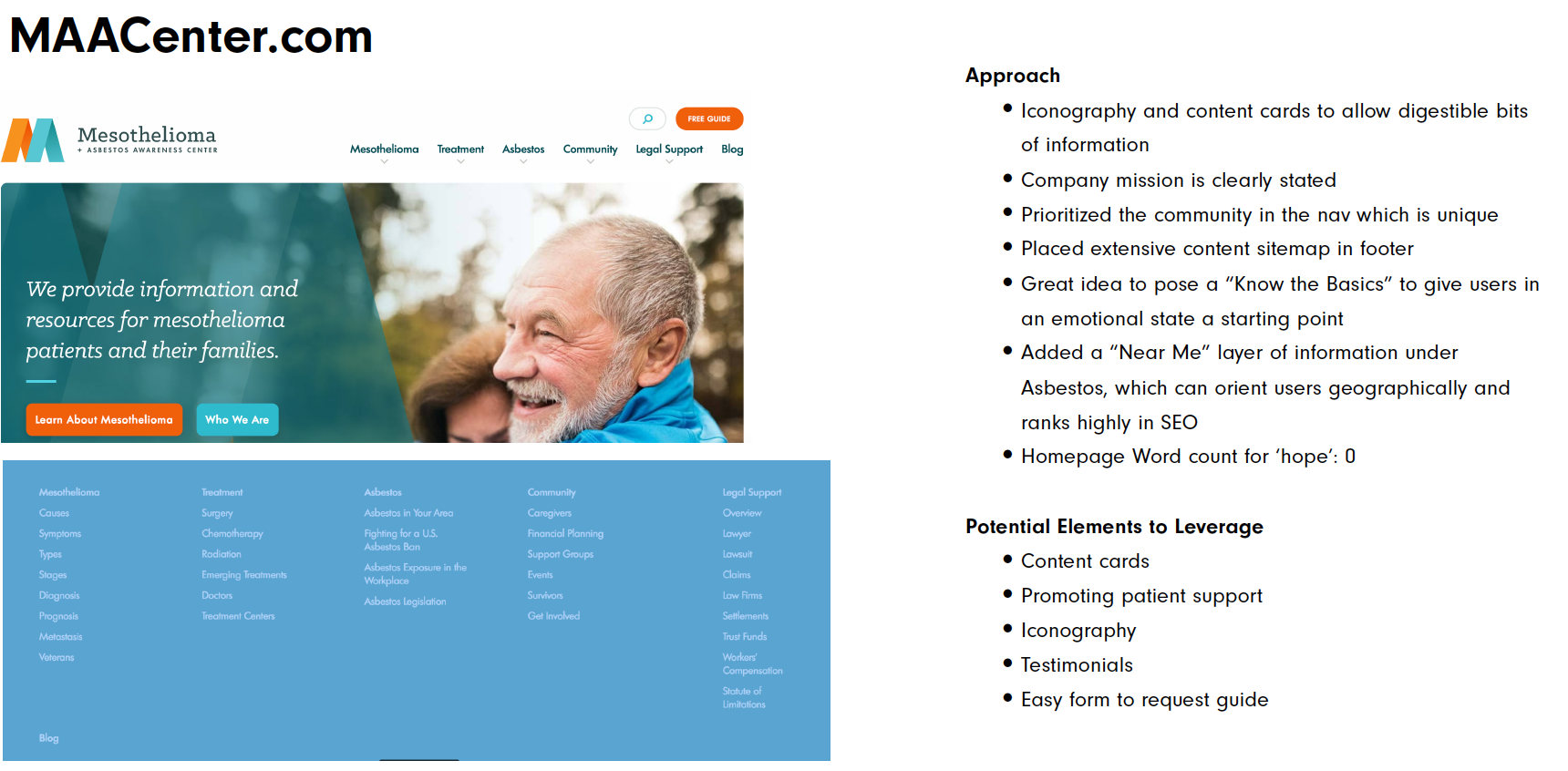
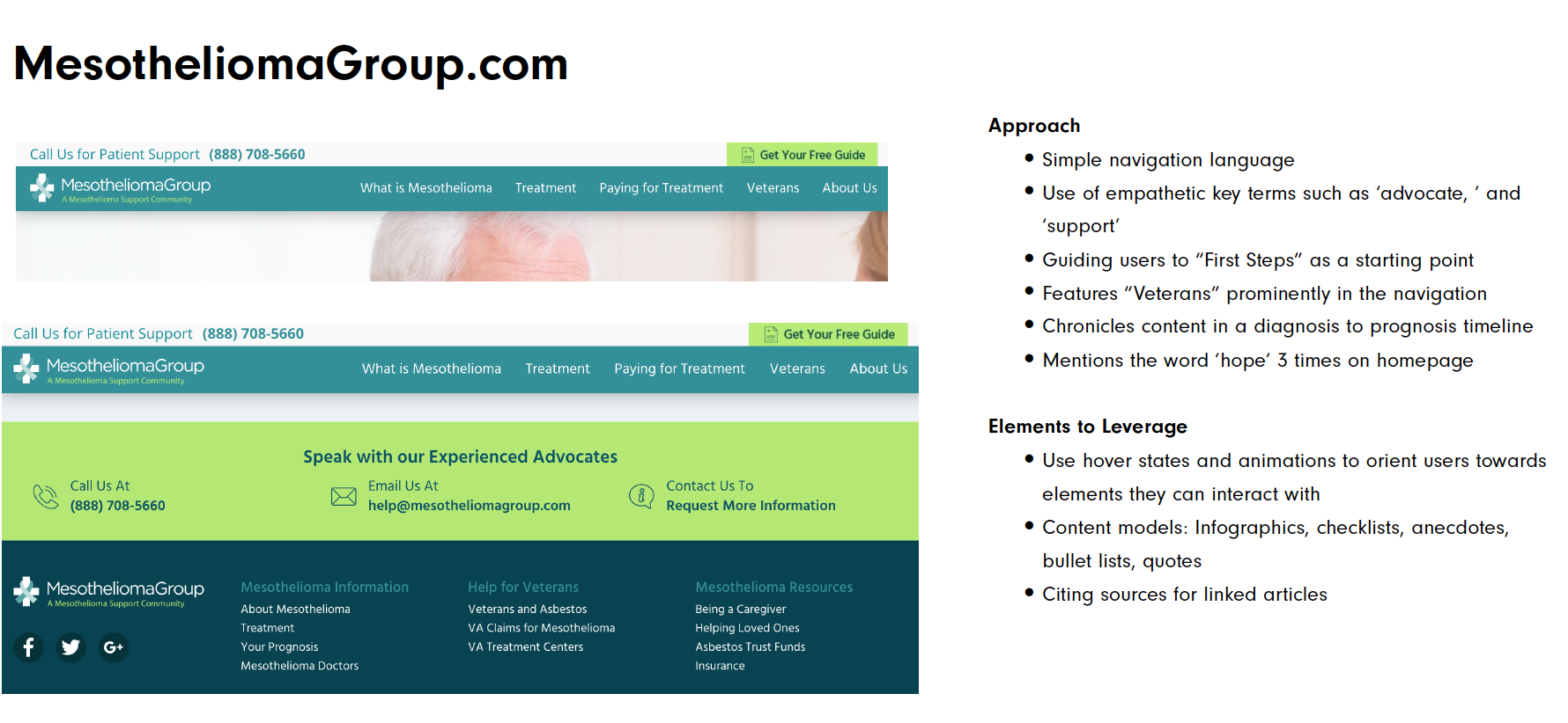
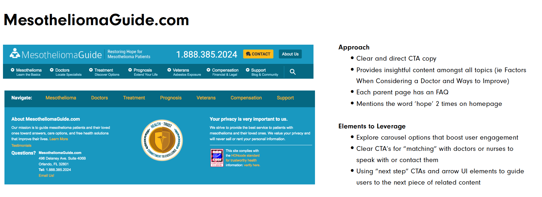
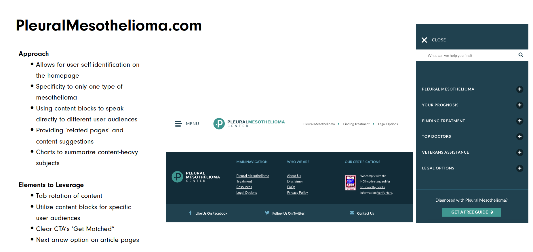
ux audits Competitive Analysis
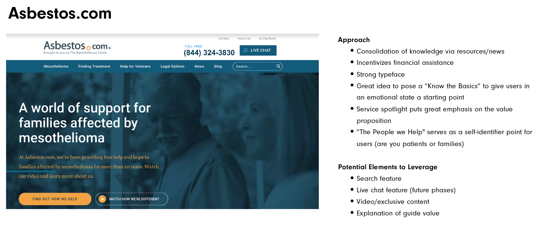
Below, I display samples of the UX and heuristic analysis I conducted of the homepage on the competitors in the space in order to evaluate the first impression of the homepage. I conducted a more thorough assessment of the full sites during my involvement of this project.

Site and Page Goals
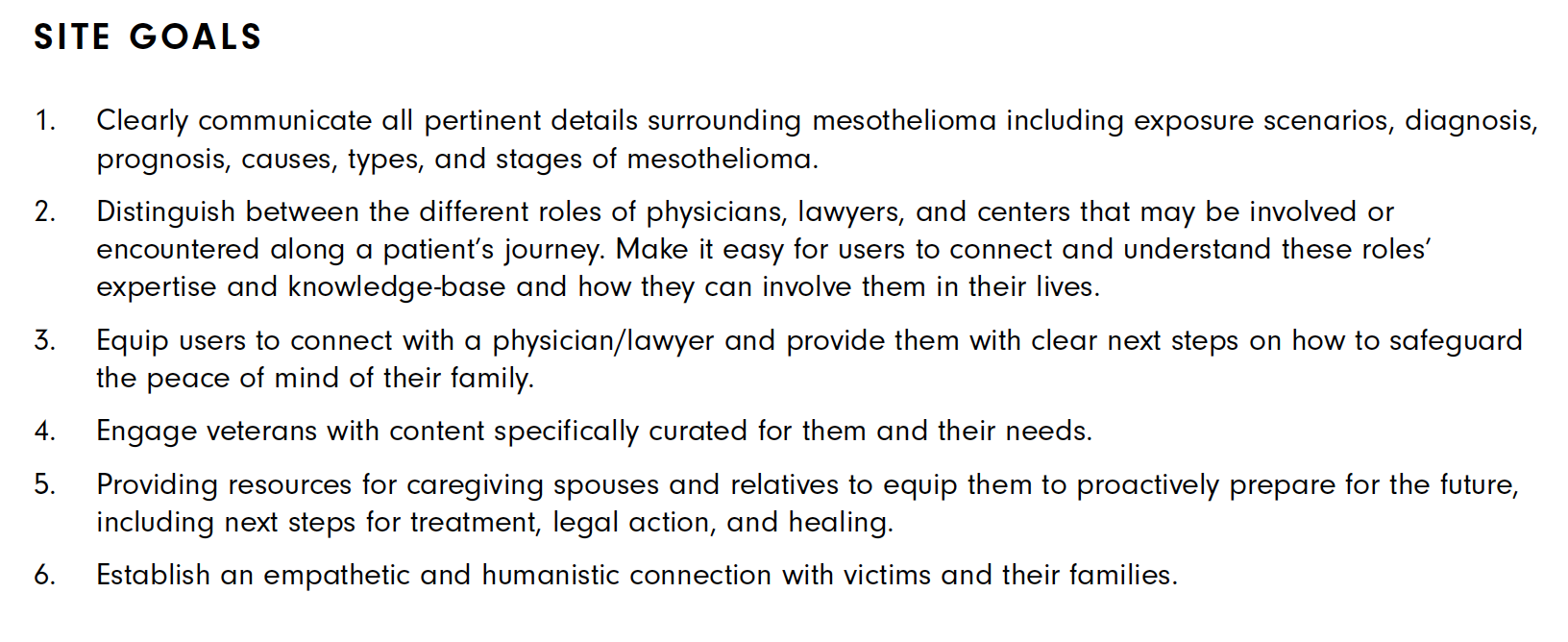
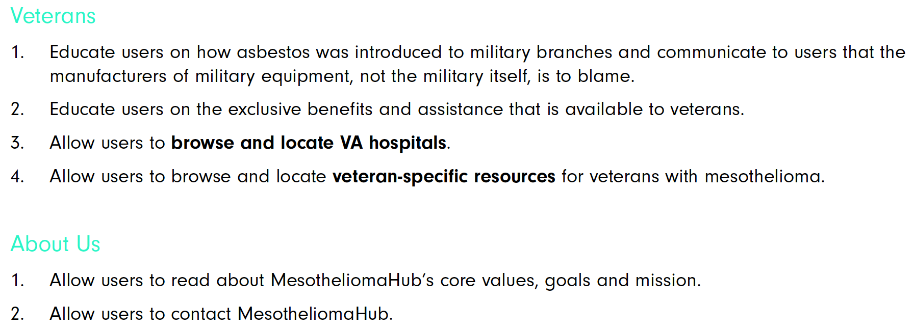
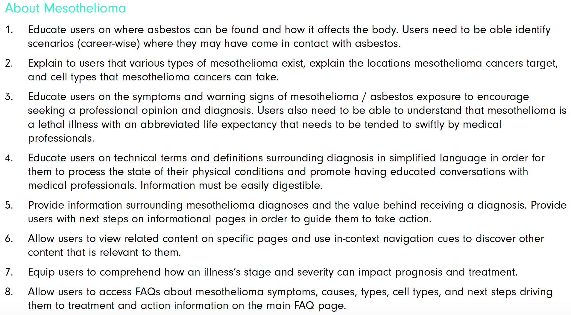
Every design, development or user experience decision made moving forward needed to reference or fall into one of the following goals (approved by the Business) in order to qualify as a reiteration or valid request. Below, I included samples of the overarching defined goals for the website and navigation.
Research Insights
Based on the keyword chart in the previous slide, the list below, categorizes the user’s keyword interests into funnel-level categories of keyword topics. We recommend that the content strategy gives attention to the following topics as they prove to be of top user priority.
Informational
In this phase, the user is focused on gathering information about mesothelioma using “what is” keyword formats, searching for general information about asbestos, or combining asbestos and mesothelioma related terms with some of the auxiliary keywords mentioned previously, including “treatments”, “side effects”, “causes”, and “precautions”. Here, users are looking to gather information and prepare themselves to seek a diagnosis if they haven’t already. Here, is where I came up with the idea to include a glossary page to assist users with definitions on medical and technical terms that would clarify any ambiguities during their periods of emotional grief.
Intentional
In this phase, the user may have more concrete information about their current condition; they may already have received a diagnosis and are consequently searching with very specific keywords, including those related to mesothelioma cell types, mesothelioma types. Due to the nature of the domain names of competitors in this space, users may end up landing directly on a domain like pleuralmesothelioma.com or asbestos.com if they end up using these keywords.
Transactional
In this phase, users are poised to take legal action and may be searching for these terms using keywords related to legal settlements.
Site Map, Information Architecture, research and a/b Testing
The sitemap approach, combined keyword research, persona goals, site and page goals, and competitive audits to inform a new information architecture for mesotheliomahub.com.
These content buckets should provide users the starting point users need to start their inquiry however they choose to enter the site, a foundation point to improve the journey from pre-diagnosis to taking action for the variety of user audiences that will be using this site, whether through a keyword that leads them to a child page or if they start from the home page. This sitemap structure (with fewer navigation choices than some of the competitor sites) hopes to satisfy these four primary user motivations.
CHALLENGE:
Some of the initially chosen language was exceeding mobile responsive margins and designs and required testing for words with smaller character counts. To test the Nav hierarchy and verbiage for semantic value, I relied on UsabilityHub to create a test plan, write screener questions, recruit users, schedule users, moderate test, gather and summarize research findings summary in order to effectively present and share results.


THROUGH MUCH CONDUCTED A/B TESTING (ON OUR TARGETED DEMOGRAPHIC) OF NAVIGATION LABELS VARIANTS IN ORDER TO ACCOMMODATE THE MOBILE RESPONSIVE DESIGNS, WE WERE ABLE TO RECEIVE USER FEEDBACK ON HOW WELL THESE LABELS HELPED ACHIEVE PAGE LEVEL GOALS
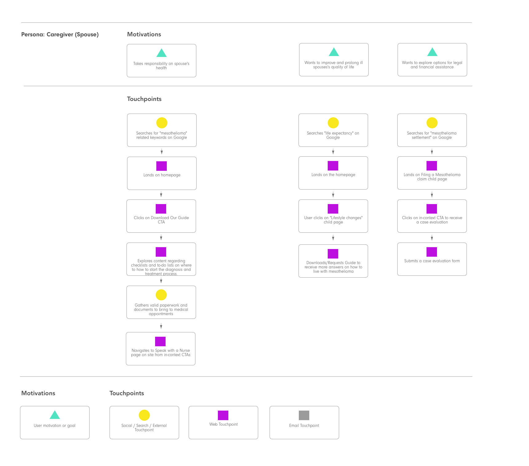
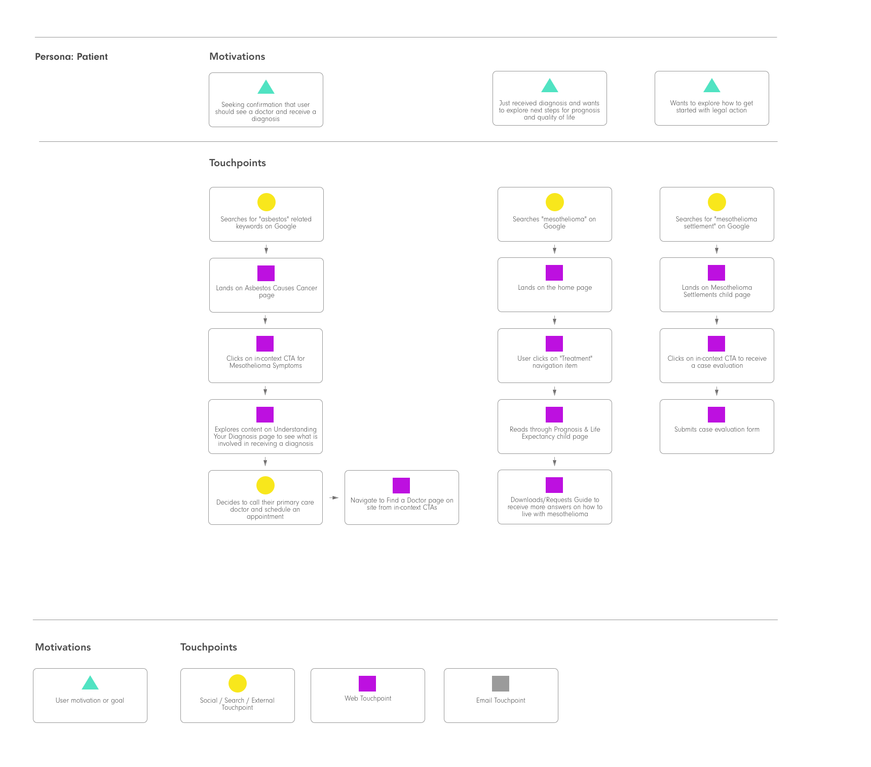
User Flows
Functional Requirements Writing
Since the Content team's plans were to scale the website over time, the Designers and Strategists agreed that a component or widget-based building block approach was suitable for them. A gallery of content models were designed for their various needs in order to assist them with the presentation of information. My responsibility was to document all functional requirements in epic and user story form so that the 3rd part contracted developer could confidently pick up the task and take ownership of the role.
An Interesting Thing I Learned:
A year prior, Google-run search results pages were no eliminated and no longer a viable option and I had limited knowledge on the what technical options would appropriately replace this function. Through some conversations with the Developer a nifty extension called Algolia was decided upon and implemented. It provided advanced search query settings, auto-suggestions, multi-lingual capabilities and metric insights to user searches. Big Win!


