

Role: Co-UX Designer
Project Brief:
The Dell.com account creation and login user flow was inefficient and unclear in its effort to service two distinct user audiences (enterprise and consumers) and posing further issues via mobile. As a result, users unintentionally were creating the wrong user accounts which would pose access restrictions later on. My colleague and I needed to identify key efficiencies in order to challenge the need for intermediary accounts entirely.
Project Scope:
The current state of the login and account creation experience was largely redundant at the beginning of the user journey and contained far too many steps for new enterprise customers. Additionally the enterprise workflow was not designed responsively and thus performed extremely poorly on mobile and smaller breakpoints. Internal tools proved that Customer satisfaction (CSAT) scores related to users who engaged with the business account creation flow were lower on average than those who did not, validating the severity of the issue. Some of the reported feedback included comments such as: The business account distinctions were not visible to users, account creation was a fragmented and erratically presented process, and users were not forced into a choice of account type. Further, the content users were trying to access with business accounts did not telegraph clearly enough that the content they were trying to access (which was gated behind login) was useful to them, prompting them to login or create an account to discover its relevance, hence rushing users to create any account in order to access restricted content.
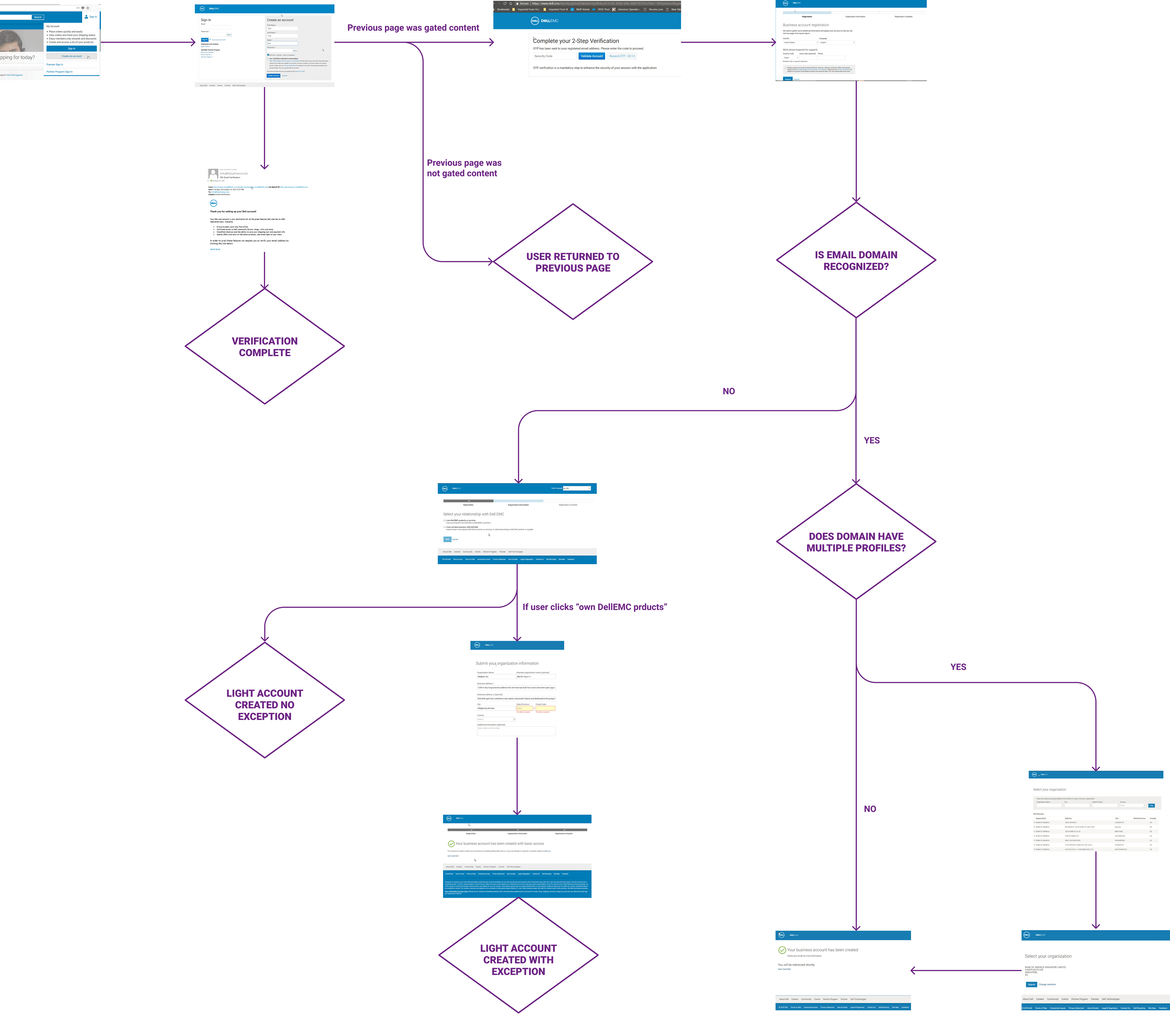
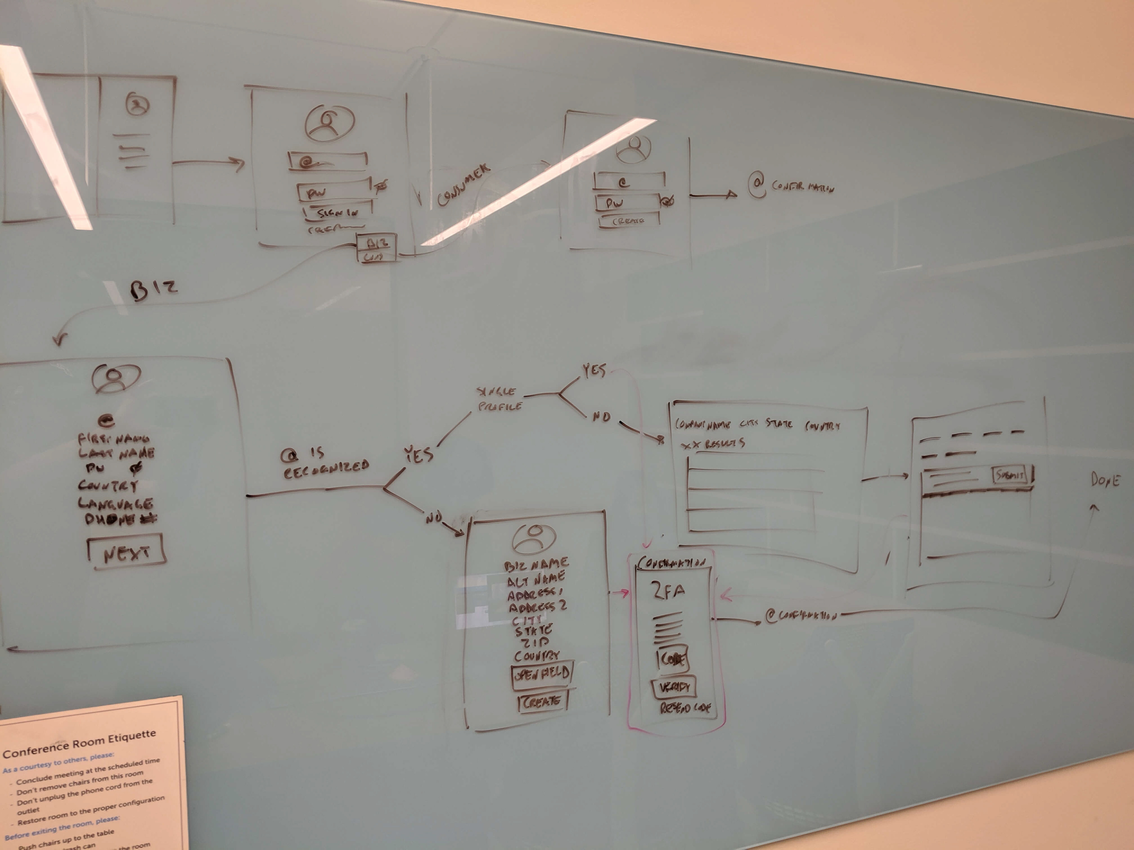
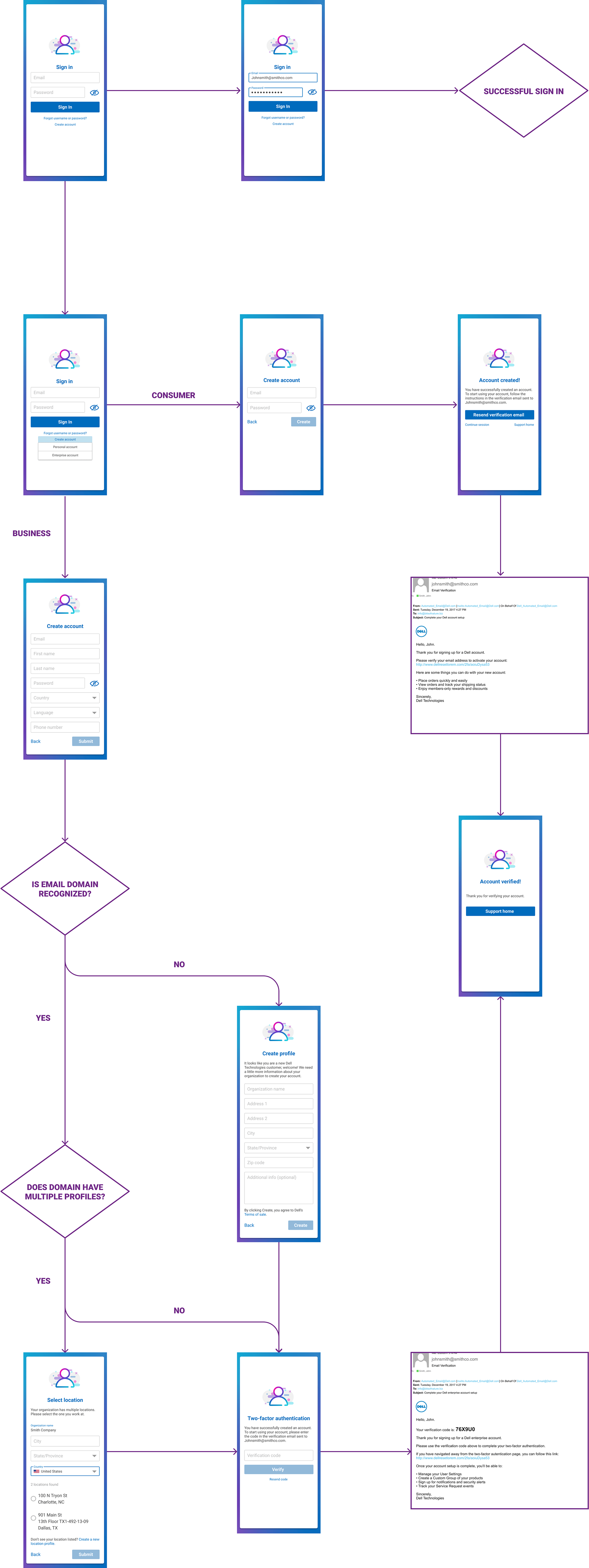
Current User Journey
LIGHT ACCOUNT USER UX ISSUES
In addition, our team continued to hear from internal teams regarding“light account issue.” Currently, there are 3 account types: consumer, light business user, and full business user. The light accounts are created when enterprise users (typically employees of an employer) create an enterprise account with a personal email causing a disconnection between associating an enterprise account with an employer. Stakeholders agreed that this intermediate account was not necessary and recently there was a dramatic spike in the light accounts being created resulting in an insurmountable backlog of manual validation tasks. My colleague and I opted to nip this issue in the bud and redesign the sign-in process to properly filter and self-identify users from the beginning.
Target Opportunity Areas
-For enterprise users optimal workflow is 4 total steps, the most complex path is 6 total steps
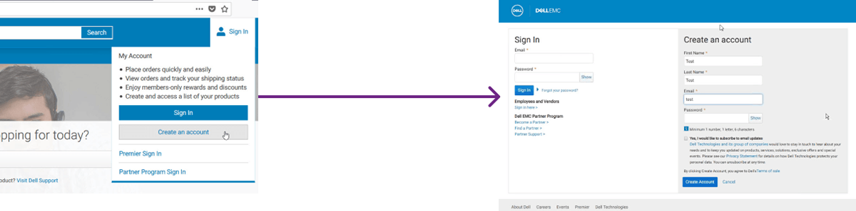
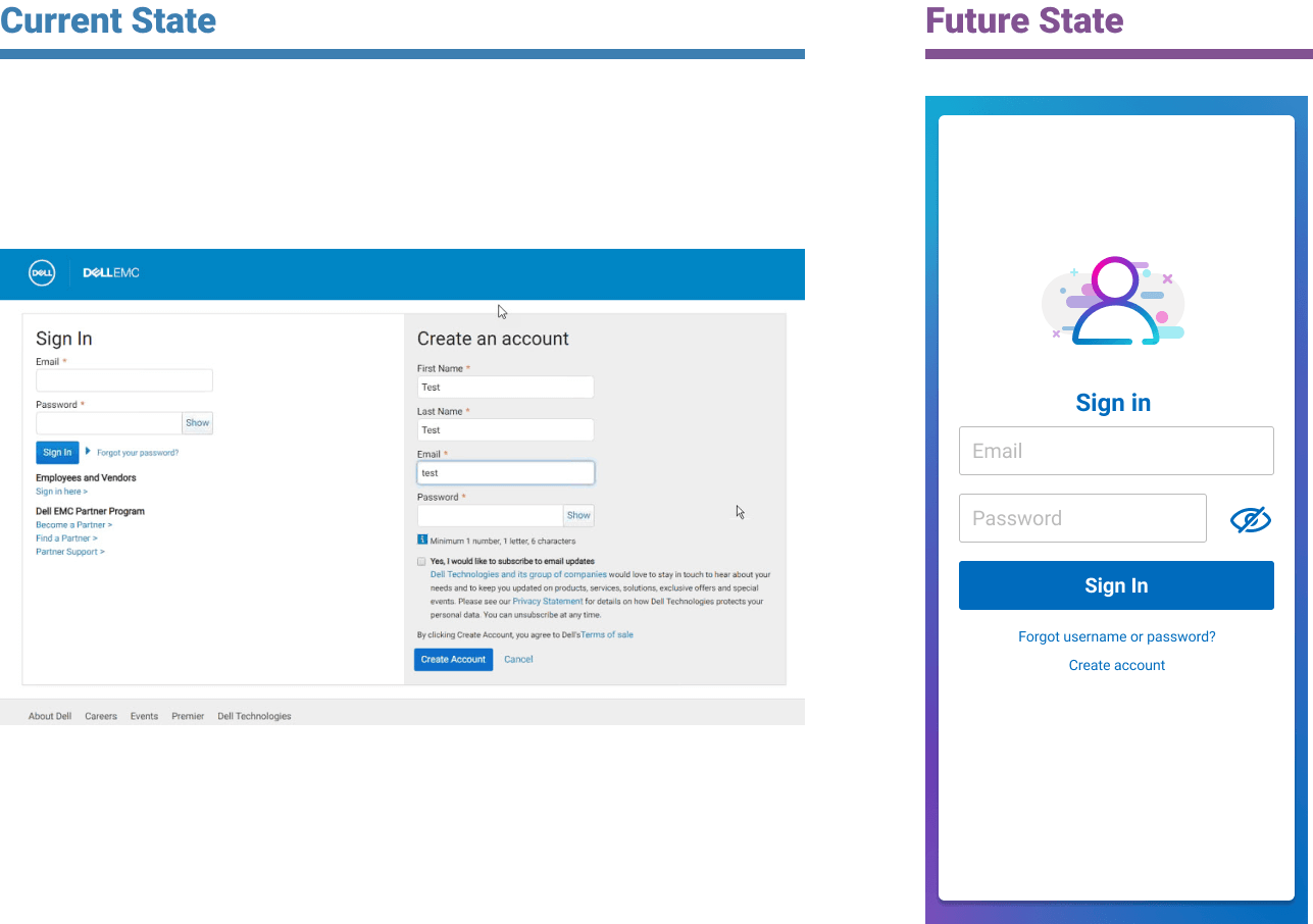
-Create an account and sign in actions are presented as separate but take the user to the same location, presenting an unnecessary illusion of choice
-The login page contains both the login form and the consumer account creation in the same view. This presents a cognitive overload for the users because they are inundated with information based on their path. It also creates frustration as users have made a selection in the previous interaction, but are still presented with both options eroding user trust in the experience. This model does not prioritize a particular action although the sign in action will have far more engagements.
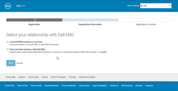
-Users are unable to make an account type distinction at this point. Business users have to “update” their account only when met with locked content, thus fragmenting this flow in a way that is obscured to the user, so when they are met with more steps later in a journey it the friction is compounded
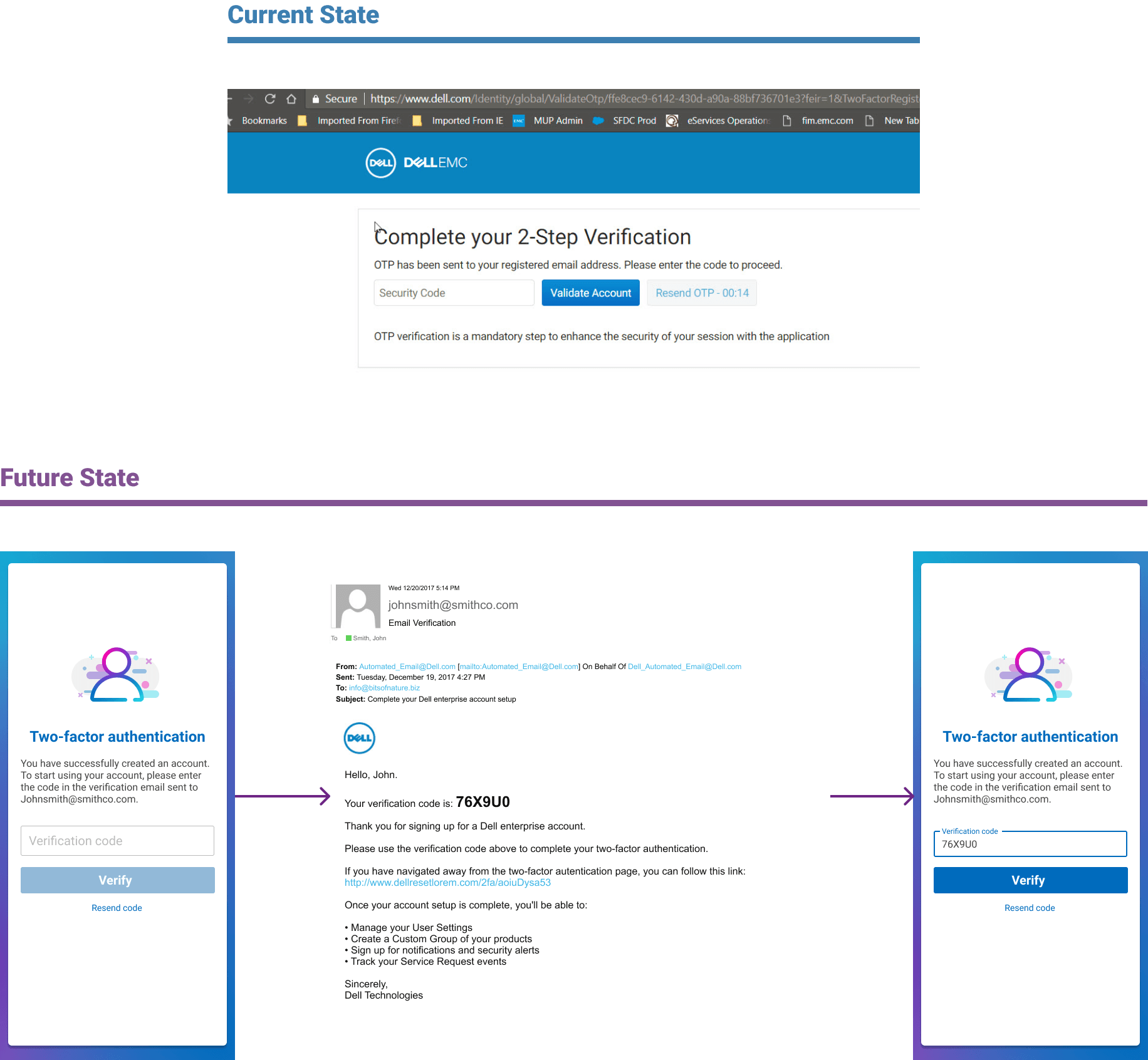
-Two-factor authentication is required prior to allowing users to pass through the form fields, creating another stop-and-wait step on an already back-loaded step
-The use of tables for selecting a single profile from a list of multiple breaks down when on a mobile device
-Some forms use a Z-shape reading pattern which is unnatural for liner form progression
-Submit selection verification screen needed to be consolidated
-Pathfinding is vague and fails to communicate outcomes to users
Competitive Analysis
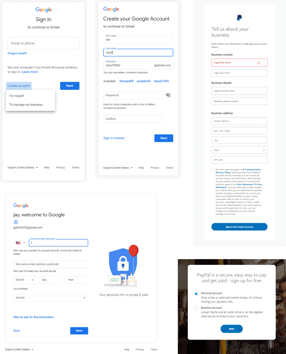
The initial steps of my approach involved conducting a competitive audit, taking in heavy influences from industry leaders such as Google, Amazon, and Paypal. I recognized that there was a fair amount of uniformity between the solutions in their overt mobile-first structuring, minimal amount of form fields, and prioritization of either sign-in or registration processes within the first action of the user flow. While at a larger template level these best-in-class experiences showed homogeneity, at the element level there was a lot of disparity and there did not seem to be an overwhelming set of axioms leveraged across all of the platforms.
content strategy
Workshop session with my colleague
initial redesign
Turning an eye then to the tactical design taking a mobile-first approach was a very clear path forward. Optimizing for mobile was already a strong driver for this project which was reinforced by industry best practices. Designing from small to large would inherently resolve issues of form reading patterns, improve scalability, and constrain the design to be appropriately minimal to streamline the experience.
Improvements
-For enterprise users optimal workflow is now 3 total steps, and the most complex path is now only 4 total steps
-Upgraded visual language to add character to an otherwise unremarkable page while still placing emphasis on the core experience. Leveraged Google Material Design patterns to provide easier path to engineering execution
-Aligned to modern standards by prioritizing login as the singular focus action based on user engagement patterns, placing account creation as secondary
Simplified the experience to be a single linear experience that presents itself fully upfront to the user, isolating the interstitial experience and preventing prolonged frustration and surprises
Eliminated the need for light accounts by requiring users to self select an enterprise or personal account type creation. This prevents accidental creations that waste man hours on validation. This also greatly optimized the pathfinding by reducing it to an early state, easily comprehensible binary choice
Updated table to a progressively filtering list to create more efficient profile selection and optimize for mobile and removed redundant submission verification screen by adding inline selection visibility and enabled/disabled states to form progression action
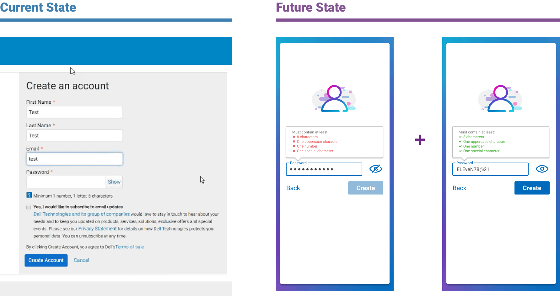
Added password preview capability to eliminate the need for password re-entry when creating account and giving users visibility when signing in
Added dynamic password requirements that display when criteria is met and displays upwards to maintain visibility when mobile keyboards consume vertical screen space
before and after
design pitch - the proposed long-term user flow vision
Simplified user journey displayed (above)
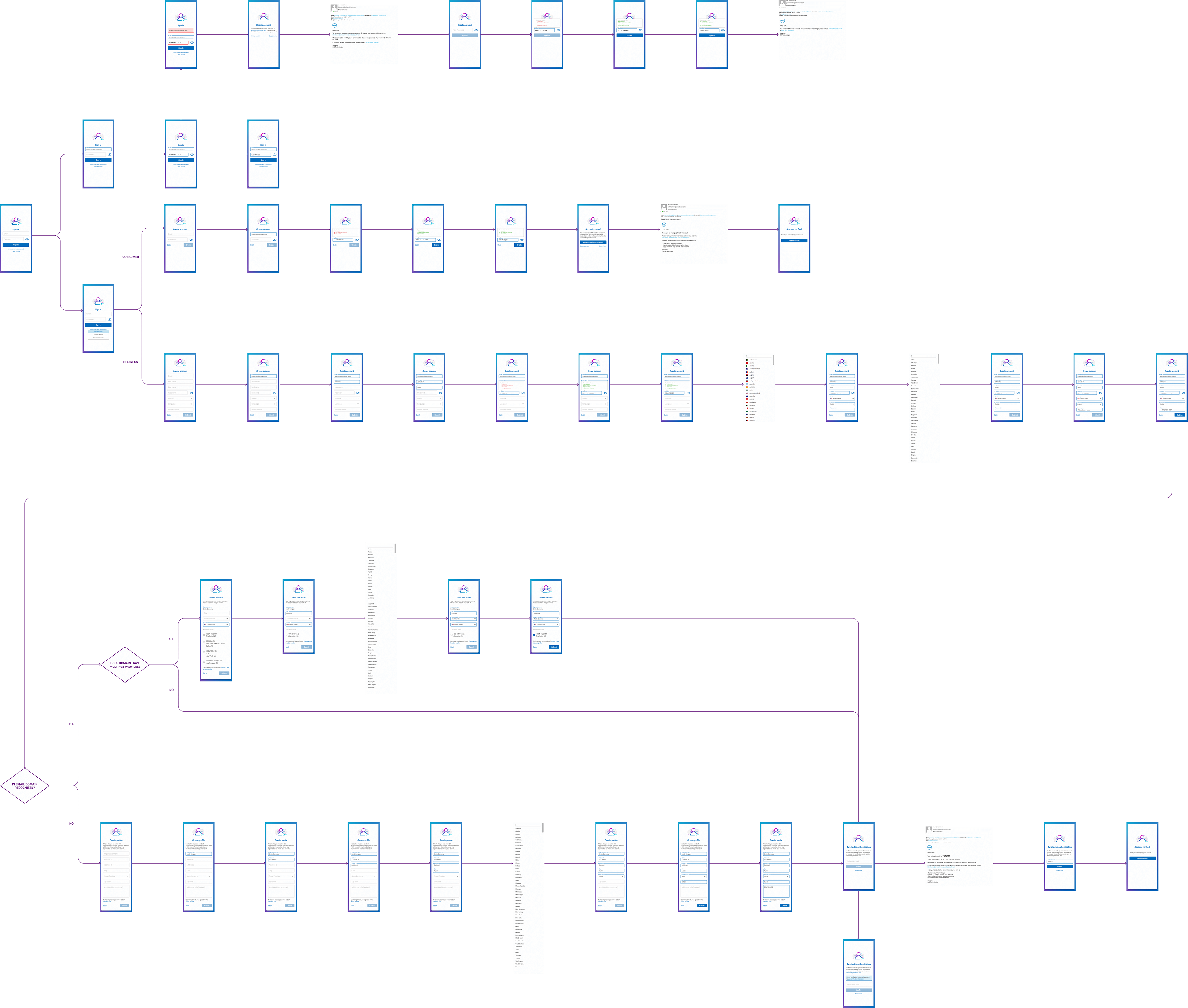
Full user journey displayed (above)