ROLE: UX Research, UX Strategist, Usability Testing, Product Owner
Client Profile:
International Fortune 500 Hospitality and Tourism company based in Central Florida
Context:
The client welcomes millions of guests a year to experience a magical and fantastical weekend. However, many guests motivations of travel a variety of ways and for different reasons. Our client specializes promoting and planning the hotel venue spaces for large group travel and corporate engagements. With modern tools, the proposals serve as a digital brochure equivalent to entice users on the many luxuries available to them during their stay including dining, entertainment and attractions. The microsites needed more features and functionality to set greater expectations, allow users to enter in transaction flows on activities they desire and most importantly assistance with orientation. One of the main issues our client's guests have is learning their way around a geographically enormous location. The product needs to provide guests with assurance, orientation, ability to transact and most importantly, a sense of excitement that awaits them at their destination.
Objective:
To make upgrades to an existing custom-built web application/software to export entered data into microsites and proposals, as opposed to PDF documents and brochures, to sell lucrative contracts and lifetime experiences.
Restrictions:
The custom built nature of the web application could not allow for 'sexy' UI. With every upgrade in functionality and features, the goal was that it had to be practical and efficient. As this was a long-time partnership, the company had the pleasure of building the first version of this application and now are faced with outdated code which coerced us to be savvy with achieving certain updates without having to overhaul and update. Also, multiple lines of businesses used this application to handle their sales, therefore, additional evaluation effort was required to understand all client requests and how this may impact all users.
How Success Will Be Measured:
By seeing the turn-around rate for the microsites and proposals production increase, assessing if the improvements led to more signed contracts with added ticket sales and if their executives approved of the exported (client-facing) microsites to meet their strict brand identity guidelines and business expectations.
Project Scope: 1 year
Web Application/Software
Tools:
Confluence, Atlassian, JIRA, AirTable,
UNDERSTANDING THE PROBLEM
What is Known
Since initially launching this web application tool for the client years ago, the dedicated team has focused on reiterations to further improve the capabilities of the system to better serve the users and their respective roles and lines of businesses as they evolve. Through speaking with the stakeholders and users themselves, we learned that there were requests to add and improve the system's user-friendliness and functionality that would prepare it to align with upcoming changes to their internal operations.
What I Need to Find Out
What changes were each line of business expecting internally, study how each line business currently operates and interacts with the application in order to get their job done and gather insights to pain points
How I Found Out
When I joined the team, there was a backlog of ideas and suggestions that needed prioritization and context, therefore, the work began with an on-site user observations day to gather insight in person.
on-site user observations
Plan:
User Profile: To meet two agents (group user role and group admin role) from each line of business that relies on the application for their daily operations as well as our stakeholder who holds the super admin role.
Format: Very informal and observational. I was to sit with each user and ask them to walk me through their 3 most common workflows and their thoughts aloud, this way, I could take notes. Intervals: 30 minutes per user.
Goal: To document their user journeys, the questions they had, department-specific needs and wants, interesting input they provided, assess the priority value (in relation to the impact level of their work) of the list of improvements we had in the sprint, and friction points that they came across. All existing and new backlog features and functionalities would be reprioritized and road mapped for sprint purposes.
Role: As I understood the user needs and business goals, I was able to oversee all moving parts of the project by managing the Kanban board by applying agile methodologies as updates made its way through design and development.
RESEARCH INSIGHTS
Learnings:
1) Many agents feel they create similar contracts, therefore, to speed up the process, they prefer to clone or duplicate an existing proposal as opposed to starting a new one within their dashboard
2) The exported microsites needed to be more useful for users once they were on-property not just useful for absorbing itinerary information prior to arrival
3) The department agents felt they wanted to add more branding and visuals to align with their marketing and branding standards to inspire guests more for their visit
4) Specific agents wanted more opportunities to upsell via more call-to-actions (CTAs)
Paint Points:
1) Previously, the agents were placing tedious effort in building itineraries individually which posed no issues for short-term visits, including data points such as event room, location, time, event type etc. However, for very eventful week long stays or longer, they wished there was a more efficient way
2) In hoping to upsell more, the agents lacked methods to add urgency messaging to encourage sales. All content was standardized and they wanted additional styling flexibility in the exported layout.
3) In the creation of a proposal, certain input fields had inconvenient glitches with their output and considered more of a nuisance than actual
4) Limitations within the search bar within a user's 'My Sites' repository. When teams of agents work as quickly as preparing a proposal in 15 minutes, the dashboards start getting crowded and it becomes cumbersome to find specific proposals.
5) Agents wanted more opportunities to upsell via more call-to-actions (CTAs)
UX PROPOSED SOLUTIONS
Below, I outlined and explained each major feature/functionality that was determined to improve all department user experiences two-fold, alleviate their workload, shift the focus towards the business goals and success KPIs.
1) Event Visualizer
2) Dashboard UX/UI improvements
3) Agenda Builder Excel Upload
4) Additional role permissions
5) Microsite and Proposal layout and content models expansion
6) Additional CTAs and logic
Agenda building Improvements
Since our initial release, agents expressed that what once took them 1 hour to create proposals from receiving that initial noticed from sales managers via e-mail, now takes them 15minutes. It was obvious to me from our observation sessions that users speed through data entry and any nuisance would interfere with their end goal, creating a microsite. As updates and new additions features and functionality were implemented, it required me to make functional requirement changes to multiple roles.
Some of the UI changes that were implemented of valuable impact through discussions with the stakeholders include:
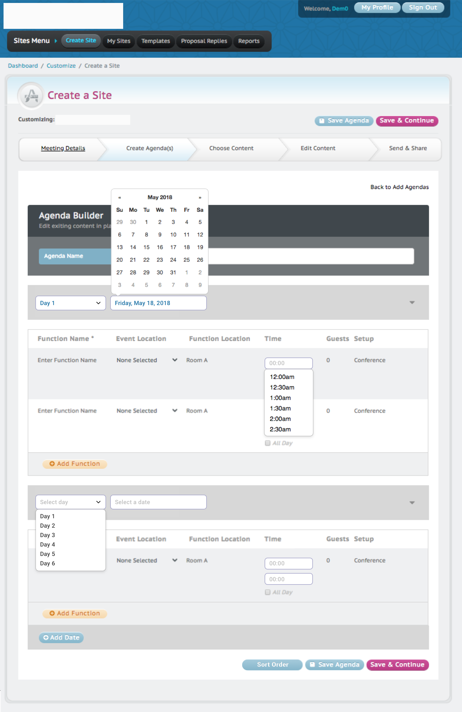
-An updated calendar dropdown layout, which previously was a manual entry
-The time field was converted into a dropdown, which previously was 2 fields with a dropdown of numbers accompanied by an AM/PM dropdown. Per user request, they still wanted the field to be editable even after making a selection
-A duplication functionality was available but only visible once the user's cursor hovers over a specific agenda entry. It was expressed that for redundant agendas, the duplicate functionality was phenomenal. This feature was made a more permanent and visible and placed next to 'Add Function'
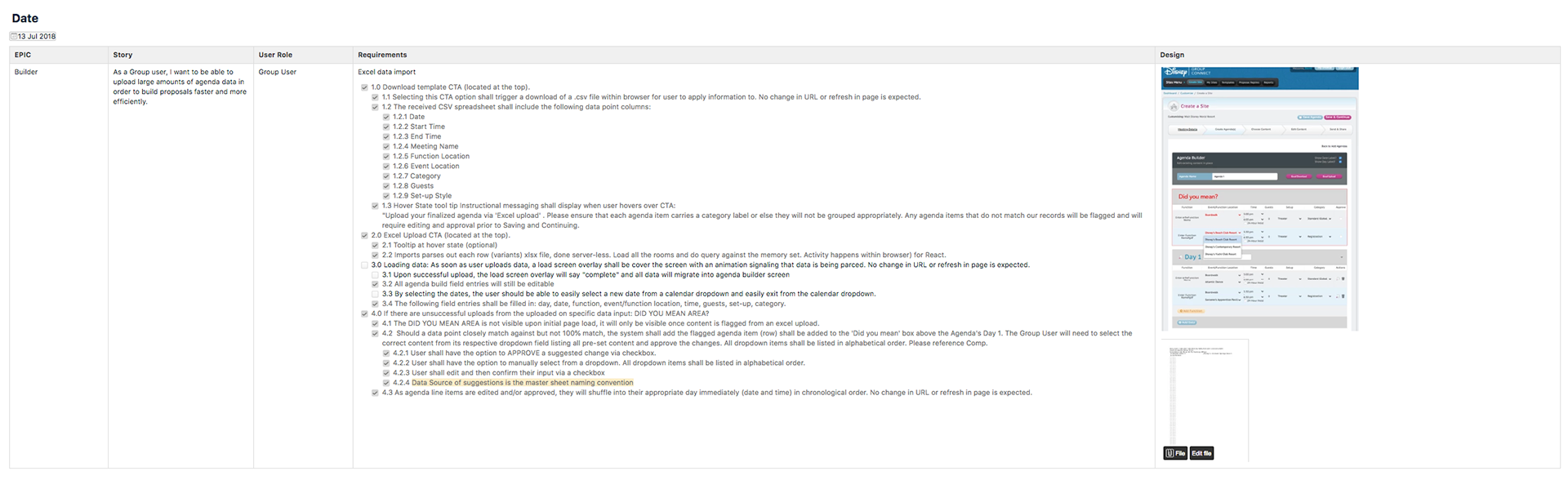
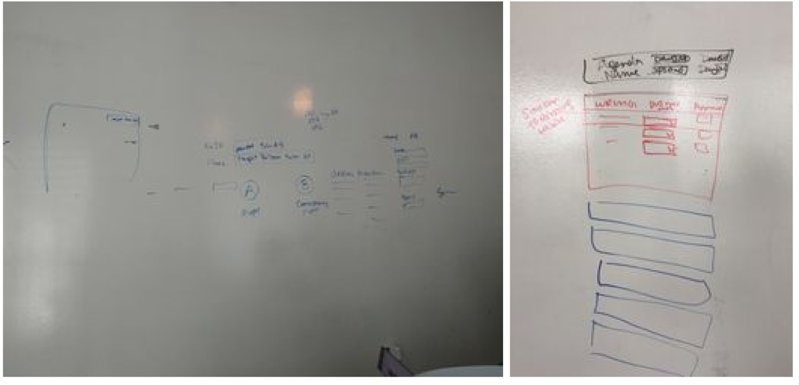
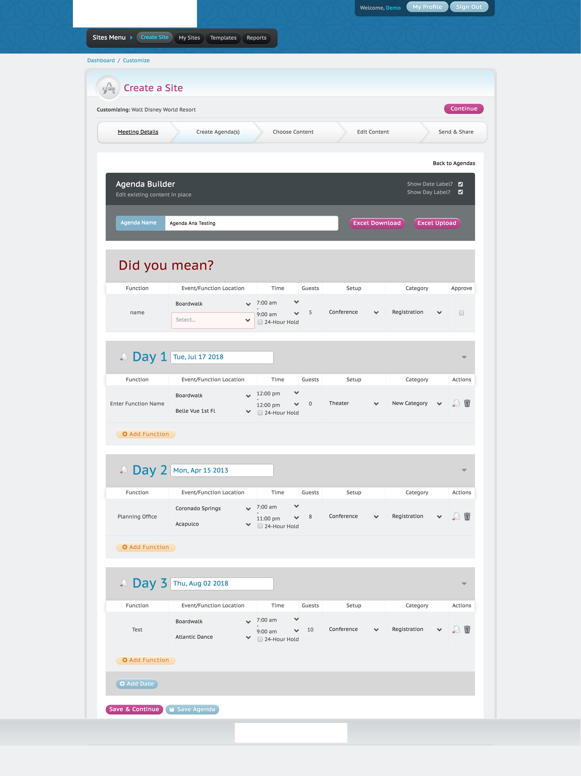
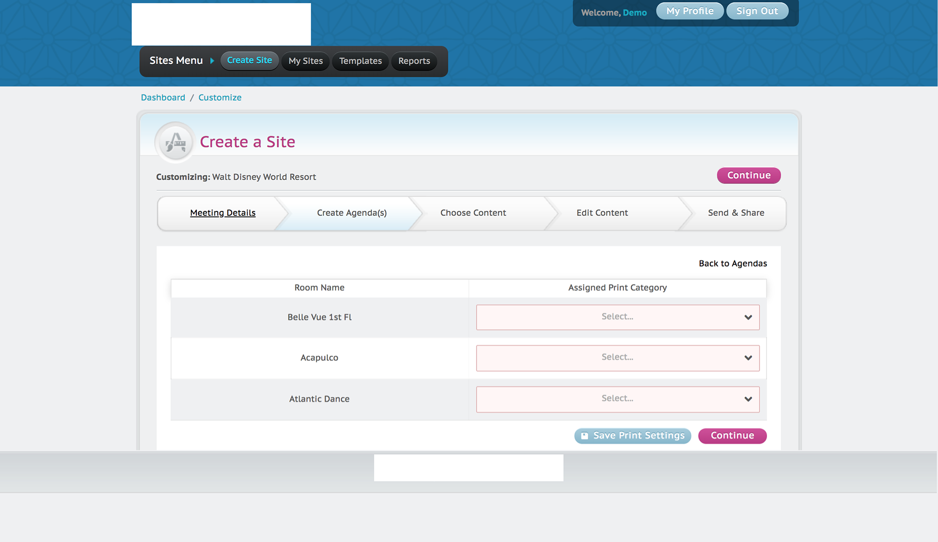
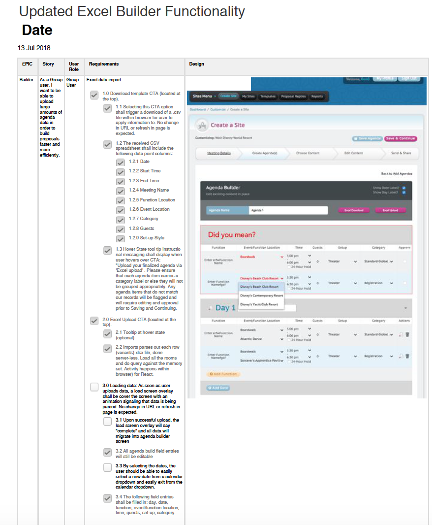
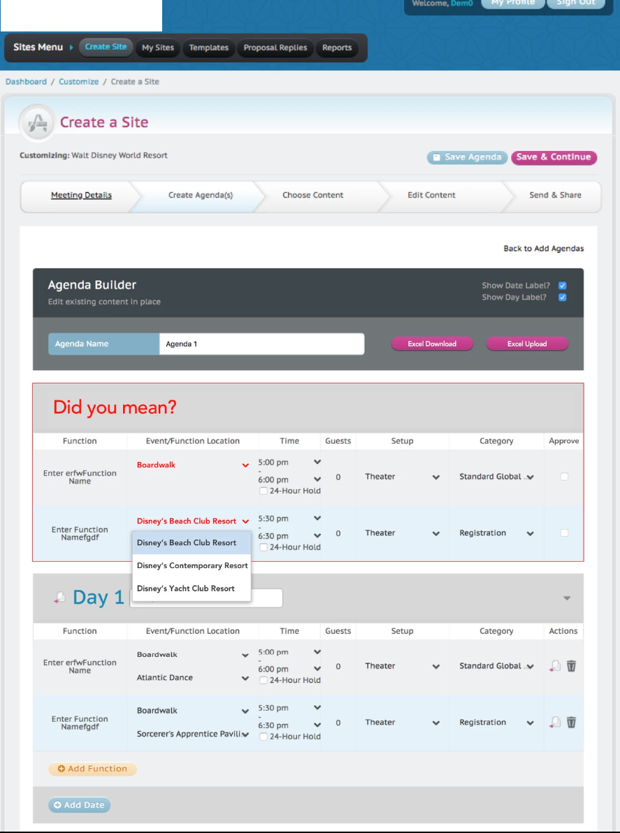
-The most prominent feature that was ALMOST removed from the priority board completely (until user observation sessions overturned it), was the Excel upload feature. Previously, it didn't function at all and wasn't aligning with the Business's internal documents. Along with the development team, we provided an 'Upload' CTA and a 'Download Template' CTA, allowing users to download a csv template with the data points already assigned. All users needed to do was copy and paste their information into the pre-set format, making the agenda building upload process a breeze. What used to ultimately take 15-20 minutes (min) to simply build an agenda was reduced to a 5 minute process of users filling out the csv file. The logic behind this was very complex, but after discussions with the Dev the most efficient way to build this was to create a standard master list (managed by the Super Admin) to compare all data users were entering to ensure that all naming conventions are consistent. This drew my idea to create a unique error box at the top of the page flagging all agenda items that were not mismatched against the any data point (event location, function name etc). This way, users can edit all flagged items in bulk, make edits and continue with microsite and proposal building.

Event Visualizer
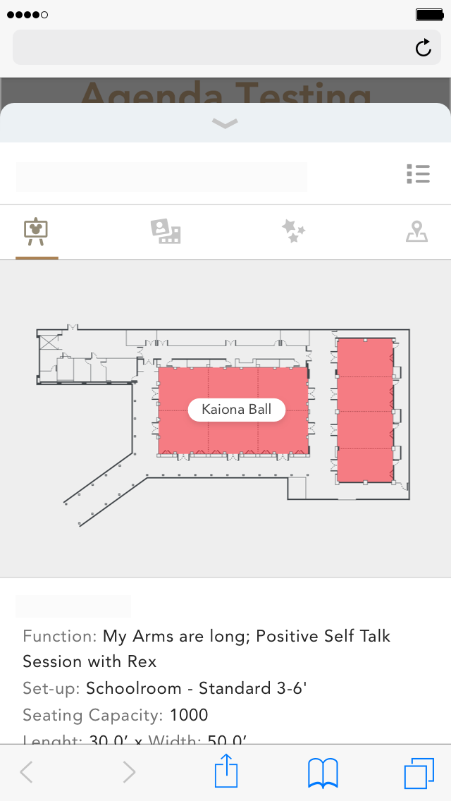
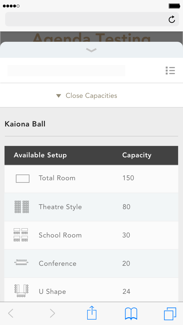
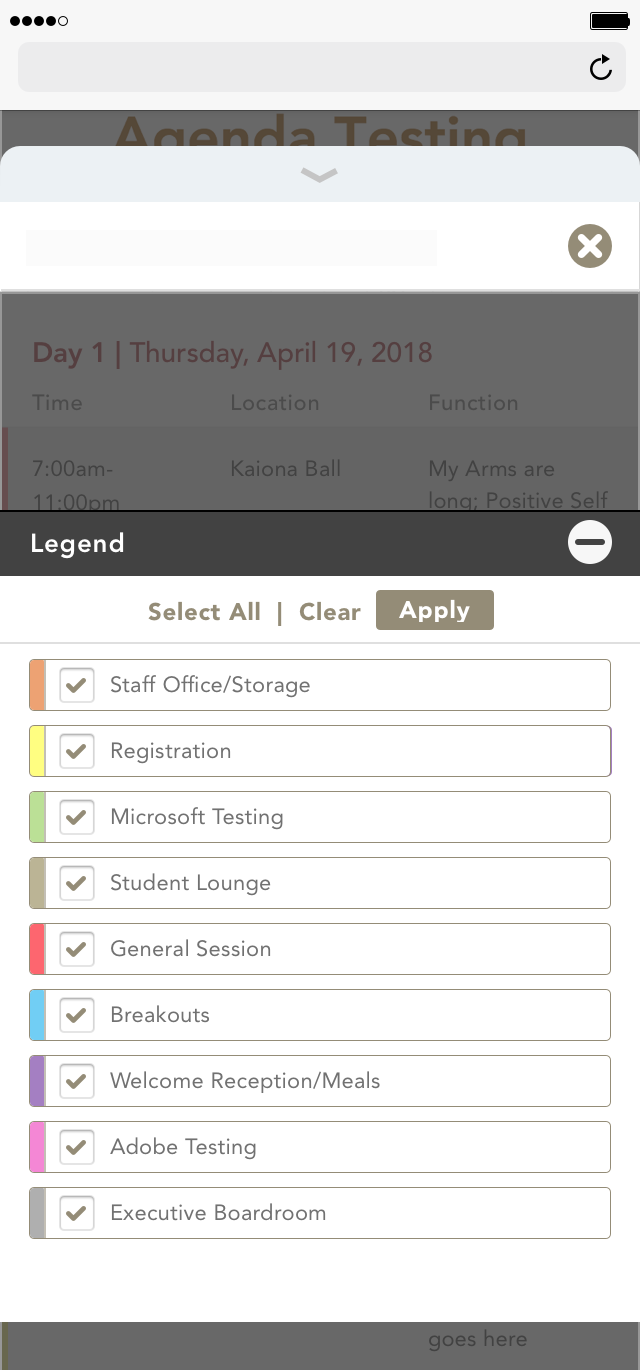
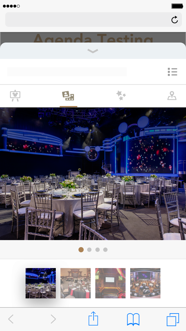
The Event Visualizer was an idea that was settled on after the client asked for an extension to the microsites and proposals to serve as an interactive agenda. It would display a filterable and categorized agenda with event specs, media galleries and maps. This solution was meant to engage users with their itinerary as well as equip users with the information on where to go and when, what to expect and build confidence that they can make their way around.
Although, the designer took care of the UI and the layout, I made the recommendations on what content from the collected and available data points within the application that would be valuable for a user that has never been to the destination and is unfamiliar with what the venue. The client and I had in mind that this would be useful in a mobile scenario where the user is already on-site and actively transitioning from one event to the next. All priority content was made visible and placed in the forefront will second-tier content such as the venue specs. In cases where the itineraries are extensive, the filter and sorting options give the users the power to cut directly to an intended event rather than leisurely browse. To add to the mobility, the event visualizer was built to be exportable in case the user wished to carry a physical copy of all the information.
User Entry point: The Agenda from the microsites
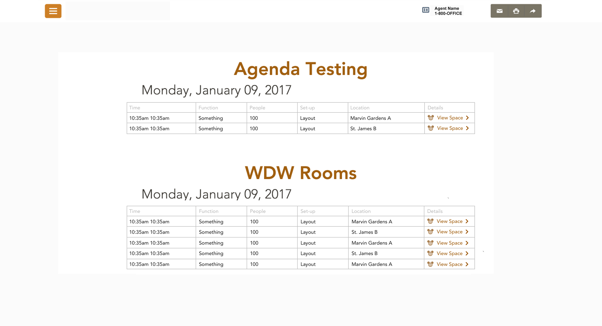

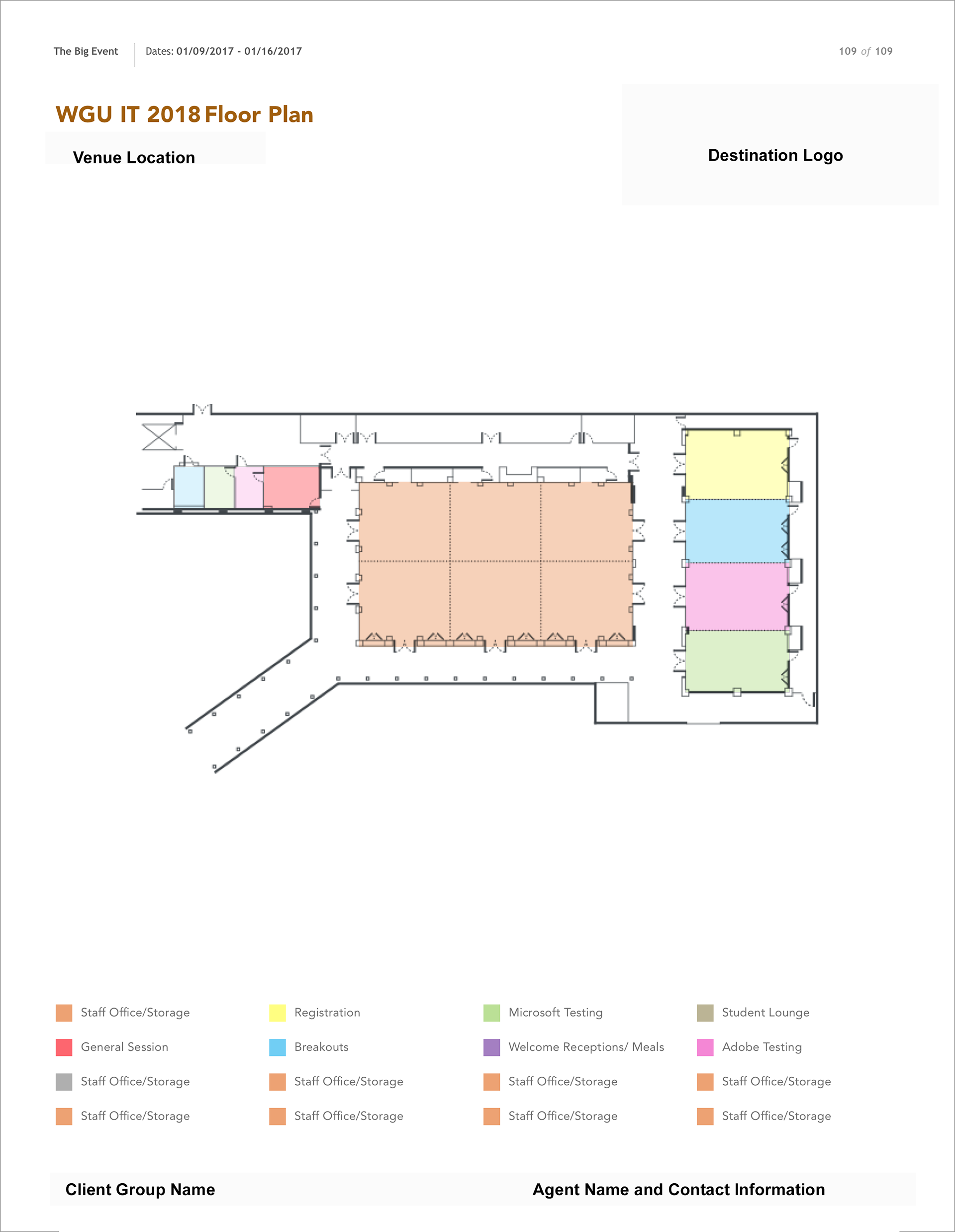
Above: Desktop and Mobile version of the Agenda on the microsites. Through selection of the CTAs, the user will be guided to the Event visualizer.

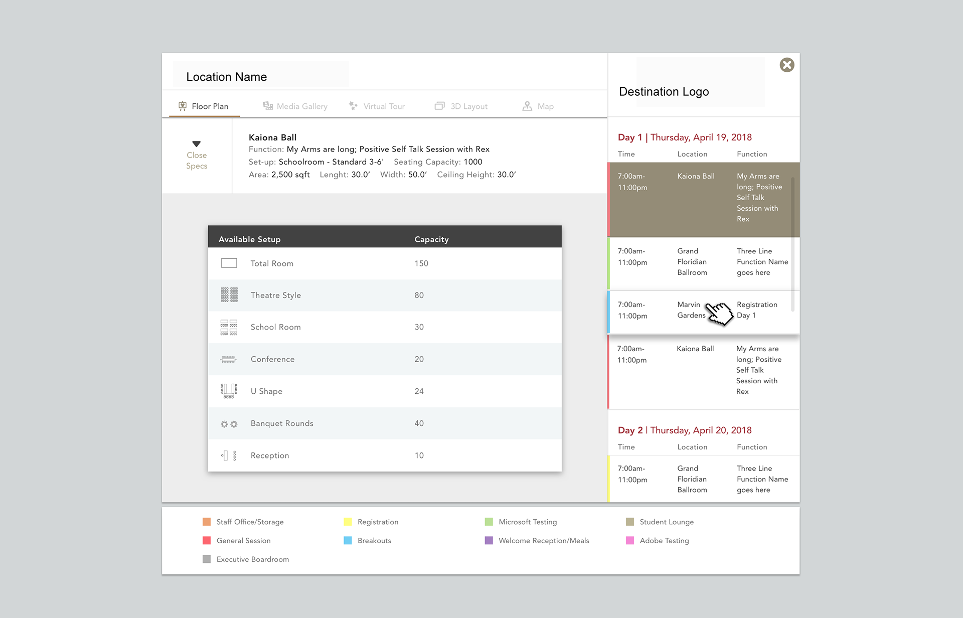


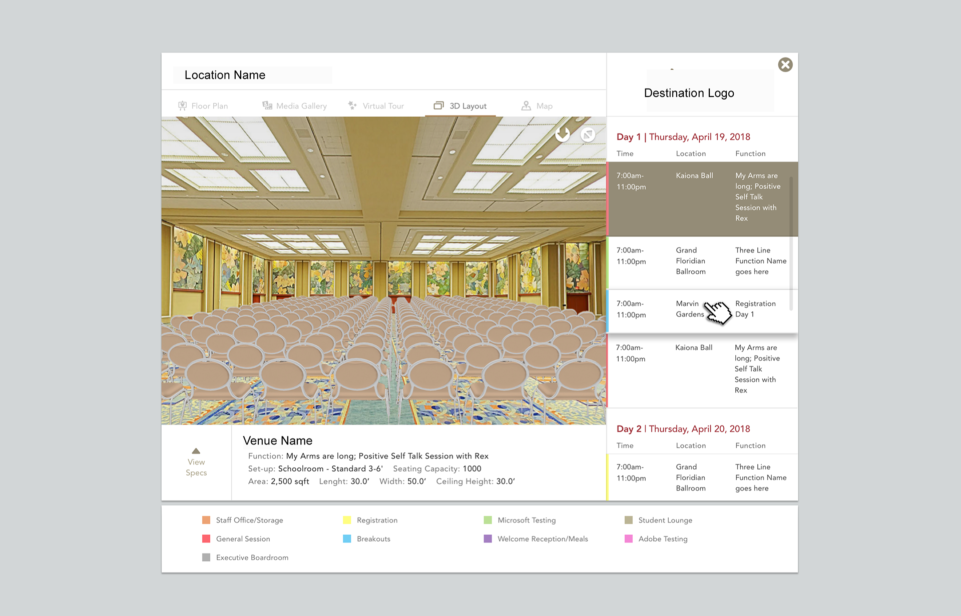
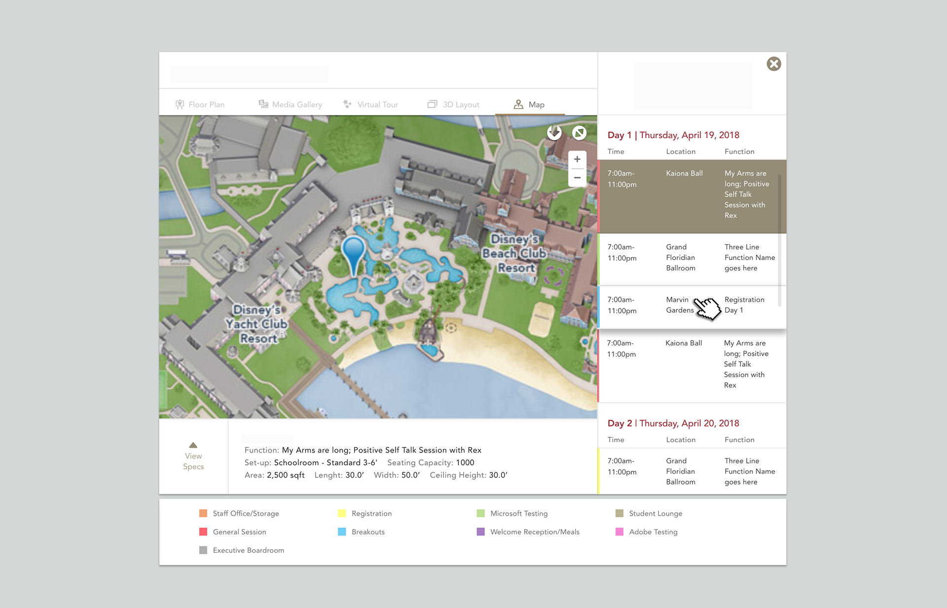
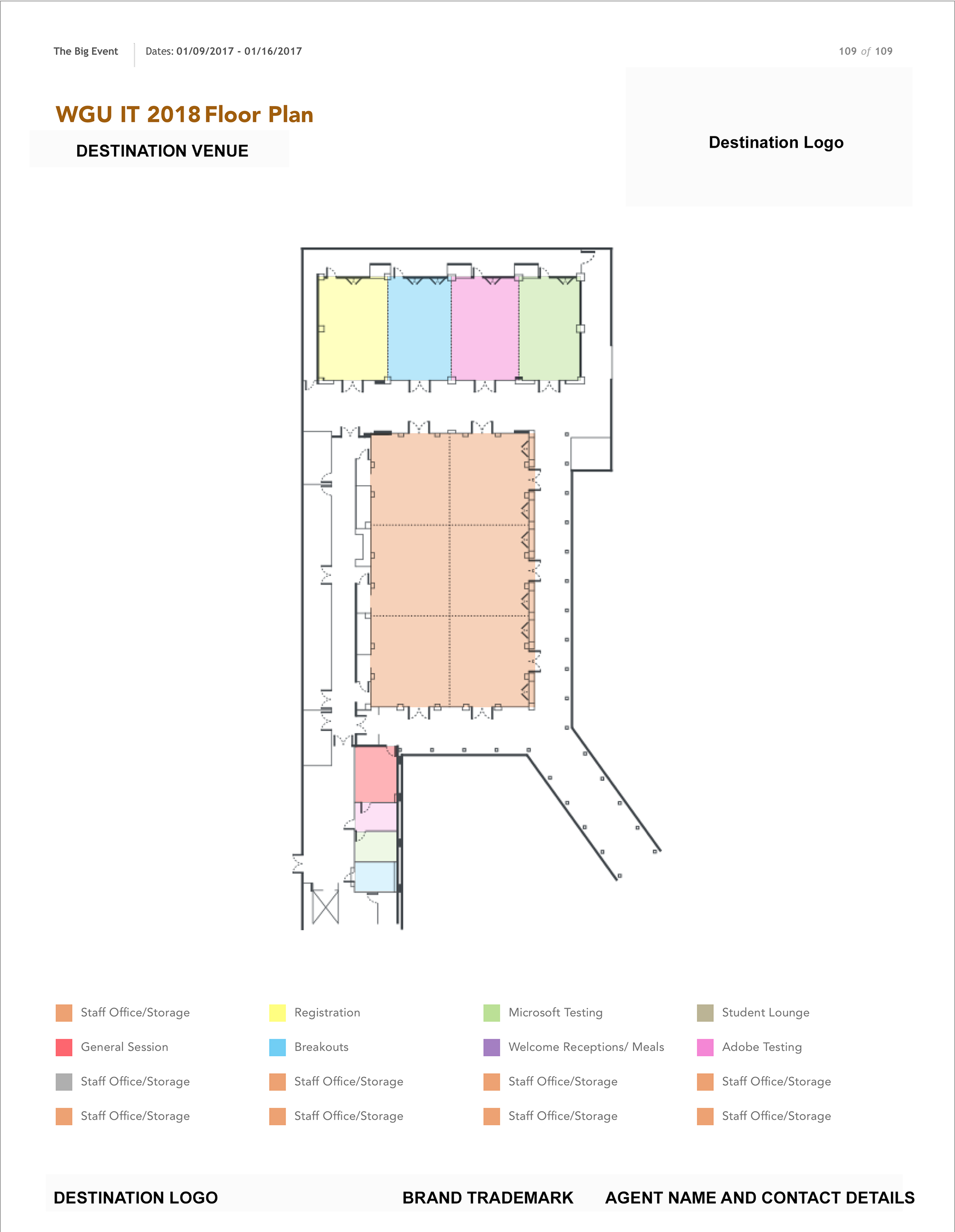
Above: Desktop view of the Event Visualizer

Above: Mobile view of the event visualizer. On the mobile version, the event visualizer will transition upwards and overlap the agenda page as an overlay allowing the user transition back to their microsite (the main hub)
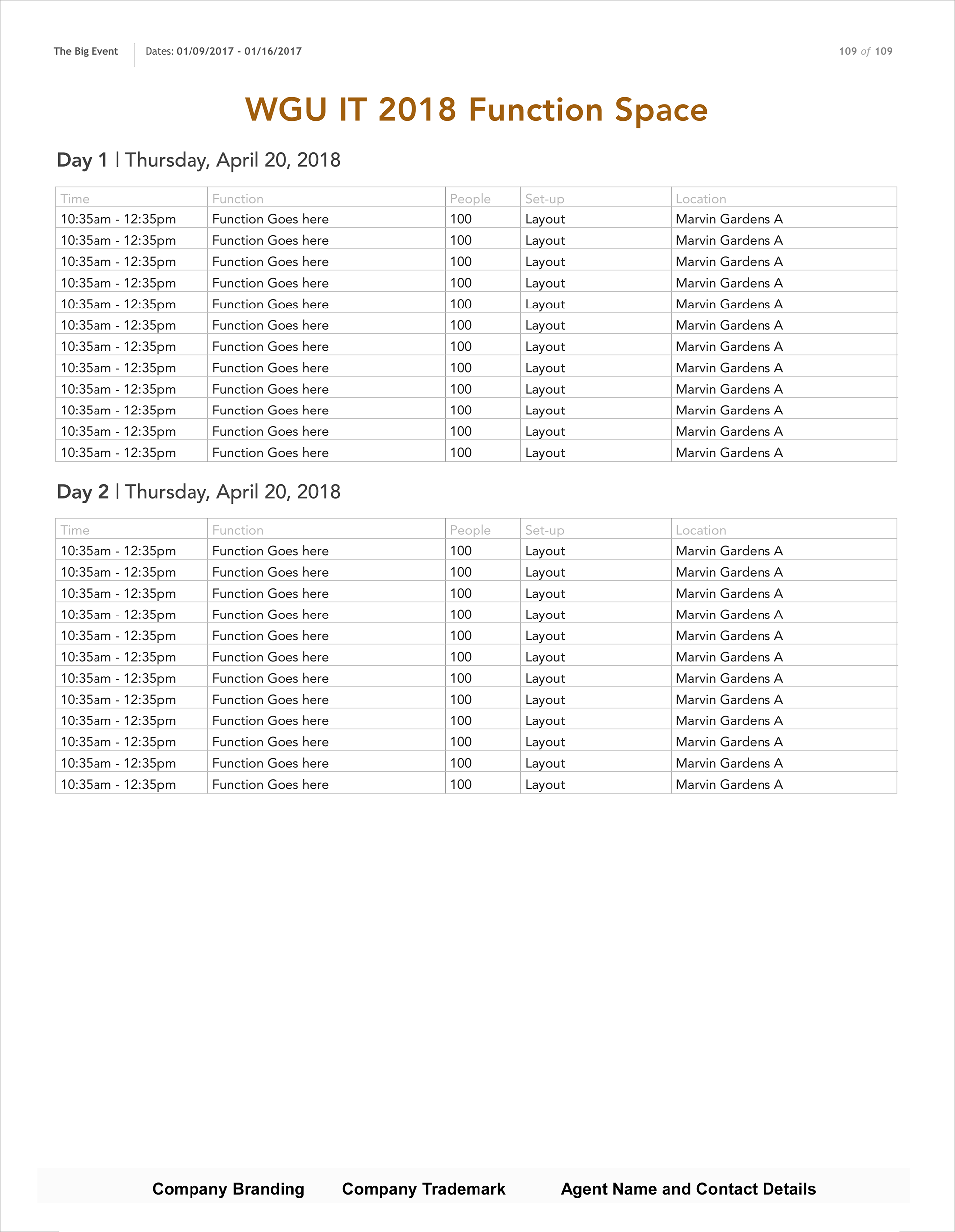
Above: Images of the exported view of the event visualizer
microsite and proposal layout expansion
Under 'Choose Content' and 'Edit Content' tabs of the 'Create a Site' workflow, users can create the content that appears within the microsites and proposals through mere selection of content widgets predetermined by the Super Admin. Unfortunately, as each line of business wanted to stand out to their audience, the variety is content widgets needed to expand with more flexibility in the WYSIWYG editor. This, of course, made the Super Admin role feel threatened to lose control, however, through discussions, our team was able to assure him that he can set standards through the master templates and he would be able to oversee and manage the content (such as creative) available via the Media Manager.
Most of the final results effort here was led by Design, however, I was able to poke holes and ask questions on the strategy of sustainability and scaling of the platform without allowing users (agents) to create too many variations for the sake of documenting everything within the functional requirements. My goal was to ensure consistent branding standards and document the expected functionality and limitations within the functional requirements.

Call to actions and banners
CTAs
Initially, the request to add CTAs within the Navigation came from one line of Business but it applied well with the pending overall client goal to upsell on incentives for guests to add to their itineraries during their stay. The back-end logic was the most difficult part to coordinate because the end-user guest would be graciously offered a special pricing during a limited time therefore the algorithm required: date frames of the availability of the pricing, ticket models (based on ticket type), an active destination URL, the enabling and disabling of the CTA etc.
This addition included a whole section of fields within get creation of a microsite which did add more steps for the user to fill in, and in turn, adding more approvals for the admin prior to activating the URL to the public. The drafting of the transaction workflow, that would happen off-platform, was another hurdle to consider. There was pressure to ensure that the expectation was clearly set to the user experience without creating confusion, yet, still placing urgency and momentum to encourage ticket sales for Parks, Events and Sporting Events.
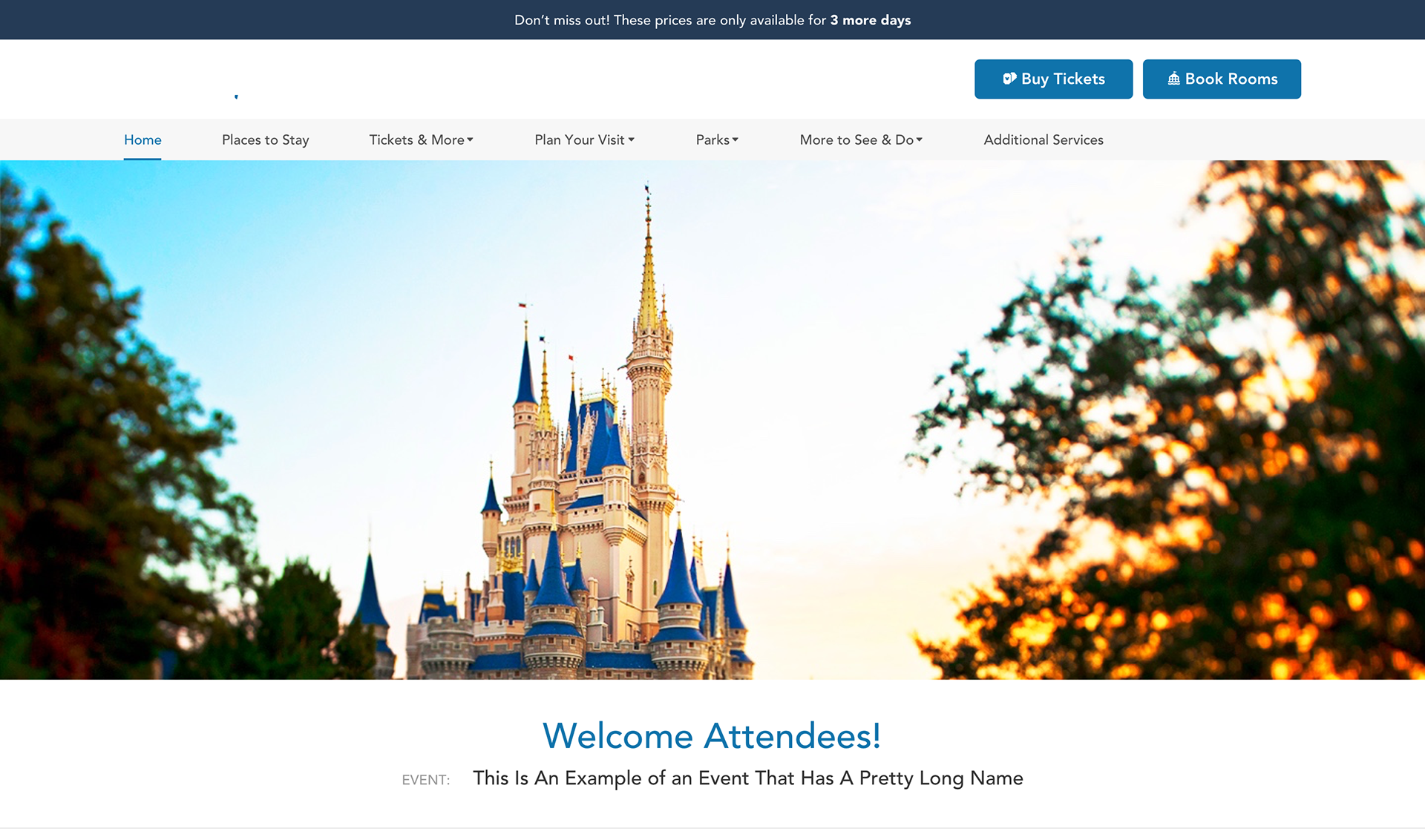
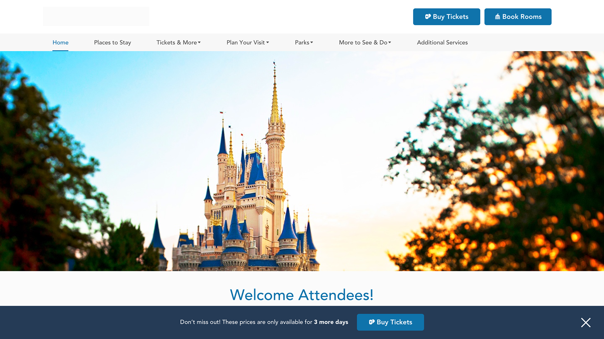
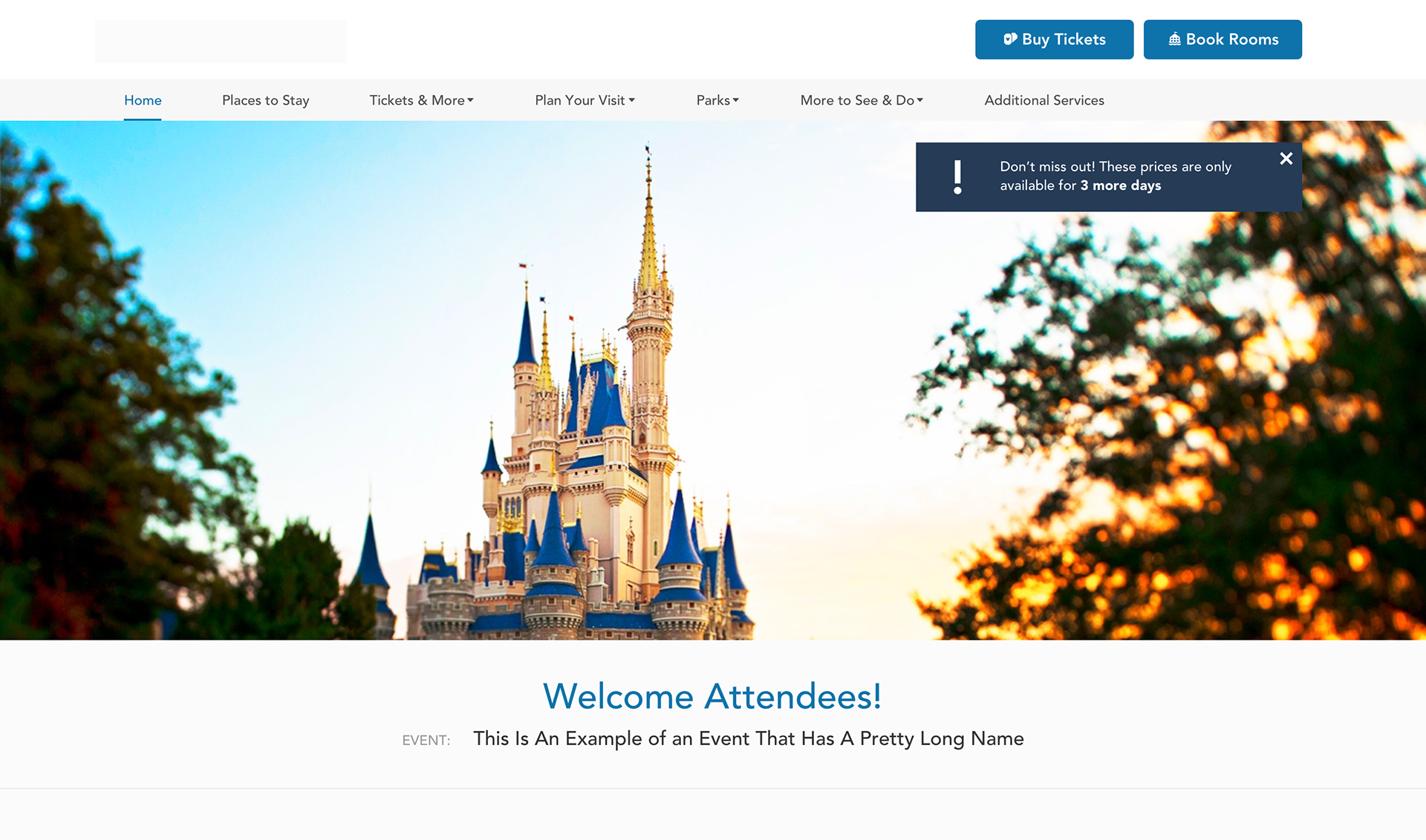
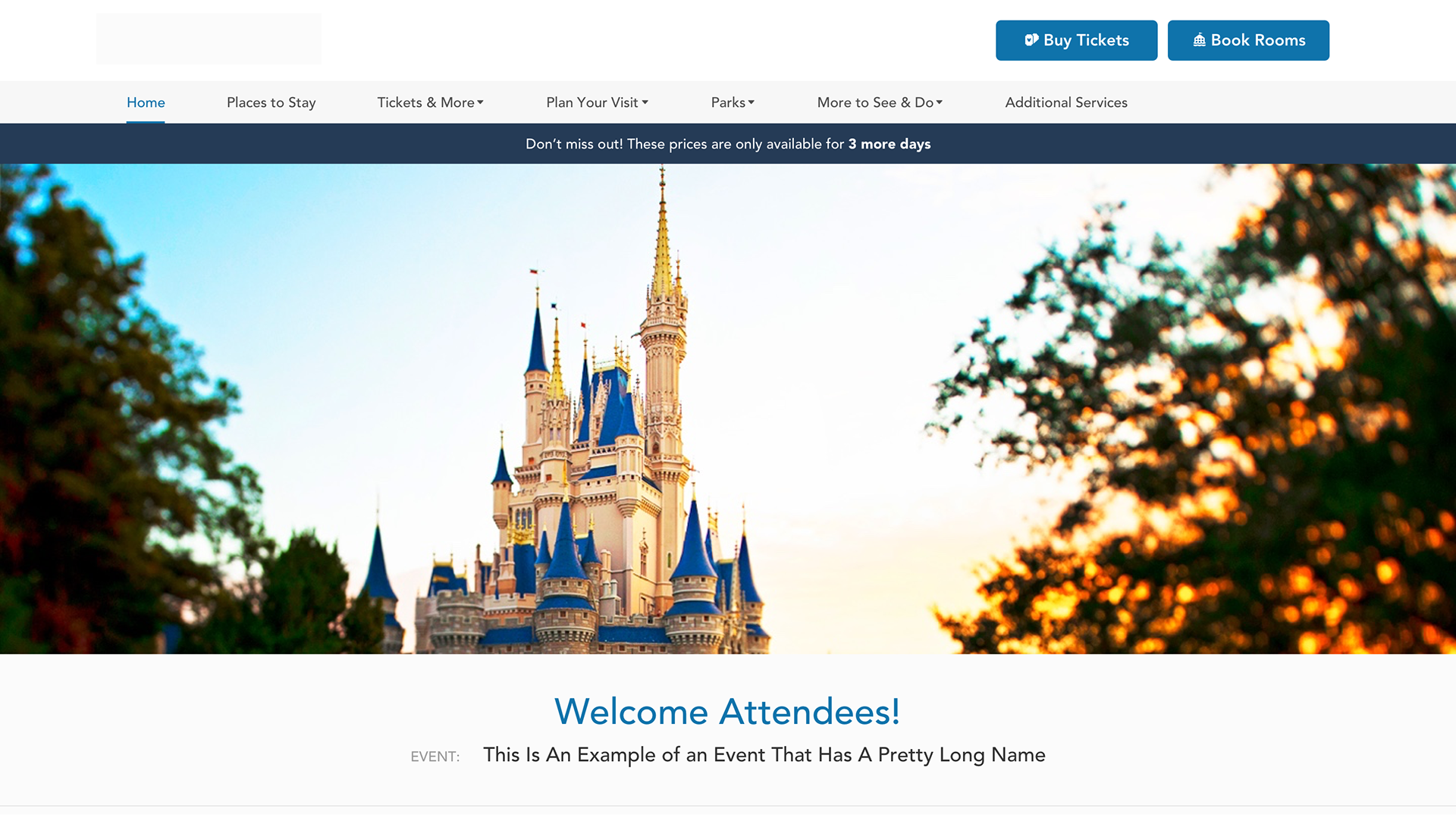
Banners
The client expressed that the current layout of the microsites did not provide enough emphasis on the ticket sales CTA and proposed that we add urgency messaging that stood out (a business goal). After some discussions, I proposed a banner that could provide this opportunity to highlight an offer or a marketing message. Although the designer, took care of the banner's placement and style, I had long discussions with the client to set the strategy, purpose and use case for the banner.
Client Requests:
-Styling and Formatting preferences on the copy
-A call-to-action
-On-brand Animation
-Strong Visibility
Caveats:
-Typically banners only promote one concept or marketing message at a time, therefore, I encouraged the client to assess which ticket type was most valuable to dedicate the urgency banner too. Also, the in-banner CTA could only carry one destination URL therefore, it had to be narrowed down.
-The animation and the CTA needed to be visually balanced but the intended action for the user had to be clear: purchasing
-I was against promoting urgency messaging for too long, there should be a dedicated window of time where it should serve as effective without desensitizing the user. Also, with GRPR rules taking effect globally, there were restrictions on methods to control when/what content a user has seen.
-Desensitization over time would be counter-productive when creating urgency
Solutions:
- A WYSIWYG editor was provided for Styling and Formatting purposes. This would assist with abiding by branding and trademark standards.
-To prevent overexposure on the banner, I explained to the client that without tracking cookies there are simply just 'alternative hacks' available that would allow the browser to identify whether the user has already sent he banner. The session could be marked, however, the user has the ability to refresh the page and it would reset, forgetting the user's info. I suggested that the client regroup with his compliance team to provide us with guidance especially since the travel destinations were located in different states (FL and CA) and each had unique legislation on data collection. Luckily, we got approval, but it was healthy discussion to consider a notice of data collection and allow wiggle room in the timeline to address this. Also, an 'X' to exit out of the banner was added in case the user chose not to see the promotion at the time.
-Urgency messaging and promotions are very time-sensitive, therefore, the copy must align. I documented that the Super Admin role could create a gallery of copy options for different time frames, that the agent users could select one and apply it as the event date closes in. Via short-code this is possible. Also, within the web application, I pitched a dropdown where the agent could set the banner to enable (30, 60 days out).
The evolution of Design Mock-ups are displayed below:


Functional requirements & QA
On this project, I was required to work alongside, the developer to ensure that the requirements I documented reflected all discussions between the internal team and the client. As agile as we functioned, I managed all functional requirements iteratively to ensure the documentation of all agreed solutions. My documentation also served dual purpose for QA once all updates made its way to lower environments. My documentation was a point of referral for notes on approved acceptance criteria to ensure we built and launched the right product.