

ROLE: ux strategist, UX DESIGNER
Client Profile:
Since 2014, Addiction Center has been an informational web guide for those who are struggling with substance use disorders and co-occurring behavioral and mental health disorders. Addiction Center is owned by Recovery Worldwide, a national informational marketing umbrella for several addiction recovery-related properties. Addiction Center works with nationally recognized treatment facilities to provide treatment counseling, rehab placement and insurance/financial consultations for those seeking help. Addiction Center's goal is to provide addicted people and their loved ones with the information, support and resources they need to find hope and healing in recovery.
Objective:
I was tasked with solely fixing the user experience and the designs on the city and state pages. Per the client's web performance analytics, these pages were receiving low (if any) engagement seemed to be excluded in these journey. These pages were primarily found via direct organic search but hardly had an entry point internally. I needed to reformat the City and State pages in efforts to increase user engagement, prioritize sponsored content and expand content to classify the client as a reliable source of information, making it crucial for the content to be accessible.
Restrictions:
I was limited to proposing user journey recommendations and solutions only via an audit as well as re-designing the layout of the City and State pages. I was not tasked to actually work on updating the any other webpages. I was a backfill to this project and had to be operate as lean as possible to solve a user flow discrepancy.
How Success Will Be Measured:
1) Improvements in user engagement and user sessions metrics
2) Expansion in entry point opportunities (internally in the site)
Project Scope:
Desktop and Mobile Site
Tools:
Excel, Sketch, Invision
UNDERSTANDING THE PROBLEM
What is Known
The State pages are getting accessed from the homepage as well as directly from google search results. Many of the city pages went untouched and were found via direct google searches if the searches were specific enough.
What I Need to Find Out
Find and bridge the gap in the user journey that is making the City and State pages unaccessible.
How I Found Out
Through incognito browsing across multiple browsers in order to place myself in a new users's place and identify ways to find the city and state pages and attempted a few entry point strategies.
Audit Results
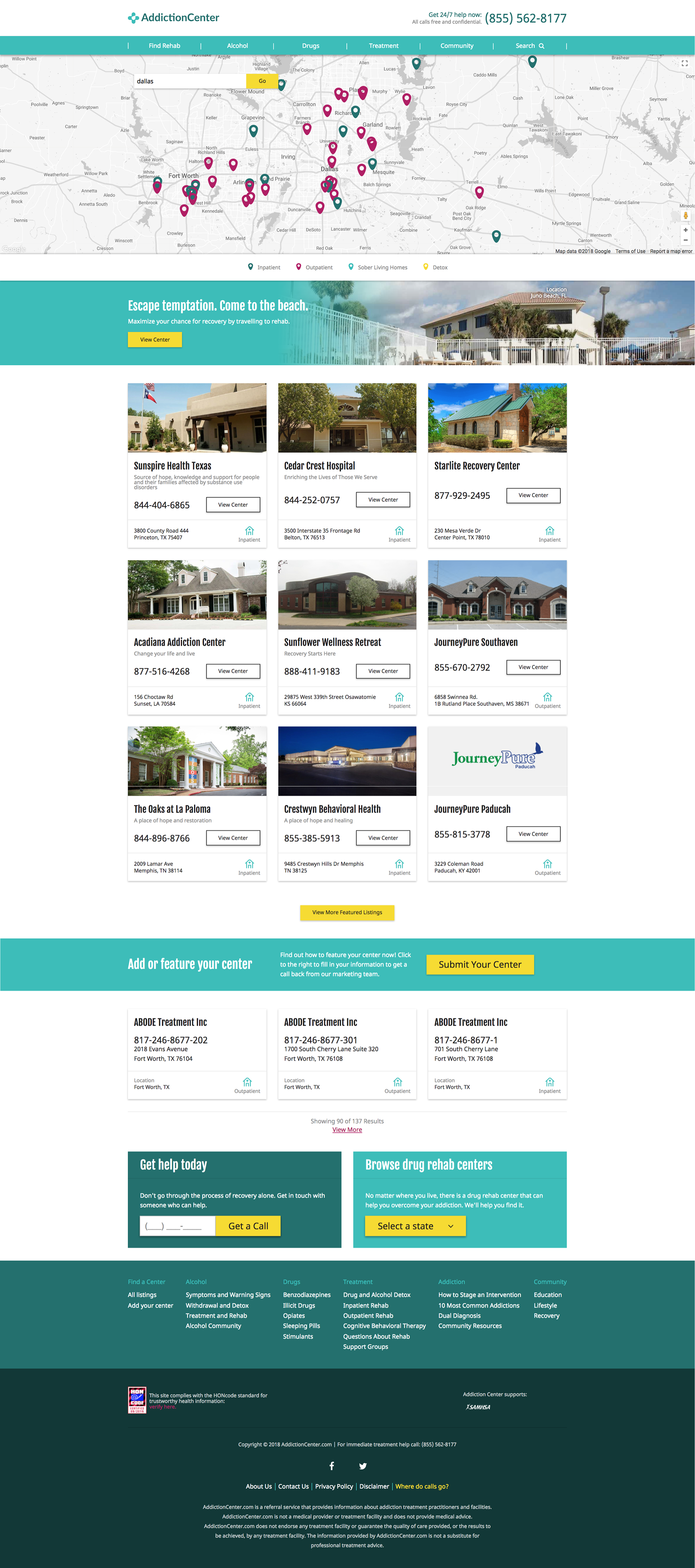
Search Results Page
- When a user either enters a zip code or city into the ‘Find Rehab’ search bar on the homepage, they are
taken to the Search results page and it is currently a dead-end. It neither directs users to the city pages or
state pages they are searching for.
taken to the Search results page and it is currently a dead-end. It neither directs users to the city pages or
state pages they are searching for.
- The map is not dynamic enough to match the content to the specific area the user is searching in and lacks filtering and sorting functionality
-The search result listings that populate are not relevant to the user's search with much logic. For example, if a user searches a specific city and or zip code listings from other cities and states populate as well.
Solutions
• Add a CTA that will lead users to nearby cities or state content pages. This will increase lengths of user
sessions, increase user engagements and maintain the users in a geographic centered journey flow.
• Add a default setting to the facilities listing cards so that they are ordered from closest to farthest in
distance. This will allow the user to tailor in on the information that is specifically in their geographic
reach.
• Make the legend interactive, this way, by selecting the icon, the user can hone in a facility type view on
the map.
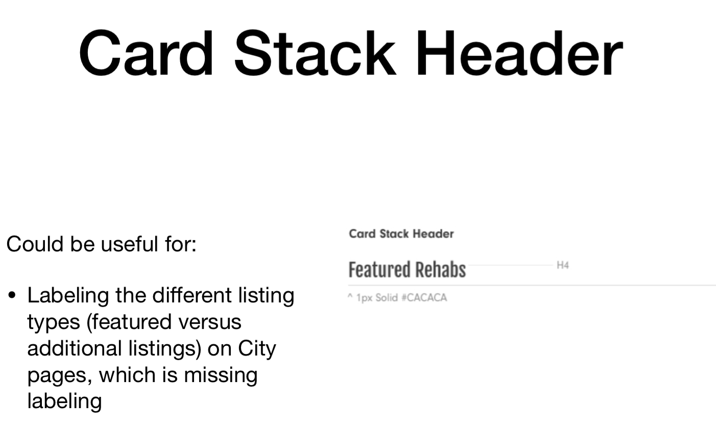
• I recommended that the client revisit the listing's tagging with their content team to ensure all content is appropriately labeled to prevent presenting unnecessary content to the user.
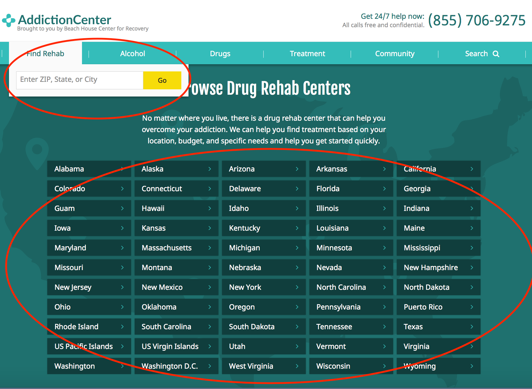
homePage
Only provides direct CTA entry points for States, no direct mention of cities, this is another limitation seen for the user.
Solutions
• Add dropdown options with listed cities on the State CTAs
• Add dropdown options with listed cities on the State CTAs
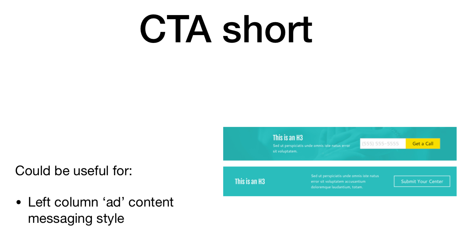
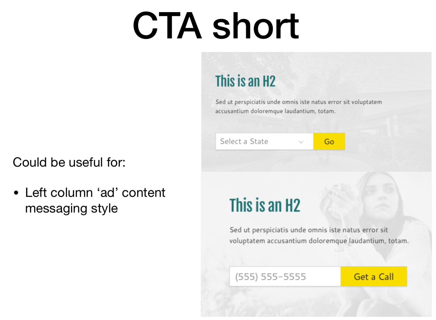
Additional UX PROPOSED SOLUTIONS
Without having to reinvent the wheel, I resorted to the client's style guide in hopes of leveraging some existing styles and functionality. To my luck, there were features and elements that were never used and I pitched using them now for the City and State templates. The clients were very fond of the idea and I was able to move forward with wireframing.


rapid WIREFRAMING
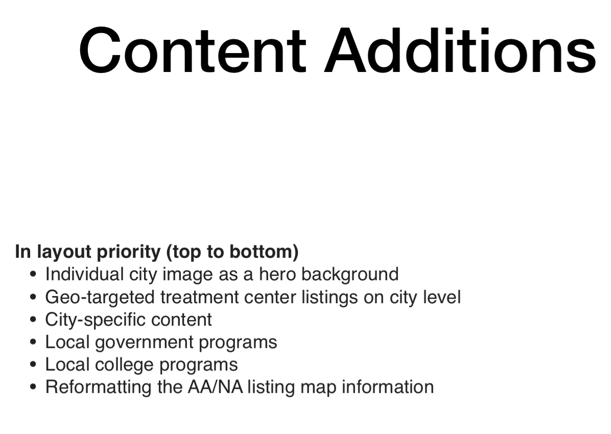
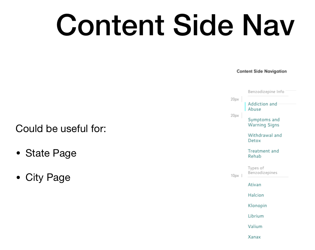
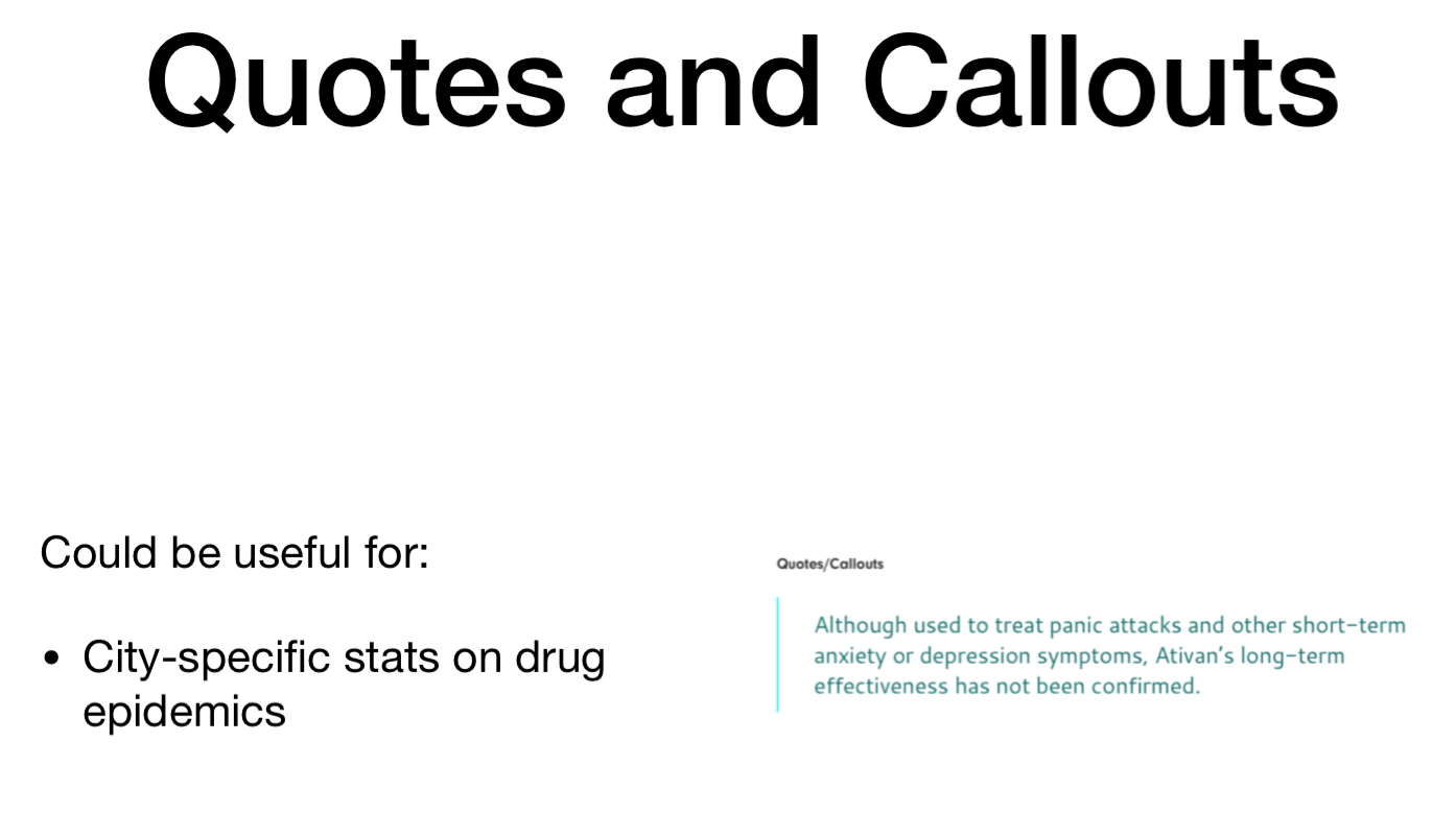
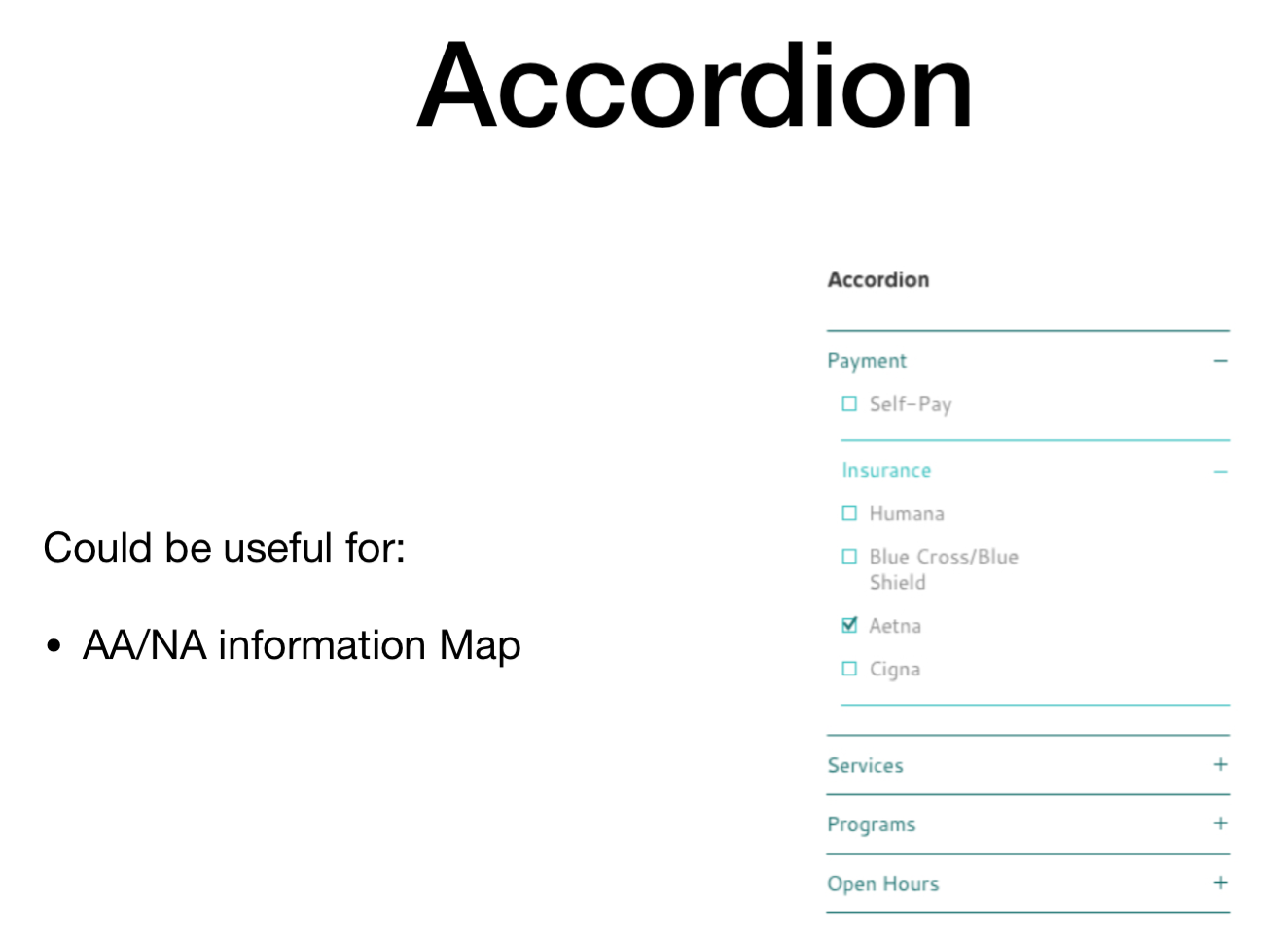
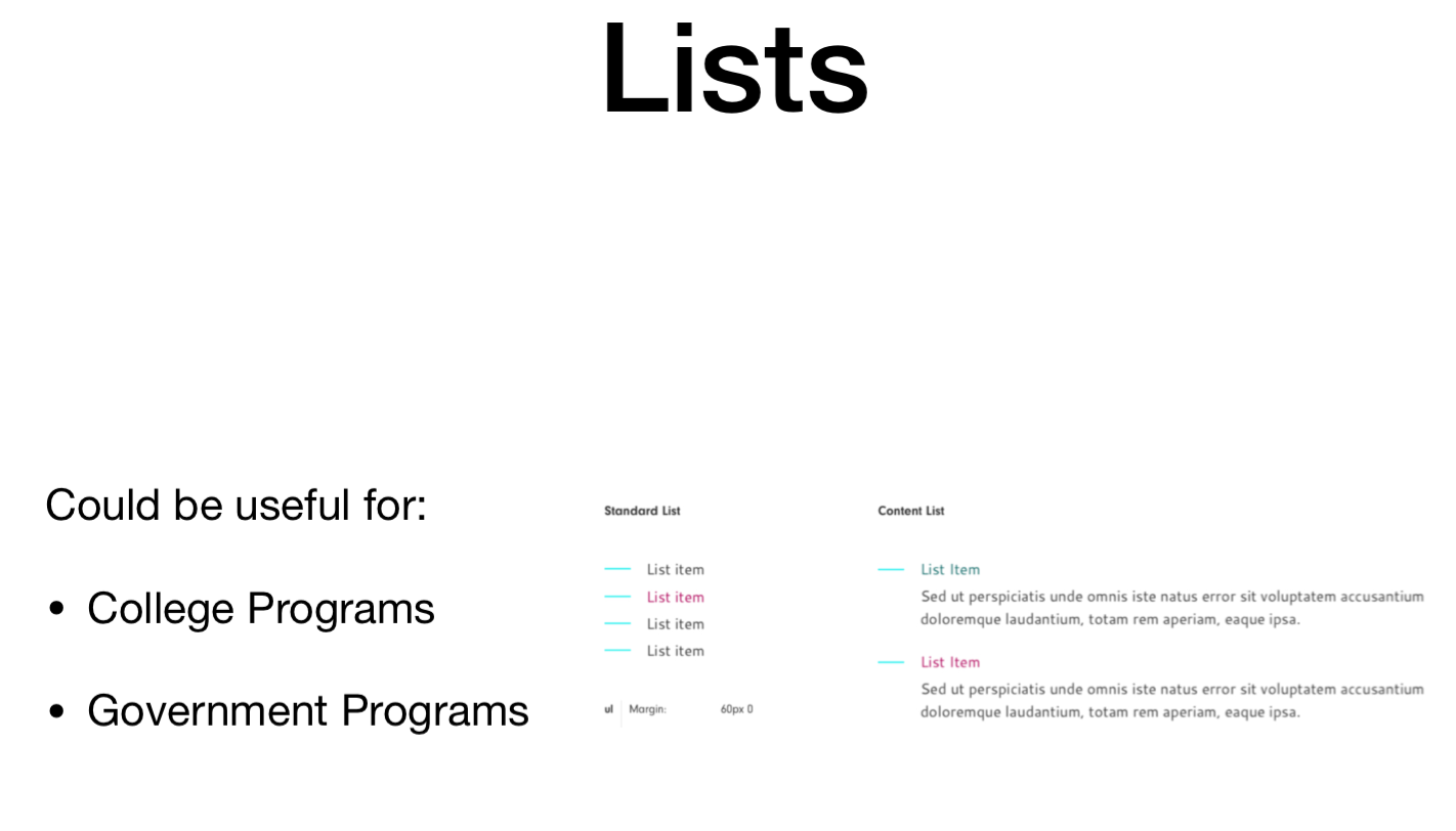
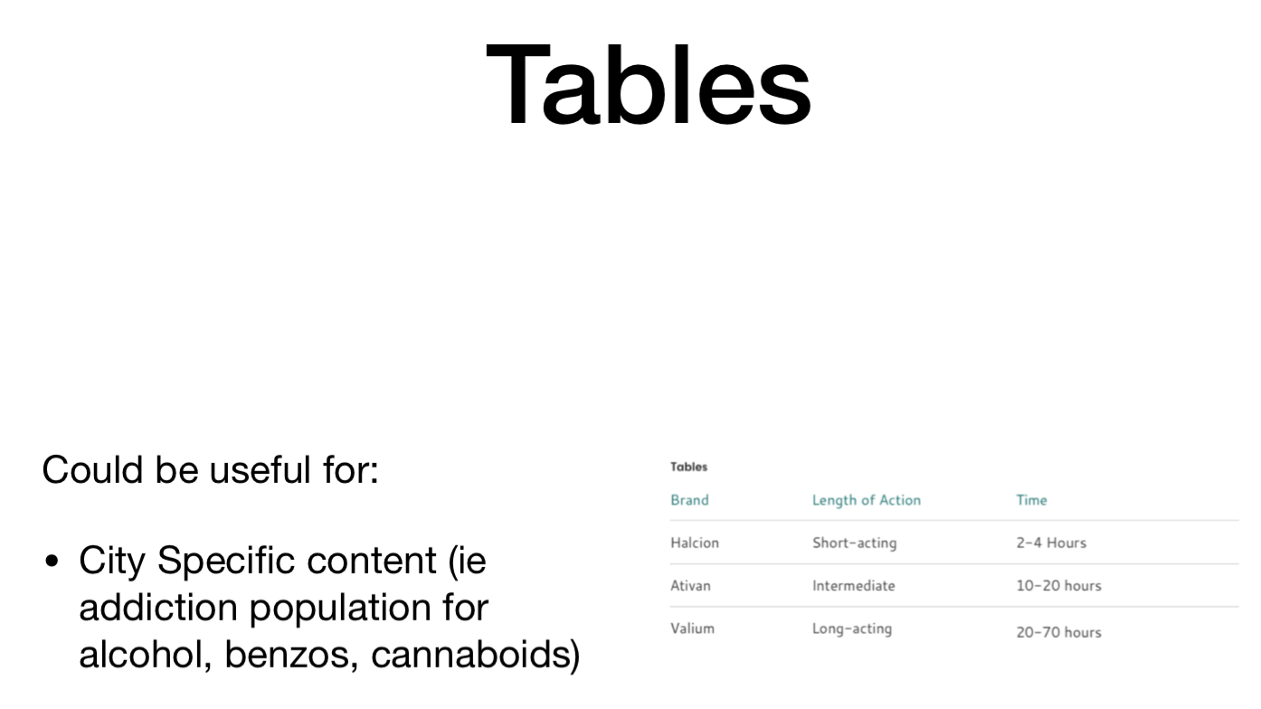
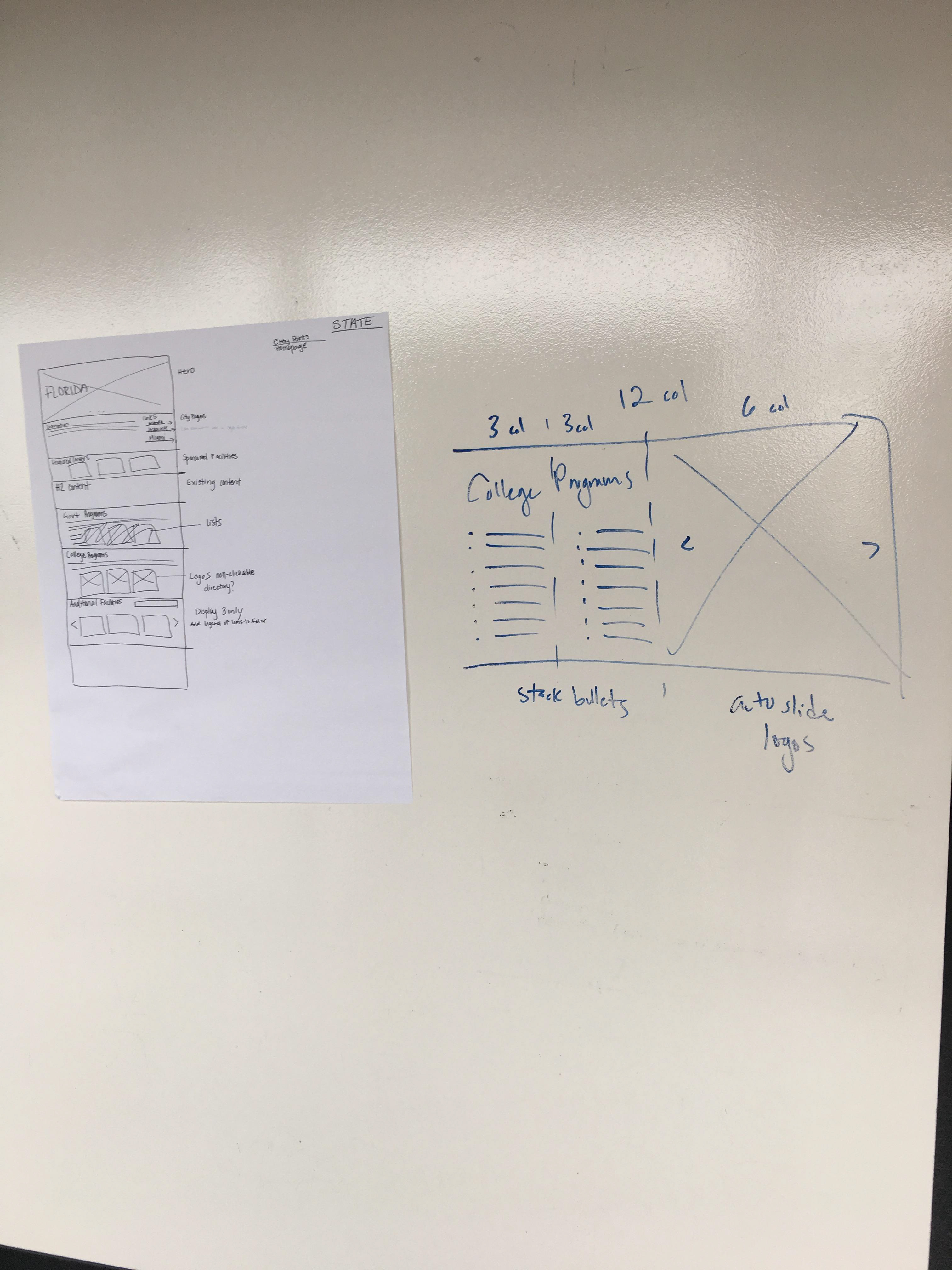
During my wireframing efforts, I made sure to add variety of components and widgets to add visual diversity to each city and state template style giving each template style it's own set of goals to achieve.
before and after
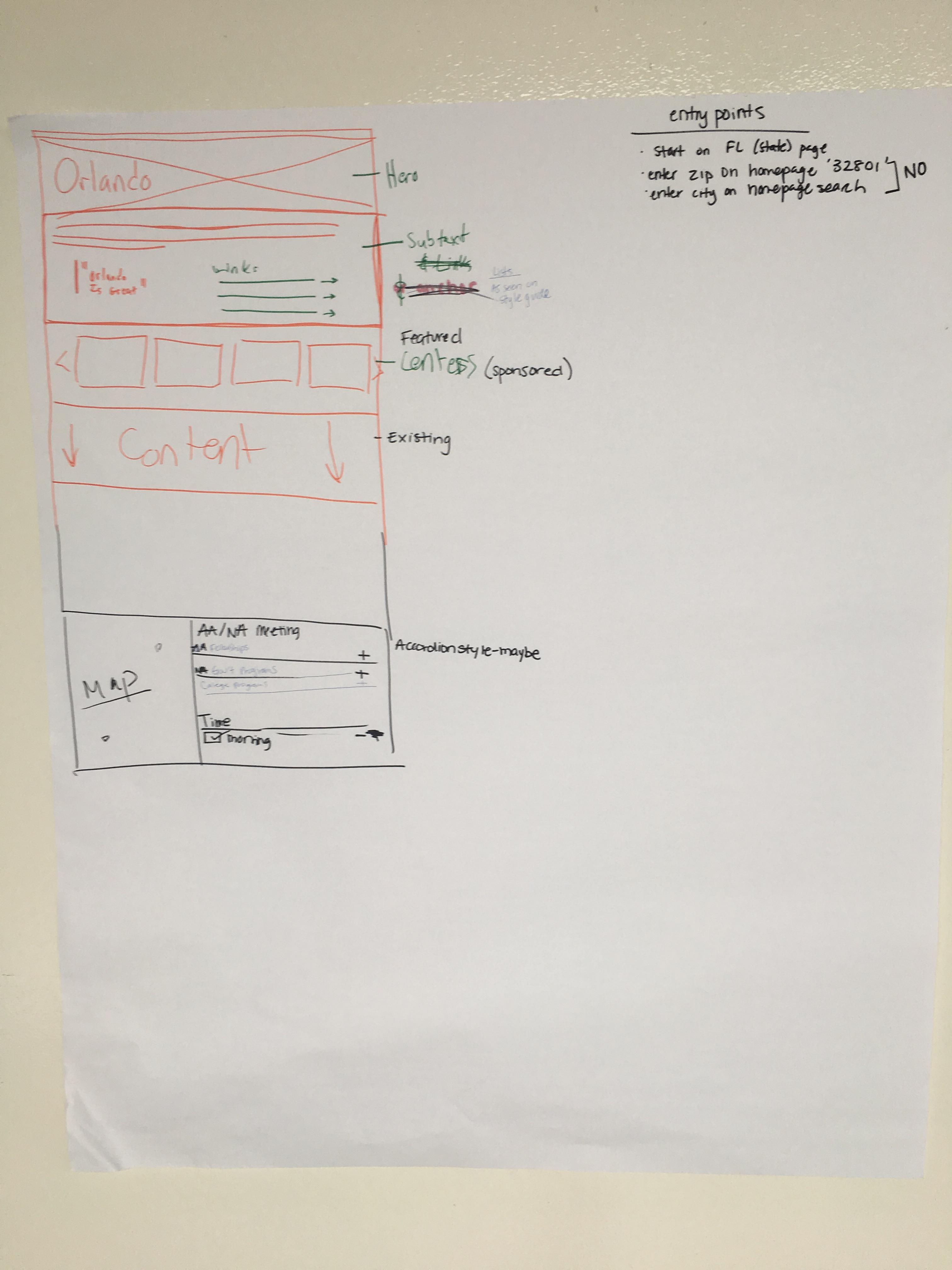
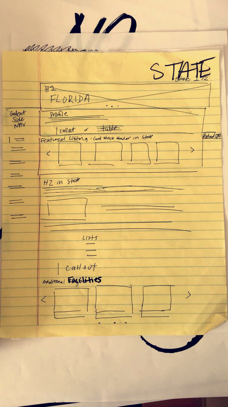
Below, is an example of the before (left) and after (right) on the layout of the State pages. Notice how on the right (the updated version):
-The header is larger and clearer to the reader as to what the page is about
-A bulleted list is included in the header to tie related cities to that state together and allow user discovery and longer sessions
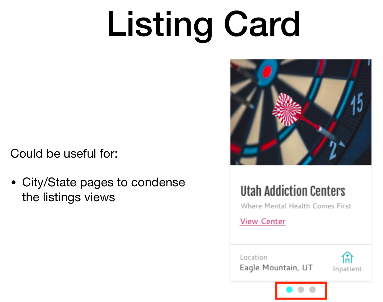
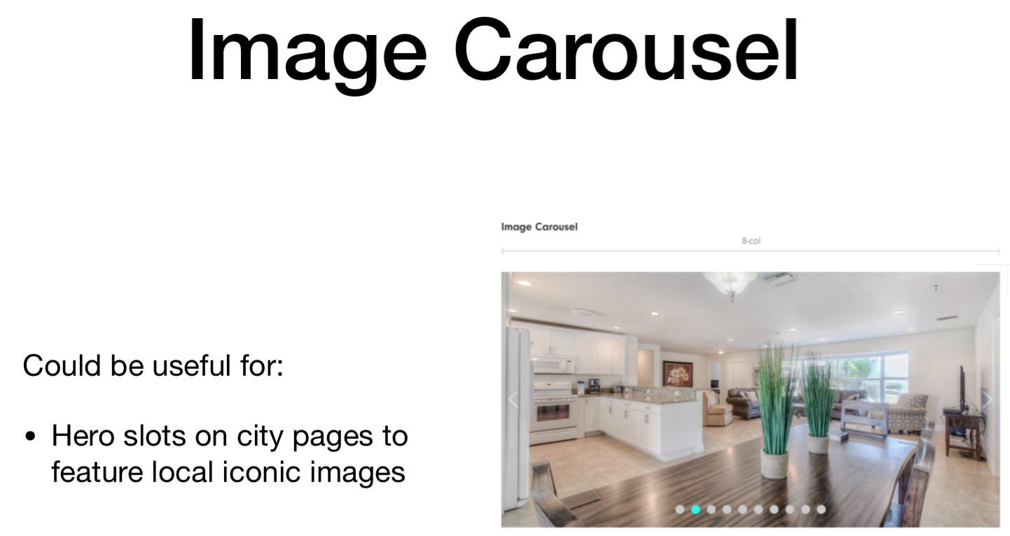
-The featured listings are visually highlighted better by reducing the layout from 4 to 3 cards and adding a carousel functionality with available carets
- Side bar messaging was repurposed into in-content modules to prevent distraction from normal and continuous user reading patterns. This allows more white space and legibility.
- With the use of charts, bullets and carousels the client was able to display college and government programs via unique widget components and content model variety. Also, by leveraging carousel carets and a 'View More' hyperlink, that expands/loads more content, the clients able to avoid lengthy pages.

LEFT = BEFORE RIGHT= AFTER
UI Designs above were created by team Product Designer
CONCLUSION
Although the project is still in progress, the client has expressed the following results:
- User flow analytics show that users are finding their way to the city and state pages internally
- The pages have successfully been indexed via Google and are receiving large amounts on direct organic traffic
-User sessions on this page are approx 3min long ( a major improvement forth previous 45seconds)
- Google Tag manager metrics prove that there are significantly more interactions among the carousel features and in-content messaging CTAs.