

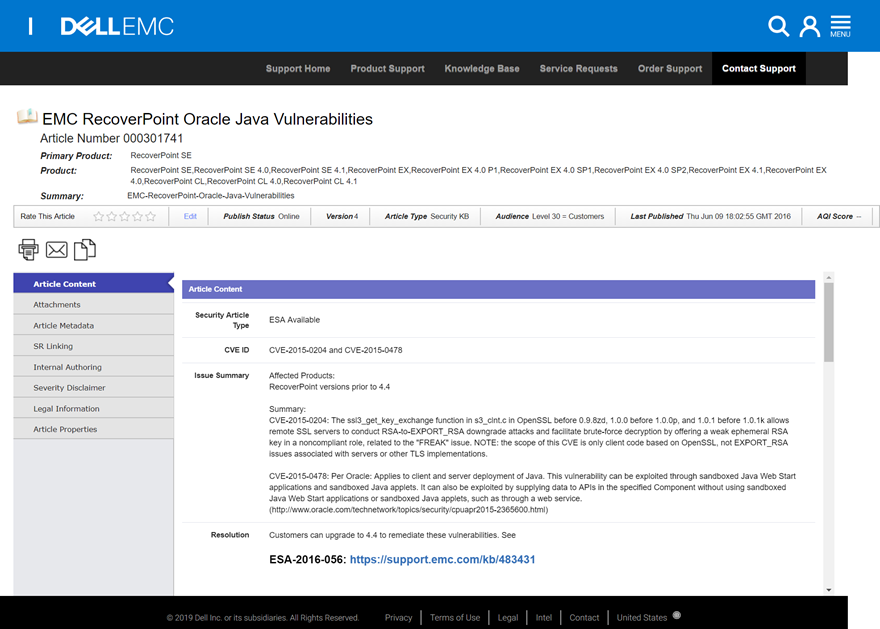
Project Brief:
Our department’s largest project to date is integrating the Dell and EMC product support sections of the overall support experience. By thoroughly cataloging all page variations out team was able to create a fully unified framework that introduced UX enhancements and optimized the efficiencies and accommodated the informational differences between the two platforms that serve different user types. Upon initial release the updated support pages have been met with positive response increasing Customer Satisfaction (CSAT) 32% for support content, generating high CSAT (70%) for new proactive diagnostic tool we introduced, and increased engagement with the most helpful tool on the page by 166%. I was assigned to the Documentation and Open Content work stream which managed all the support content, documentation and product-related reading material to users.
Project Scope:
After the acquisition of EMC by Dell, our business partners received feedback indicating that our customers would like to see a fully integrated experience between the two support experiences, with EMC traditional serving enterprise users exclusively and Dell serving small/medium businesses and consumer products. Out task was set out to take the two existing experiences and create a single style and framework that could accommodate both product types. We sought to preserve all functionality that was proven valuable to minimize the inevitable change impact while also identify and capitalize on any efficiencies and enhancements we discovered. Another KPI placed on our team was reduce the amount of calls received by the Dell and EMC Call centers by encouraging the support sites to empower users to self-troubleshoot leveraging digital resources.
We instantiated a new peer reviewed design language to streamline the framework and production velocity. The team also conducted frequent and thorough user testing throughout the project allowing us to make rapid changes and solve emergent solutions nimbly.
Problem Statements:
80% of contacts are soft calls - they should be able to resolve on their own if they had what they need. Customers don't know what to do after the first piece of content they find doesn't solve their problem.
What are the measurements of success?
-Customers are able to find a solution to find the correct self-help information
-Helping Customers learn to what they don’t know
What defines Failure?
Self Help Failure Rate: what drives user to call and failing to achieve by themselves, within 7 days
dell and emc persona research
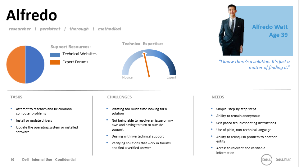


Persona research above was conducted upon the Dell EMC merger - Second hand info provided to UX Team
Persona driven insight to apply to Documentation Tab designs
CONSUMER USER NEEDS:
• Simple, step-by-step instructions
• Minimal reading
• Expert-endorsed solutions
• Non-technical verbiage and instruction
• Easy-to-search content
• Educational content
• Simple, step-by-step steps
• Ability to remain anonymous
• Self-paced troubleshooting instructions
• Use of plain, non-technical language
• Ability to relinquish problem to another entity
• Access to relevant and verifiable information
• Skimmable information
• Fast track to relevant information or requesting parts
• Ability to quickly engage at an expert level
• Simple uncluttered interface
• Highly visual experience utilizing graphics and large, easy-to-read text
ENTERPRISE USER NEEDS:
• Transparency of management tools for a full end-to-end view to provide and constantly improve services
• Data classification, lifecycle management and compliance
• Staying on top of knowledge, skills and awareness to meet needs of business
• Adaption rate of technology opportunities
• Efficient way to get vendor up-to-speed when needed
• Independent resources that have been vetted by other industry professionals
• Comprehensive knowledge about my environment
• Ability to fast-track issues to senior support personnel
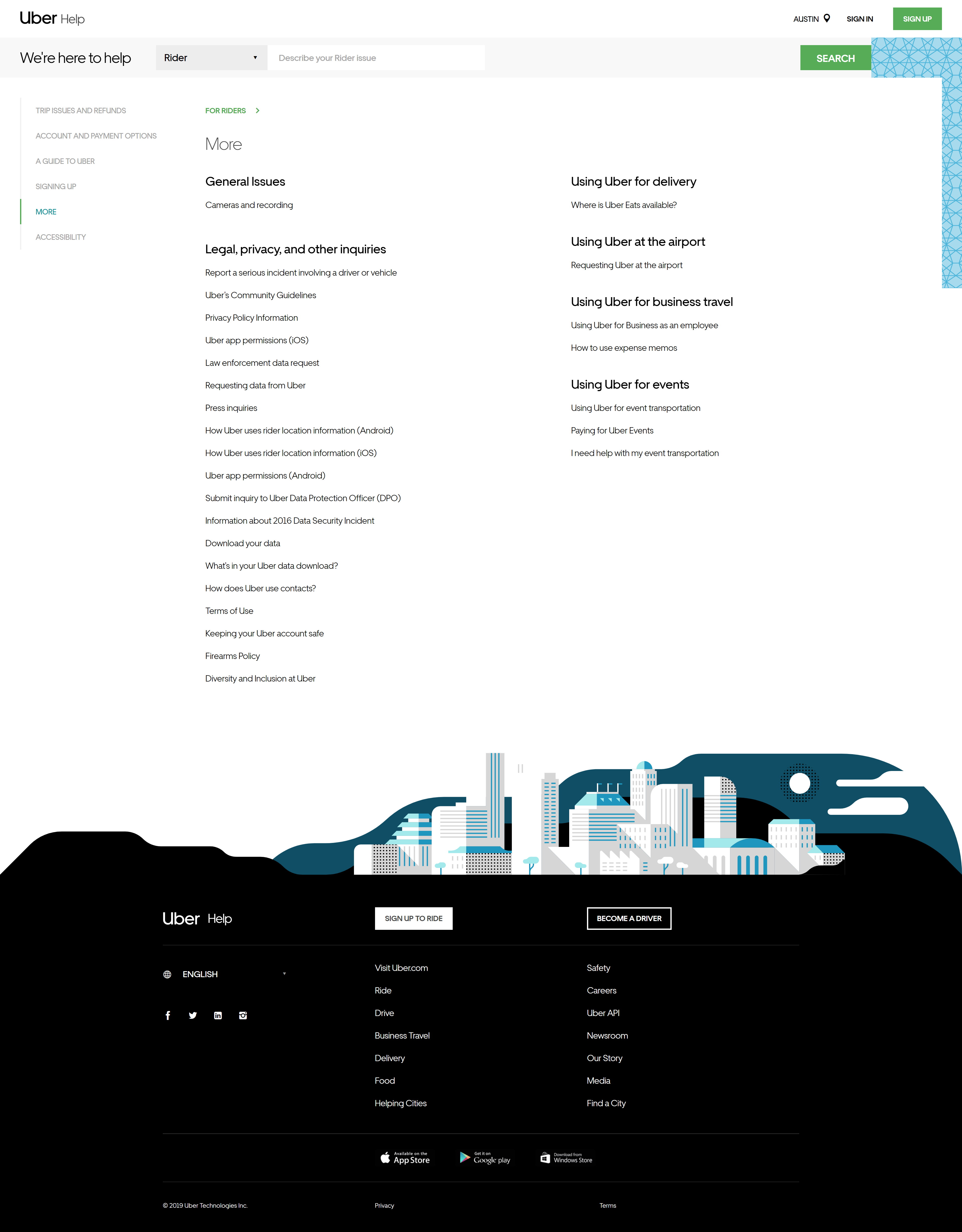
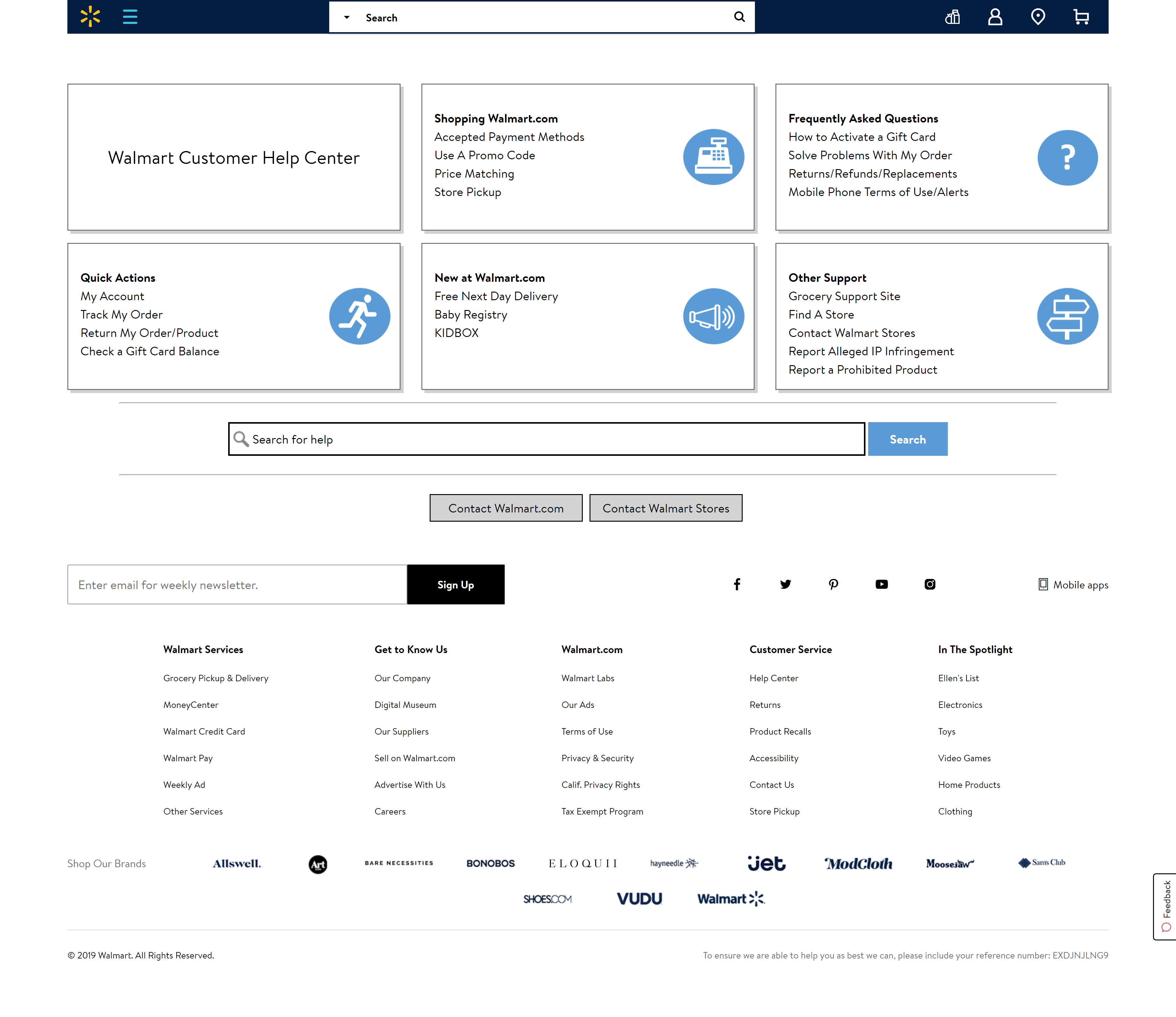
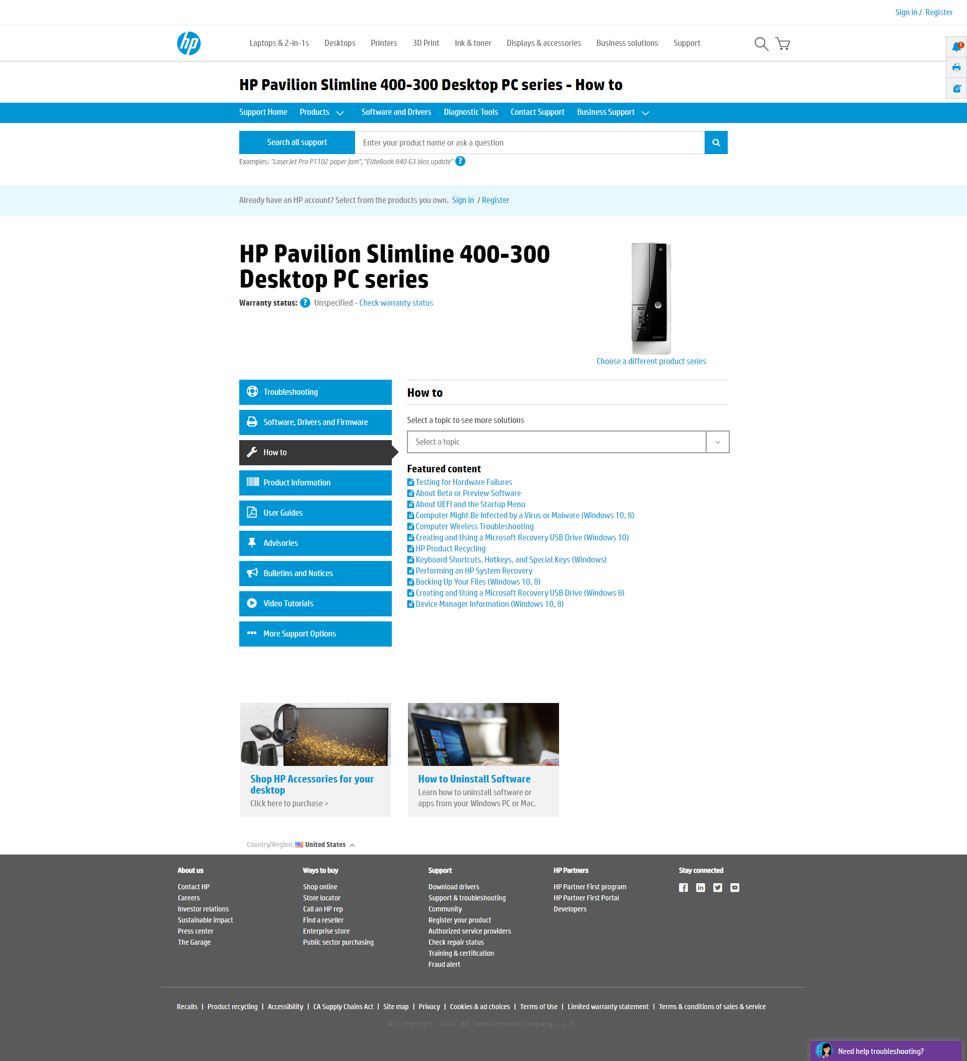
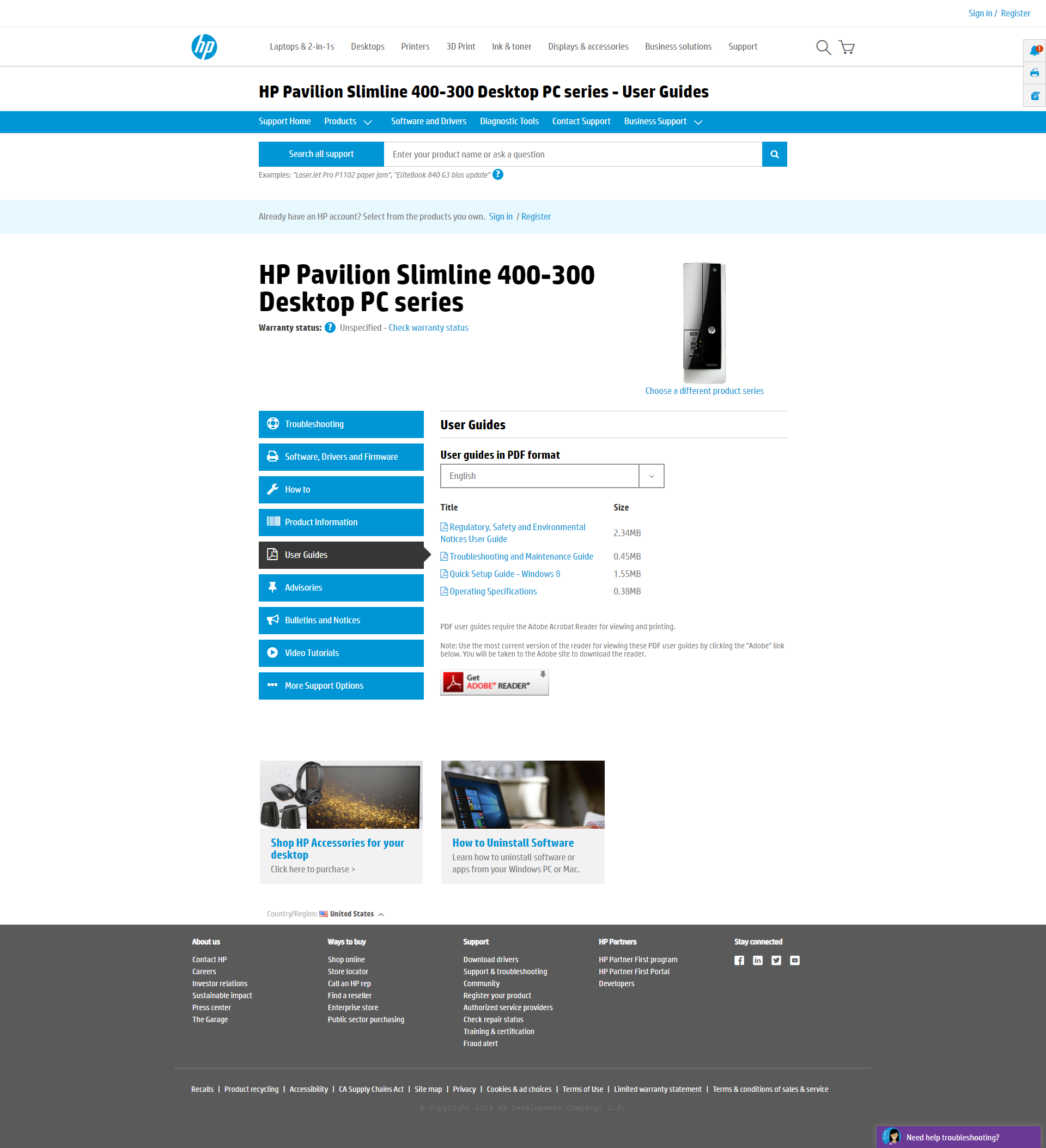
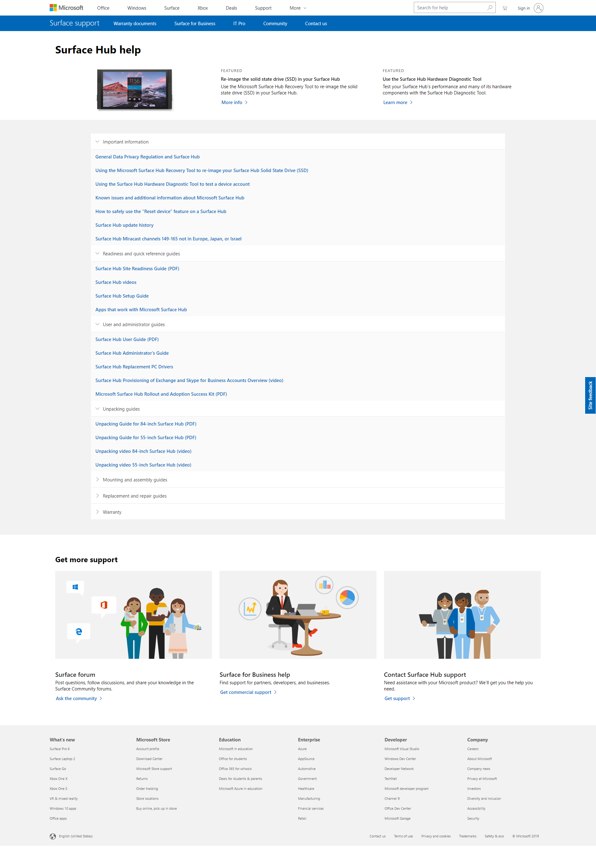
UX Audit Pre-Merger
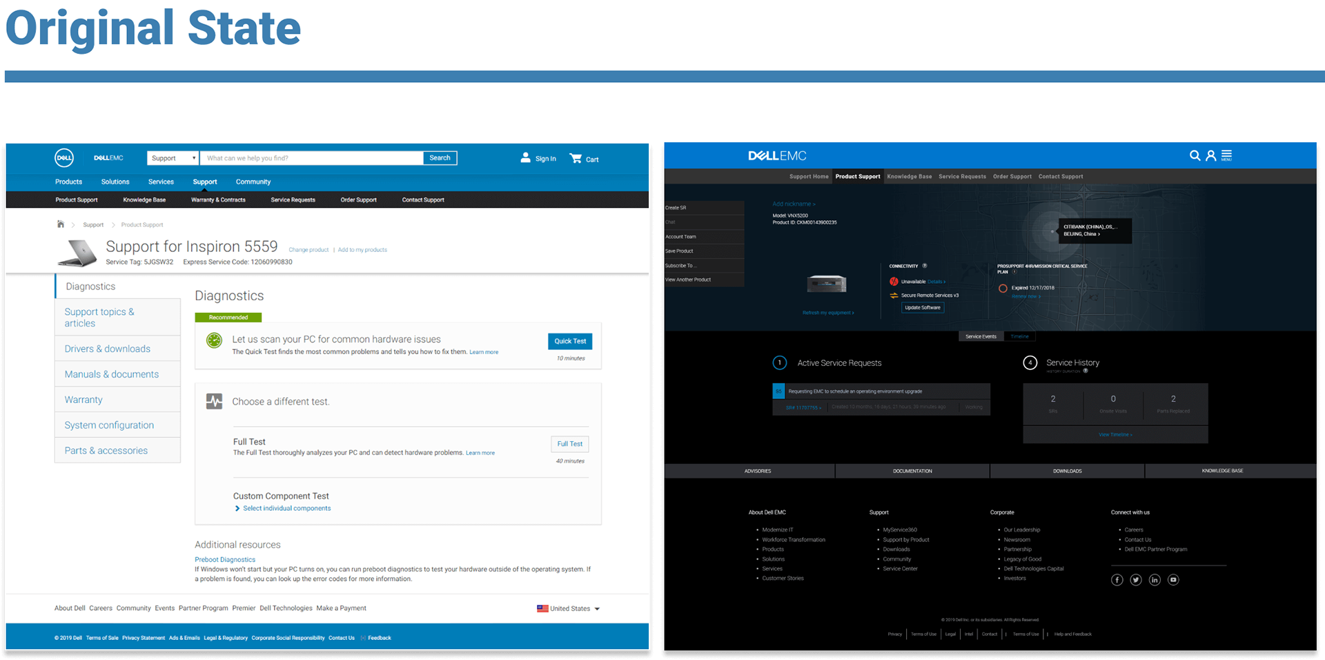
Dell Product Support (Left) and EMC Product Support (Right)
Identified UX Issues for the Open Content and Documentation Program
Framework Thematic Pillars
Setting up a single source of truth and answers that functioned equally for enterprise and consumer users proved a compelling challenge. Between the Dell and EMC pages our team begin to identify the structural and architectural opportunities for improvement across the product types and user journeys. Through extensive user interviews and online heat maps, we were able to isolate the most important tasks users were undertaking on these pages and begin constructing a more efficient path for them
The team developed three large pillars to drive the project:
Improving search experience and compartmentalizing
While the UX community is aware of the norms of user search behavior, the production state held a major disconnection and shortcoming with meta data, content rating and defining relevance. Due to the fact that there was SO much content, the company lacked strategy to present helpful content at the right time during the user's journey.
Unifying to a single Information Architecture
The legacy pages suffered greatly two varying content strategies and methods in which to identify its content types and subgroups by different names. In addition, two different content management teams had 2 different operating styles and methods for entering meta data. To improve the user retention rate, I the applied Miller’s Law (The average person can only keep 7 [plus or minus 2] items in their working memory) and knowing that it was an impossibility to get down to 4 categories for initial release we set the limit to 5 sub-topics to greatly unburden our user’s cognition.
Optimizing for mobile
It was not a surprise for our team to learn that mobile use was very low for these support pages, further the legacy EMC pages did not function at all at lower break points by design. We could not solidify a causal relationship between the quality of the mobile experience to the low usage but we knew that it was unacceptable to have a poor experience on mobile in 2019, especially given the ancillary device problem solving scenario was prominent amongst users we spoke to across various user studies over the course of the project.
Access and Distribution
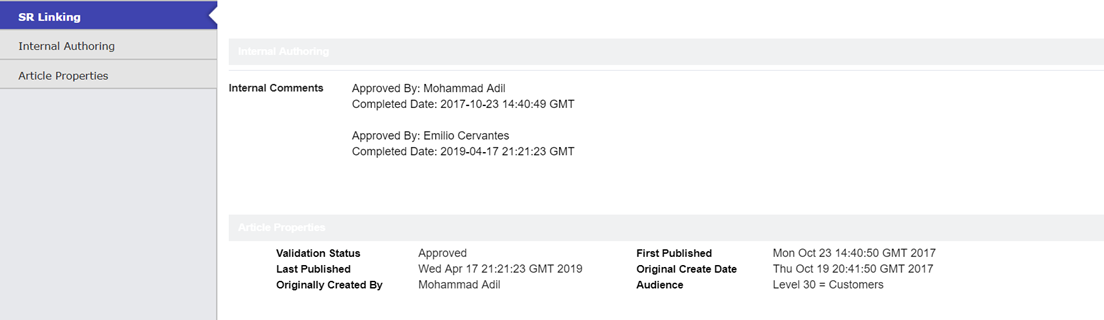
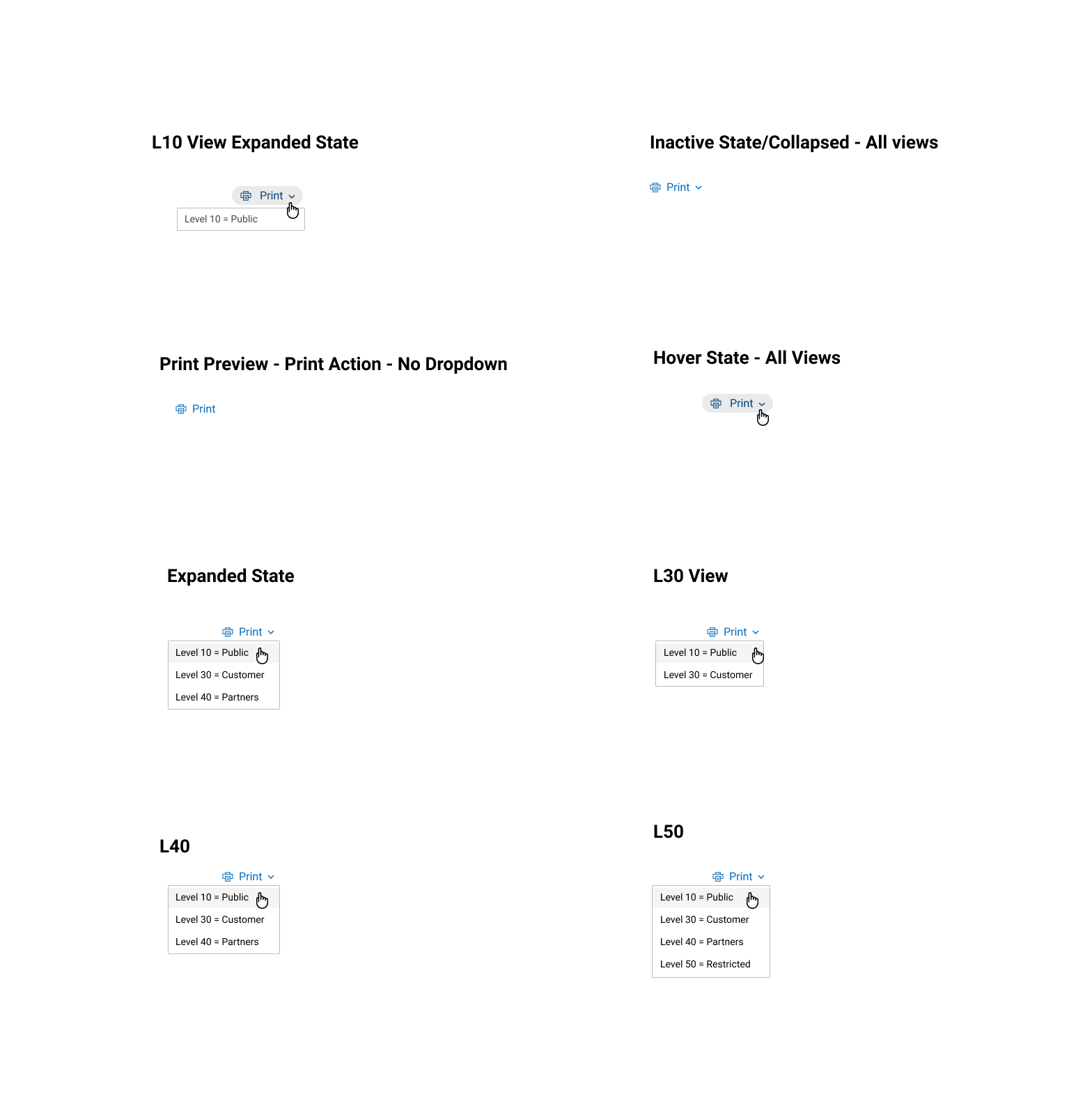
EMC historically restricted content by users levels which made certain content invisible. Aside from finding the information, enterprise users/IT admin needed to be able to access and distribute the content in order to assist their company internally to assist with self-troubleshooting.
ENTRY POINTS
Ways to find articles
SEO – External Search
Coveo – Site Search
Someone sends you a direct link – tech support agent
Direct Link to page
Navigate from product support page
Community thread
Ways to get to Manuals
SEO – External Search
Coveo – Site Search
Someone sends you a direct link – tech support agent
Direct Link to page
Navigate from product support page
Community thread
Ways to get to videos
SEO – External Search
Coveo – Site Search
Someone sends you a direct link – tech support agent
Direct Link to page
Navigate from product support page
Community thread
The Approach
Given the sheer scale of the project, two weeks were set aside to schedule brainstorm sessions to identify the problem statement, generate proposals and design drafts, for strategic frameworks for the design.
competitive analysis


Some UX/UI elements that were leveraged from the UX competitive analysis include: relying on clear IA to group up the information and solutions, suggest top solutions or frequently asked questions (to save user time), provide hyperlinks and text links, a wide variety of content mediums needed to be available (ie video, downloads). There was mixed reviews regarding meta data.
First Draft
Reasons why I opted to use accordions:
Summary: Longer pages can benefit users. Accordions shorten pages and reduce scrolling, but they increase the interaction cost by requiring people to decide on topic headings.
Accordions are more suitable when….
·People need only a few key pieces of content on a single page. By hiding most of the content, users can spend their time more efficiently focused on the few topics that matter
·The information is restricted to very small spaces, such as on mobile devices.On small screens people often stop scrolling before reaching the end of an extremely long page. If the page has several loosely related pieces of information, users often cannot guess if the information in which they are interested will be found somewhere down the page and they quit before scanning it all. In such cases, extremely long pages are detrimental to the user experience
·Collapsing the information is a better alternative: it minimizes excessive scrolling and gives users an overview of the content available on the page. Reading on mobile is twice as difficult, and the mini-IA provided by the accordions helps readers understand the structure of the page and lets them focus on the relevant pieces
·Shortening long content pages
·Collapsing the page minimizes scrolling
·The headings serve as a mini-IA of the page. This allows users to form a mental model of the information available
·Hiding (some of) the content can make the web page appear less daunting
·Accordions can be a better alternative to within-page links. Which are problematic because they break people’s mental model for hypertext links. People expect clicking a link will load a new page. Without proper cues people are confused about where they are on the site


Research and Peer Reviews
Research and Peer Review Structure
I worked directly with my business and research partners to establish a cadence of usability testing for all design iterations in flight. We were able to take work to users at a high frequency giving us the ability to validate our designs through micro and macro task analysis. Our rapid design direction also fostered a real sense of comradery between the team, making reviews more casual and collaboration much more fluent and effective. The follow user tests were conducted:
-Why are users not searching more
-Are the category topic names clear to measure any cognitive burdens
Executive Summary
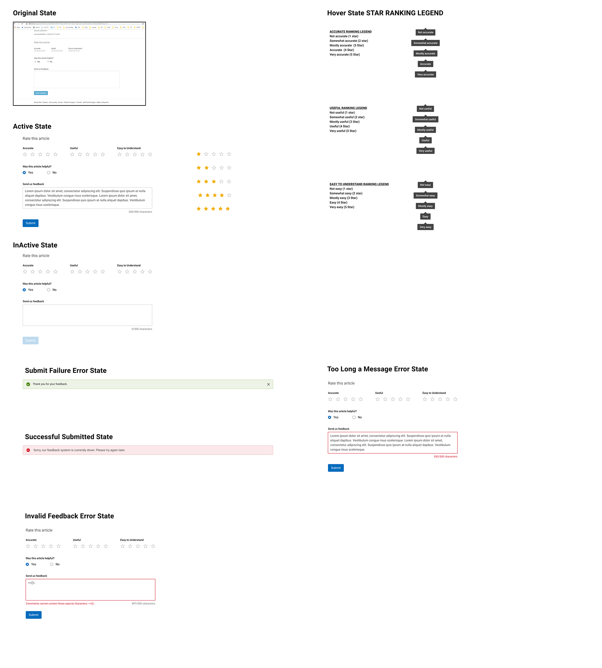
Users find it easy to find product specifications on the documentation tab. Though 9/15 participants mentioned they would use the in-page search when explicitly asked, however observations indicated that it wasn’t the best method to find results. Other comments included preference to scrolling, searching google, browsing on the site etc.
Results
Study 1
13/15 participants found it easy to find product specifications. 14/15 participants found the
search results to be helpful on the documentation page. 13/15 participants stated that they would come to the documentation tab to find their product’s manual. One participant mentioned that they were lost while trying to find product specs, but after they found it, it seems logical to use the documentation tab. 9/15 participants mentioned they are likely to use an in-page control to find a manual. The reasons that participants had as to why they wouldn’t use an in-page search included the preference to scrolling down on site, search results seem untrustworthy (whether Dell or external site results), prefers browsing on site before using search, rather search on google than internal website. Based on this information, we needed to observe if users could easily find a search result in the in-page search box under the documentation tab. This led us to conduct another study with 5 participants on 16th August.
Study 2
In the first task which started on the overview tab, all 5 participants did not use documentation
tab as their source of finding answers. In the second task, once they were directed to the documentation tab, 4/5 participants found it easy to find information on troubleshooting a faulty USB port (via in-page search control). When asked if they are likely to use documentation tab to search for information,4/5 participants stated “not likely” as the answer. Many participants mentioned that they were looking under support, global search, google search, or try to find them under categories like “Trouble shooting”, contact support etc. In conclusion, the type of document we ask participants to find may have caused them to look at locations other than the documentation tab.
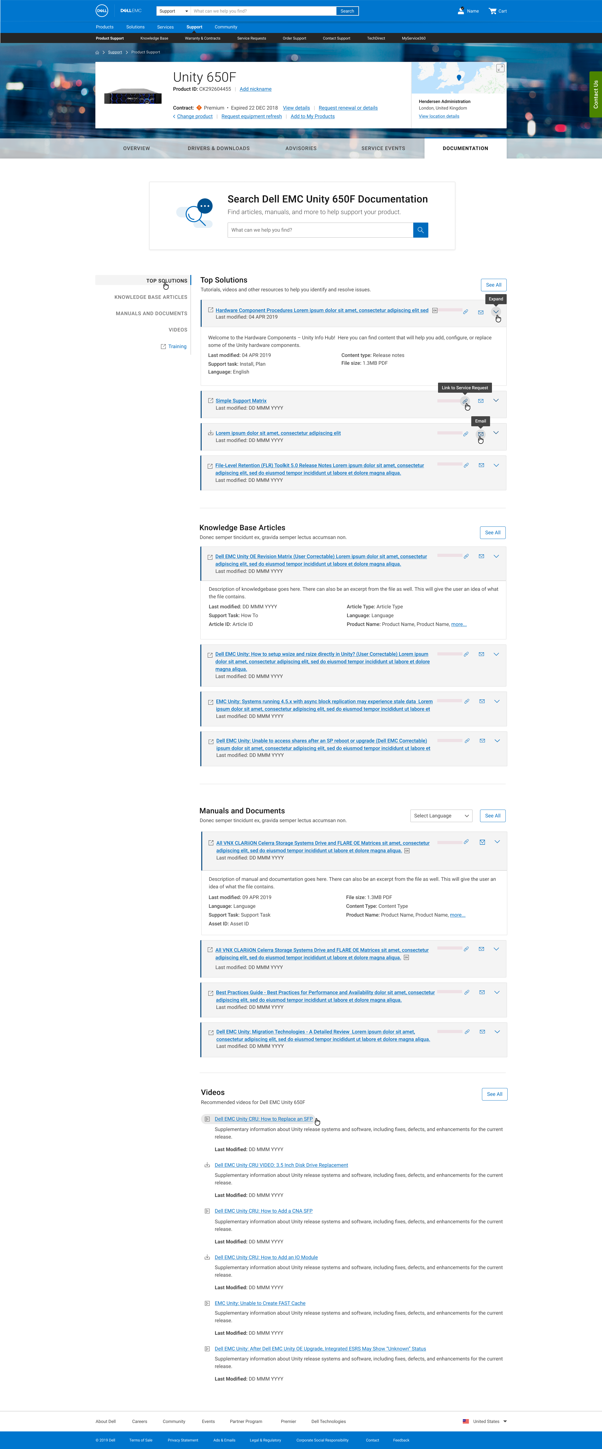
Efficiencies, Improvements, and Visual Alignments
-Matching mental models by only populating results relevant to selected product
-Placing an enlarged search box at the top of the page to establish priority tasks (search)
-Enhanced the ease of use and scannability of content results by limiting the amount results available
-Implementing the left rail navigation in order to outline the content subgroups available that also serve as anchor tags to drop users at specific spots of the page
-Highlight what are top solutions for user common issues
-Making meta data available when users are interested via accordions
-Making it easy for users to access content (view page and view PDF)
-Added CTA to direct users to a filtered search results page
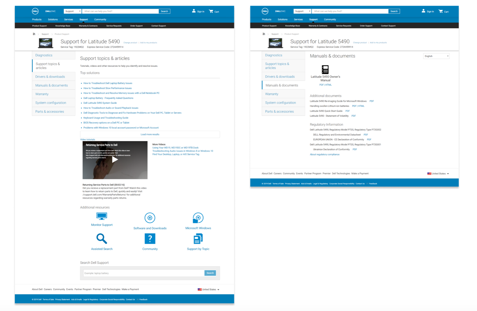
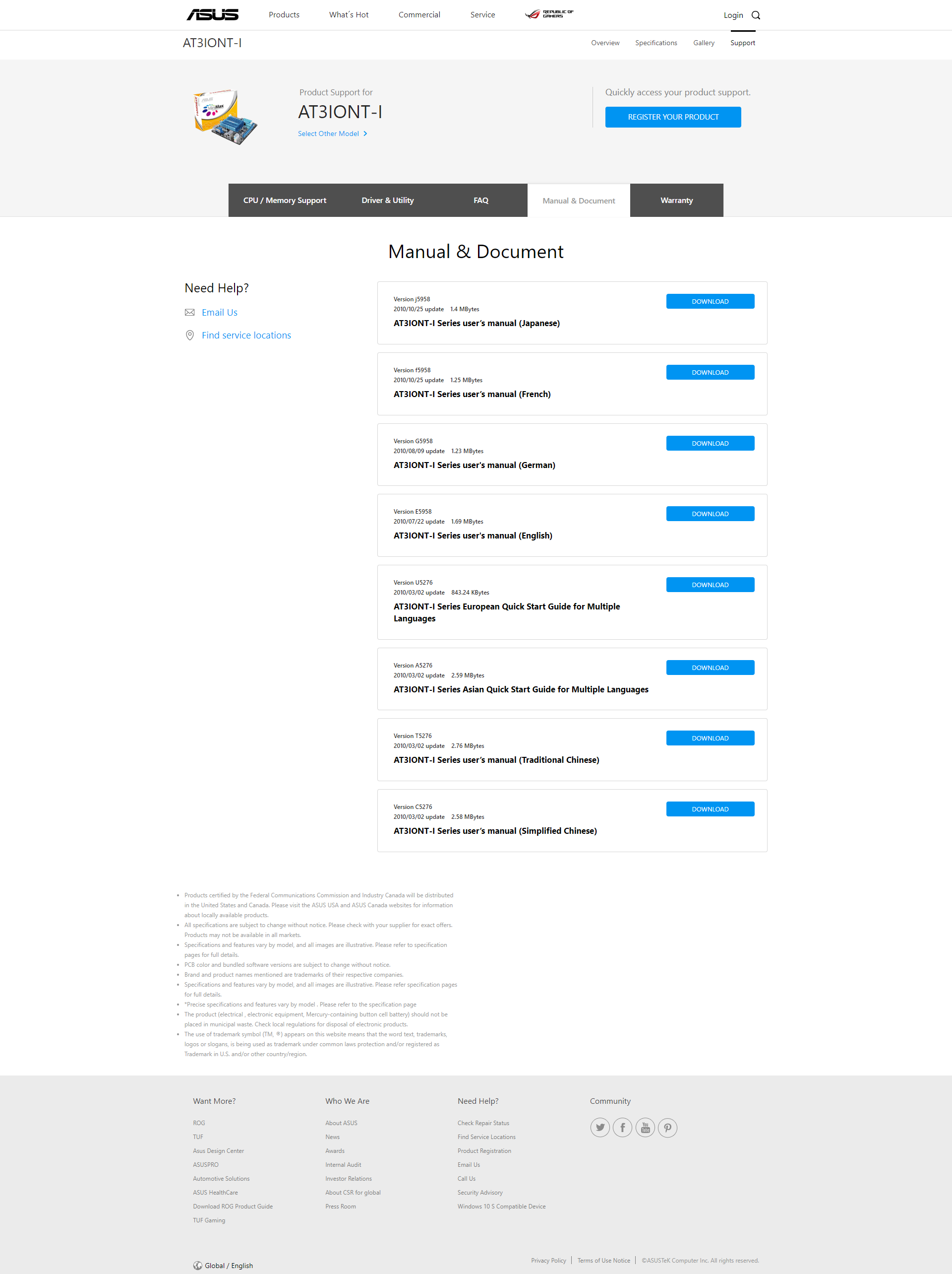
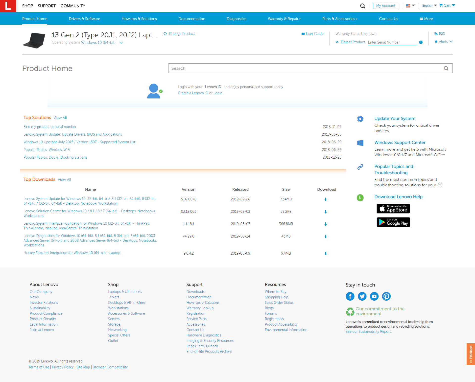
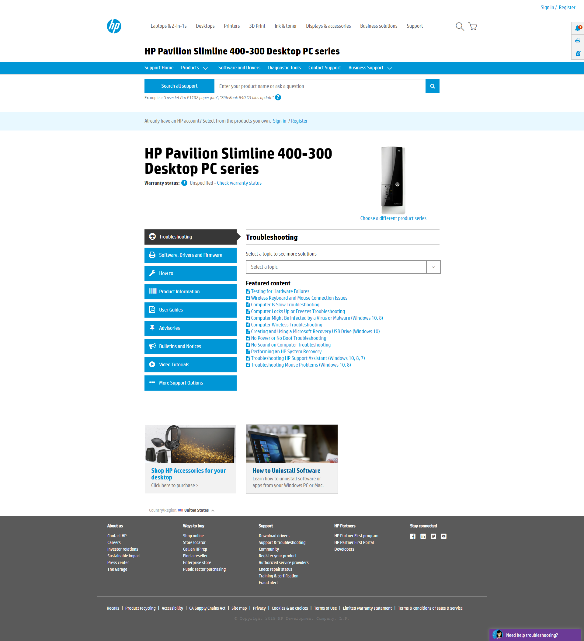
Legacy = BEFORE / Integrated = AFTER
results
-Increased traffic by 6%
-Increased CSAT by 9%
-Increased CSAT by 25% for 'view page' interaction
-Increased CSAT by 38% for 'view page' interaction for Manuals
-Increased CSAT by 32% for 'view PDF' interaction for Manuals
-CSAT is at 25% for accordion interaction
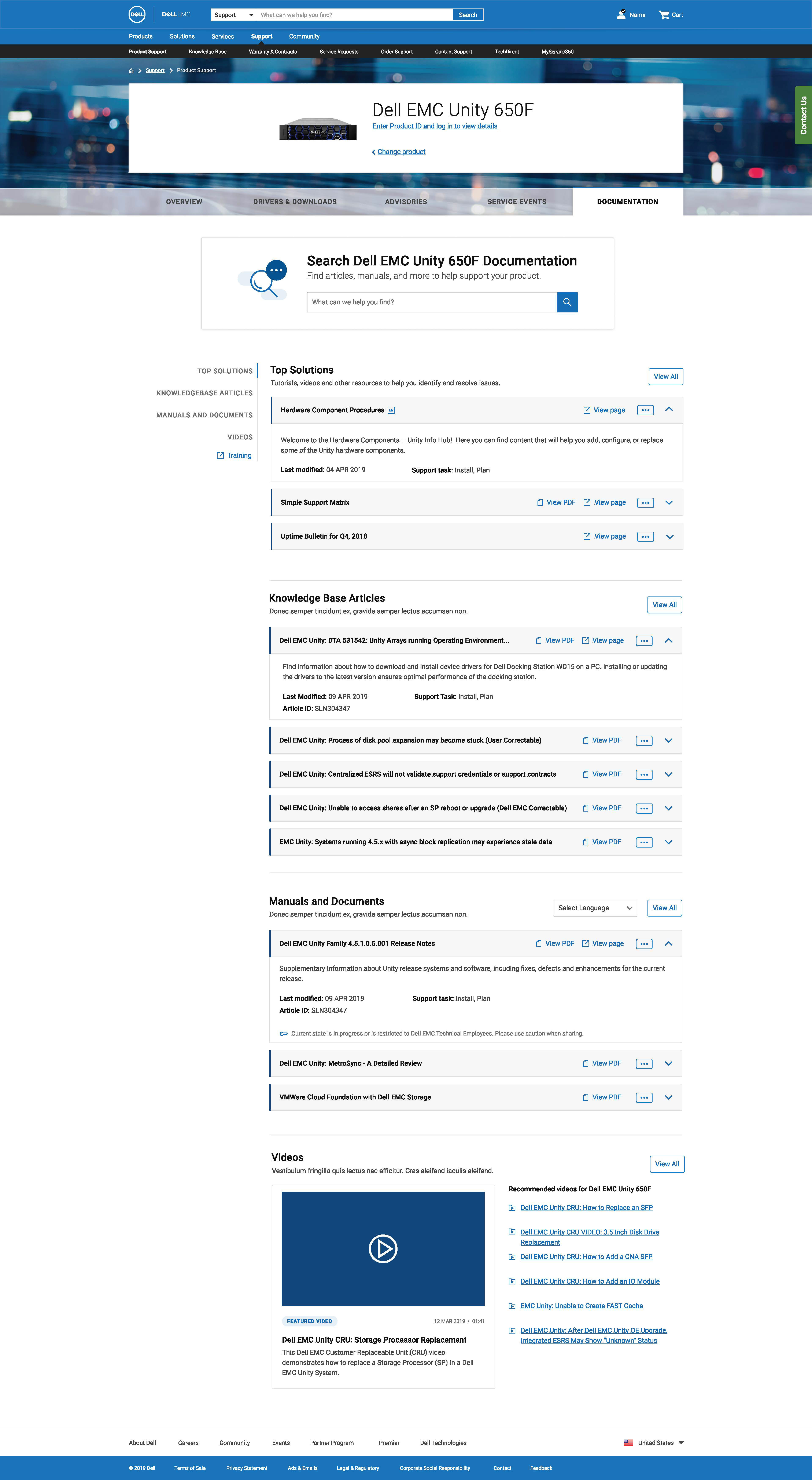
Latest Drafts and Reiterations
Efficiencies, Improvements, and Visual Alignments
-Expand the real estate in title line to allow for long titles and translations
-Designed to allow text wrapping
-Leveraging more use of iconography while adhering to accessibility UX rules
-Hyperlinking title names to replace the 'view page' feature

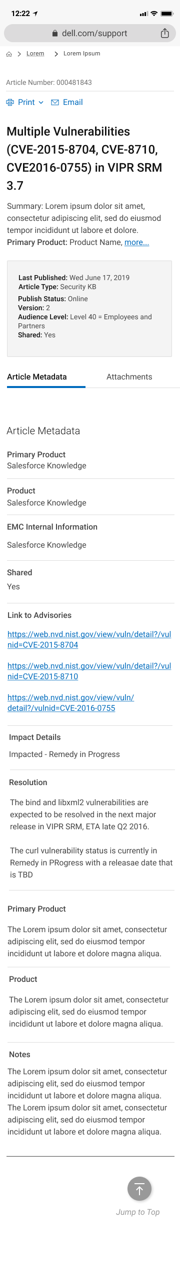
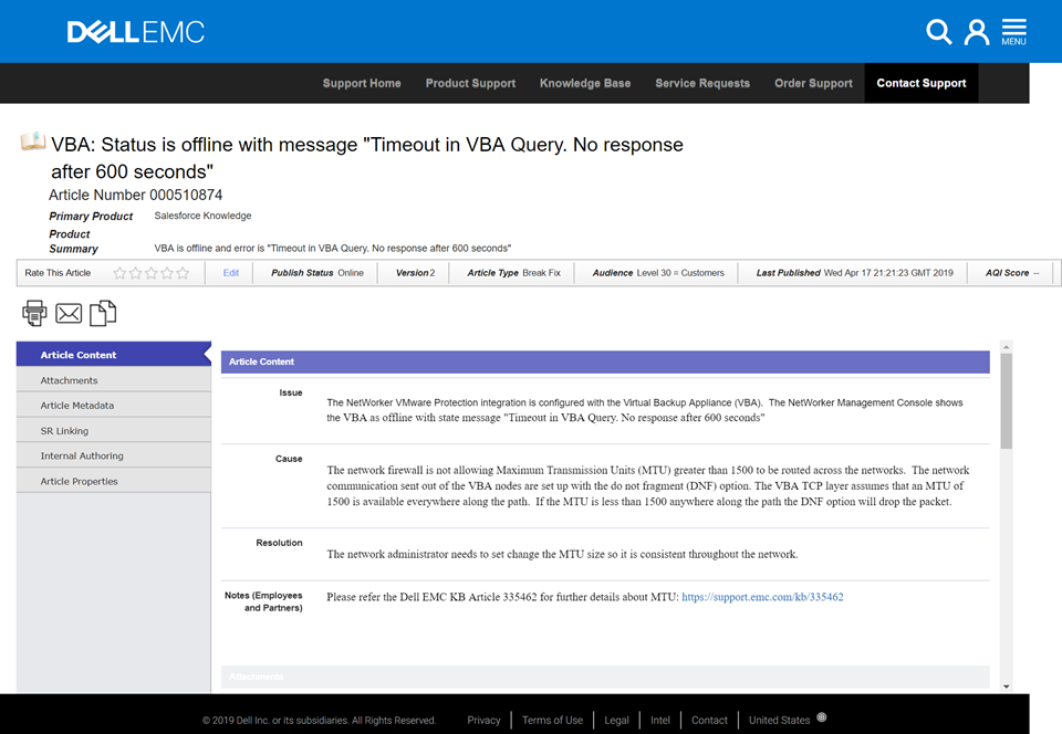
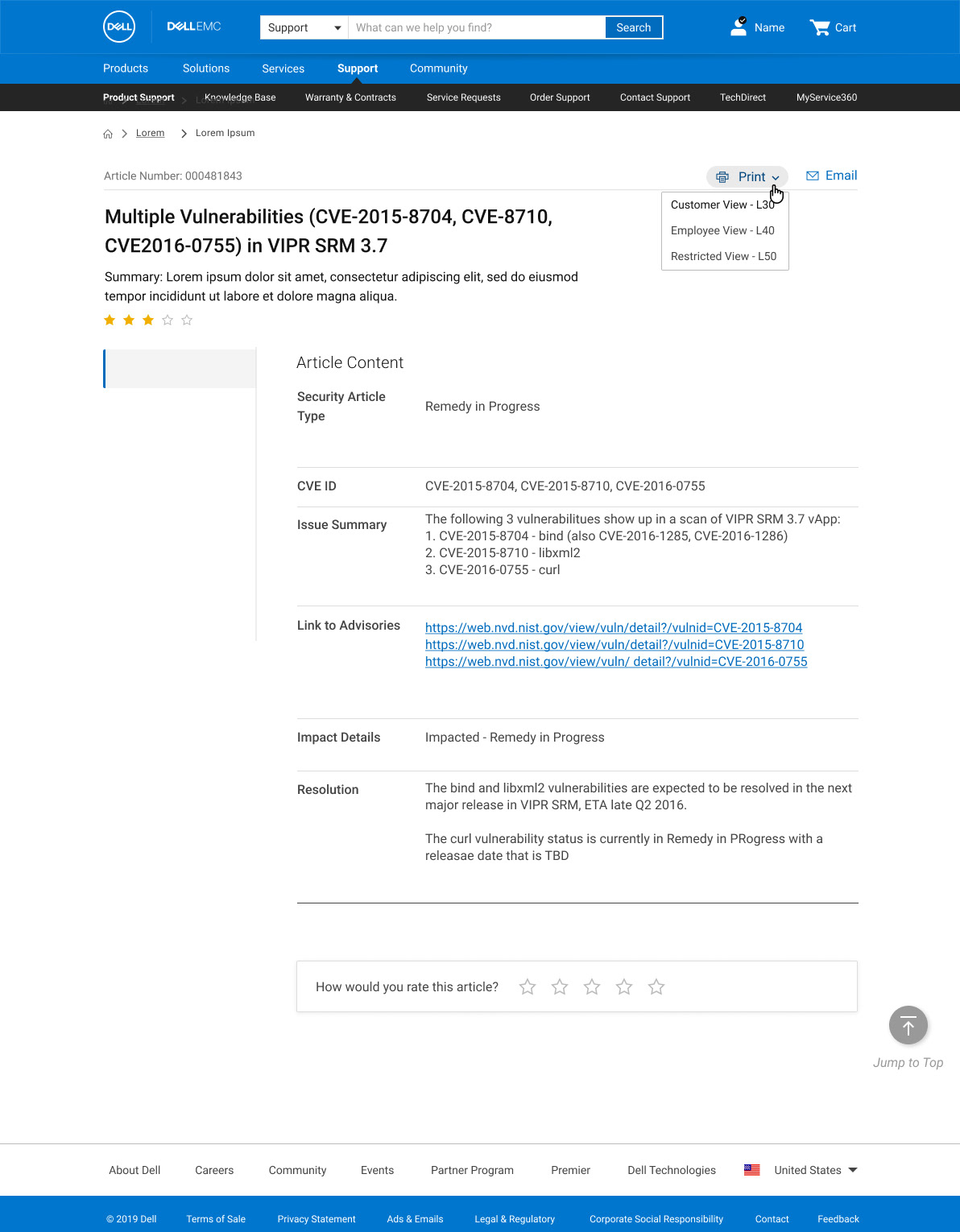
Article Templates Revamp - BEFORE
UI Elements I've added to team UX Design Library
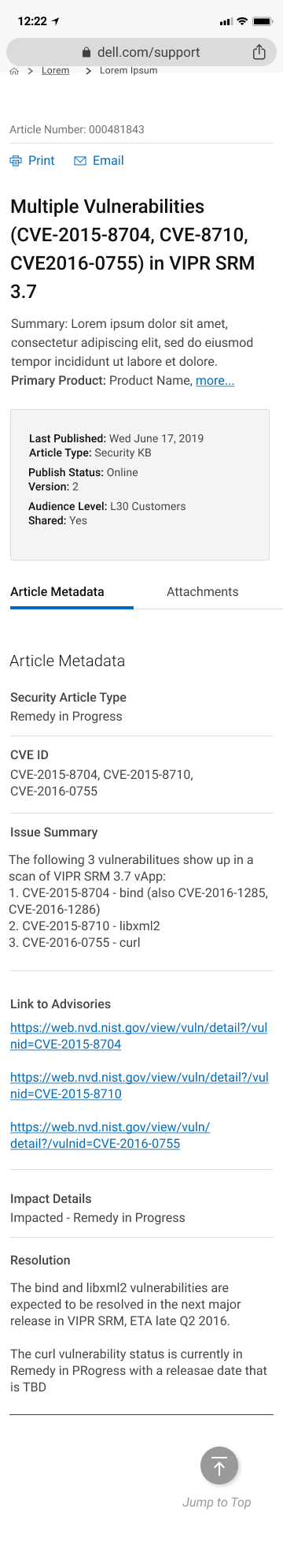
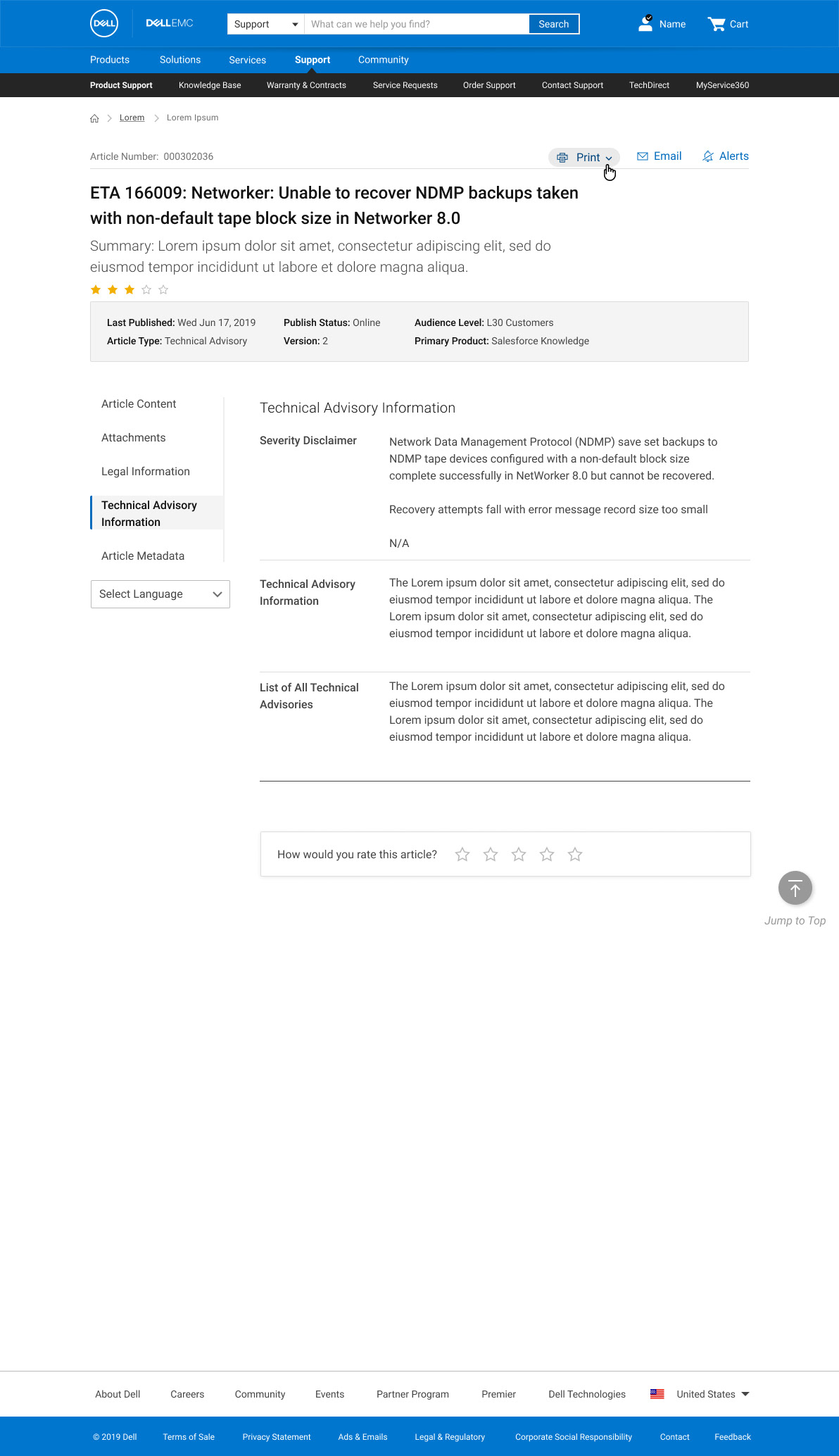
Article Templates Revamp - AFTER
results & Conclusion: Ongoing Efforts
Overall the updates and redesigns have been a resounding well-received success for end users, internal stakeholders, and executive leadership with a positive response. Many of our direct feedback sources exclaimed the newly introduced tools and enhancements as making their self-help experience much smoother. There were some takeaways about how we can further improve the experience that are forthcoming.
One area of success within Product Support was my newly structured Documentation tab which combined the historically segmented pieces of content that the user could access. The consolidation of this content as well as it’s overall restructuring and introduction of search capabilities led to
increased engagement and a 32% increase in Customer Satisfaction (CSAT)