
**(Much of my work was inaccessible, unlaunched and archived by Design Team)**
CONTEXT
My Role as a Senior Studio Designer required rotating collaboration of multiple workstreams via listening, probing questions to define issue, and supporting on a solve via UI/UX to improve user experience. Experience in: SaaS Applications, macOS, ChromeOS, Microsoft Office, Figma, Confluence, responsive mobile design QA, Jira.
Wove's vision:
To be the most connected and productive wealth management SaaS applications platform in the Financial Technology space (FinTech)
To be the most connected and productive wealth management SaaS applications platform in the Financial Technology space (FinTech)
What is WOVE?
Wove is an easy, intuitive operating system created specifically for financial wealth management firms and their financial advisors and investors. Built with the highest levels of integration, Wove connects technology and data to deliver a truly interoperable, complete platform experience.
Product vertical I designed in: Wove Advisory
Where the experience streamlined efficiency with Wove as advisors reduce manual data entry, minimize the chance of errors and fortify investment management processes. Unlock scalability and expand premium services like tax management and customized portfolios to a wider client base effortlessly.
KEY ACHIEVEMENTS FROM THE TEAM FROM 2023+2024:
- Rollout new features that meet user's mental models and needs for efficiency and speed
- Reskin all UI to new design system that meet accessibility standards and WOVE branding
- Migrate 350 clients from legacy applications to new Wove Platform
- Achieve strong prospect pipeline, accelerate out product development to create a suite of products
- Completed a first multi-custodial trade and portfolio rebalancing
- Creation and delivery of a seamless solution for end to end alternative financial investments
- Initiated and transitioned 17 applications to new infrastructure to what would be the unified platform
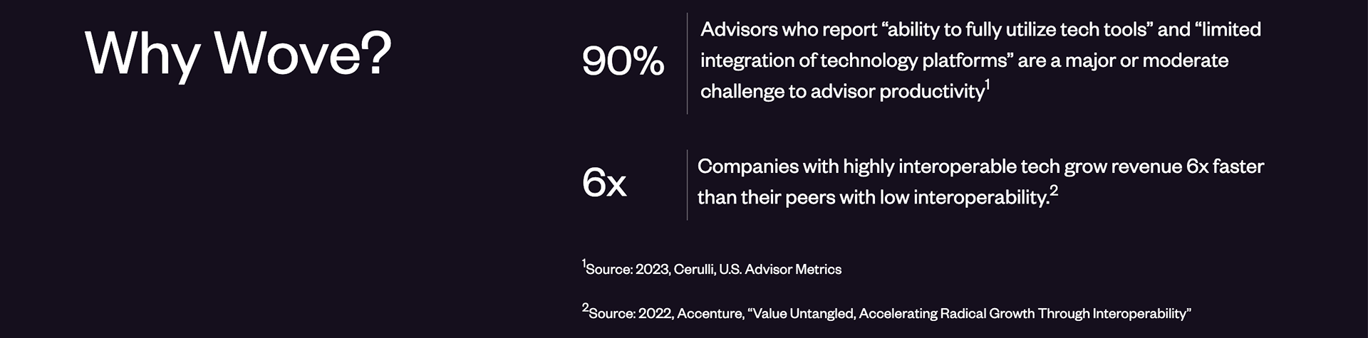
Industry User Challenges and Pain Points
Prospects have identified that the overrall ecosystem and the speed at which it is being created, as the driver for being interested in moving their business to BNY Pershing X
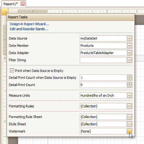
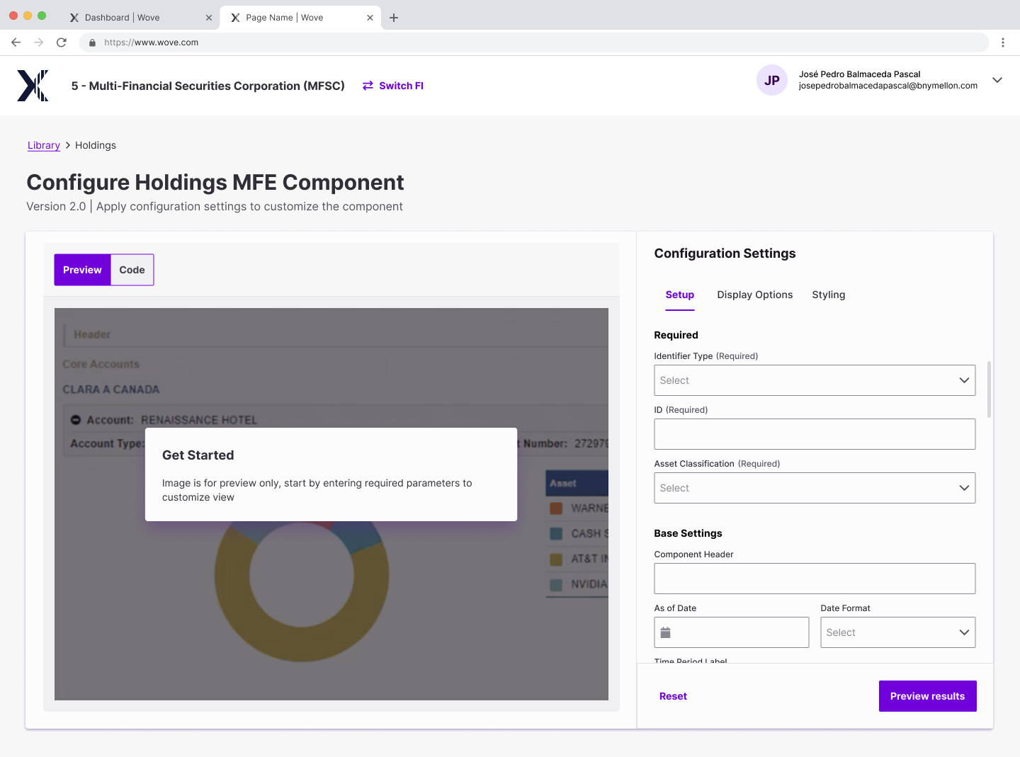
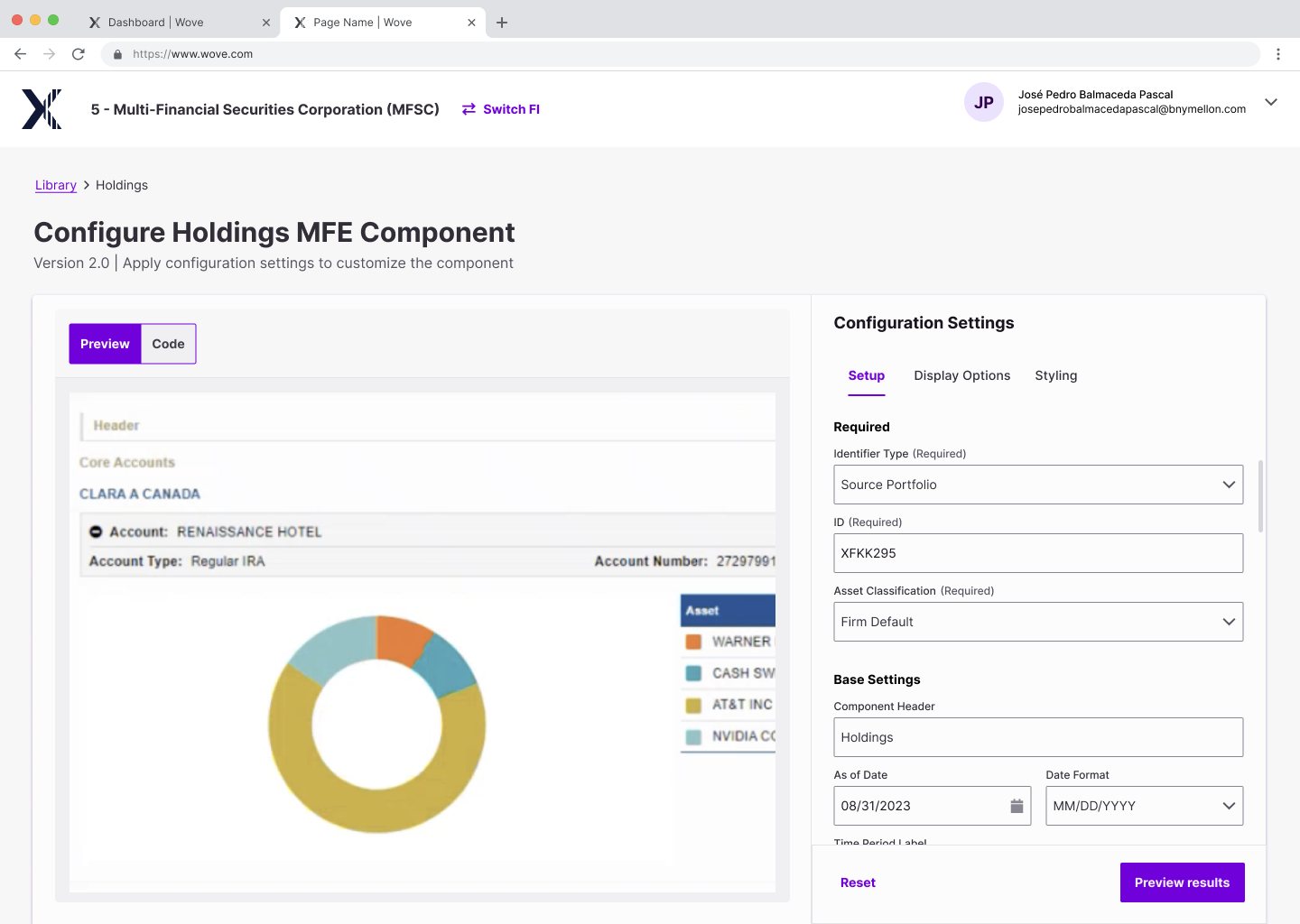
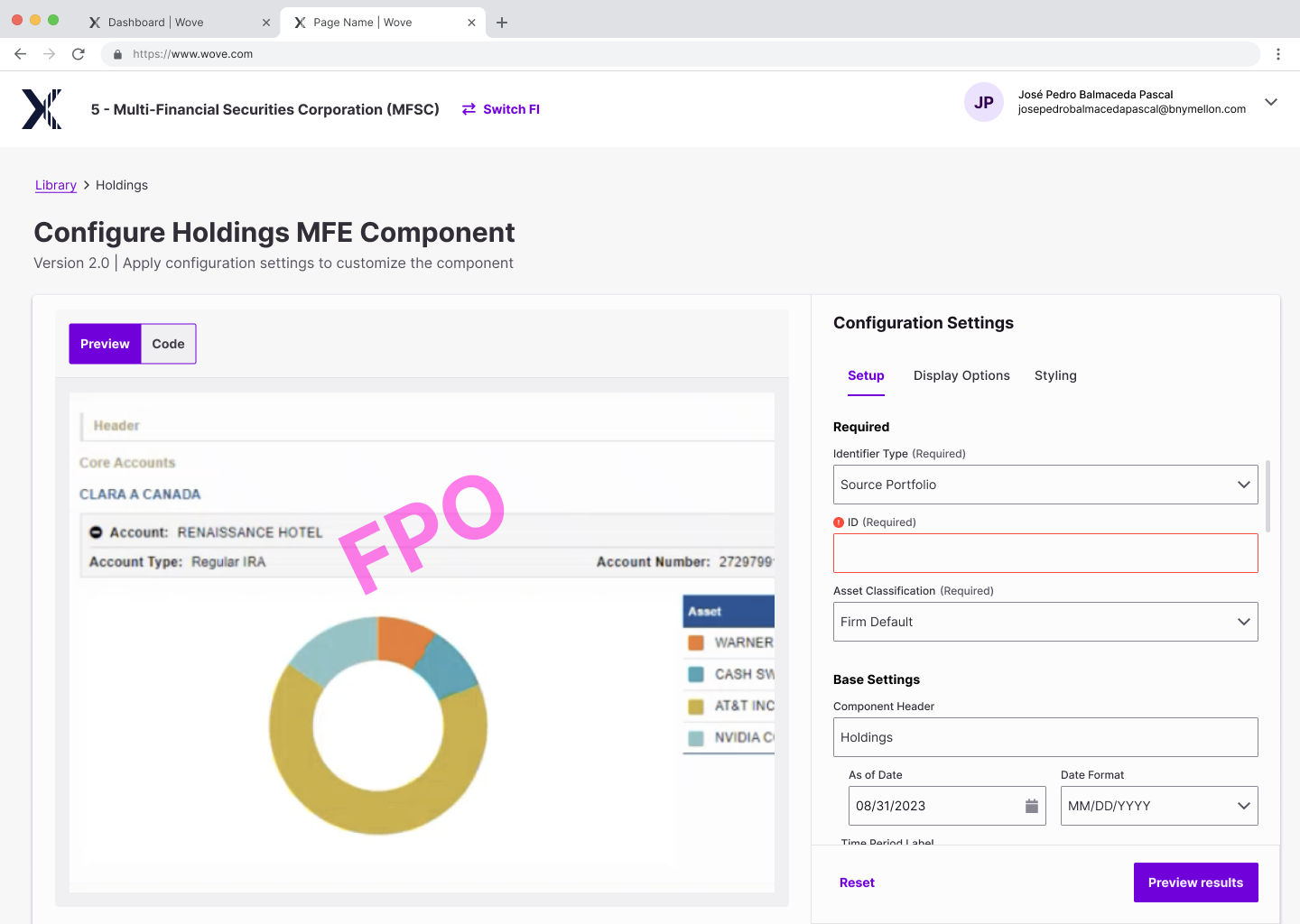
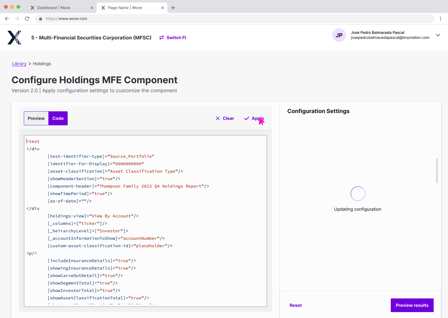
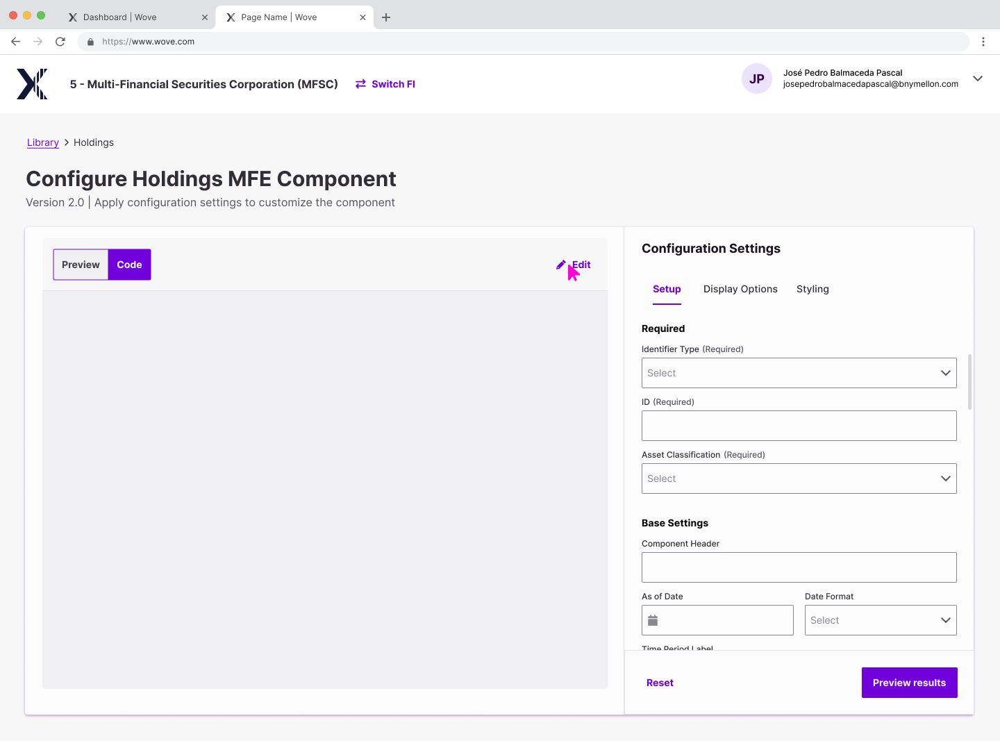
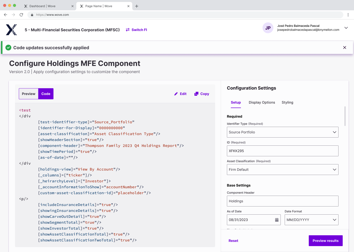
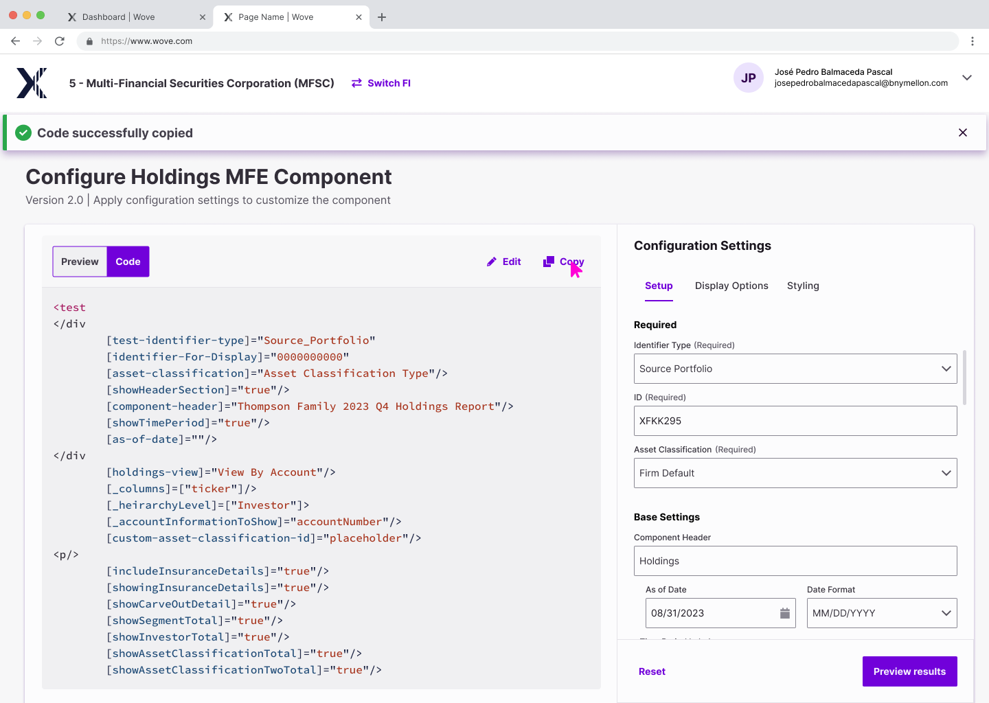
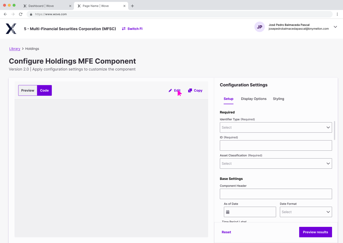
Micro front end (MFE) Reporting Generator
The user pain point:
What previously looked like a Windows 98 UI, where selections were made one a time via multiple fields without any preview mode. The experience was not intuitive. The result was a code of the created report that was used to share between Advisor and Home Office and their clients.
What previously looked like a Windows 98 UI, where selections were made one a time via multiple fields without any preview mode. The experience was not intuitive. The result was a code of the created report that was used to share between Advisor and Home Office and their clients.
The impactful UX/UI changes include:
A side-by-side layout where selections and adjustments made by the user are made visible in real time that way the user can validate and verify the data they are building in real time as a way to reduce errors and reduce having to go back or start the report over. I designed the IA behind the inputs and entries by categorizing them under tabs to prevent visual clutter.
A side-by-side layout where selections and adjustments made by the user are made visible in real time that way the user can validate and verify the data they are building in real time as a way to reduce errors and reduce having to go back or start the report over. I designed the IA behind the inputs and entries by categorizing them under tabs to prevent visual clutter.
Benefits:
These improvements allow the user to have the confidence in their selections (with instant validations of the output) and move through the experience quicker. This allows users to produce multiple reports in the time it used to take them to complete one with a significant reduction in errors.
These improvements allow the user to have the confidence in their selections (with instant validations of the output) and move through the experience quicker. This allows users to produce multiple reports in the time it used to take them to complete one with a significant reduction in errors.
(Before photos were archived prior to me keeping it for portfolio use - similar UI is represented below just for reference):

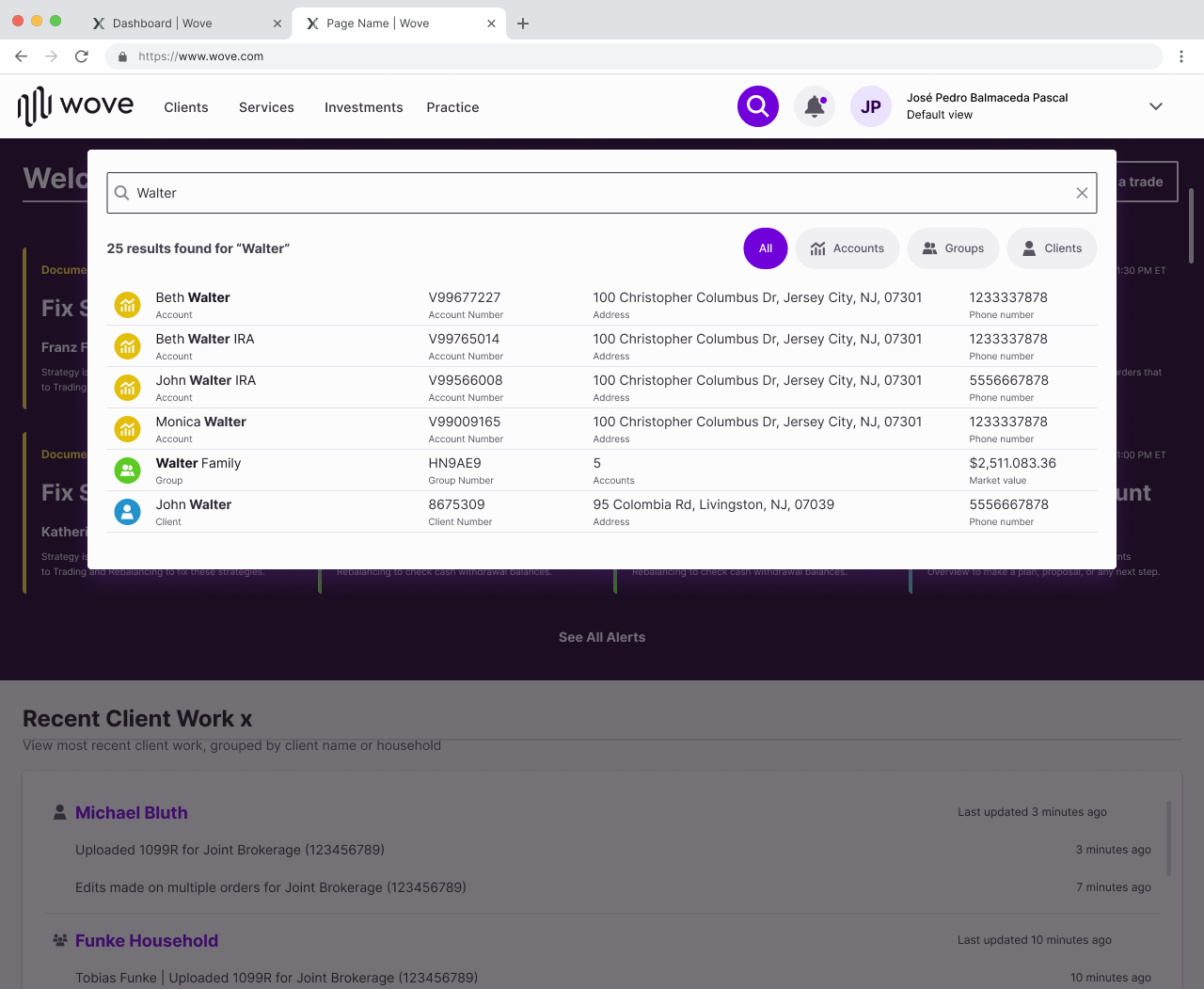
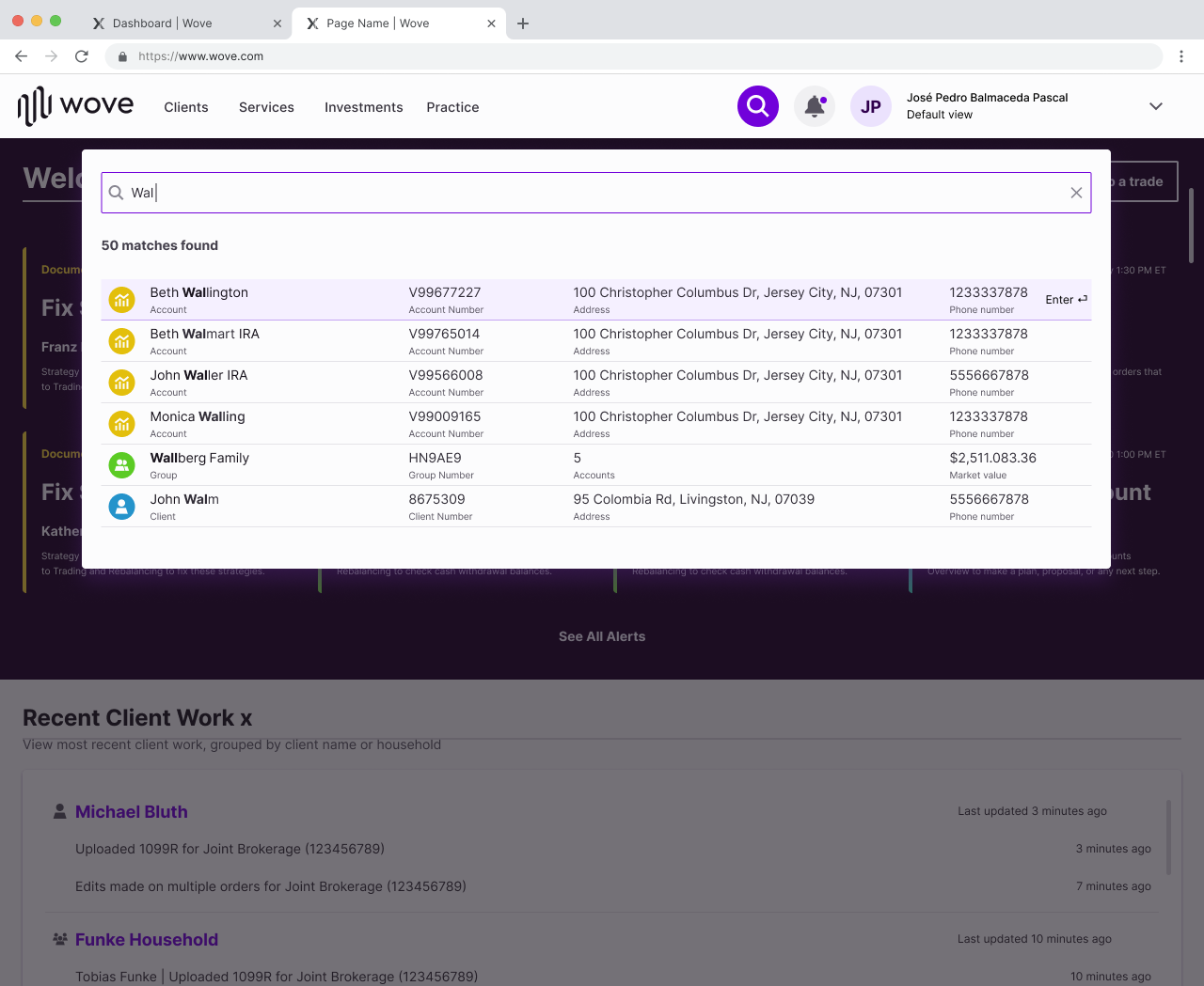
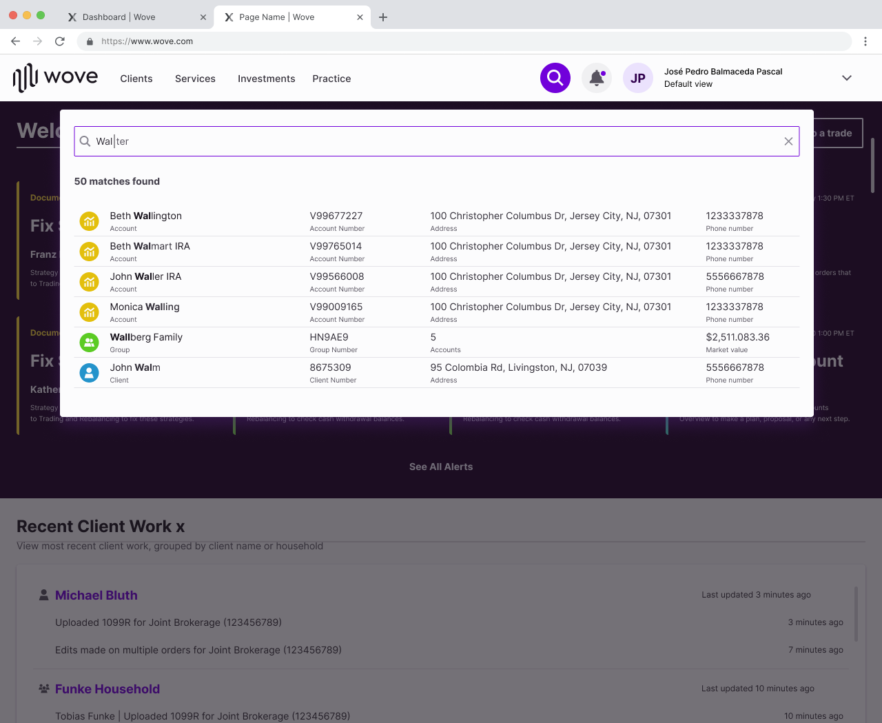
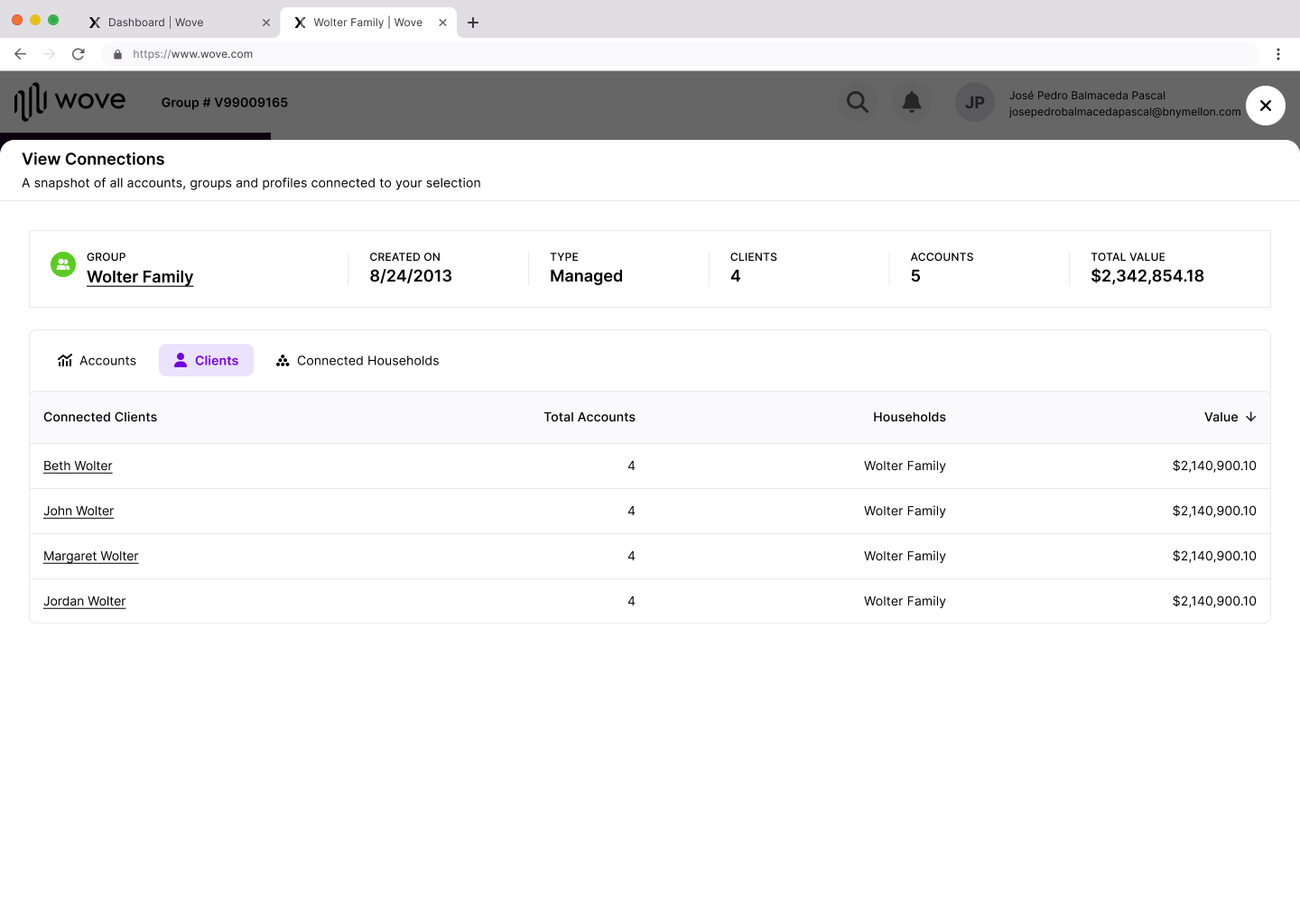
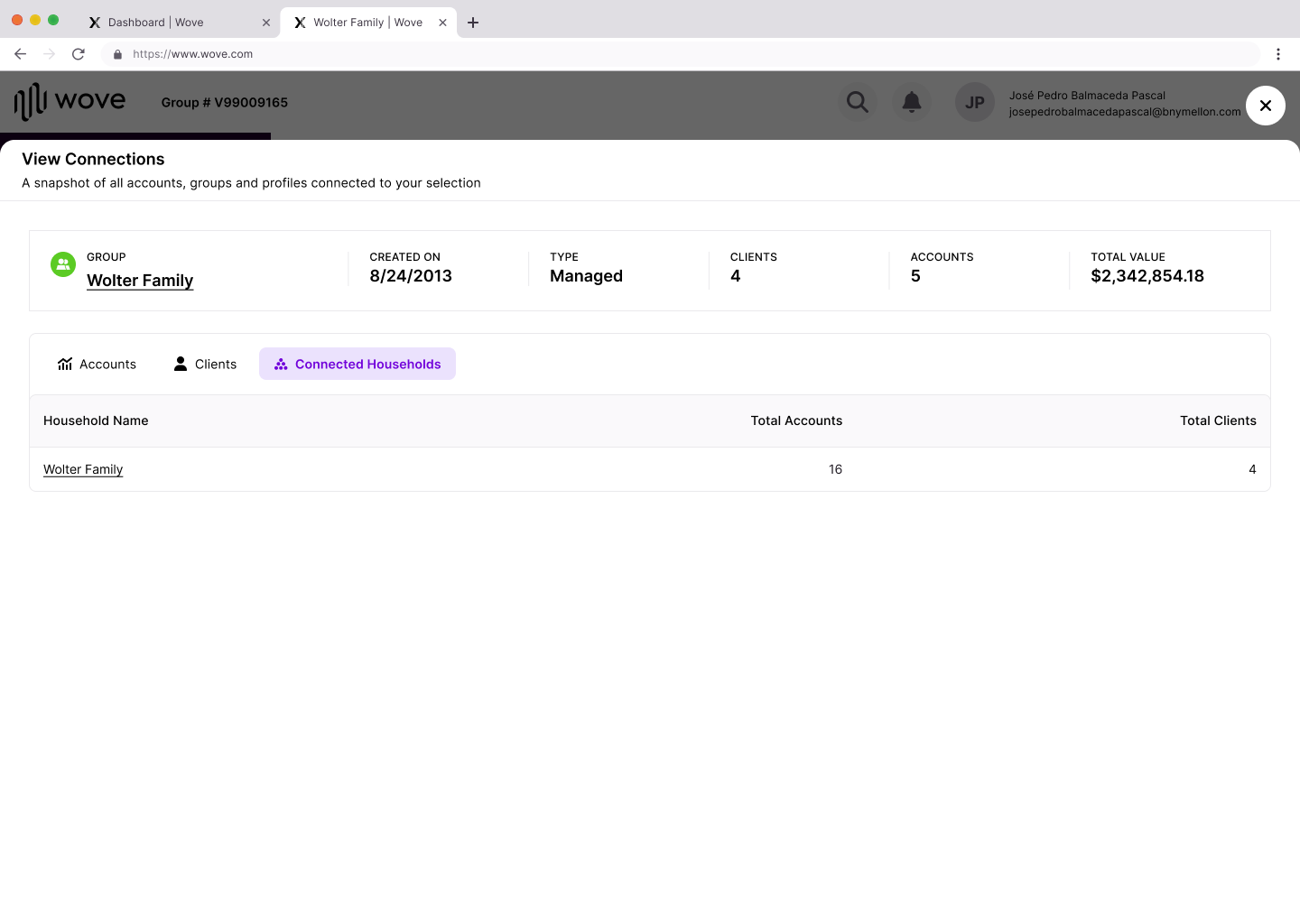
global search
The global search feature is available across all platforms and consolidates all available data to Advisors and their staff (Home Office) into the 3 financial entity categories: By Accounts, By Groups, By Clients.
The user pain point:
Experience did not allow for multiple entry points to reach a desired result or search query. Experience lacked detailed meta data to improve query to user intention match and navigability also lacked or suggested search assistance features.
Experience did not allow for multiple entry points to reach a desired result or search query. Experience lacked detailed meta data to improve query to user intention match and navigability also lacked or suggested search assistance features.
The major UX/UI changes include:
- Filter by category
- Add search result overview count
- Fuzzy search and suggestive results
- Introduce auto-complete feature and functionality
- Updated categorization (iconography and color coding)
- Accessibility keyboard shortcut interactions were defined
- Document the responsive and accessibility specs of this experience across multiple devices
- Reformatted visualy into table rows to contain primary and secondary data points in a balanced way that add
context to each results to very correct selections (ie for use cases of multiple similar names)
(Before photos were archived prior to me keeping it for portfolio use)

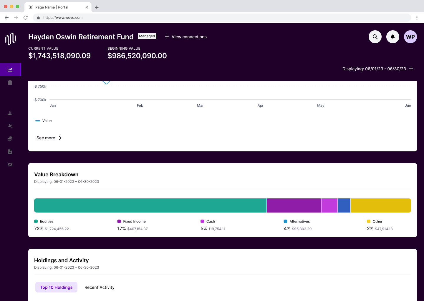
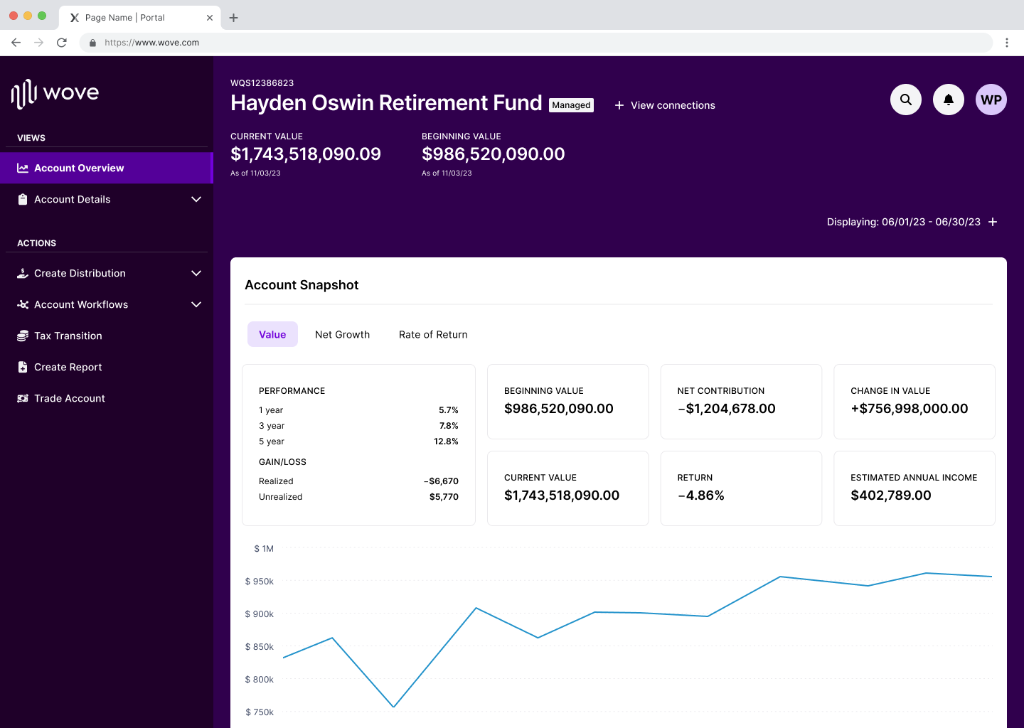
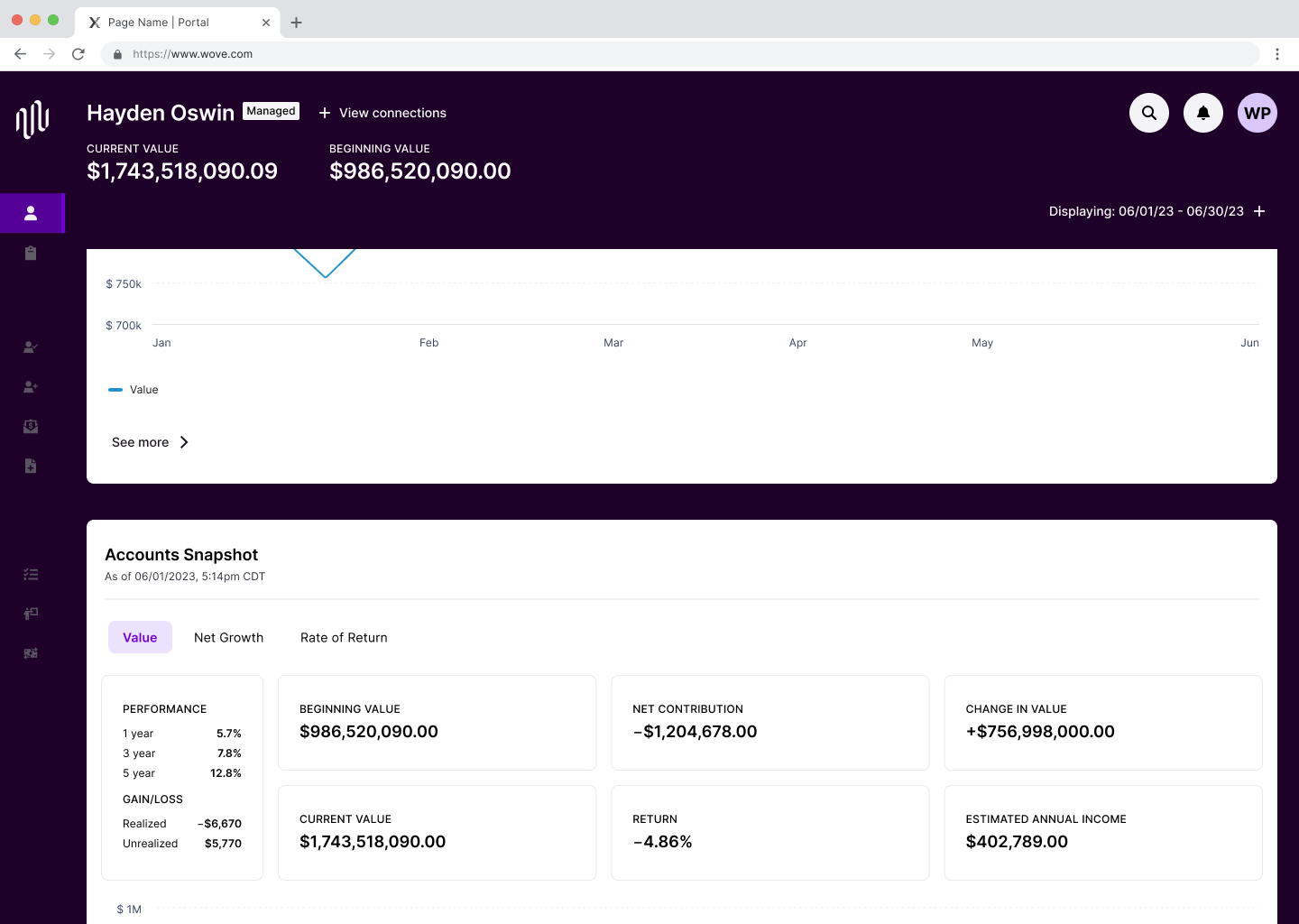
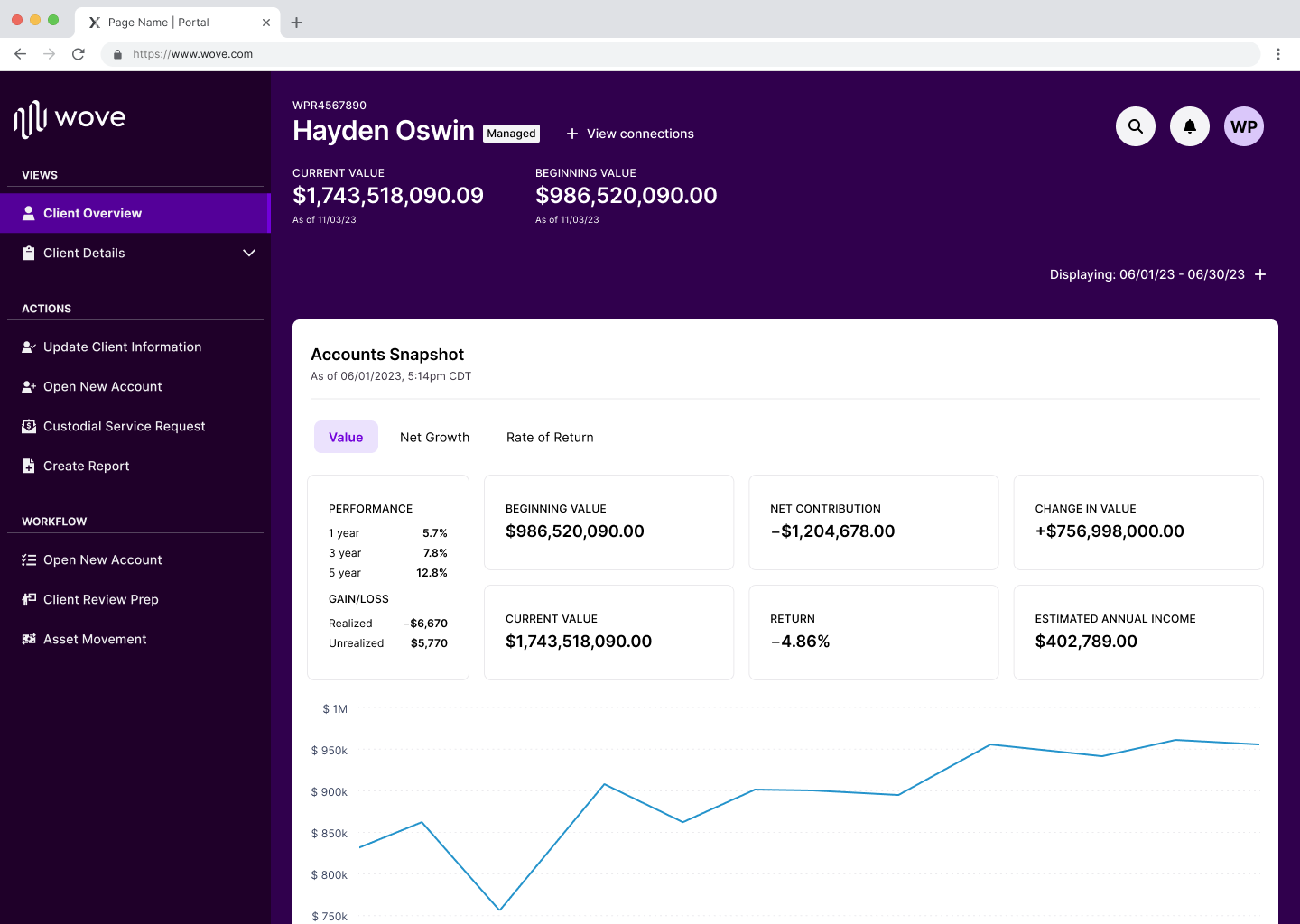
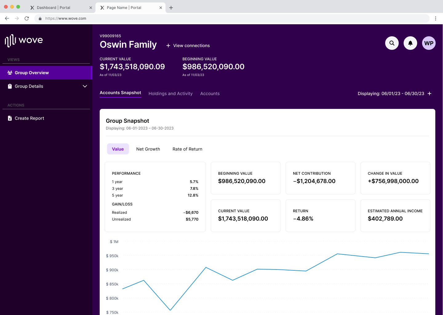
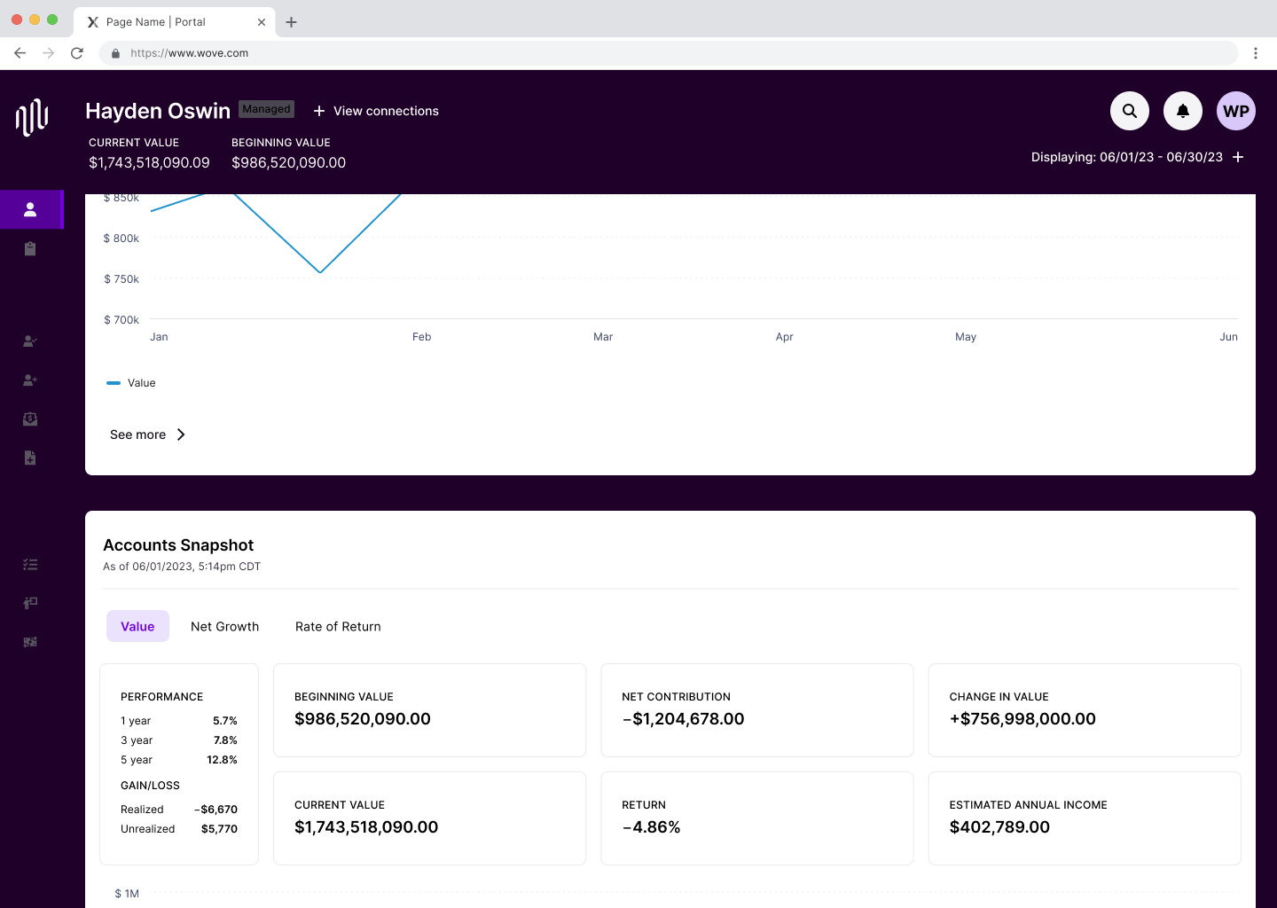
Overview Pages
This pages are the destination page result from having selected an entity/category from the search result or any entity/category linked text from any area of the platform. Very accessible, highly visible and customizable pages. These pages provide a financial performance overview of the Client, Account or Group filled with data visuals and charts according to various date ranges. These pages are not exportable and were previously flat in design and very lengthy.
The major UX/UI changes include:
- Hero space containing important data points from the overall performance
- Switching the date range from a dropdown text field into a minimal text link looking style
- Baking the platform's global nav into the hero to maximize the use of space and go full bleed on the page
- Designed to behave responsively and dynamically, meaning it condenses and collapses as user a user scrolls
down the page to only display crucial overview numbers to identify hierarchy and a sense of prioritization of
displayed data. Also, notice color change and font size change through the transition of scrolling down
(Before photos were archived prior to me keeping it for portfolio use)

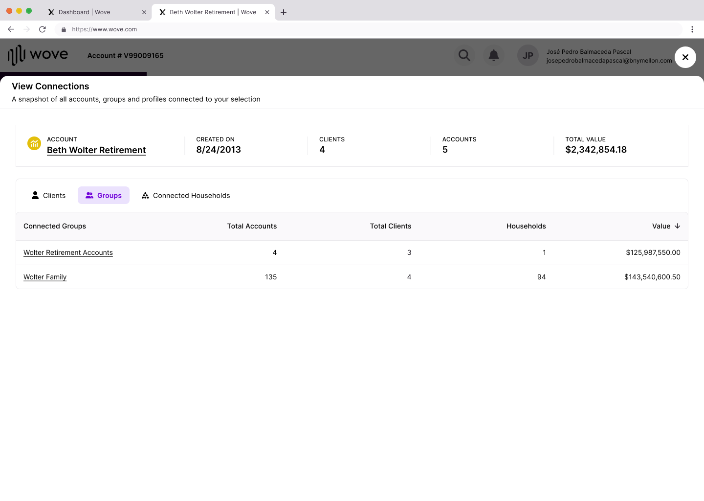
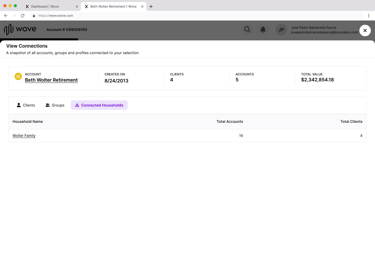
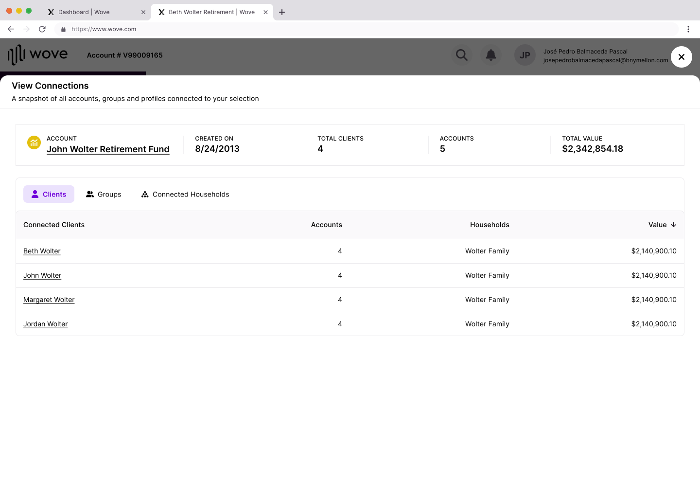
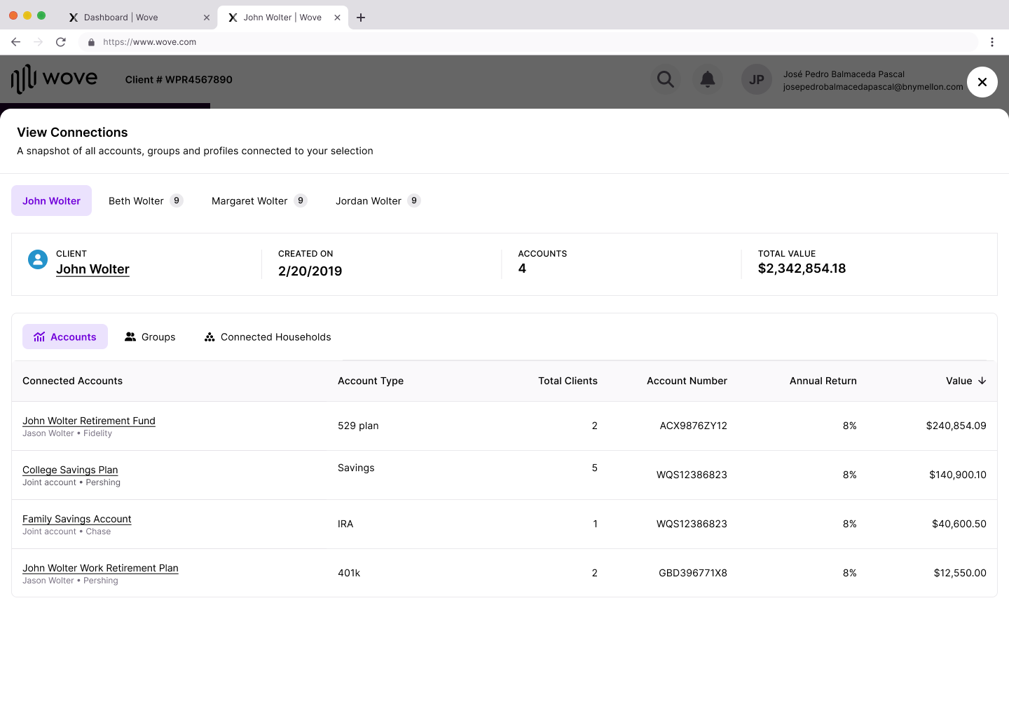
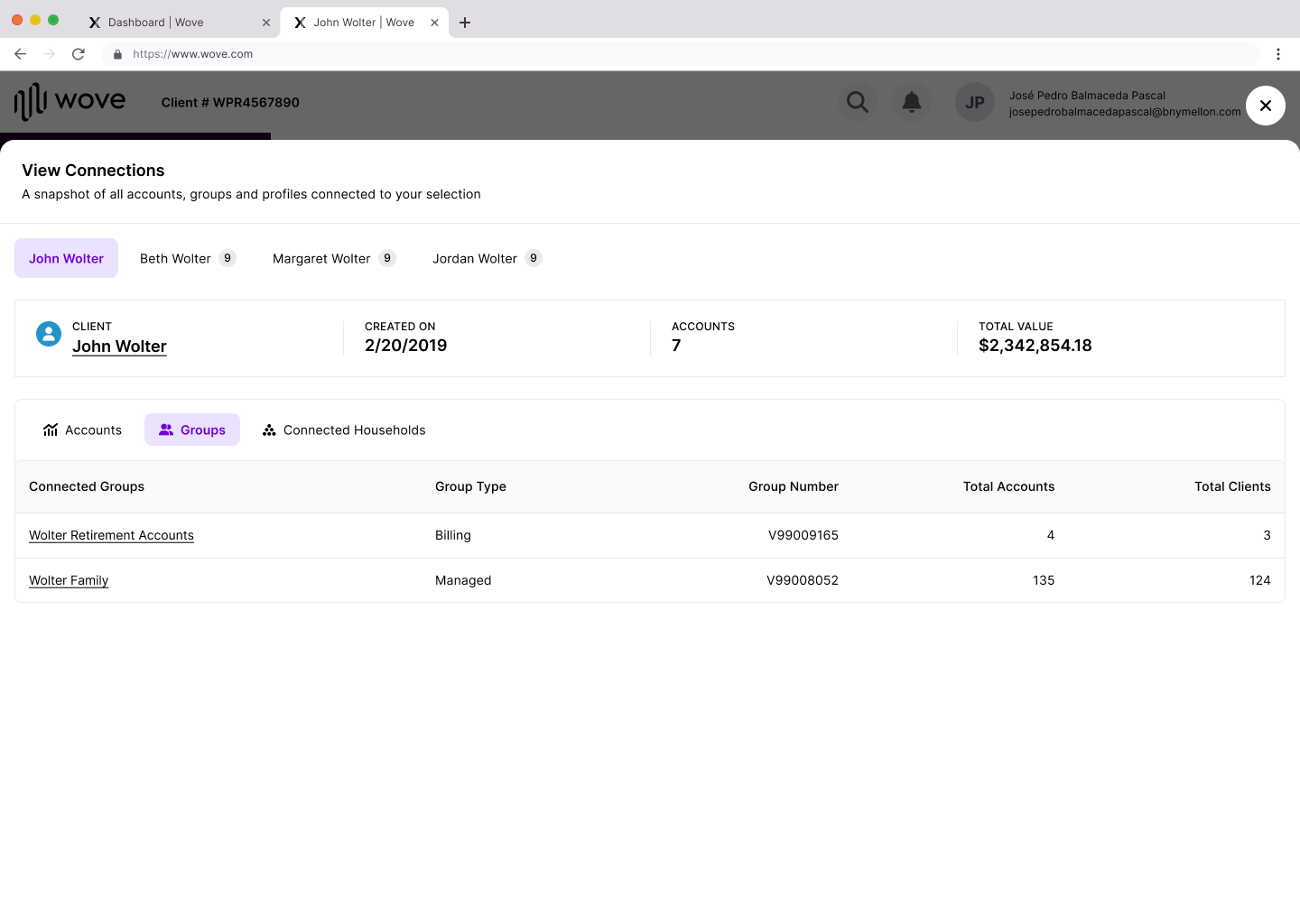
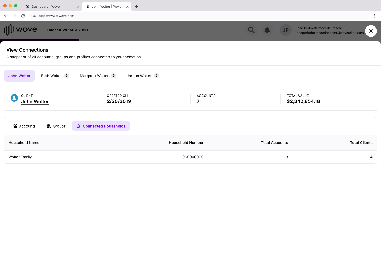
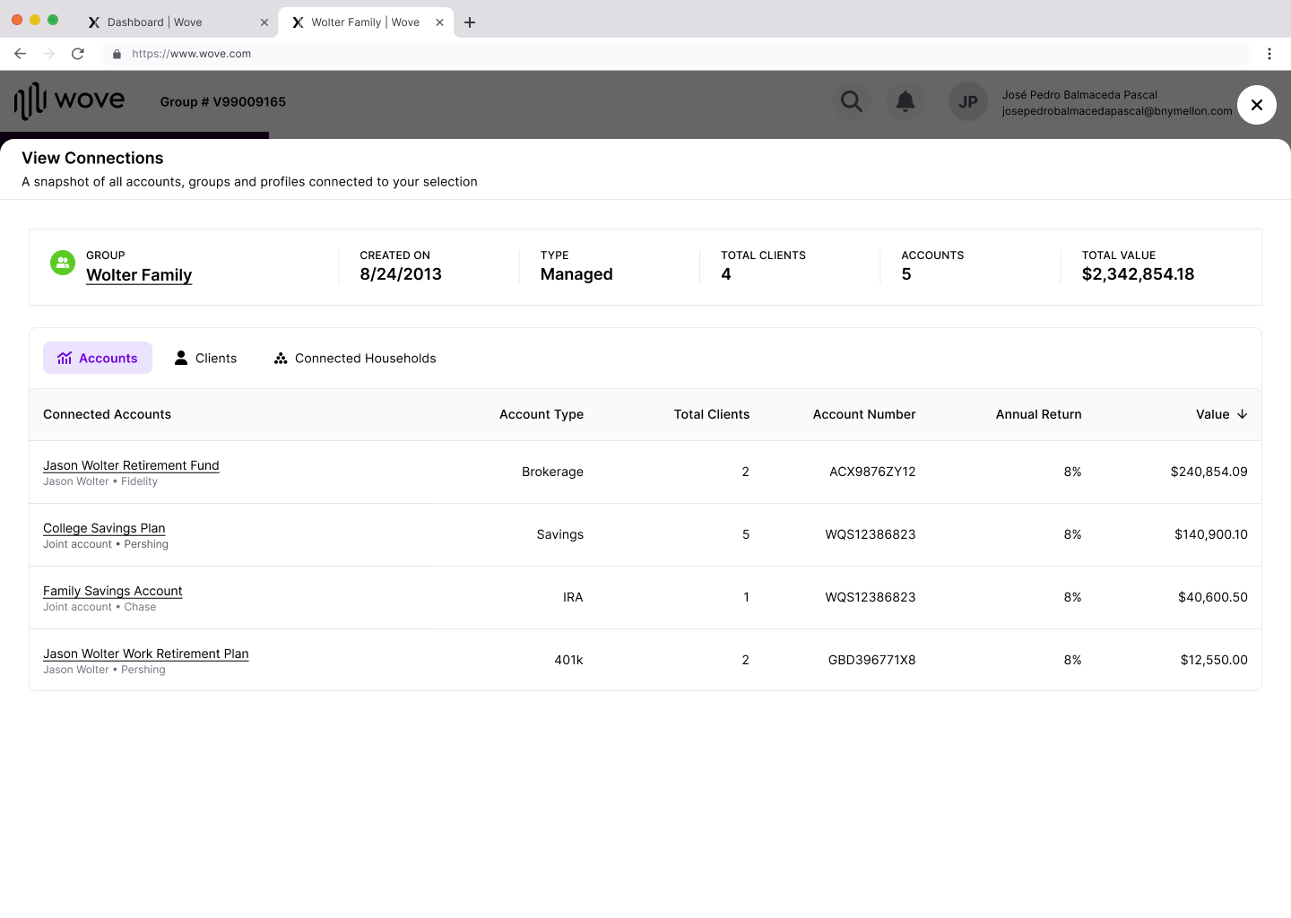
Context Switcher
The purpose of the context switcher is to help the user (Advisor) jump around clients and accounts that are associated to each other either by familial relation or another way.
The major UX/UI:
-Previously was a modal, placed into a bottom sheet instead to use full advantage of real estate
-Summary bar of the 'current selection' leveraging platform iconography and colors
-Category to filter results via tabs
-Table view to display all relevant data
-Text link data to jump to the next associated profile
Benefits:
This way, similar actions can be done more seamlessly by being able to jump to associated accounts/clients/groups.
This way, similar actions can be done more seamlessly by being able to jump to associated accounts/clients/groups.
(Before photos were archived prior to me keeping it for portfolio use)
UX Research and Key Findings
- Advisors want interoperability, Advisor clients want simplicity, Banks want revenue
- Users expect automation and systematic process
with minimal disruption in order to organize their work, drive priorities, deliver business results and manage risk.
- Users needs guidance when presenting new UI, features and functionality
- Users seek clarity and flexibility
- Advisors are disoriented but are open to new capabilities if it means leveraging the power of data to streamline
services, anticipate unmet needs and manage accounts and their opportunity profit more efficiently
- Users want more options to customize dashboards, table displays, reporting etc that suit their role and use case
Product Opportunities in HMW Statements
How might we?...
- Reduce cost to serve by automating processes that can help scale business profits and operations?
- Add more self-serve opportunity to clients to complete their tasks at a more efficient pace without sacrificing
quality and redirecting that energy back towards building client relationships ?
- Empower quicker action and decision making?
- Reduce duplicative or trivial and time consuming processes?
- Create intuitive user journeys?
- Leverage the power of data to streamline services, anticipate unmet needs?
- Offer more capabilities that allow for customization dashboards, table displays, reporting etc that suit their role
and use case
- Add emphasis to key data that would add value?
-Split views amongst personas to create focus on the each user's role (when possible)?
Other Role Achievements
- Mentor Junior Designers
- Main Designer to establish to Wove Advisory Platform experience via Global Elements and IA
- Single Handled suggested and created a UX Patterns Guide with platform examples and specs to commonly
used patterns that did not exist in the Design Library to inform Decentralized Design teams on new standardized
ideas they can leverage to build platform parity. Everything documented was submitted and presented to Design
System Team to add and adhere to the way Designers were operating for nuance use cases.
- Design QA
- Introduce new features, interactions and functionalities ideas
- Create the Designer to Content Strategist work request process to improve team collaboration and
communication
🏆 Results and Achievements 🏆

BNY is the corporate brand of The Bank of New York Mellon Corporation and may be used to reference the corporation as a whole and/or its various subsidiaries generally. Brokerage custody provided by Pershing LLC, member FINRA , NYSE , SIPC , a BNY company. Brokerage services may be provided by Pershing Advisor Solutions LLC, member FINRA, SIPC. Bank custody provided by BNY Mellon, N.A, member FDIC. Investment advisory services, if offered, may be provided by one or more affiliates of BNY. Technology services may be provided by Pershing X, Inc. This site provides information for investment professionals. It is not intended for use by the general public. Trademarks belong to their respective owners. Products and services described herein are intended for financial professional use.