
Role: UX Researcher, UX Designer, IA, Content Strategist
Client Profile: Tru Nature is an all-natural juice shop located in the Orlando, FL and Long Beach, CA. They pride themselves in making healthy food that is quick, convenient and delicious. The brand is most recognizable for it's artistic and psychedelic theme. Inside all store locations are wall to wall murals of underwater mermaids, dancing with fruits with a touch of Hindu icons and elements. They currently have no proprietary digital experiences outside of a Facebook page and Instagram account.
Objective: To research the user needs in order to assess which digital experience would be most relevant that would result in increase in sales, expansion of brand awareness and boost client-business engagement
Project Scope: Website (Desktop)
Tools: Illustrator, Excel, Sketch, InDesign, InVision
understanding THE PROBLEM
What I Know
“...54% of Americans said people in the U.S. pay more attention to eating healthy foods today compared with 20 years ago – the same percentage who said Americans’ actual eating habits are less healthy today than they were 20 years ago. And while 73% of Americans said they were very or fairly focused on healthy and nutritious eating, 58% said that most days they probably should be eating healthier” -Source: Pew Research Center
What I Need to Find Out
What the most strategic opportunity for Tru Nature was that will enhance a customer's experience, what the current pain points were for the customers, what could be done better to attract new clients and what were the values that Tru Nature wished to communicate to its guests.
How I Found Out
I conducted research on the current and potential target market and assessed their needs and experiences via interviews and surveys. Used competitive analysis to compare what other companies in the same industry (and market) were doing successfully that could be applied to Tru Nature's business model.

RESEARCH
INTERVIEW FEEDBACK | In-Store Experiences
a) Before coming across Tru Nature, participants had juicing experiences in large chain smoothie places but none of their products were as fresh.
b) 80% of the participants did not know about the 10% discount for showing proof of gym membership or that there were daily special menu items.
c) No participant knew the hours of operation or phone number.
d) Average visit: 20min.
e) Hectic schedules are the biggest impediment to letting them achieve their goals.
f) All participants showed high interest in trying new flavors and experimenting
g) All participants did share that they noticed all the nutritional posters alongside the counter listing the health benefits of each ingredient that they serve and expressed that seeing those have swayed them to make special requests to their drinks or decide on a different menu item.
PARTICIPANT PROFILE:
a) 20+ participants from the Orlando, FL area at a driveable distance to Tru Nature
b) Mix of age, income and ethnic background
c) Mix between those who have visited Tru Nature and those who have not
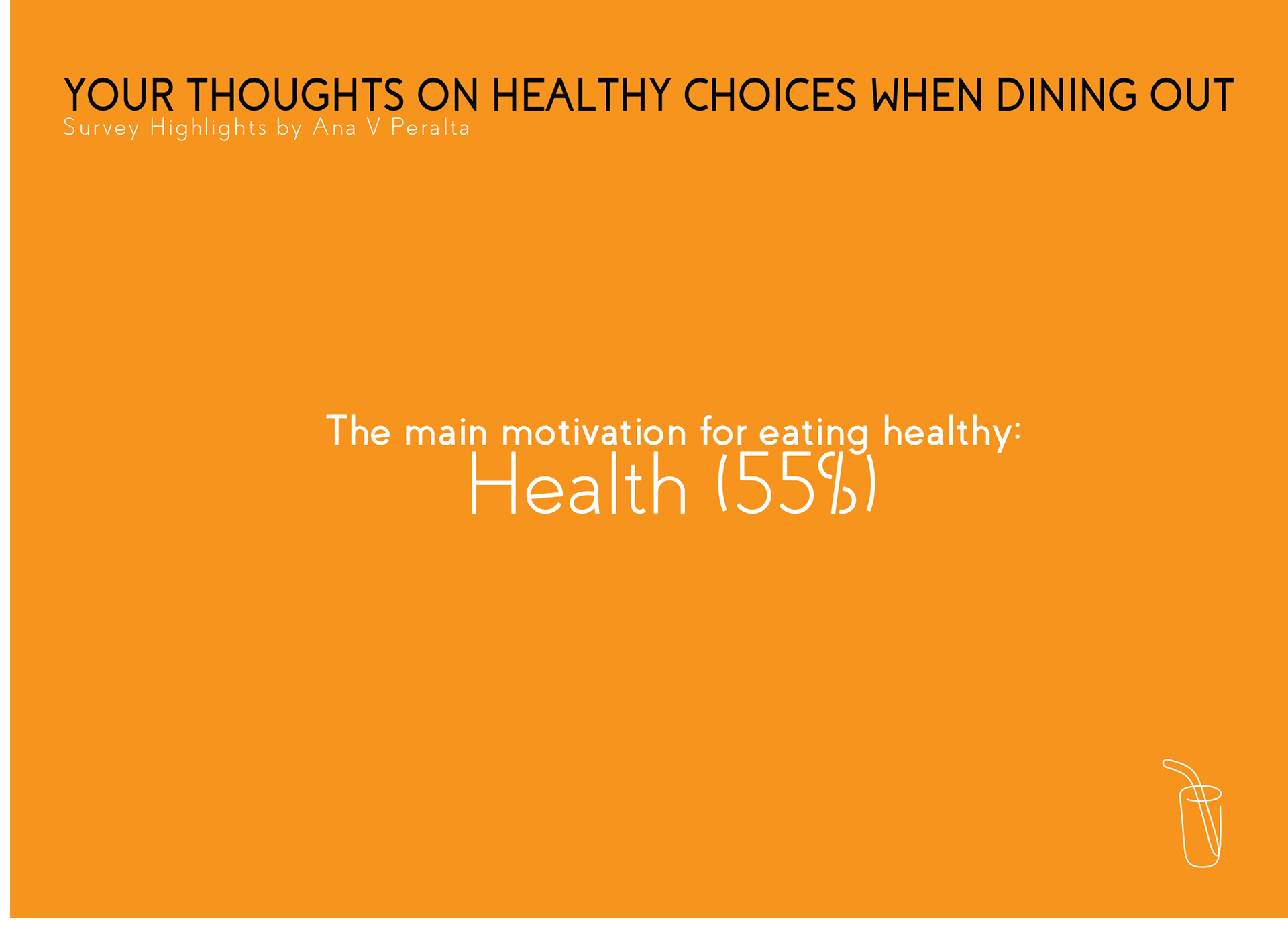
d) All participants expressed currently or previously having an interested in getting healthy and have established some sort of a health goal (i.e. motivations varied from weight loss, to eating clean or detoxing).
e) All participants have a hectic lifestyle but still mostly prefer to make a majority of their meals at home, however, they have relied on Tru Nature to keep them on target when schedules get crazy.


RESEARCH RESULTS
Learnings:
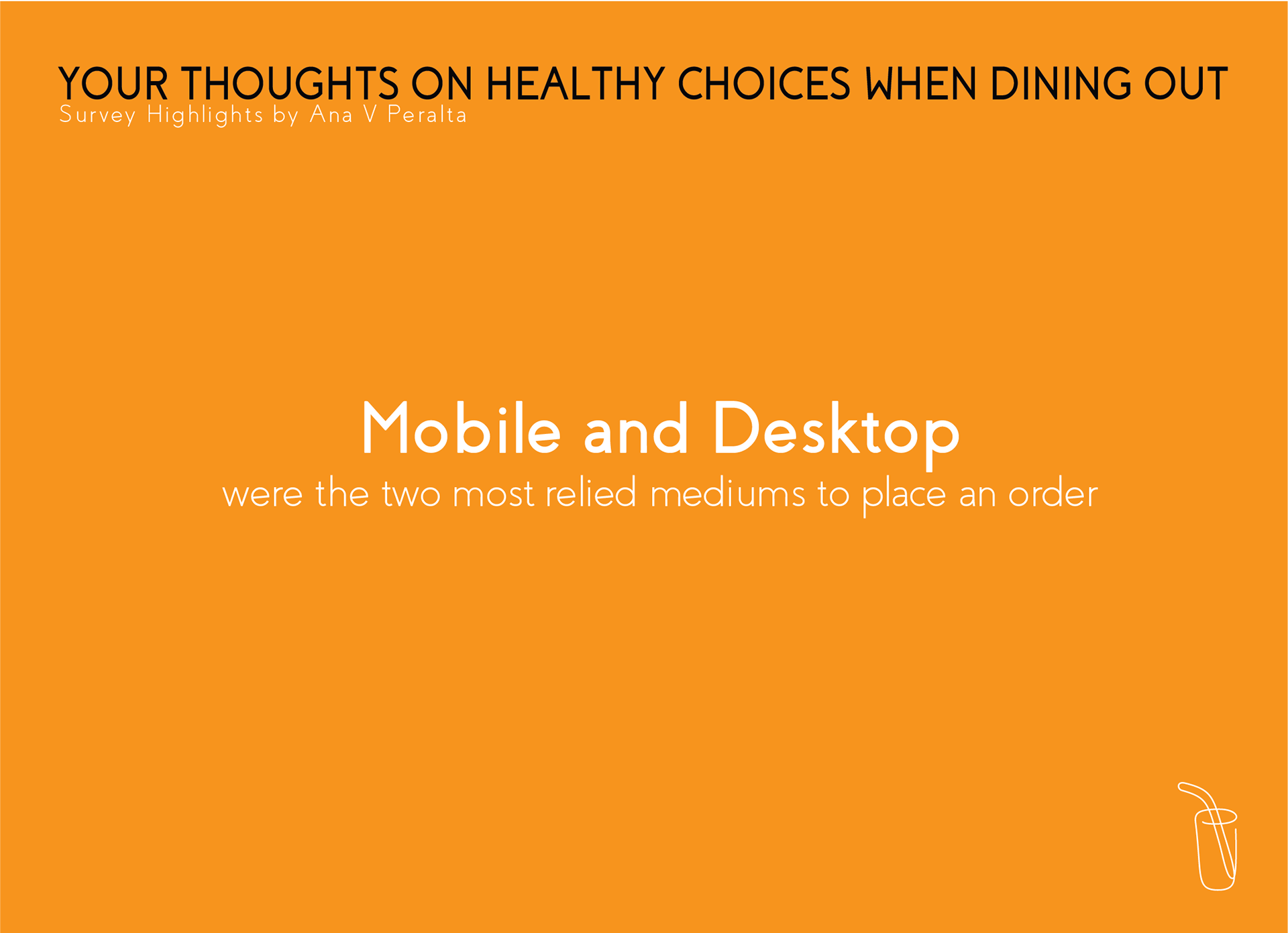
1) Digital presence on web or mobile looks to be essential means of communications to attracting new customers and keeping up with the lifestyles/schedules of existing customers.
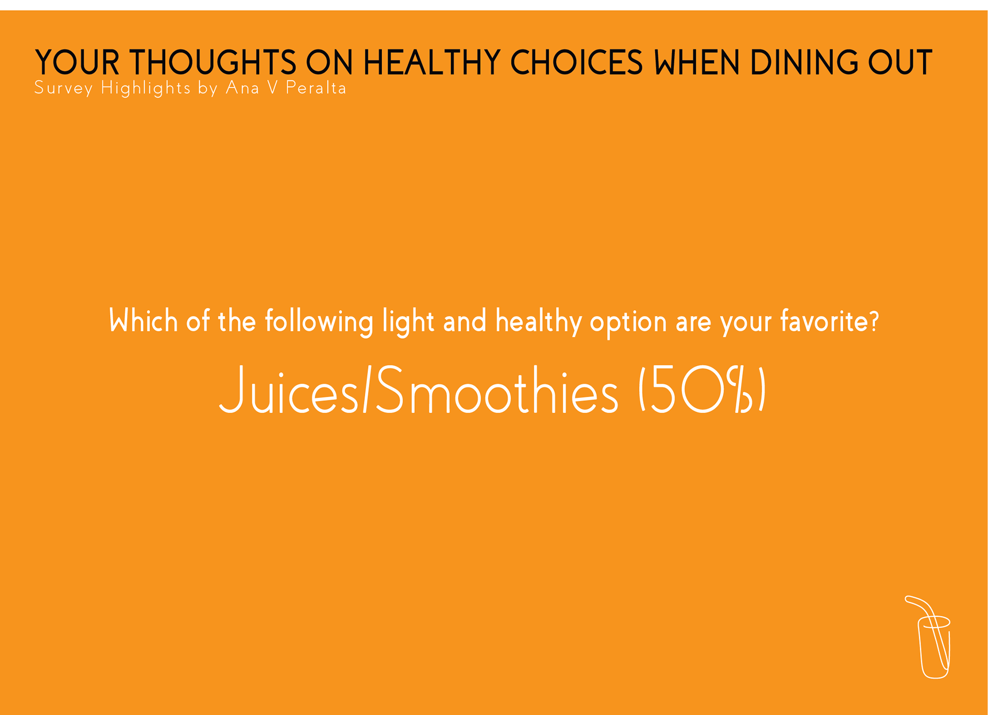
2) Surveys revealed that Juices/Smoothies are clearly the most appealing item to a majority of participants, which is a positive sign that Tru Nature, will appeal to everyone.
3) There seems to be a profitable time of day in which customers are most likely to visit at once, and ensuring that all customers get fast and friendly service would suggest that having the operations ready at this time would result in positive business.
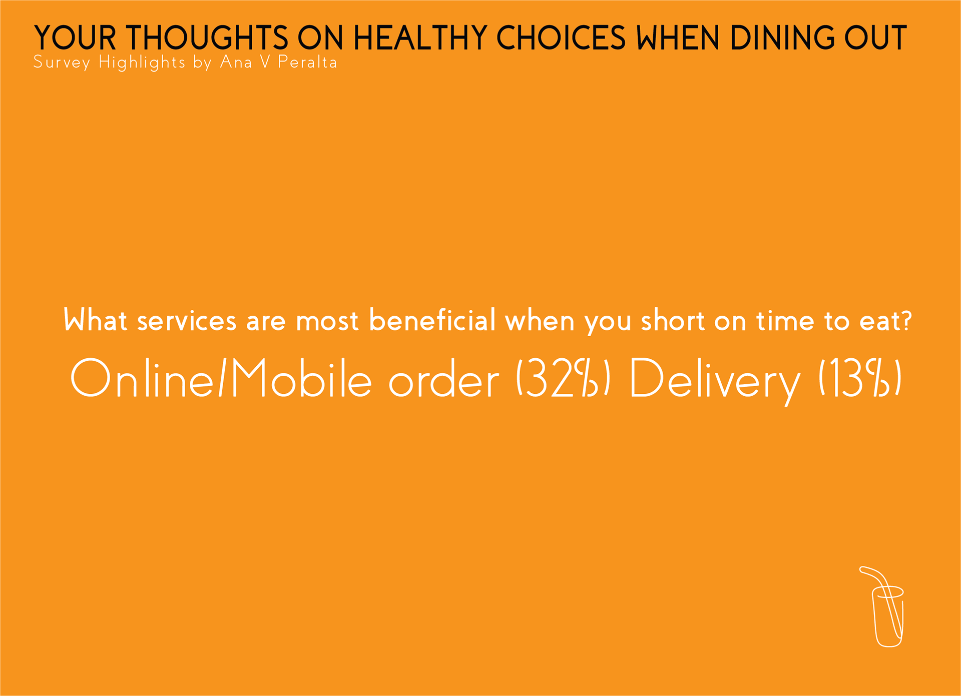
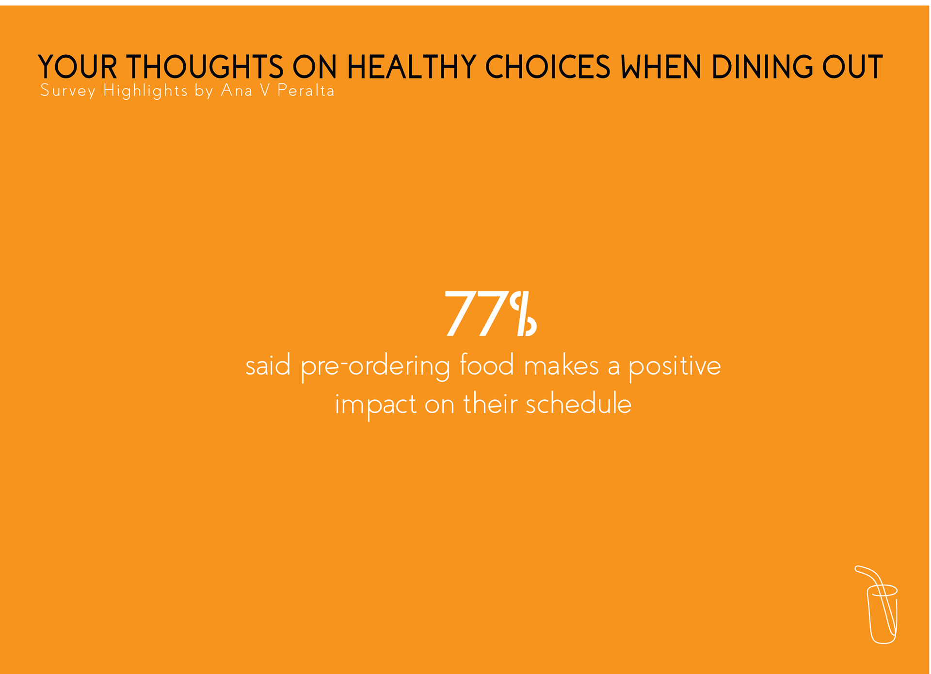
4) All participants shared that having the option to call ahead and order online would make a difference and positive impact on their schedules.
Pain Points:
1) The more hectic their schedules are the more help they need to stay healthy and planning is helpful
2) Customers feel unaware of certain and perks, values and community that will entice them to keep the business top of mind
3) The clientele is reliant on third party sources for essential info such as business hours and address. The most commonly used sources to investigate this are: Google, Yelp, Facebook
4) Marketing is primarily reliant on word-of-the-mouth due to little physical promotional materials available to share and distribute
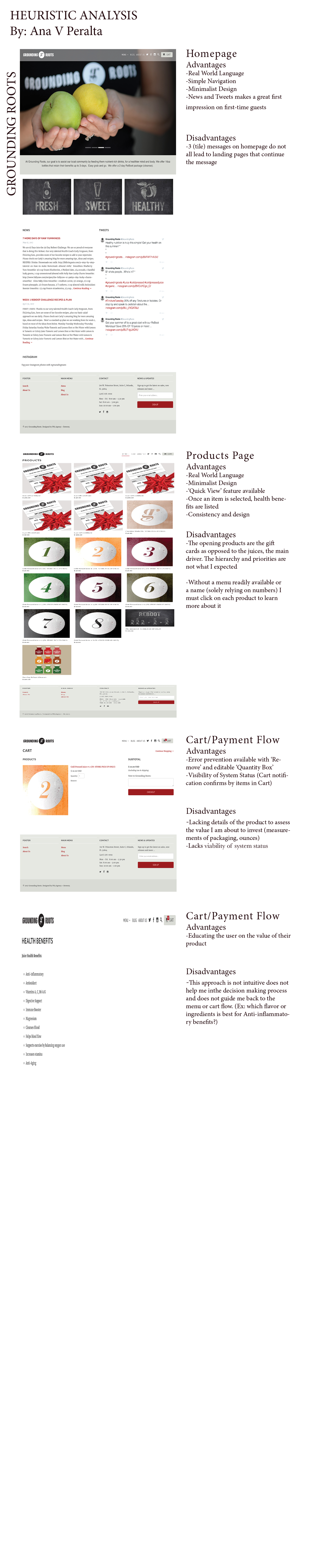
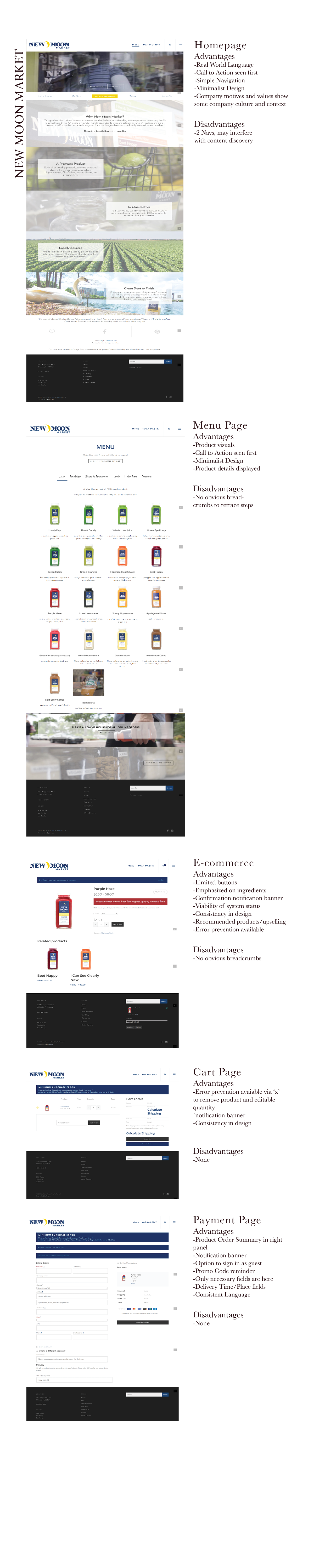
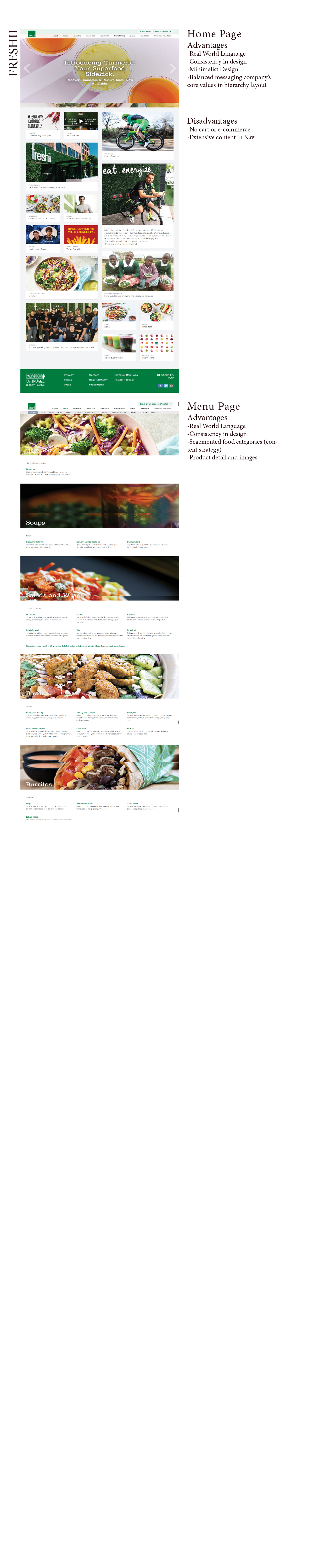
HEURISTIC ANALYSIS | COMPETITIVE ANALYSIS
Local juice shops within close proximity to the Tru Nature where assessed to benchmark their web presence. I assessed each website via Nielsen and Molich's 10pt Usability Heuristic evaluation as a best practice rule of thumb to understand what type of digital experience the current local Orlando market was receiving. To my surprise, the Orlando juice market was not very advanced in the intuitive sense, which gave me the hope that Tru Nature could become a lead contender to set an example.
Screenshots and Notes of my research and learnings are summarized below:

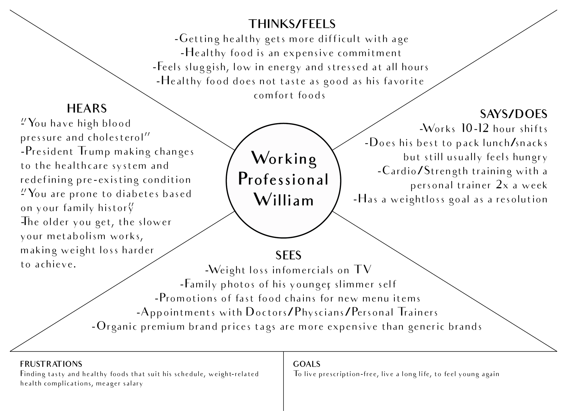
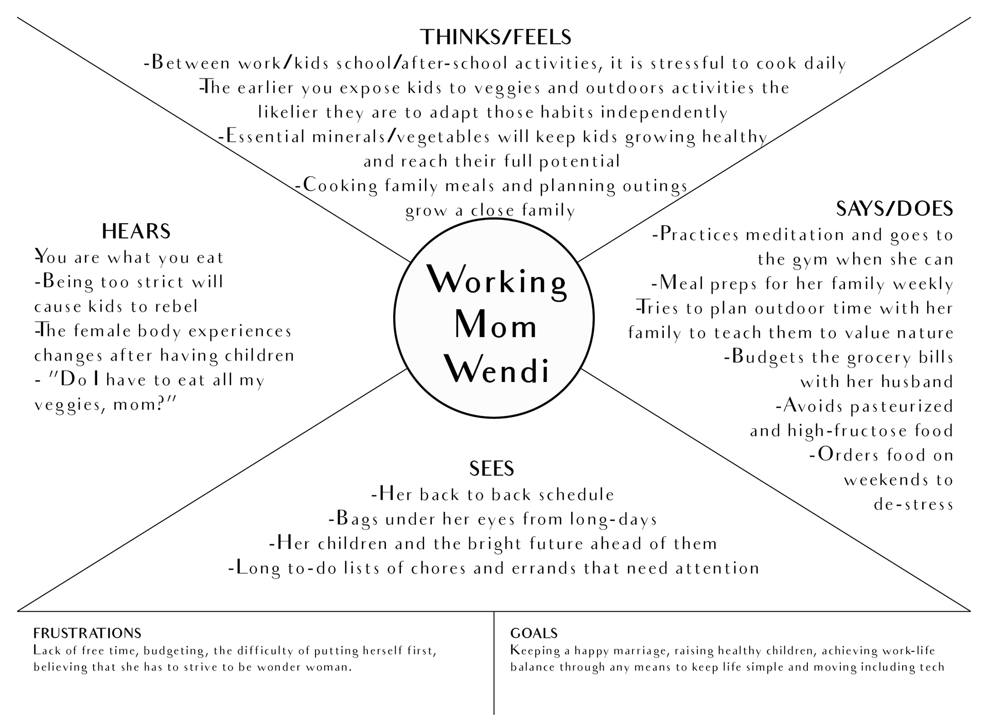
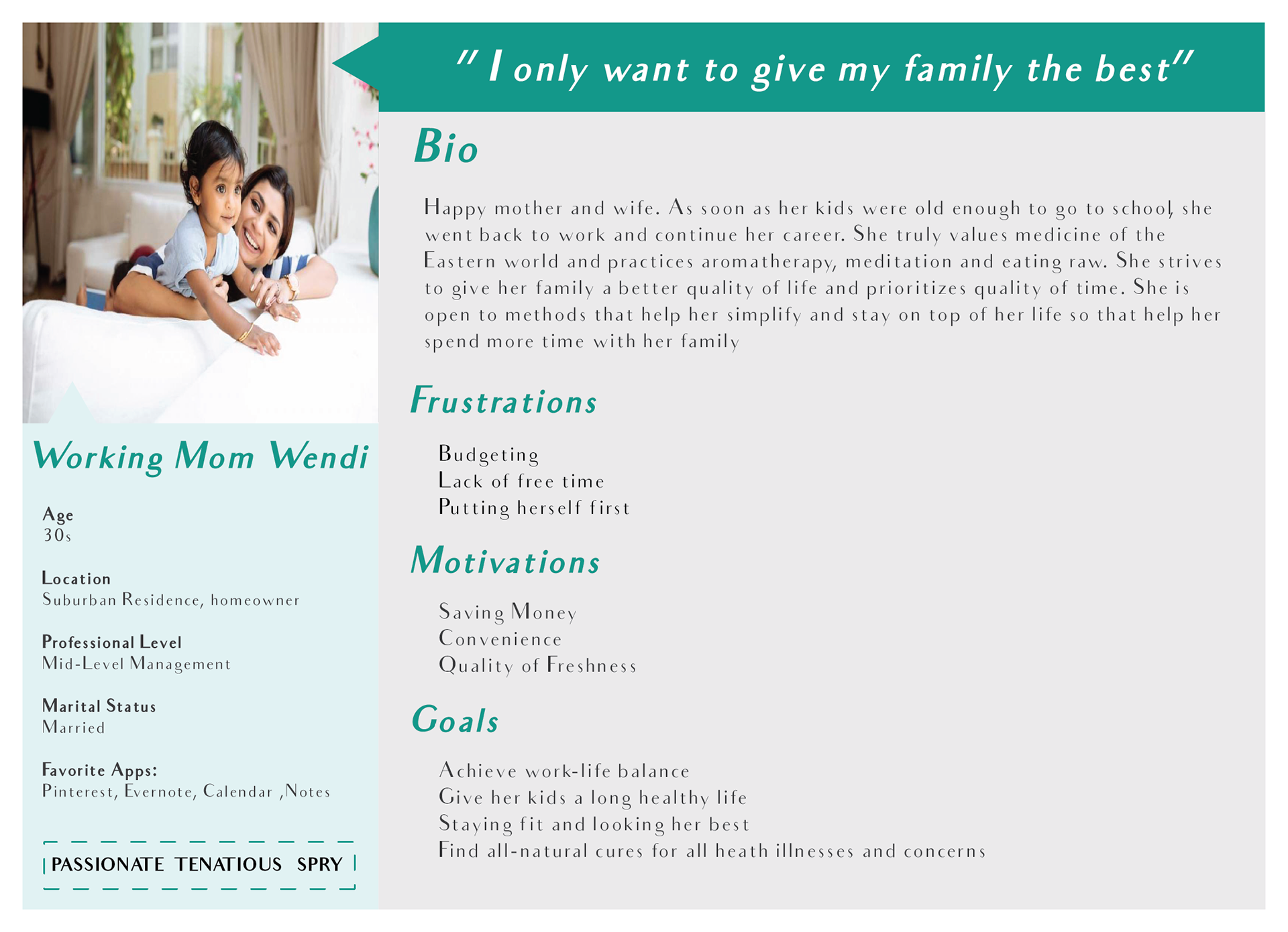
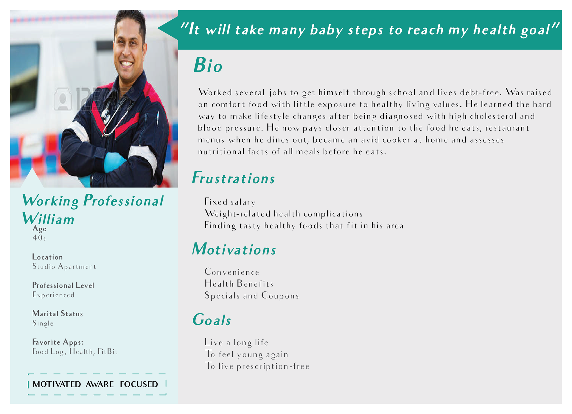
EMPATHY MAPPING and PERSONAS
Through on-site visits and observations, several common variables within clientele were identified to create the 3 key users, also know as, Personas. Through interviews, I was able to gather insight as to how an individual thought, spoke, felt and acted in relation to living a healthy lifestyle, a core value for Tru Nature.
My learnings were recorded below


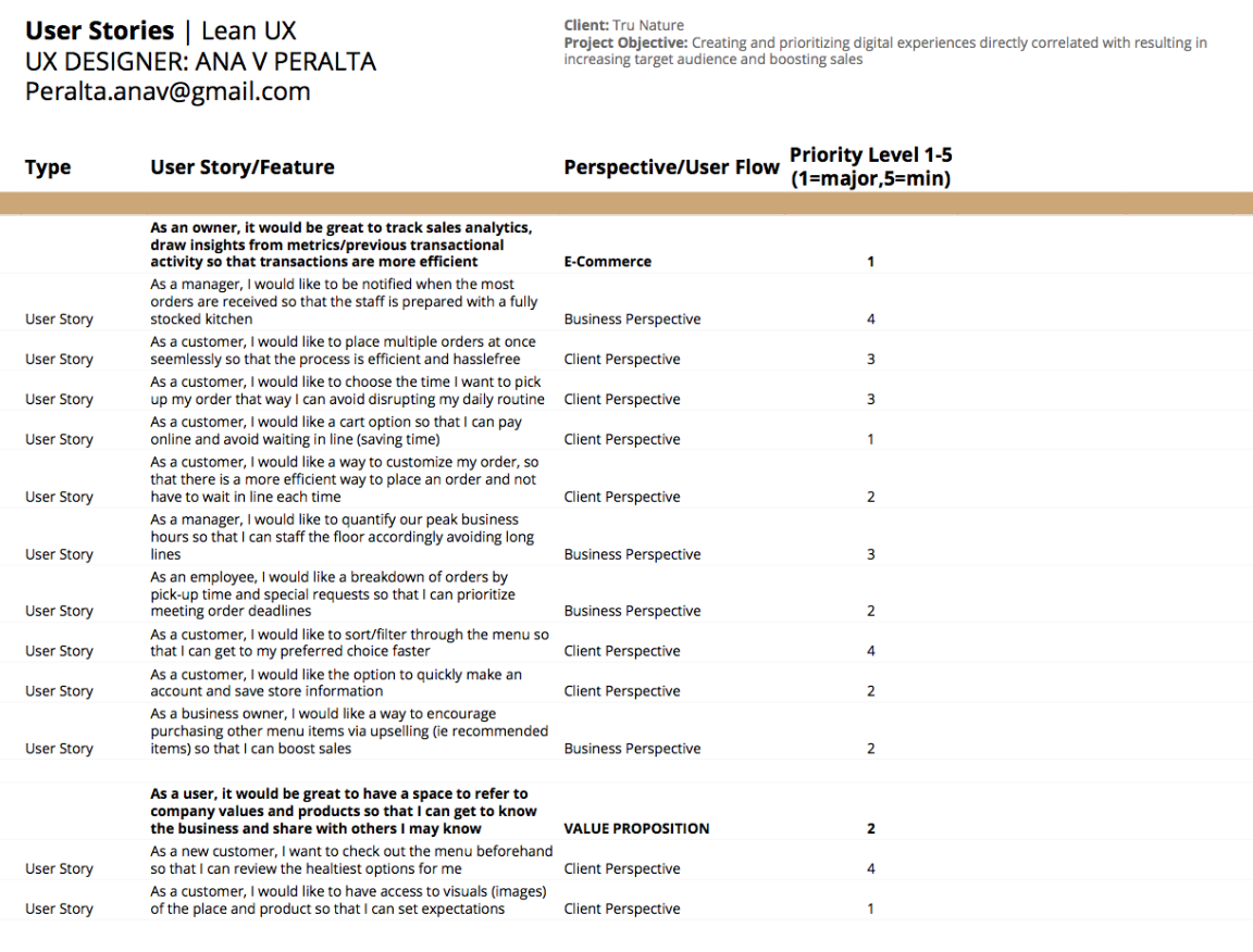
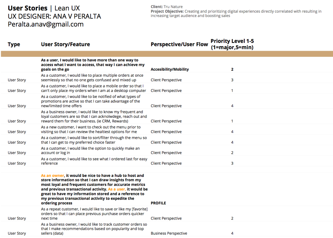
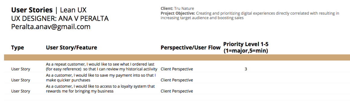
USER STORIES
I created a granular list of user stories that would be very relevant to addressing all mentioned pain points for the clients as well as the learnings that were shared, followed by giving each line item a prioritization label to indicate where the need was strongest to address the project goal.
I concluded that there were 5 main goals necessary to improve the Tru Nature experience: E-commerce, Profile, Accessibility/Mobility, Social Media and Value Proposition (marked in BOLD in my spreadsheet).
Please see my spreadsheet below.

CARD SORTING
For this activity, I profiled candidates against the identified Personas who all shared the same sense of healthy living. All candidates were familiar with the business so it made it easier to explain what the needs are based on what the client offers. With a deck of 30 realistic tasks, the users were left to their own devices to sort.
User 1
Categories:
Profile, Menu, About Business, What’s New, Location
Input:
-Her priorities were having visuals of the food, seeing the menu, learning how to make her ordering experience quicker and educating herself on ingredient benefits).
-Felt the gift-cards were seasonal items and primarily promoted for holiday-centric reasons and felt it should go under ‘Whats New’
-Felt the content regarding ‘Location’ should differ from ‘About Us’ to separate information between each establishment
-Felt all visuals should be categorized as social media
User 2
Categories:
Menu/Food Gallery, Menu, Deals, Brand, Contact Us, General Info, Profile
Input:
-Believed in the floating cart feature alongside the menu (combined) where edits, quantities, additional meal info and special requests were made prior to purchasing, as see on Pei Wei's website.
-Expressed the following priorities were important for him to see in the homepage: Ordering, Menu and Pictures
User 3
Categories:
Login/Membership, Order, Contact Us, Business Info, Menu, Pics, Employment, Mission, Events Calendar, Health Benefits
Input:
-Unsure of where to placed company awards but felt it was a homepage factor
-Had one category called ‘Services” but later managed to break it down
-Priorities: About the company, the menu, reading about the health benefits


Image from Card Sorting activity conducted with users that fit the current target audience
Results and Findings
I found that the most interesting part was that each participant had a unique logic and take on what the categorizations should be.
Overlapping Topics:
a) Viewing menu items with images and descriptions, ways to order online
b) General info regarding the business and it's brand
c) Other services (outside of menu items) they would consider participating (i.e. gift cards, creating log-ins, signing for alerts on specials and promotions).
Unexpected Results:
-a) Interestingly enough, none of the users mentioned FAQs or made a category special to social media, all assumed it go under ‘news’ where they felt limited time content would fall under.
b) A new category that I did not expect was an events calendar page, although I believe I could incorporate as an elements of a Newsletter.
Challenges
I felt the Health Benefits content was a unique piece to the in-store experience that helped customers make more educated decisions with their orders, however, I felt that adding in to the Nav would interfere with the two more important business goals: increase sales and target market. I learned that clients would feel more confident about their purchase but could not claim with certainty if it would encourage them to purchase more at check-out or refer other peers to visit. Frankly, Tru Nature's ingredient inventory is not unique compared to other nearby juiceries, therefore, my conclusion was to include it in the header where it would always be available to a user with a health goal in search of information.
SITE MAP
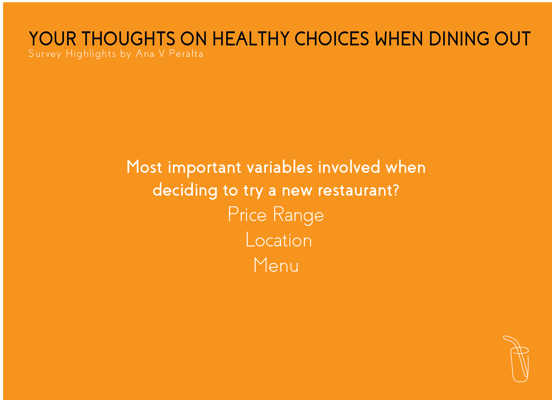
Based on the defined needs and goals from interviews with users of the target audience, I have gathered the following priorities to frame the site's Navigation. In an effort to meet the two main business goals of increasing sales and target audience, I placed the Menu and Locations first (left hand side) in order for it to catch guests eyes first. The Menu tab allows a user to fall into a purchase flow which will encourage sales after a guests has been enticed by the menu.
Challenge: As Tru Nature qualifies as a small-business as is in the early stages of their growth, their content is limited in quantity, therefore I felt there was room to consolidate and reduce the need for many pages.
Please see diagram below.
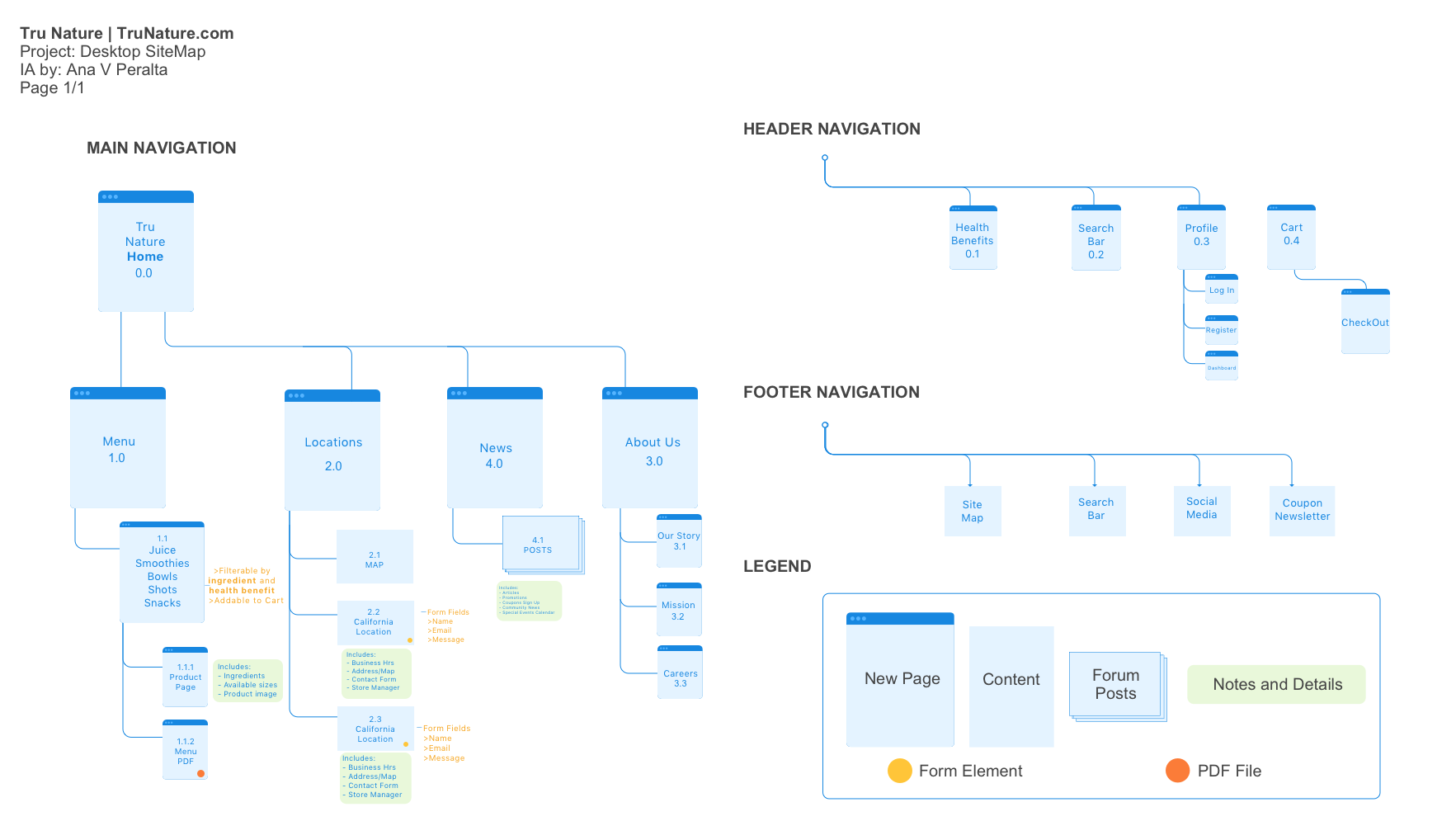
Site Map by Ana V Peralta
USER FLOWS
USER FLOW #1
This flow caters to users based on motivations determined in the Personas, it outlines if a user had a health goal in mind versus looking for a benefit.
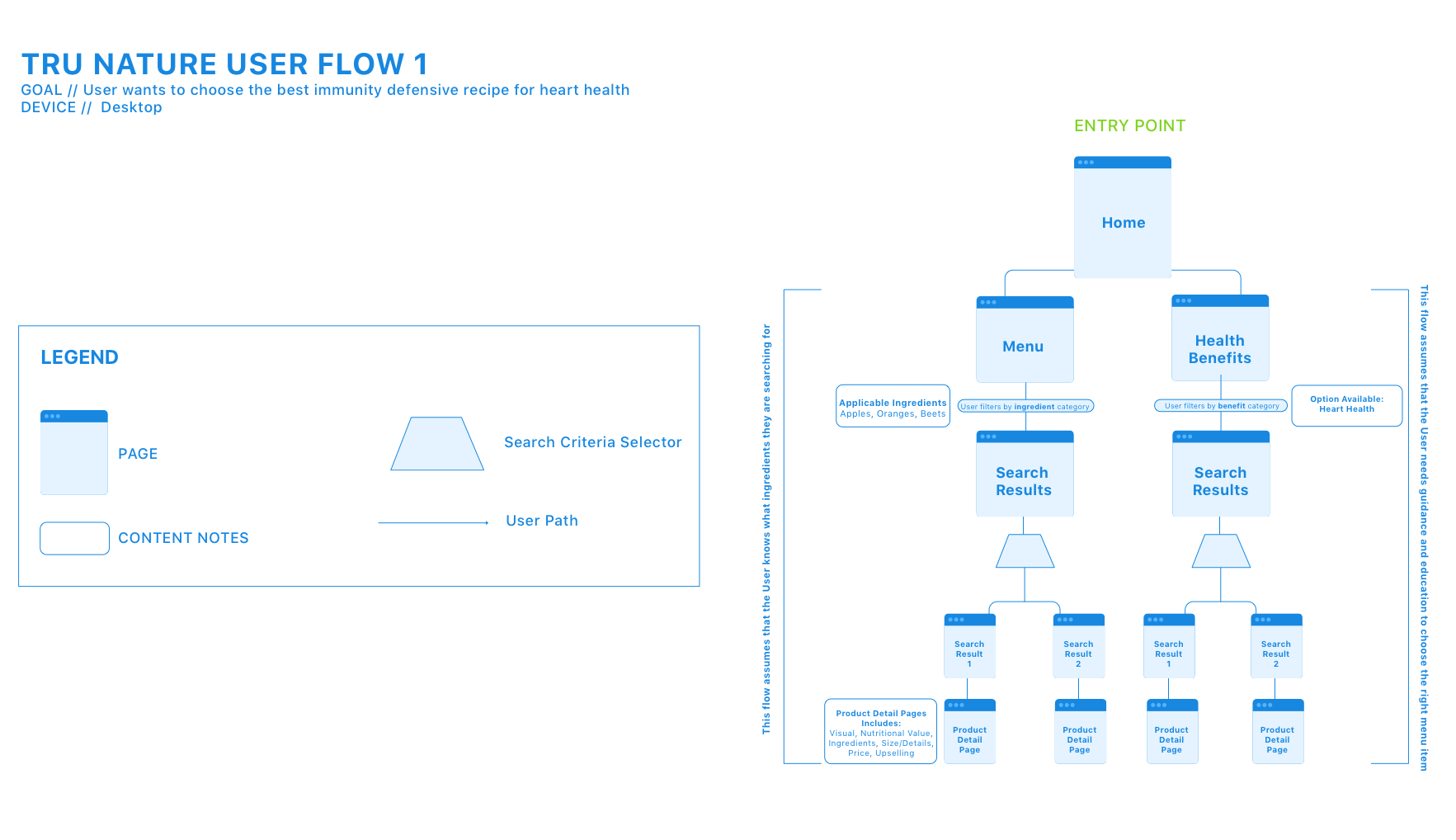
By Ana V Peralta
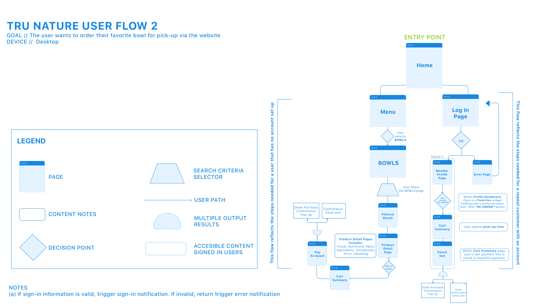
USER FLOW #2
When outlining the purchase flow, I intentionally made the flow shorter for a logged in member in order to encourage more registered users. This will result in Tru Nature building records of a customer base which will make marketing efforts more efficient.
By Ana V Peralta
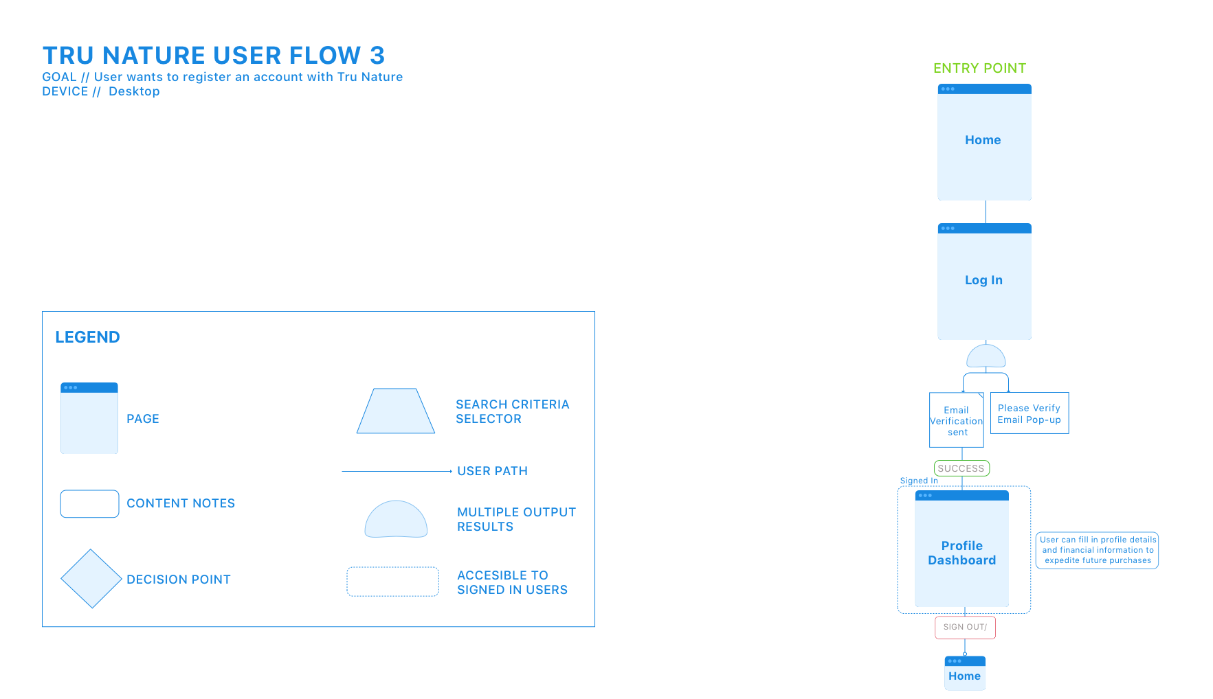
USER FLOW #3
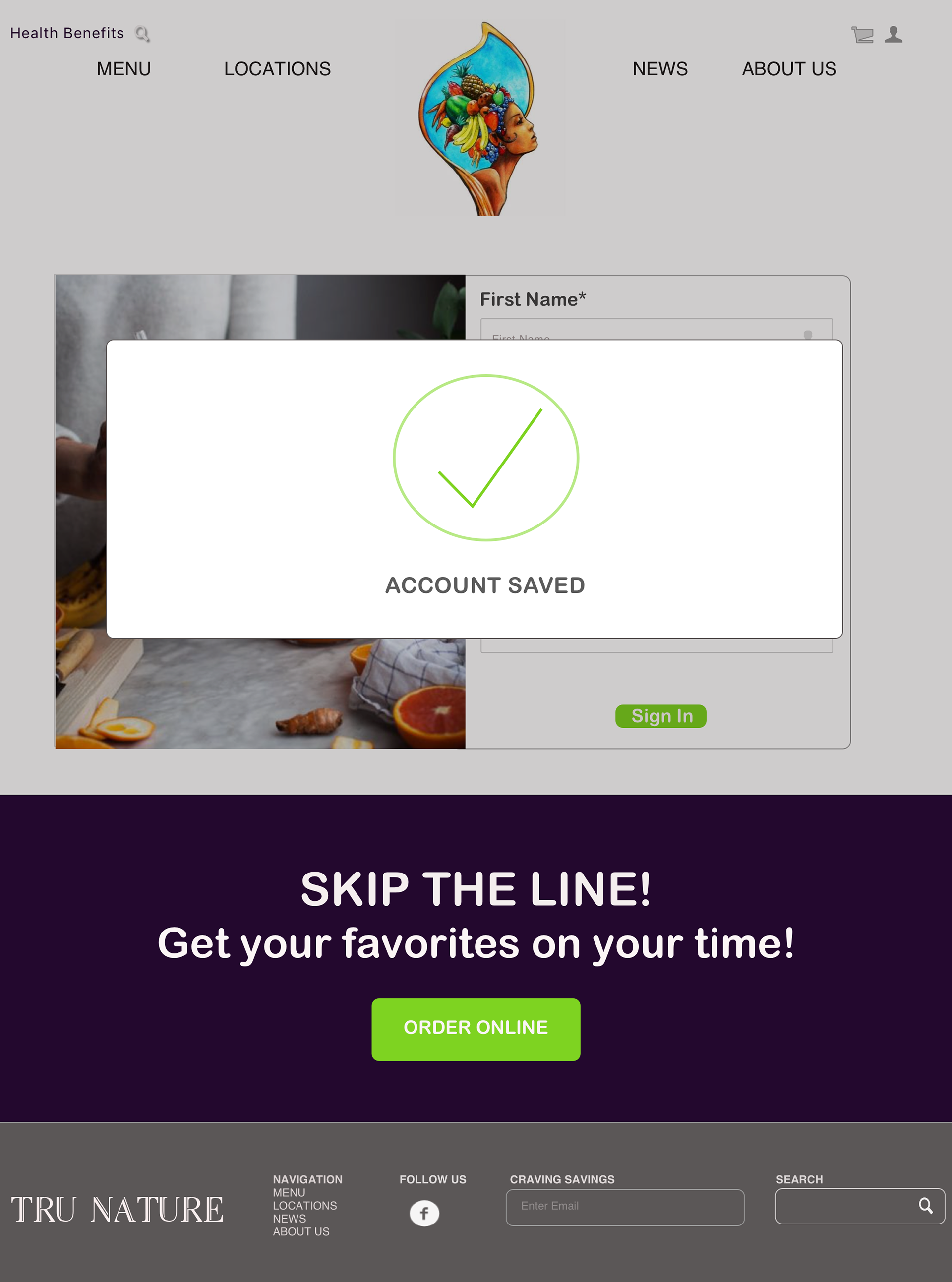
This flow outlines the easy flow to become a registered member. As this is a business goal, I felt it was essential to make it as seamless as possible to encourage users to sign up.
By Ana V Peralta
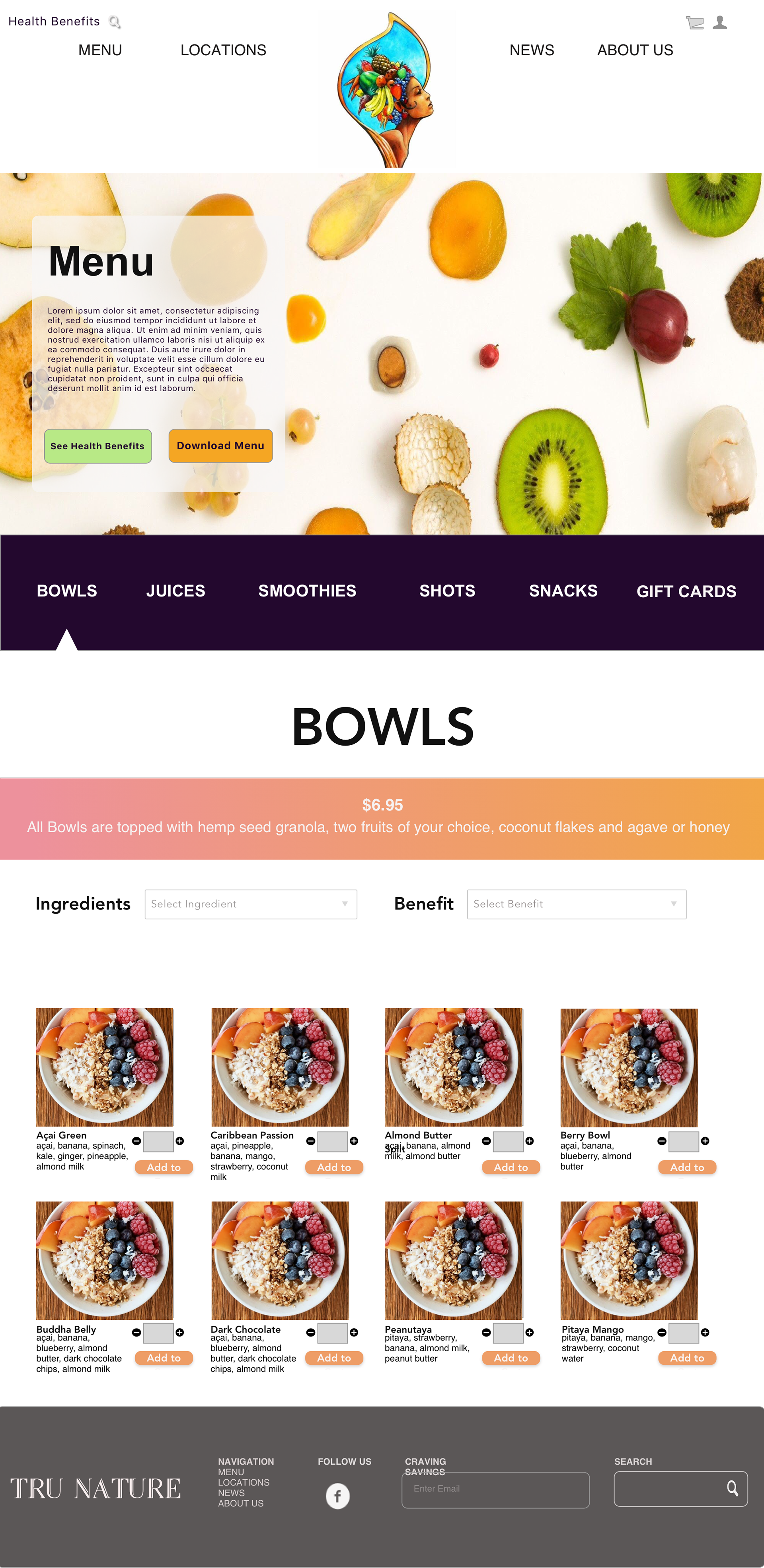
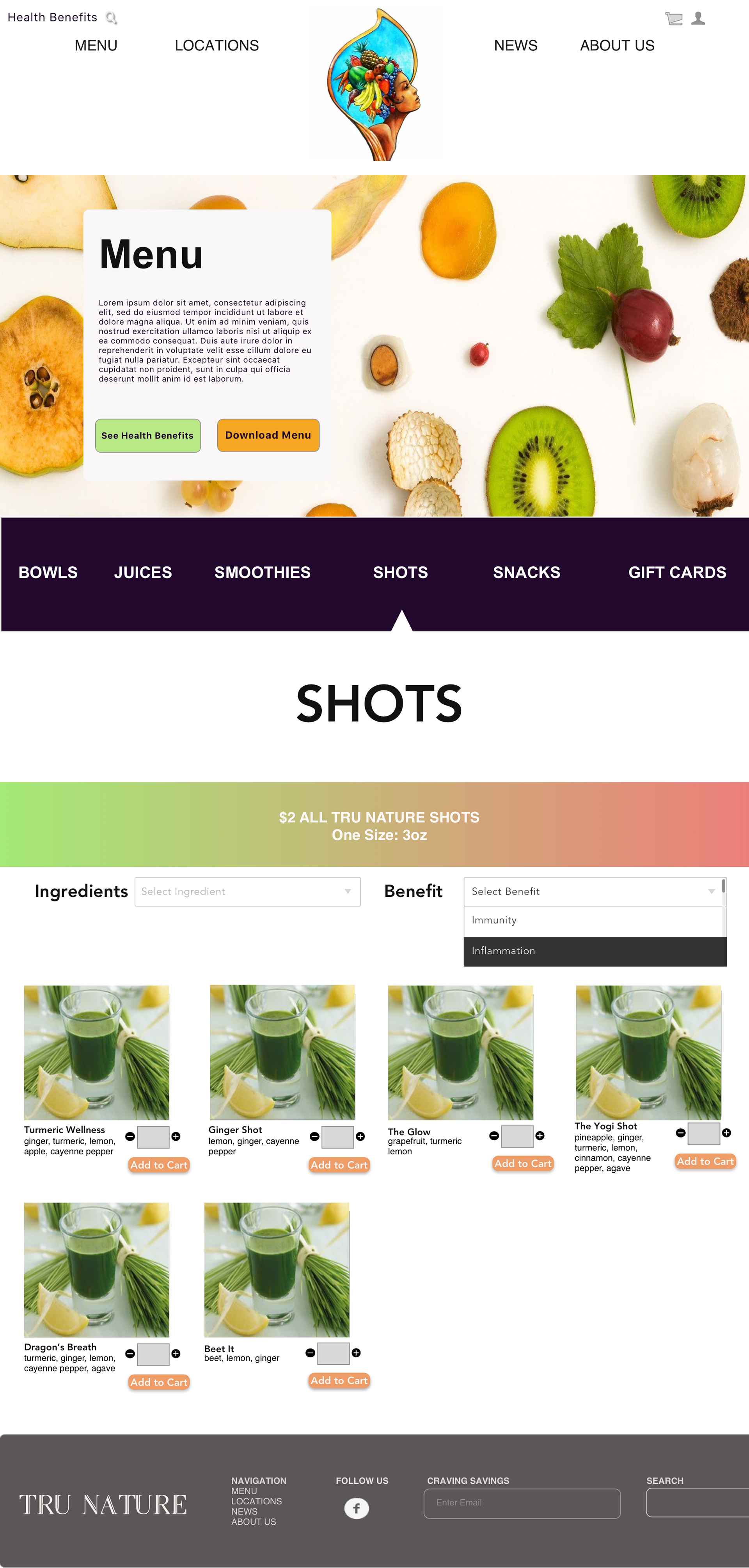
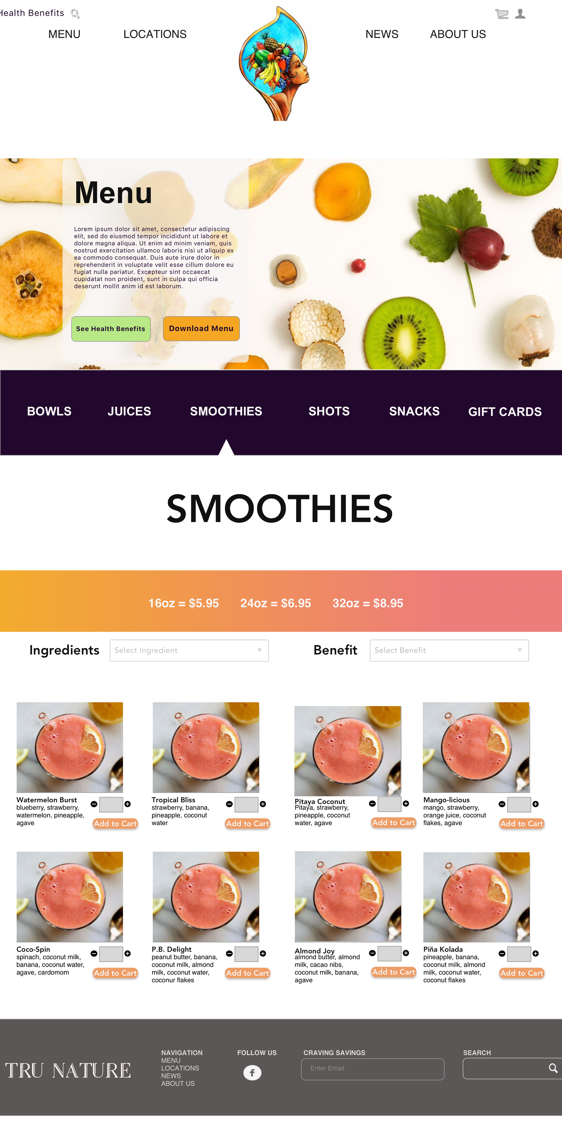
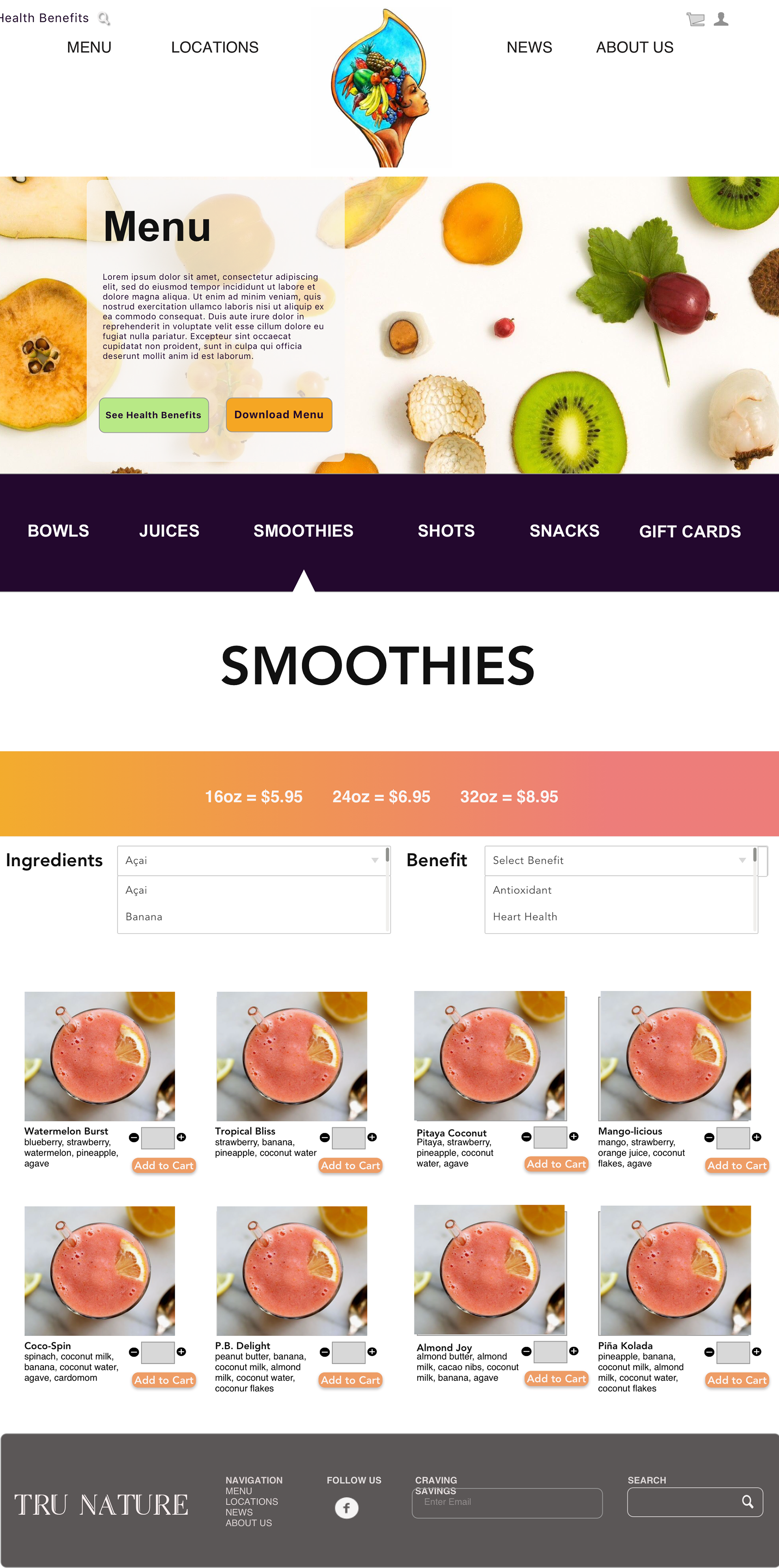
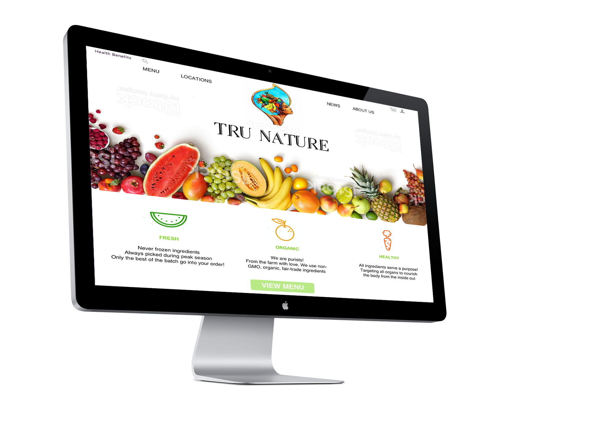
WIREFRAMES
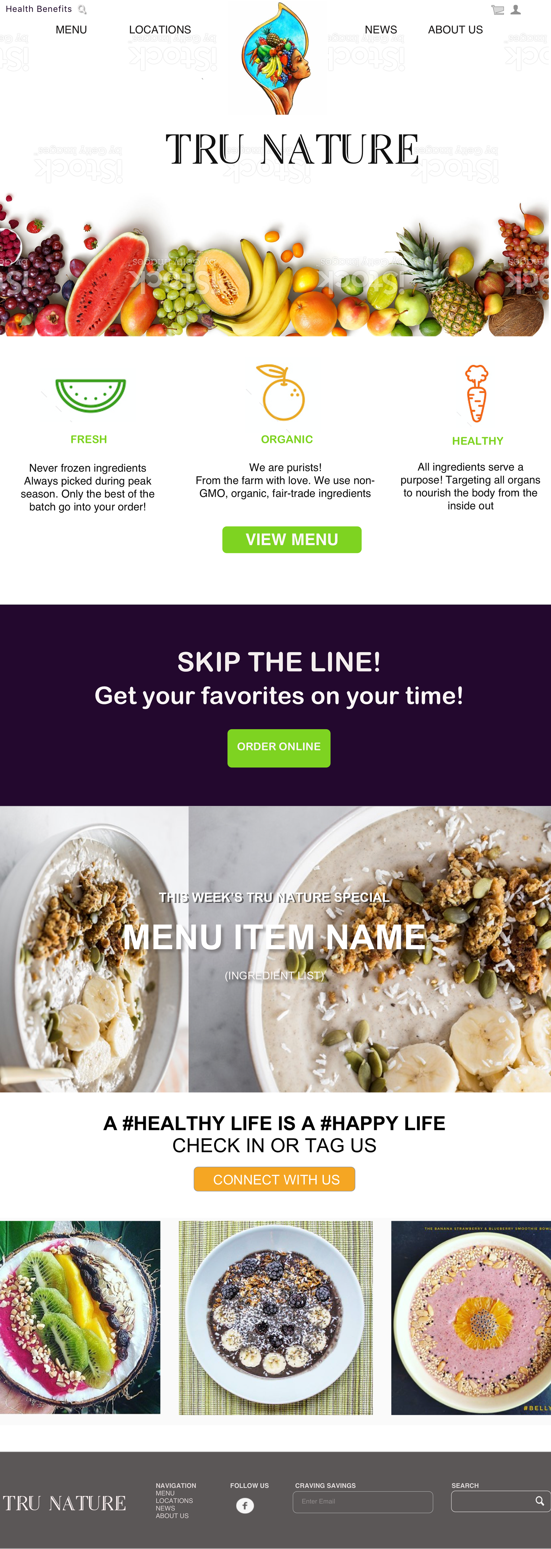
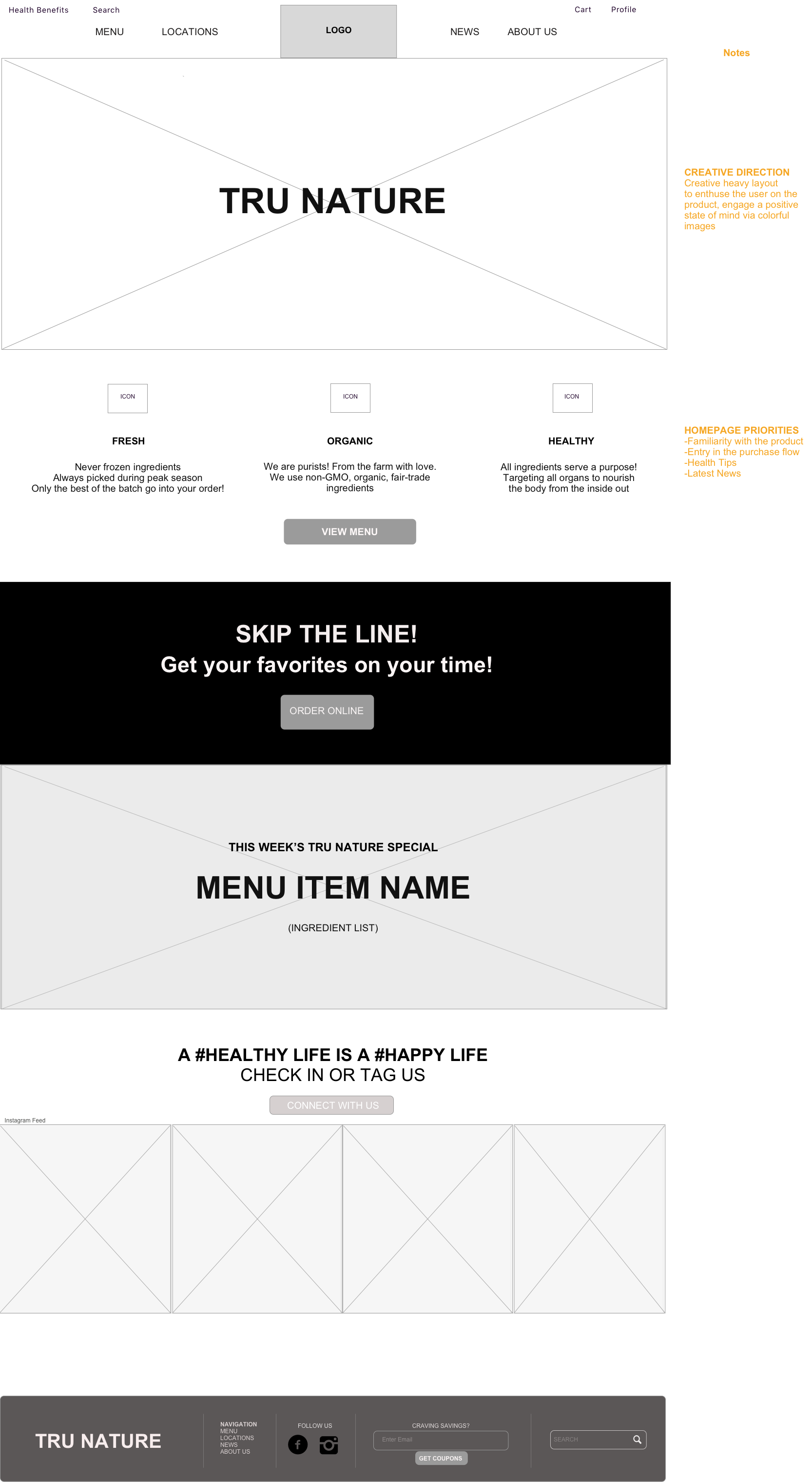
My goal was to design a website that was creative heavy in order for the product to be the lure for users, to essentially 'eat with the eyes'.
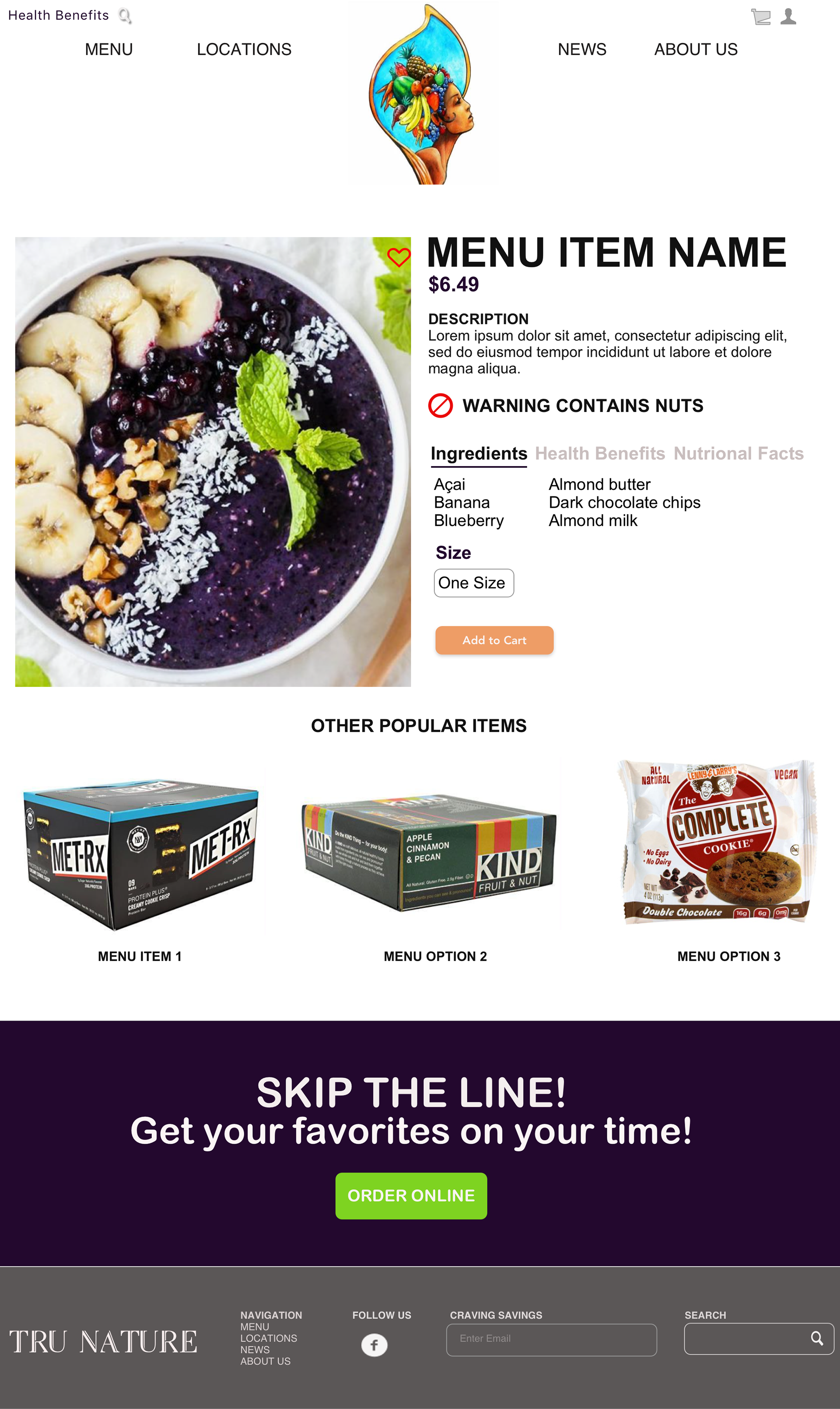
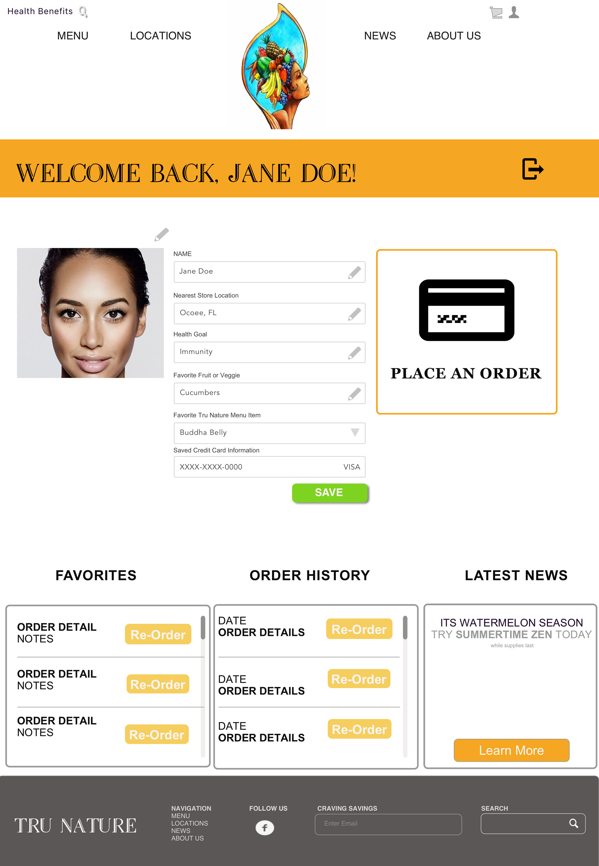
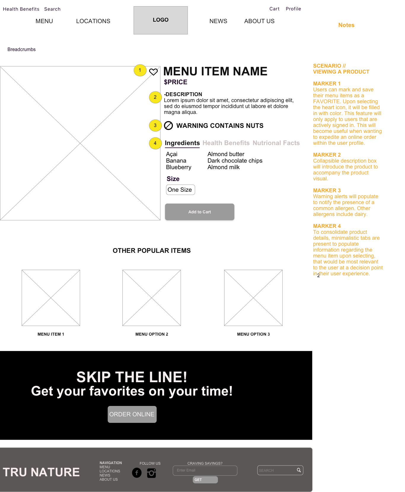
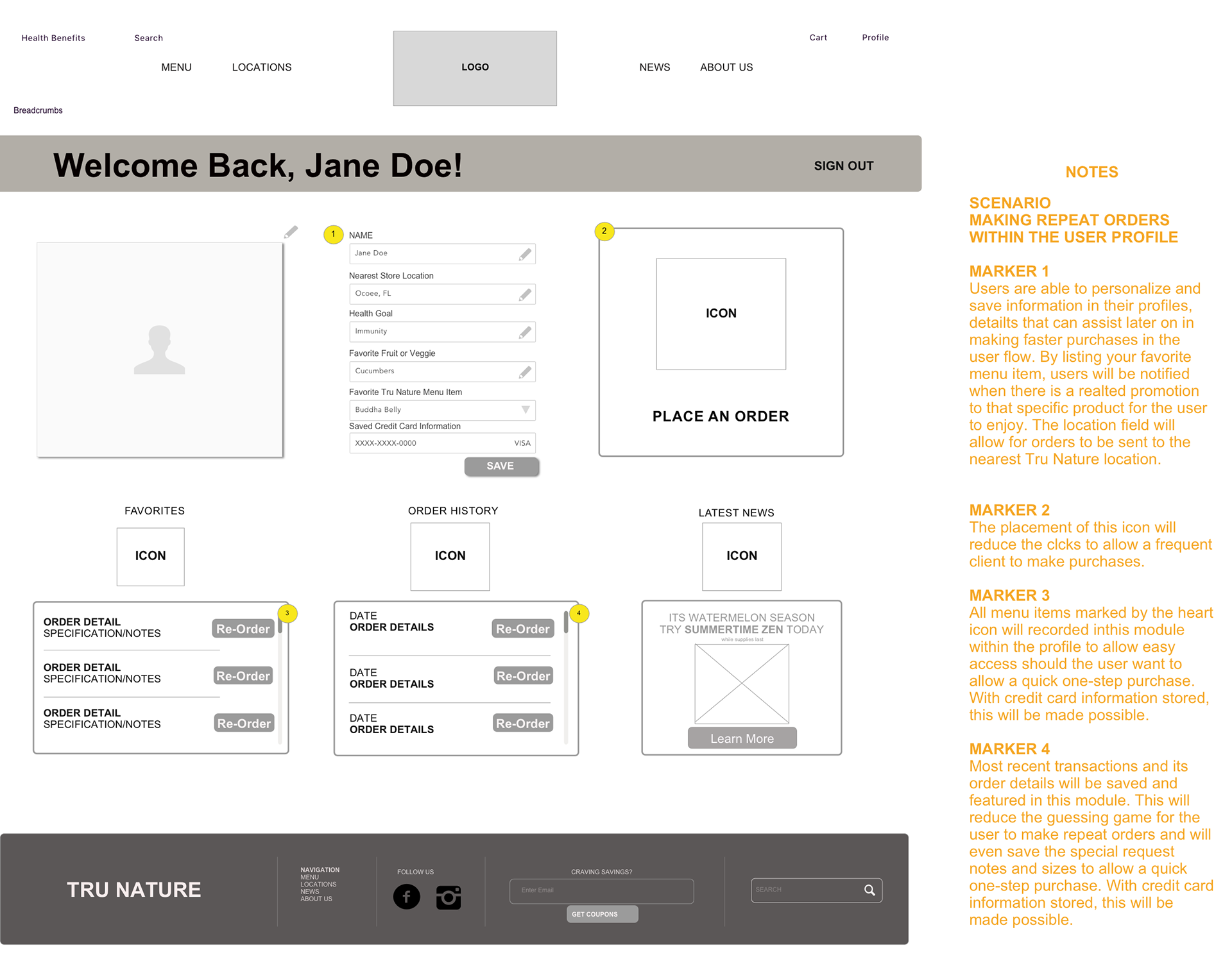
PRODUCT DETAIL PAGE PROFILE PAGE
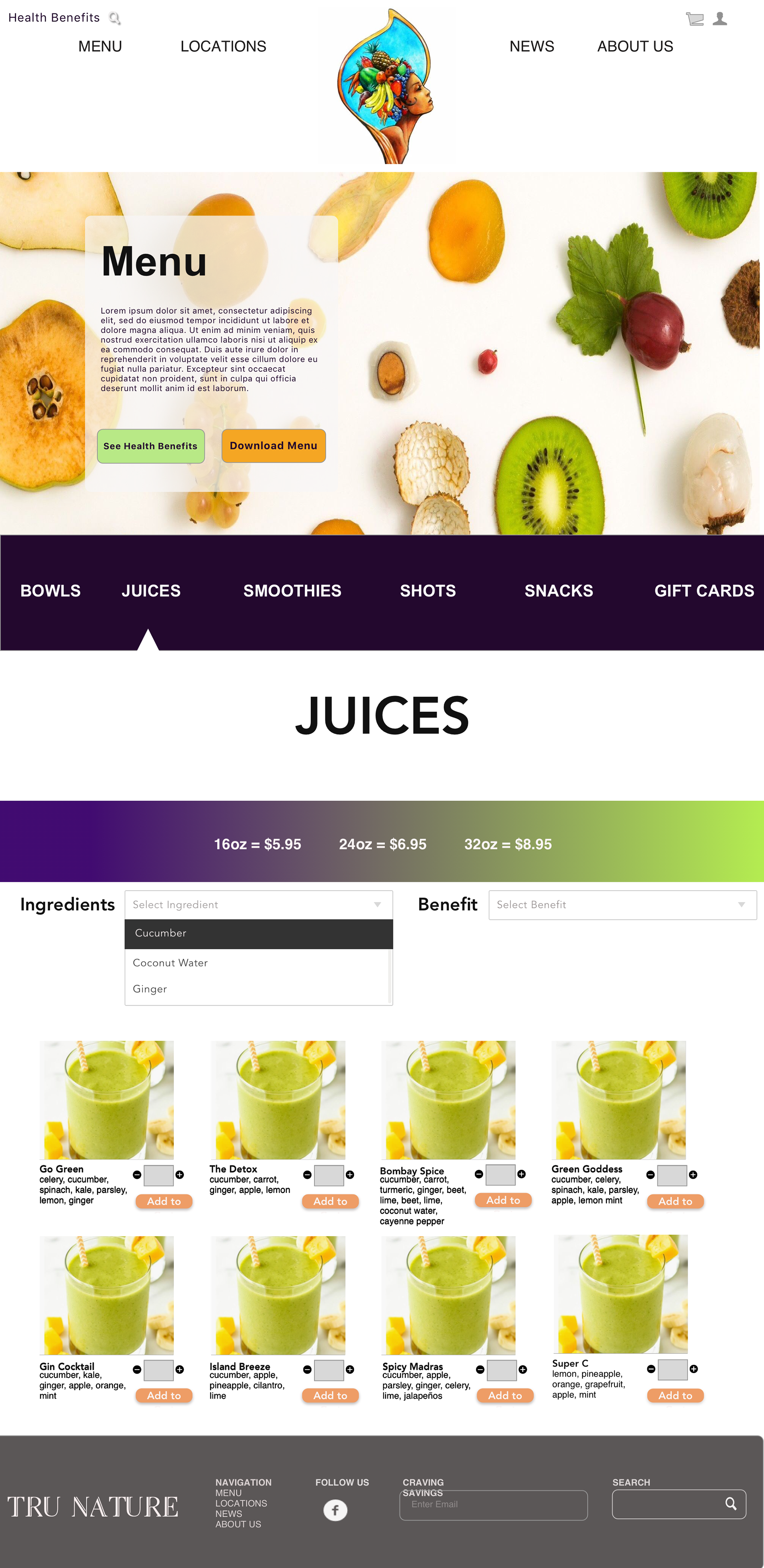
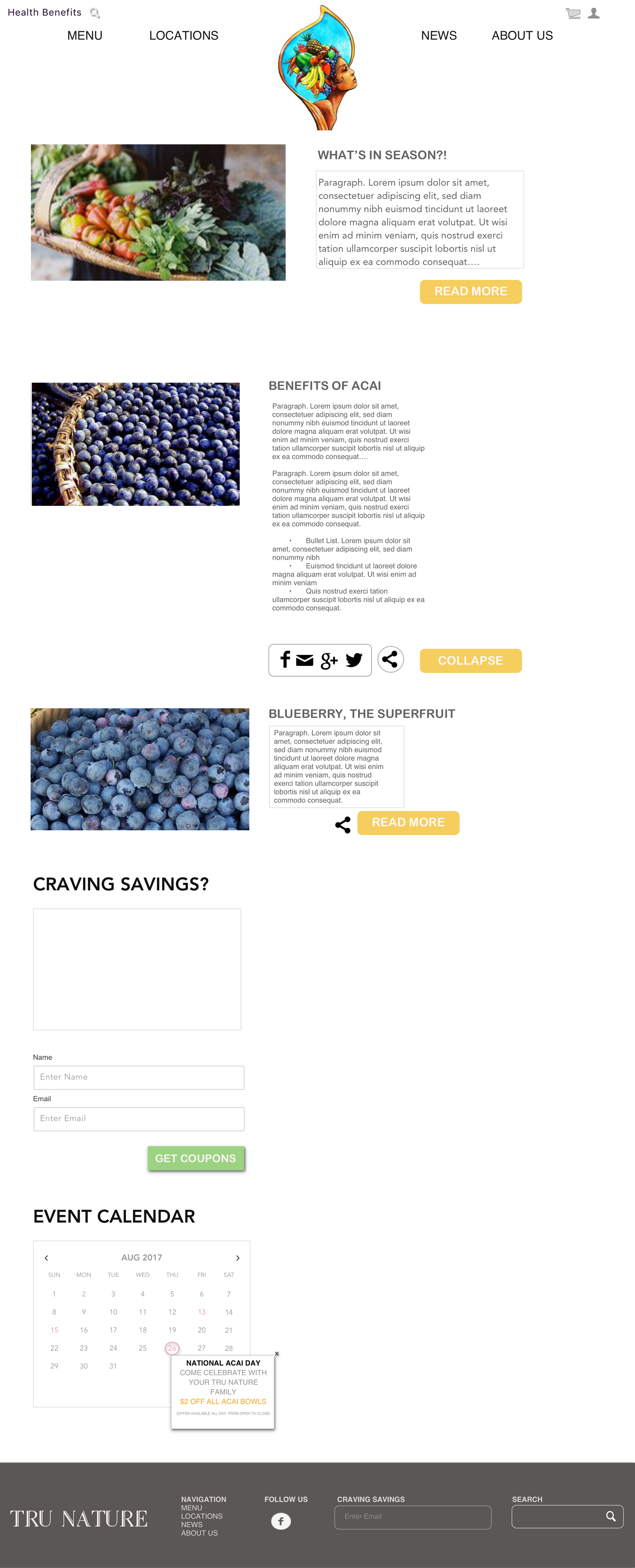
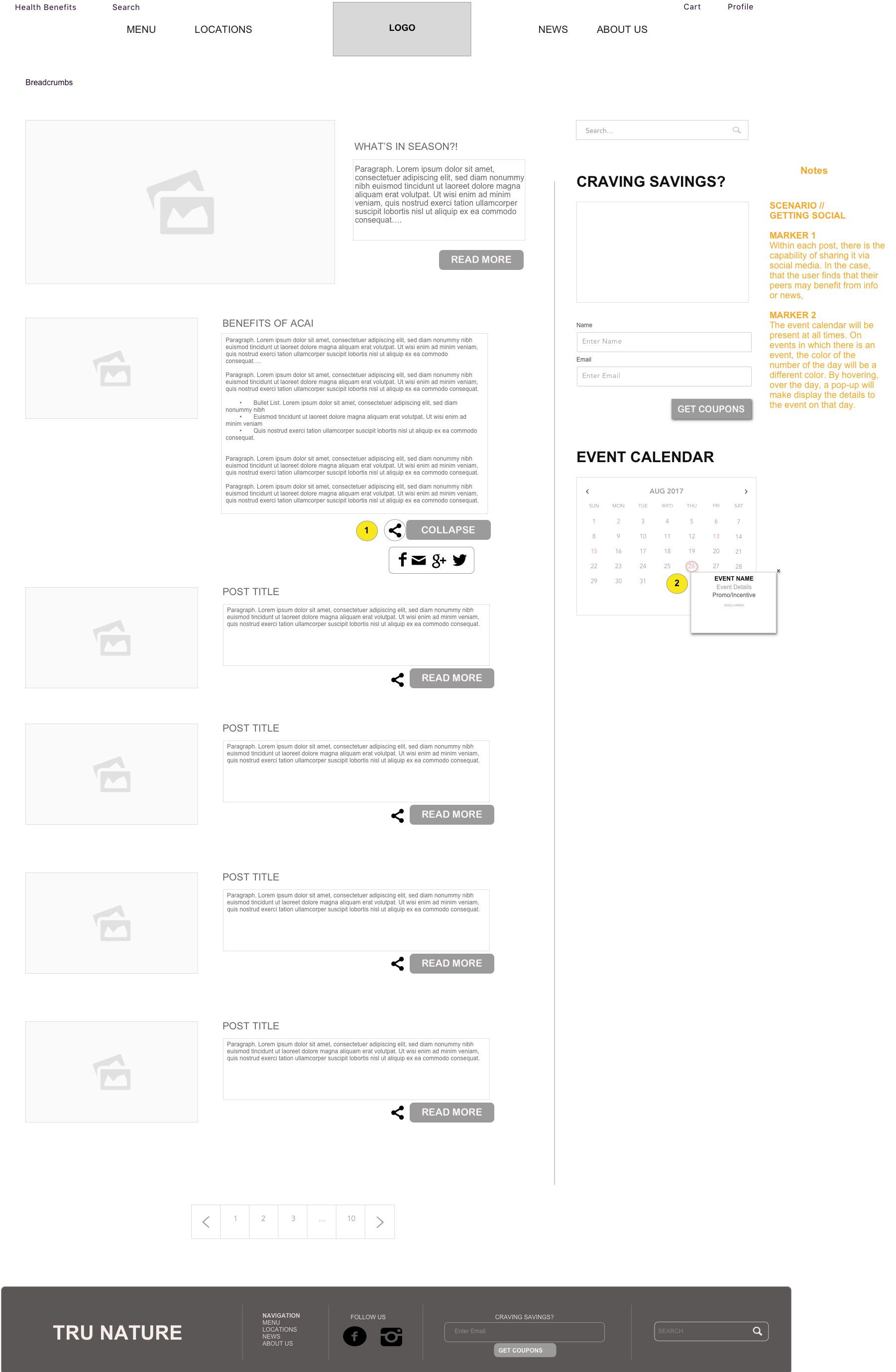
MENU PAGE (BOWLS) PAGE NEWS PAGE
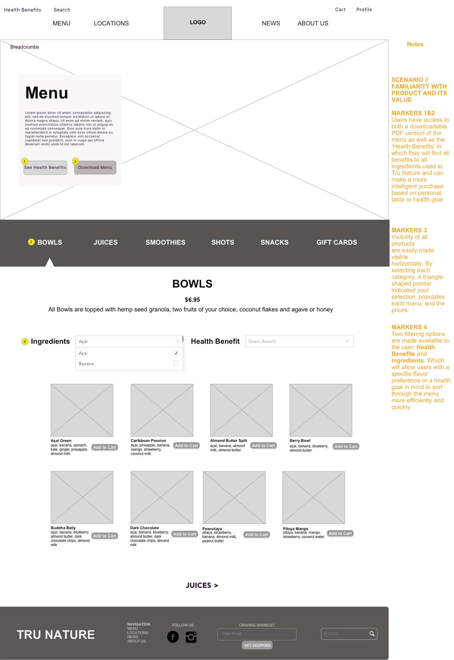
I opted for a dynamic layout on the Menu pages as it is the key to sales and by making it the most engaging and intuitive pages, it would lead to more engagement, longer browsing sessions and ultimately connect the user with the product.
CART PAGE HOMEPAGE

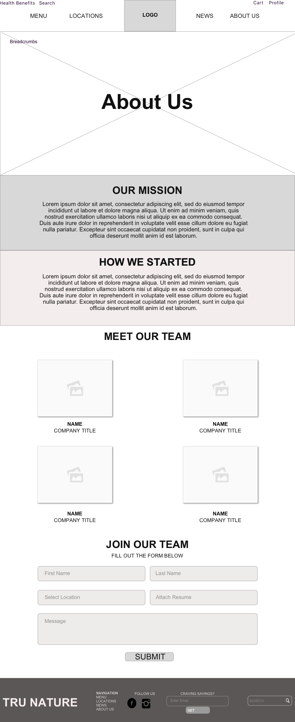
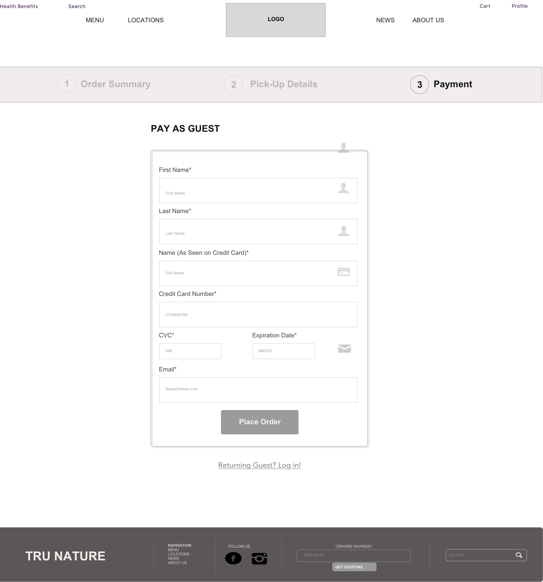
ABOUT US PAGE PAY AS GUEST PAGE
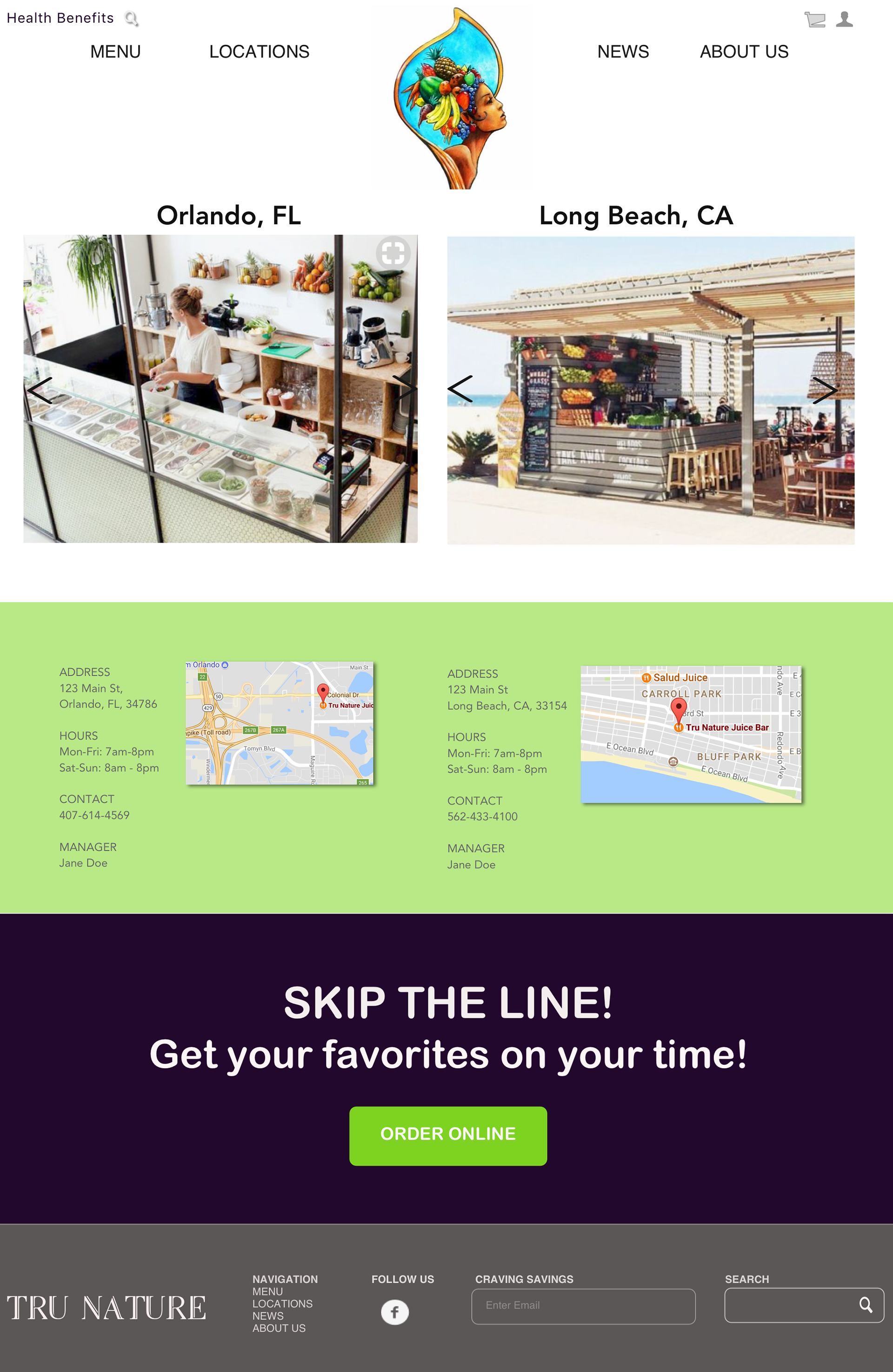
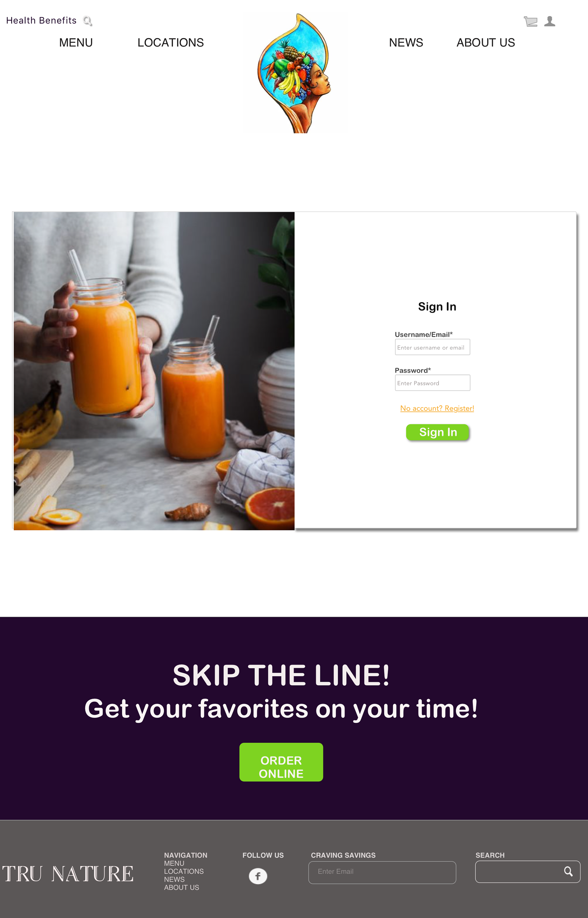
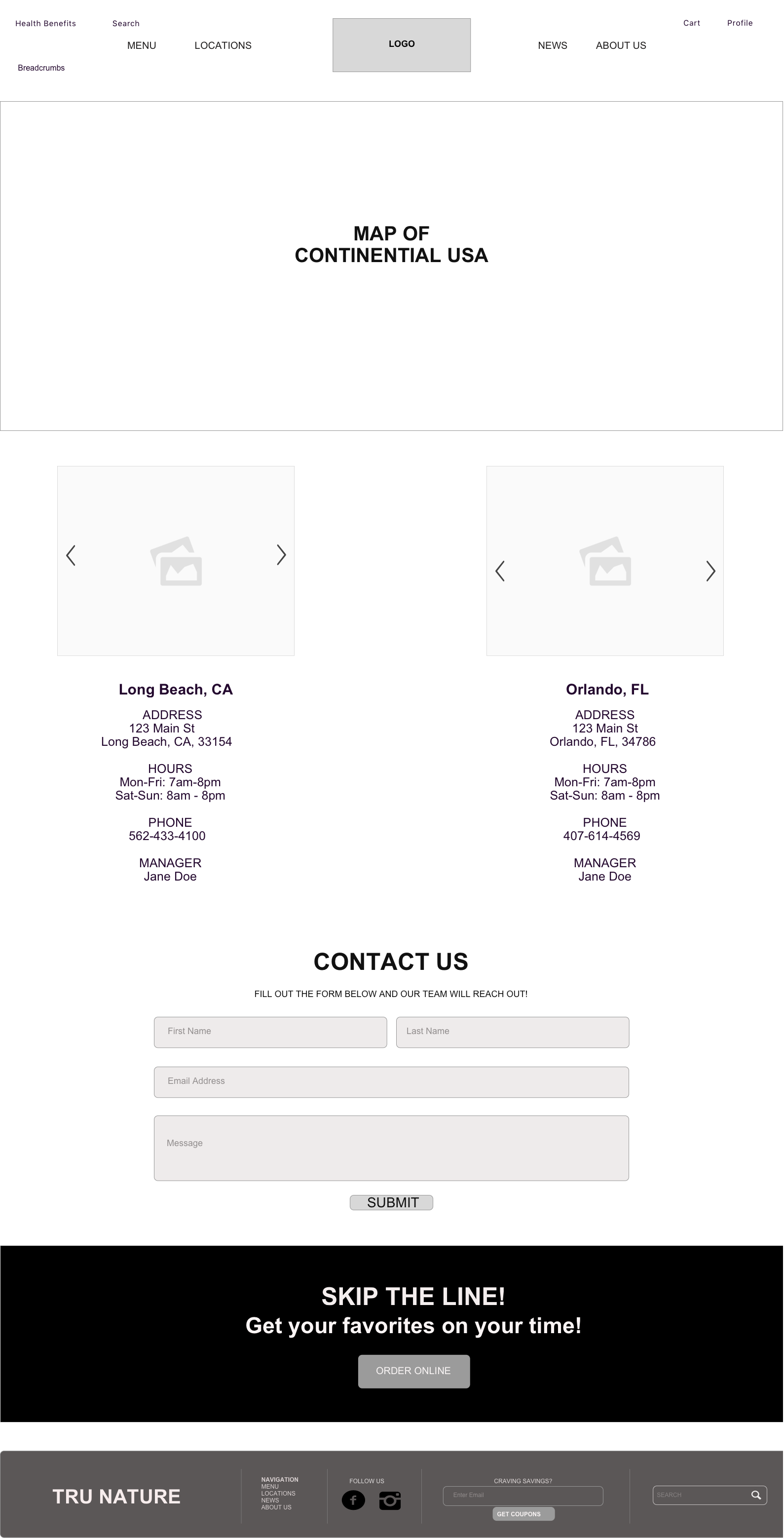
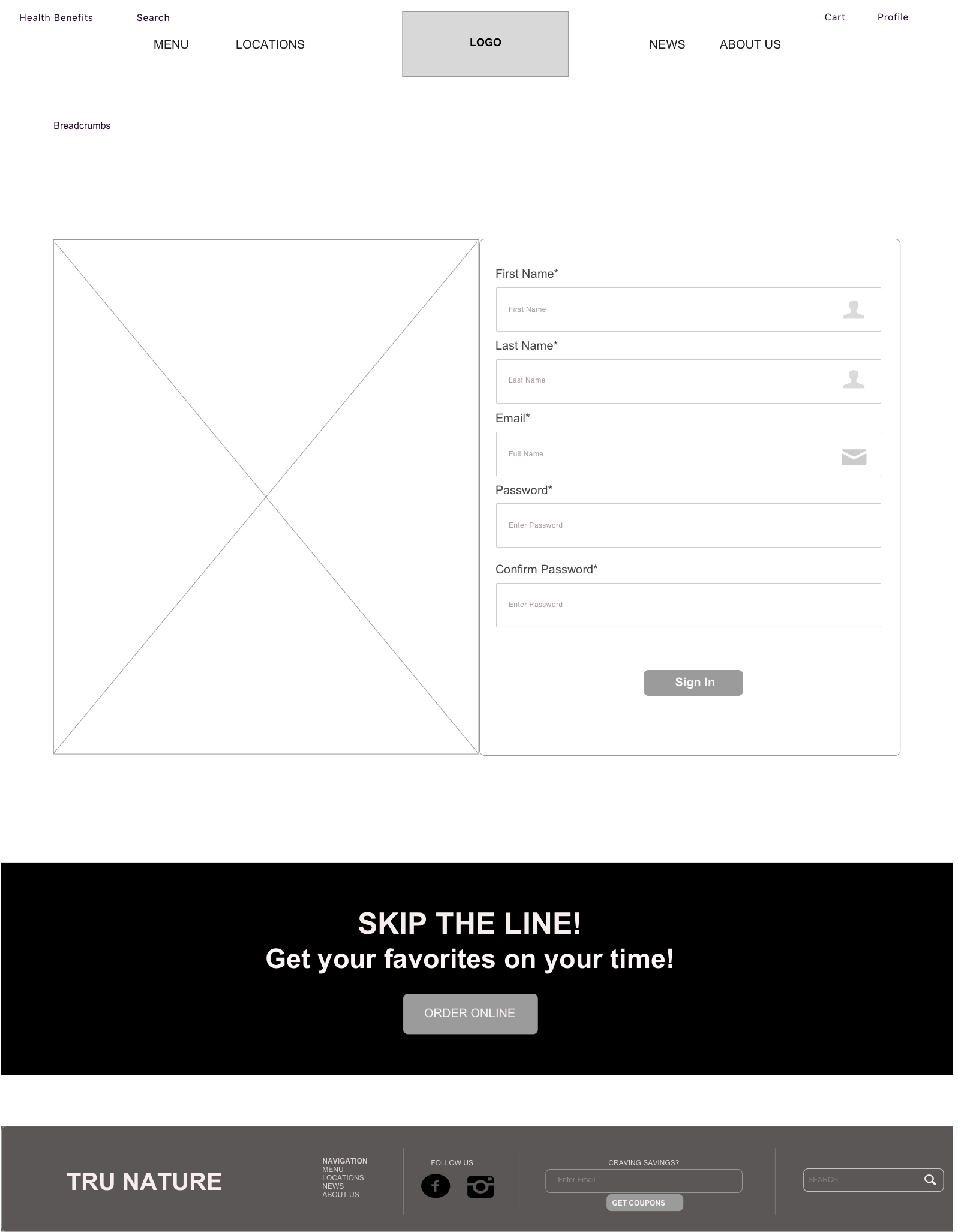
LOCATIONS PAGE REGISTRATION PAGE SIGN IN PAGE

USABILITY TESTING results
Learnings
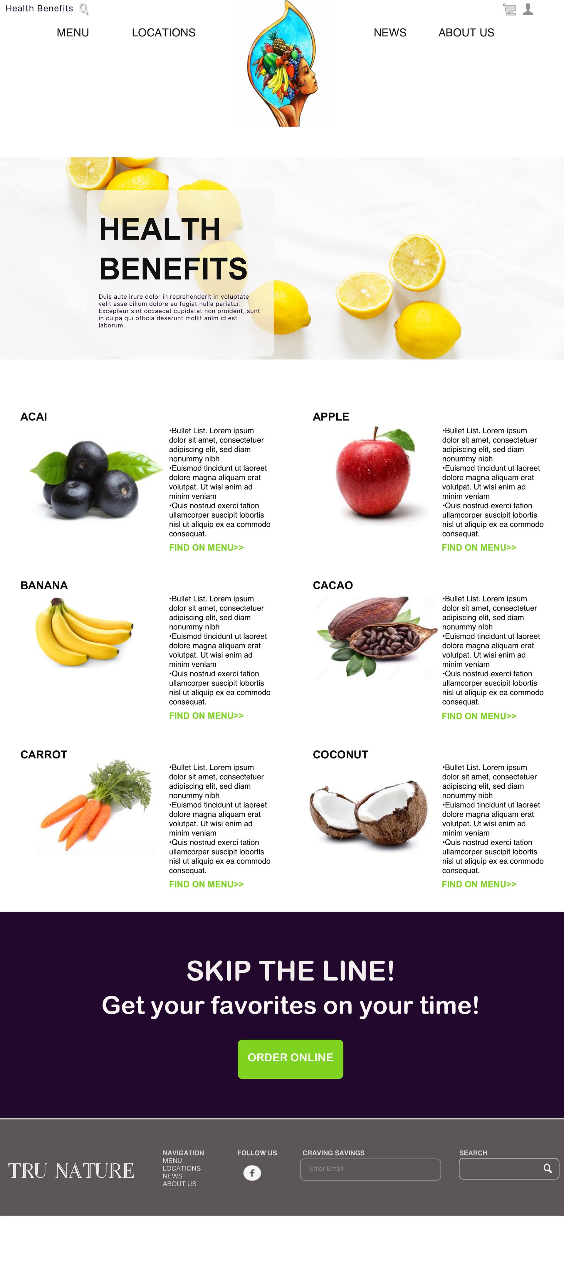
1) Originally, the Health Benefits was a presented as a hyperlink into the Menu's hero and many candidates that would guide user's to a lightbox listing all ingredients served at Tru Nature. Unfortunately, even users who were interested in seeking this information were missing and the click-rate was under 10%. Also, as the business plans to urge a mobile experience, the lightbox did not present itself well on mobile devices, therefore, it was removed Menu page, replaced with a prominent button and given it's own page. Also found in the header.
2) The dropdown selections on the Menu page (i.e. Ingredients and Health Benefits) originally was built as a one-a-time selection, however, users expressed that an option allowing multiple selections would be helpful to them. 40% of testees claimed they indulge in flavor combinations as opposed to thinking one ingredient at a time. Once this capability was implemented, the felt that the filtered menu was more true to their tastes and specifications
3) Menu layout: The first draft of wireframes used a mosaic tile layout to feature all categories of food selection, however, it was very overwhelming for users to explore the menu and move onto (or back) to another category and see what the menu holds. As I searched for an alternative I opted to for an Nav-like layout for the Menu allowing for easy browsing and content exploration for the user. The reduction in creative images on the page allowed for users to focus and take notice of the menu items better.
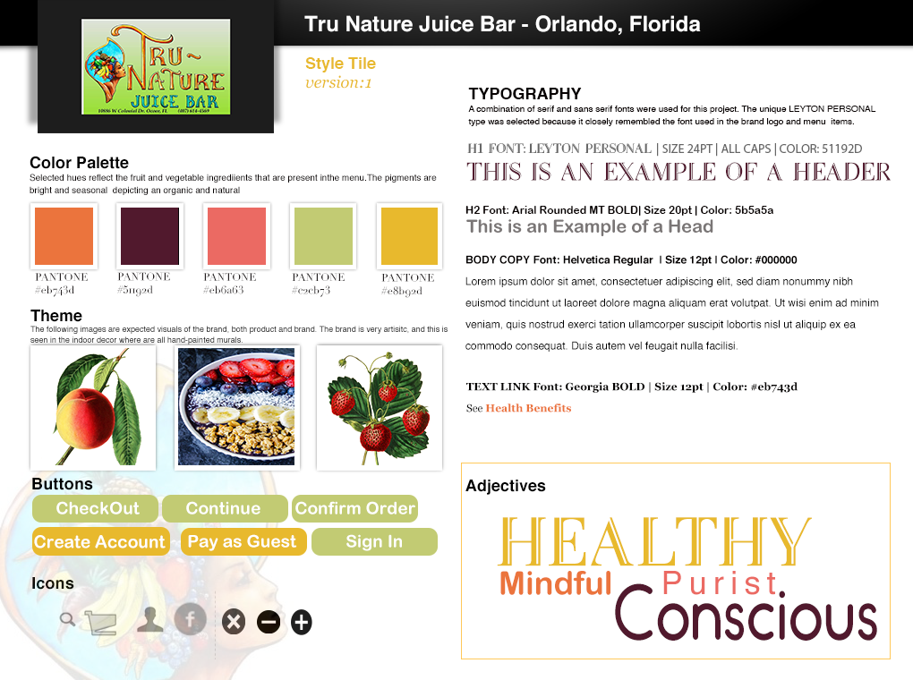
STYLE TILE
INVISION PROJECT prototype | desktop